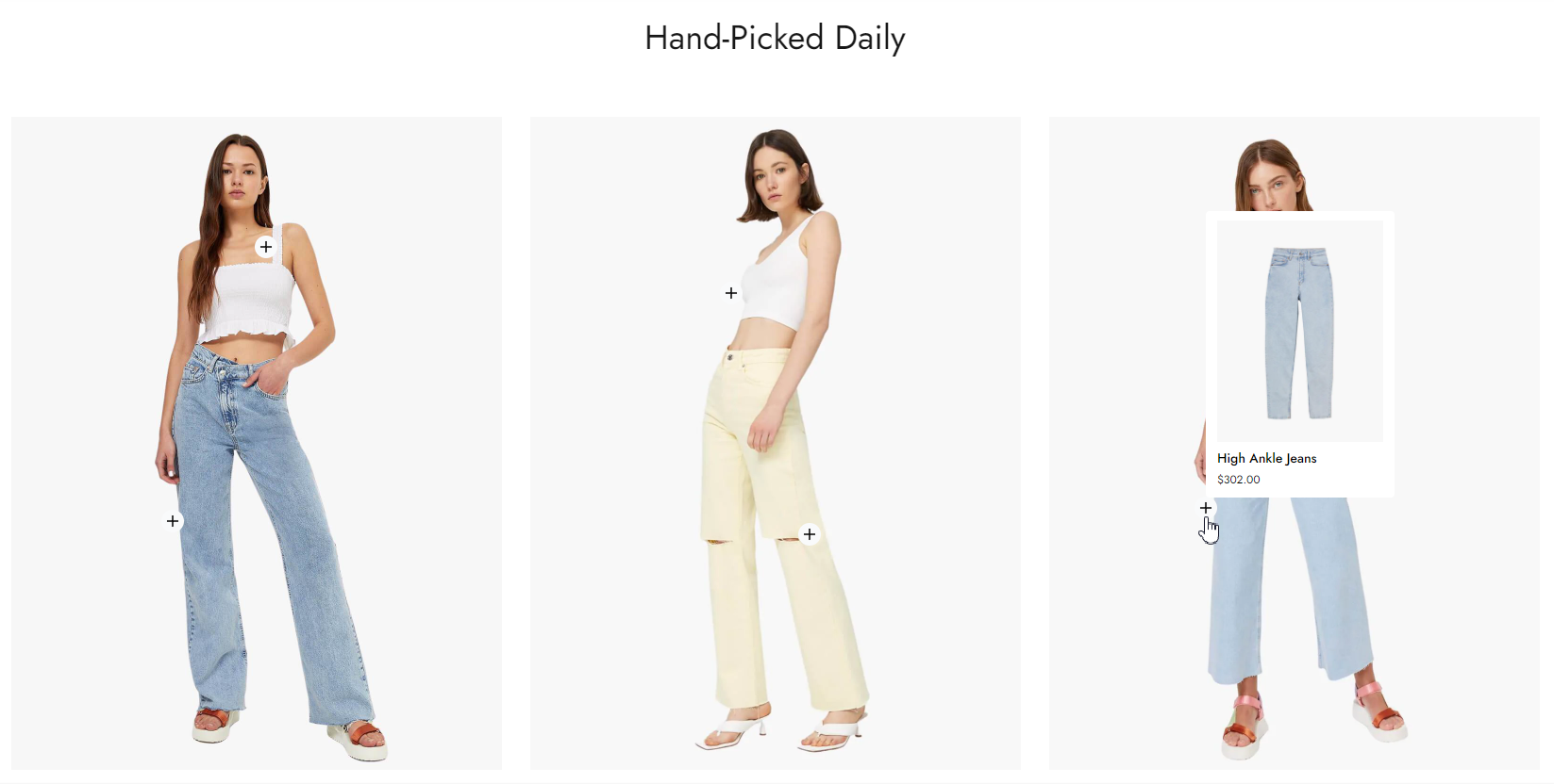
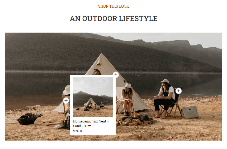
The Lookbook section helps you showcase multiple products and let customers interact with them. This is one of the amazing features that can boost your sales like a cross-selling art.
This article shows you how to create lookbooks on your own for a powerful and eye-catching store.
Steps
In the theme editor (Customize) , click Add section.
Locate Lookbook.
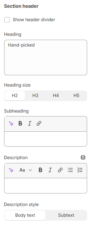
Save. # Section settings
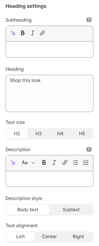
Show header divider or not;Give your section a Heading , a Subheading and a Description , or simply leave them blank.
Adjust the Heading size as H2/H3/H4/H5;
Select the Description style as Body text/Subtext;
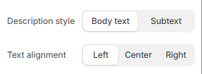
Adjust the Text alignment : Left/Center
Change the Description style : Body text/Subtext
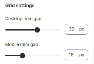
# Grid settingsAdjust the item gap for mobile view and desktop view.
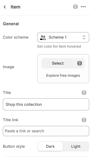
# Block settings# Lookbook as ItemEach item consists of a high-resolution image and tagged products. You can add your preferred image and select the button style (Light/Dark).
To tag products on the item image, you must add the chosen products.
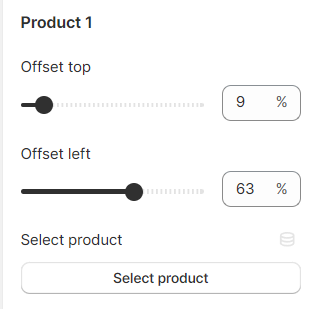
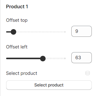
Then, use the offset top and offset left to adjust the button. You can add up to 5 tagged products for one lookbook item (image).
# Lookbook sliderInteractively showcase your highlighted products.
Similar to adding the
Lookbook's items , after adding an image to the block, select up to 5 products and adjust the corresponding buttons.
# Heading settingsGive your slider a descriptive Heading , Subheading , and Description if needed.
You can adjust your Heading text size as H2/H3/H4/H5 and select your Description style as Body text/Subtext.
Select your preferred Text alignment (Left/Center/Right).
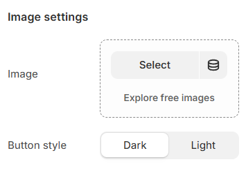
# Image settingsSelect/Upload your image for the Lookbook and select the Button style as Dark/Light.
Then, add the products to the Lookbook slider.
Use the offset top and offset left to adjust the button. You can add up to 5 tagged products to one lookbook slider.
# Slider settings
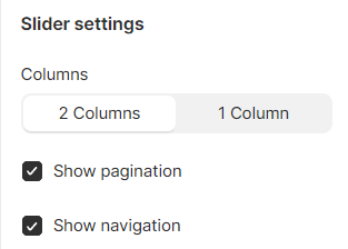
Select the number of columns for the product slider (1 column/2 columns);
Show the pagination and navigation or not.
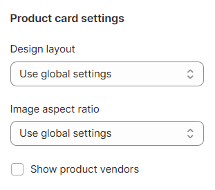
# Product card settingsDecide on the Product card's Design layout , Image aspect ratio , and show the Product vendors if needed.