# Apply global styles across your store
This video shows an older version of the Global styles. For the current layout, check Global styles directly inside FoxStudio.
Global styles is a system of reusable design variables and presets. Instead of styling each element individually, set your brand's colors, font sizes, and button styles in one place — then apply them across your store with a single click.
Any change you make to a Global style is automatically applied everywhere that style is used, keeping your store visually consistent without manual rework.
## When to use this
Best fits for:
* You want consistent colors, fonts, and button styles across every page, without restyling each element by hand
* You're setting up your brand's design system before building out pages
* You need to update a color or font size in one place and have it apply everywhere it's used
## How to open Global styles
1. Open any page in **FoxStudio**.
2. Click the **paintbrush icon** in the left sidebar.
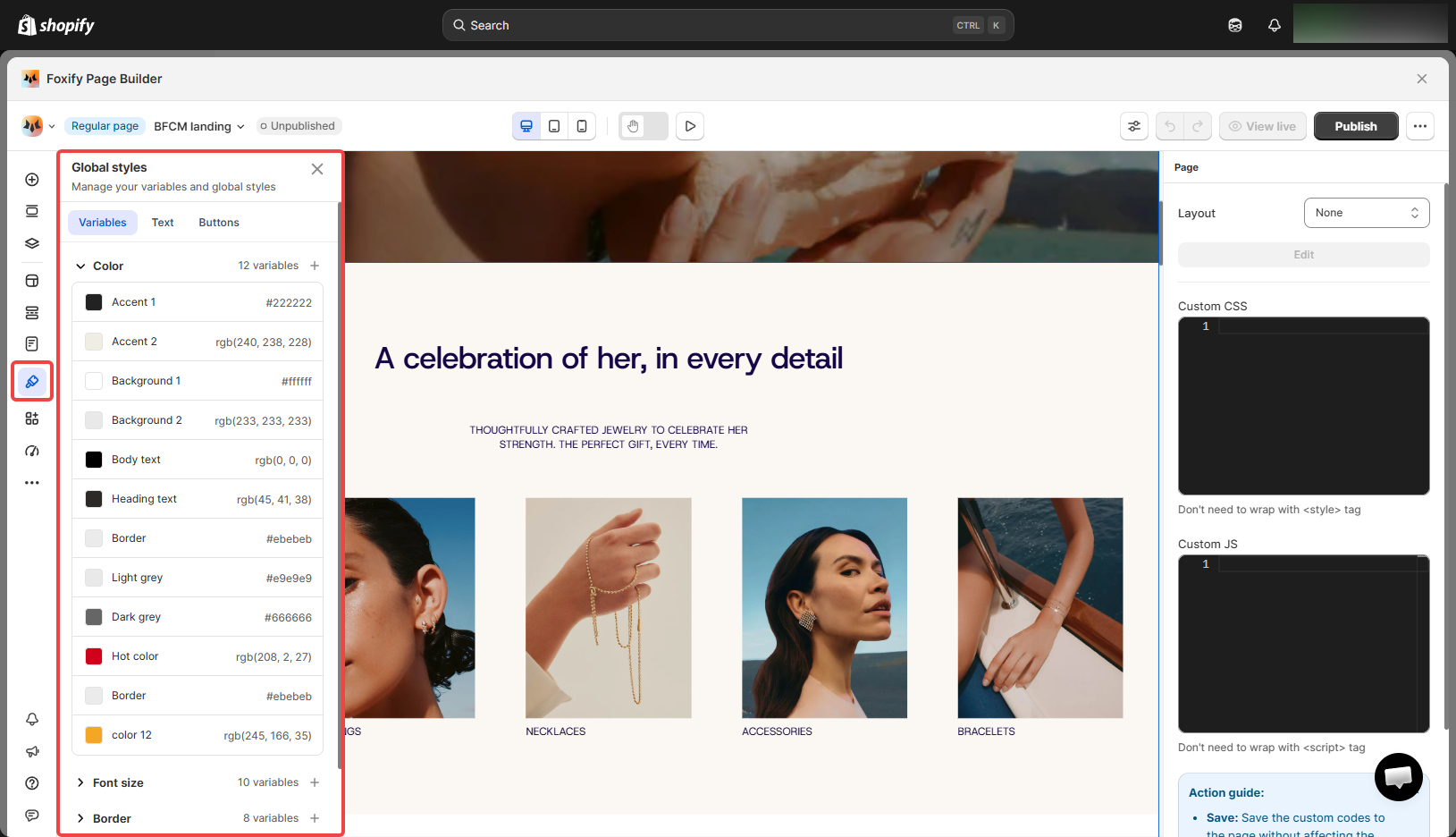
The Global styles panel opens with the Variables, Text, and Buttons tabs.
## **Variables**
Variables are reusable values you define once and apply across your pages. The Variables tab has 5 categories, each with default presets you can edit or extend.
| Category | What it controls |
| --------- | ------------------------------------------------------------------------------------------------------------------------- |
| Color | Brand colors: Accent 1 & 2, Background 1 & 2, Body text, Heading text, Border, Light grey, Dark grey, Hot color, and more |
| Font size | Reusable size variables used across text elements |
| Border | Border width and radius presets for consistent edge styling |
| Space | Spacing variables for padding and gap — keeps layout rhythm consistent |
| Custom | Any additional variables your store needs beyond the defaults. [Learn more](#custom-variables) |
### Create a custom variable
1. In the **Variables** tab, expand **Custom**.
2. Click **+**, fill in a name and value, then click **Save**.
The name you choose becomes a CSS variable automatically. Value type is either **Number** (a numeric value with a unit, e.g. px, %, em) or **String** (any text value).
### Apply a variable
In the Inspector panel's **Design** tab, click the variable icon next to any compatible **Color**, **Space**, or **Border** field, then search for and select your variable.
_nd9XTRTf.gif)
## Text styles
Text styles are predefined typographic presets you can apply to any text element with one click.
### Customize a text style
Click any style to open its settings panel. Each text style lets you configure:
| Setting | What it controls |
| --------------- | --------------------------------------------------- |
| Style name | The label shown in the text styles list |
| Color | Text color — can be linked to a Color variable |
| Font family | Typeface for this style |
| Font size | Size in px — can be linked to a Font size variable |
| Line height | Vertical spacing between lines in px |
| Font weight | Thickness of the text (Regular, Medium, Bold, etc.) |
| Letter spacing | Horizontal spacing between characters in px |
| Text transform | AA (uppercase), Aa (capitalize), aa (lowercase) |
| Text decoration | Underline, strikethrough, or none |
Click **Update** when done.
### Apply a text style
In the page editor, select a text element, then click **Select style** in the toolbar to choose a predefined text style.
_3CtONyhj.gif)
## Button styles
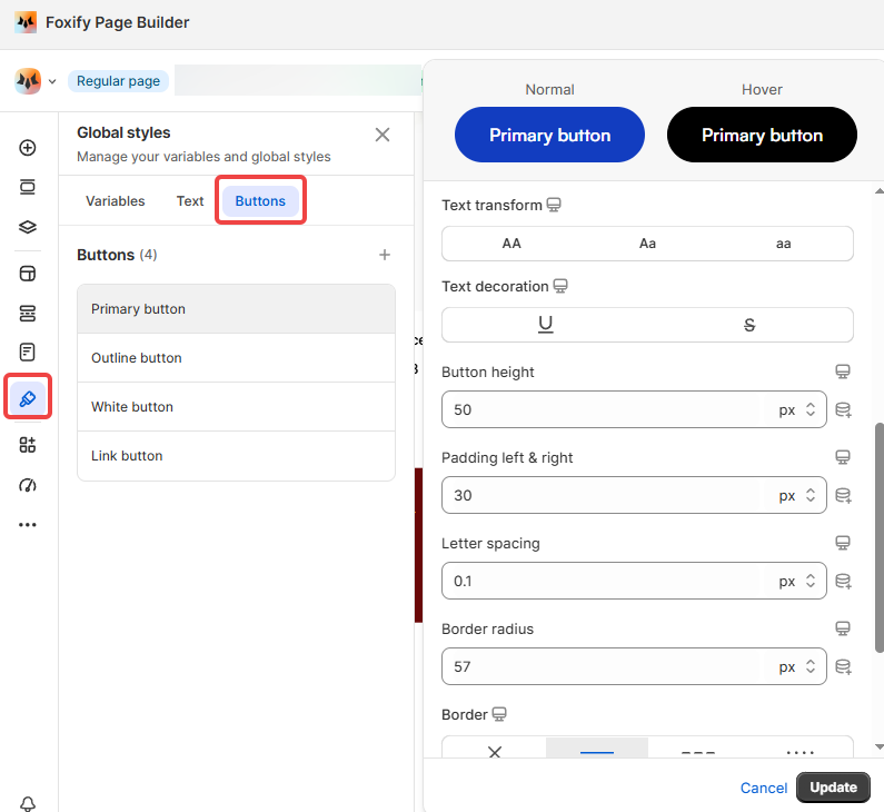
Foxify includes 4 default button presets:
* **Primary button**
: Your main CTA — solid fill, for the most important action on a page
* **Outline button**: Transparent background with border — for secondary actions alongside a primary button
* **White button**: White fill — good for use over dark or image backgrounds
* **Link button**: Text only, no border or fill — for low-emphasis actions
### Customize a button style
Click on any button style to open its settings. Each button has two states — **Normal** and **Hover** — and you can configure: Color, Background color, Font family, Font size, Font weight, and more.
### Apply a button style
In the page editor, select a button element, then click **Select style** in the toolbar to apply a preset.
_lPijD2En.gif)
You can edit Foxify's default text and button styles, but you can't delete them. Add your own custom styles alongside the defaults instead.
## FAQs
**What's the difference between Variables and Text/Button styles?**
Variables are raw reusable values — a color, a size, a spacing amount. Text and Button styles are ready-to-apply presets built on top of those variables (a text style's Color or Font size setting can link to a Color or Font size variable, for example).
**If I update a Global style later, does it change pages that already use it?**
Yes — any change to a Global style is applied automatically everywhere that style is used, across your store.
**Where can I apply a custom variable?**
Anywhere the Inspector panel's Design tab shows a variable icon next to a compatible field — typically Color, Space, and Border fields.
## Related articles
Layout & styling
Add and edit elements
Editor tools