
FoxstudioAdd and edit elements
Layer slider
2 min read

How to add a Layer slider element
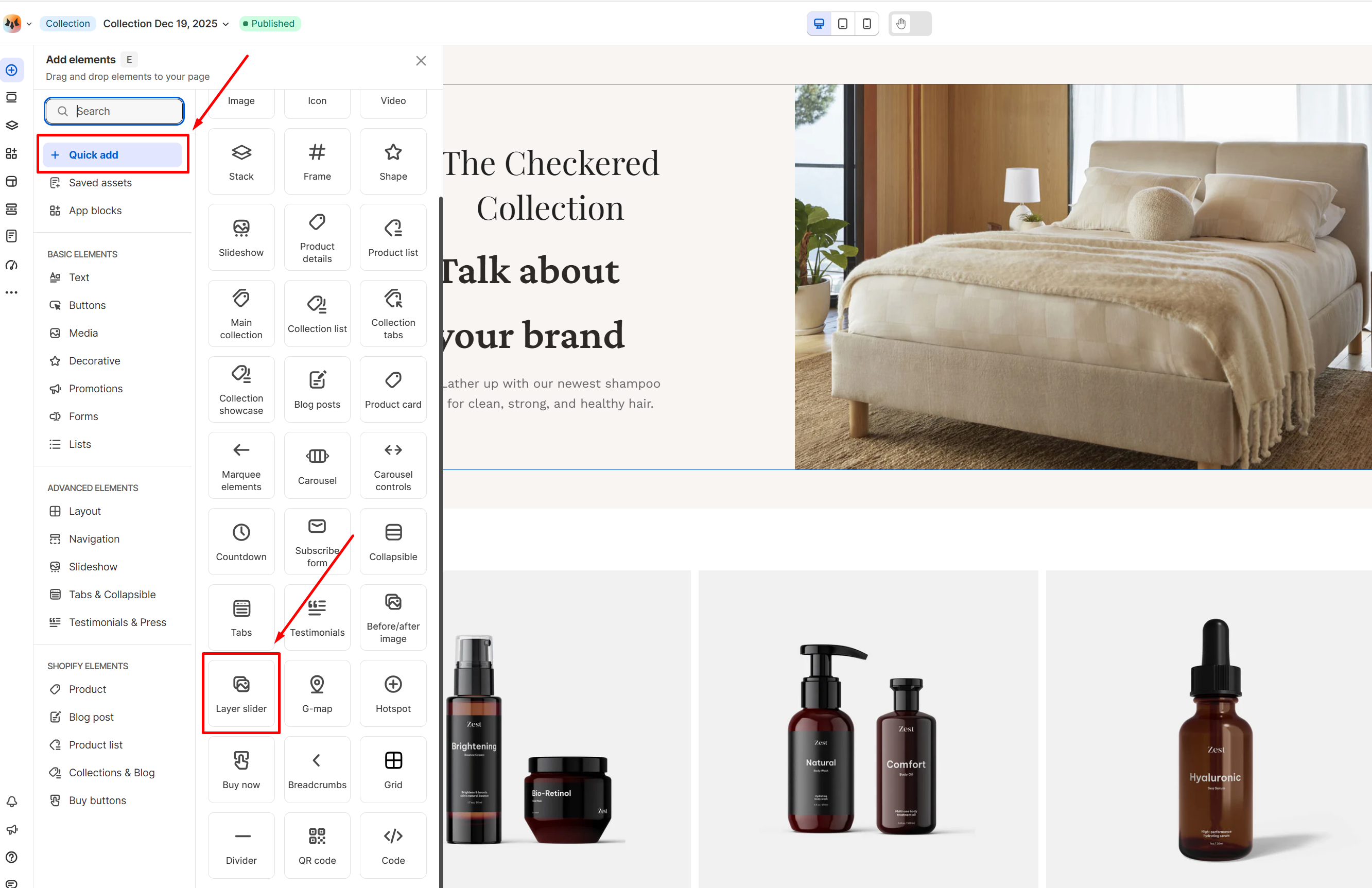
- In the FoxStudio editor, on the left Sidebar > Click Add elements, or press E.
- Select Quick add, select Layer slider element.
- Drag the image slide onto your canvas.
How to edit Layer slide
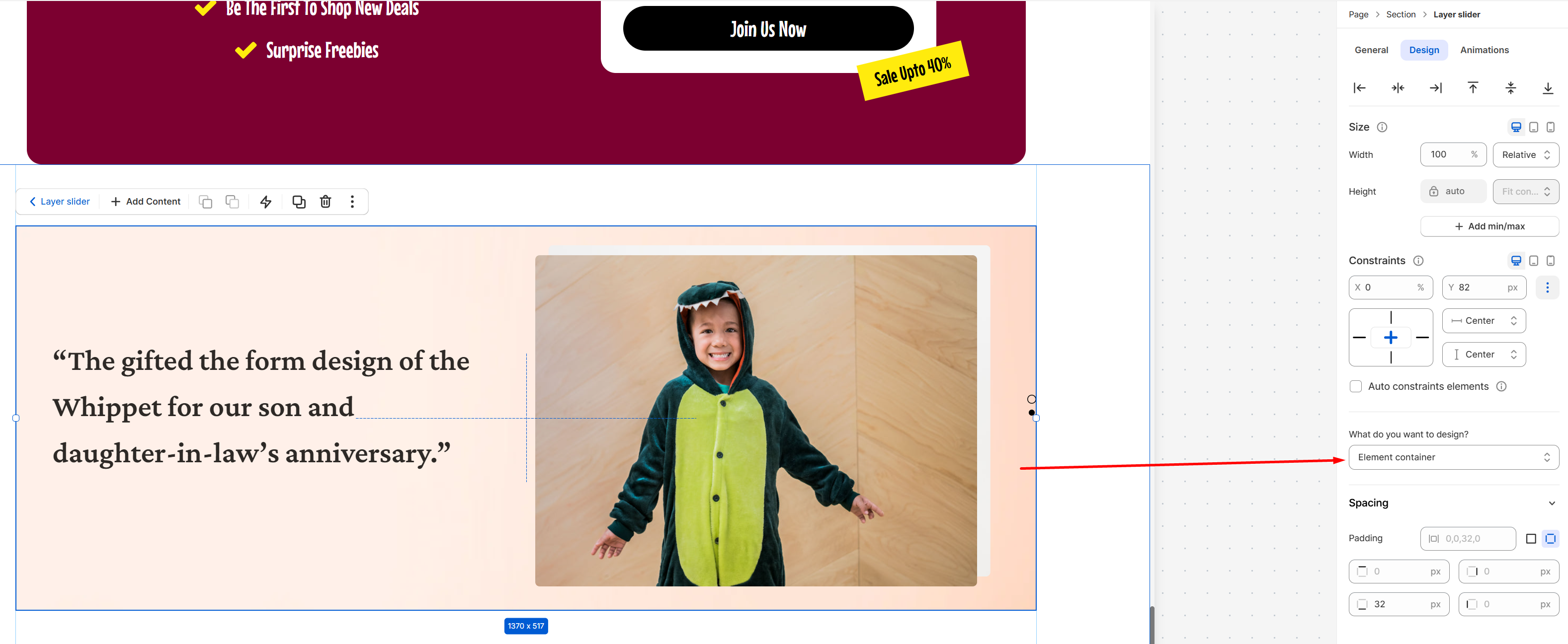
- Select the relevant layer slide element in the editor.
- All the formatting tools for the element can be found in the right-handsided Inspector panel.
General settings
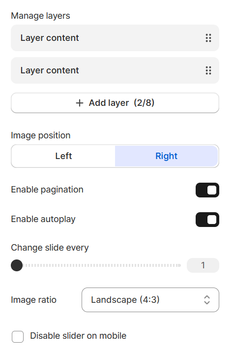
Manage slides
- Add new slides:
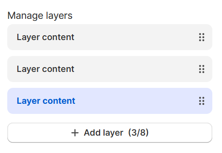
- Reorder slides:
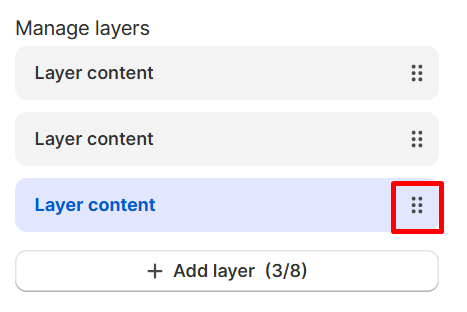
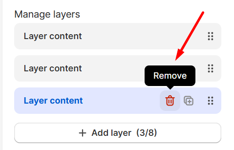
- Remove slides:
Hover over the slide you want to remove, click the Remove icon.
- Image position: Choose the image placement relative to the content area: Left or Right.


- Enable pagination: Toggle the navigation dots at the center of the slider.
- Enable autoplay: Toggle to transition slides automatically and set the duration (in seconds) for each slide to stay on screen.
- Image ratio: Set the aspect ratio for the images


- Disable slider on mobile: Toggle this on to disable the sliding transition and display your slides in a vertical layout on mobile.
Design settings
Constraints
- Spacing: Adjust the spacing (padding and gap) of the element.
- Backgrounds: Set background to the theme either with a color or a media. If a color and a media are set as the background of an element at the same time, it will prioritize the media.
- Borders: Apply a border to the element and define the border radius value.
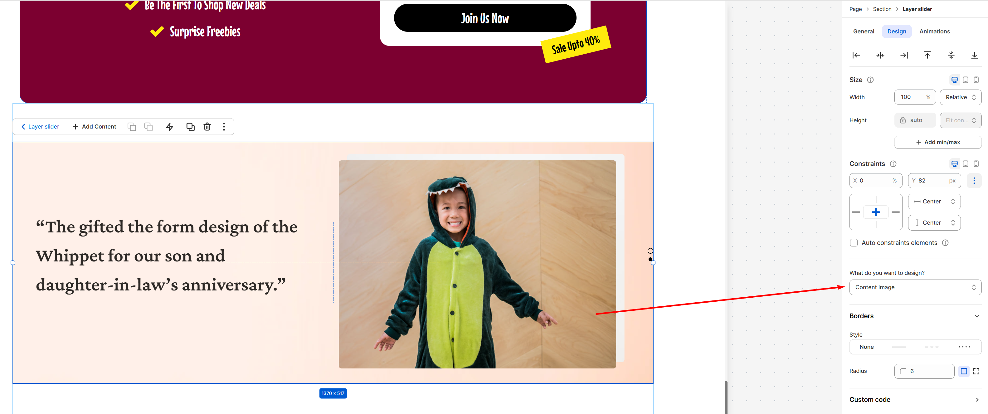
- Borders: Apply a border to the element and define the border radius value.
Animations
Animations
Last updated