# Blog posts
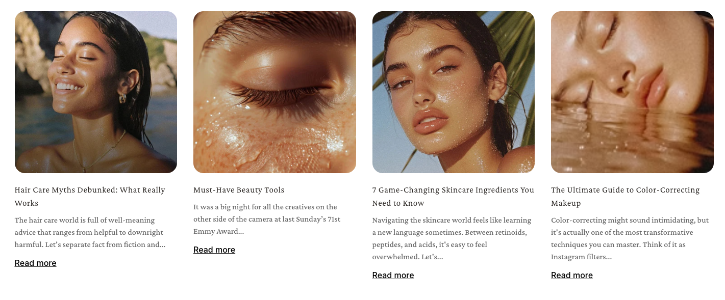
Display a grid or carousel of blog articles on any Foxify page — keeping customers engaged with your content without navigating away.
## When to use this element
Use Blog posts when you want to surface blog content directly on a page — so customers can discover articles without going to a separate blog page.
Best fits for:
* A homepage section showing latest news, tips, or brand stories
* A landing page combining product content with editorial articles
* A "You might also like" section at the bottom of a product or collection page
* Any page where building trust through content supports conversion
### How is this different from Blog post elements
Blog posts element
## Quick setup
**Before you start:** Make sure you have at least one published blog with posts in Shopify Admin → Content → Blog posts.
See [Add and managing blog posts](https://help.shopify.com/manual/online-store/blogs/writing-blogs/working-with-blog-posts)
**Add the element**
Click **Add elements** (or press **E**) → find **Blog posts** in Quick add → drag it onto your canvas.
**Select your blog**
In Inspector → **General** → **Select blog**, choose the blog you want to pull posts from.
**Set posts and columns**
Set how many posts to show (up to 24) and how many columns to display them in.
**Choose a card style**
Select the article card on the canvas. In the Inspector panel, choose a **Card style** preset or use Custom to control each card element individually.
**Preview and publish**
Check mobile preview, then click **Save & Publish**.
**Expected result:** A grid of article cards appears on your page, each showing the post image, title, excerpt, and meta. Clicking a card takes the customer to the full blog post.
### Settings — General
| Setting | What it does | When to use |
| --- | --- | --- |
| Select blog | Chooses which Shopify blog to pull posts from | If you have multiple blogs, pick the one most relevant to this page's context. |
| Number of posts | How many posts are displayed (max 24) | 3–6 for a homepage section. Use more for a dedicated blog listing page. |
| Columns | How many columns the post grid uses | 3-4 for a compact grid. Avoid more than 4 on pages with a narrow content area. |
| Gap | Spacing between cards horizontally and vertically | Increase for an editorial, airy feel. Decrease for a dense content grid. |
| Enable carousel on desktop | Turns the grid into a scrollable carousel on desktop | Use when you have many posts but limited vertical space — lets customers browse without the section growing too tall. |
| Enable swipe on mobile | Allows swipe navigation on mobile | Recommended on — makes the element much easier to browse on small screens. |
## Article card settings
Click any individual post card on the canvas to edit its settings. Changes apply to all cards in the element.
#### Card style
| Option | When to use |
| --- | --- |
| Use global | Inherits card style from Theme settings → Product cards. Best for consistency — change once, update everywhere. |
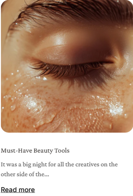
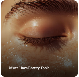
| Style 1 / Style 2 | Quick presets if you want this section to look different from the rest of the store without custom styling.
• Style 1:
• Style 2: |
| Custom | Full control — add, remove, and reorder card elements (image, title, meta, excerpt, read more). Use when presets don't fit your layout needs. |
#### Image ratio
| Option | When to use |
| --- | --- |
| Use global | Matches image ratio from Theme settings. Recommended for consistency. |
| Adapt to image | Each card takes the natural dimensions of its image. Use when blog images have varied sizes and you don't want cropping. |
| Square (1:1) | Consistent, modern look. Works well on any grid width. |
| Portrait (3:4) | Good for editorial or fashion blogs where tall imagery is common. |
| Landscape (4:3) | Good for lifestyle, food, or travel content with wide hero images. |
#### Text align
| Option | When to use |
| --- | --- |
| Left | Default — works well for most layouts, especially multi-column grids. |
| Center | Good for editorial or minimal designs where centered text feels intentional. |
| Right | Rarely used — only when the overall page layout calls for right-aligned text. |
#### Custom card elements
When using Custom card style, you can manage what appears on each article card. By default, cards include blog-specific elements — but you can also add any standard Foxify element (text, buttons, images, icons, etc.) directly onto the card.
Drag elements up or down within the card to change the order they appear.
*Learn more:*
* Blog post elements: [Blog post's elements](https://docs.foxecom.com/foxify-app/foxstudio/add-and-edit-elements/blog-posts-elements)
* Other elements: [Add and edit elements](https://docs.foxecom.com/foxify-app/foxstudio/add-and-edit-elements)
## FAQs
#### My posts aren't showing up. What should I check?
Make sure the blog you selected has published posts in Shopify Admin → Content → Blog posts. Draft or hidden posts won't appear.
#### Can I show posts from multiple blogs in one element?
No — each Blog posts element pulls from one blog at a time. To show posts from different blogs, add multiple Blog posts elements and select a different blog for each.
#### How do I control which posts appear first?
Posts appear in the order they were published — most recent first. To change the order, adjust publish dates in Shopify Admin → Content → Blog posts.
## Related articles
Blog post's elementsCreate a Blog postTheme settings
 |
| Custom | Full control — add, remove, and reorder card elements (image, title, meta, excerpt, read more). Use when presets don't fit your layout needs. |
|
| Custom | Full control — add, remove, and reorder card elements (image, title, meta, excerpt, read more). Use when presets don't fit your layout needs. |