
FoxstudioAdd and edit elements
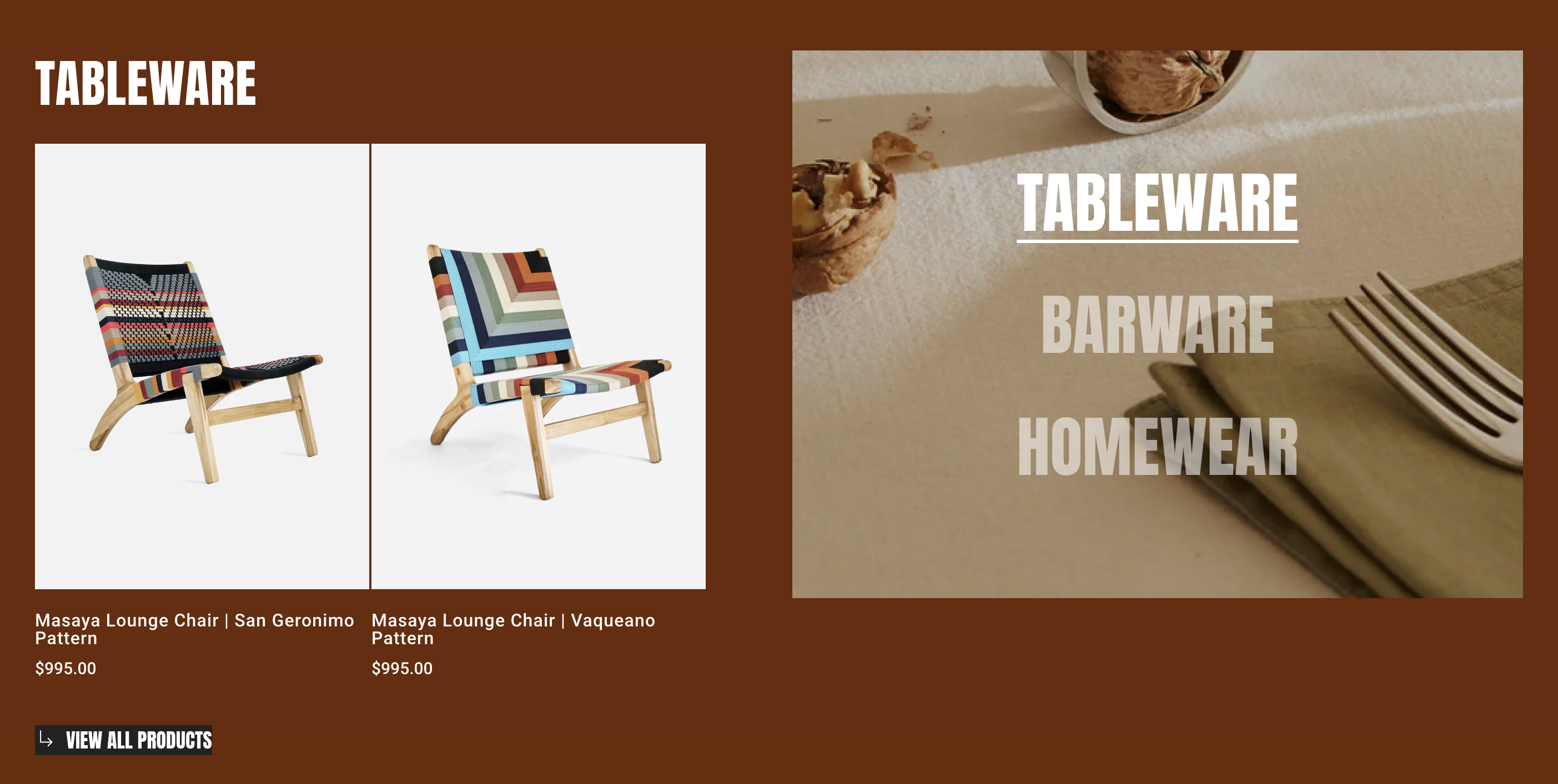
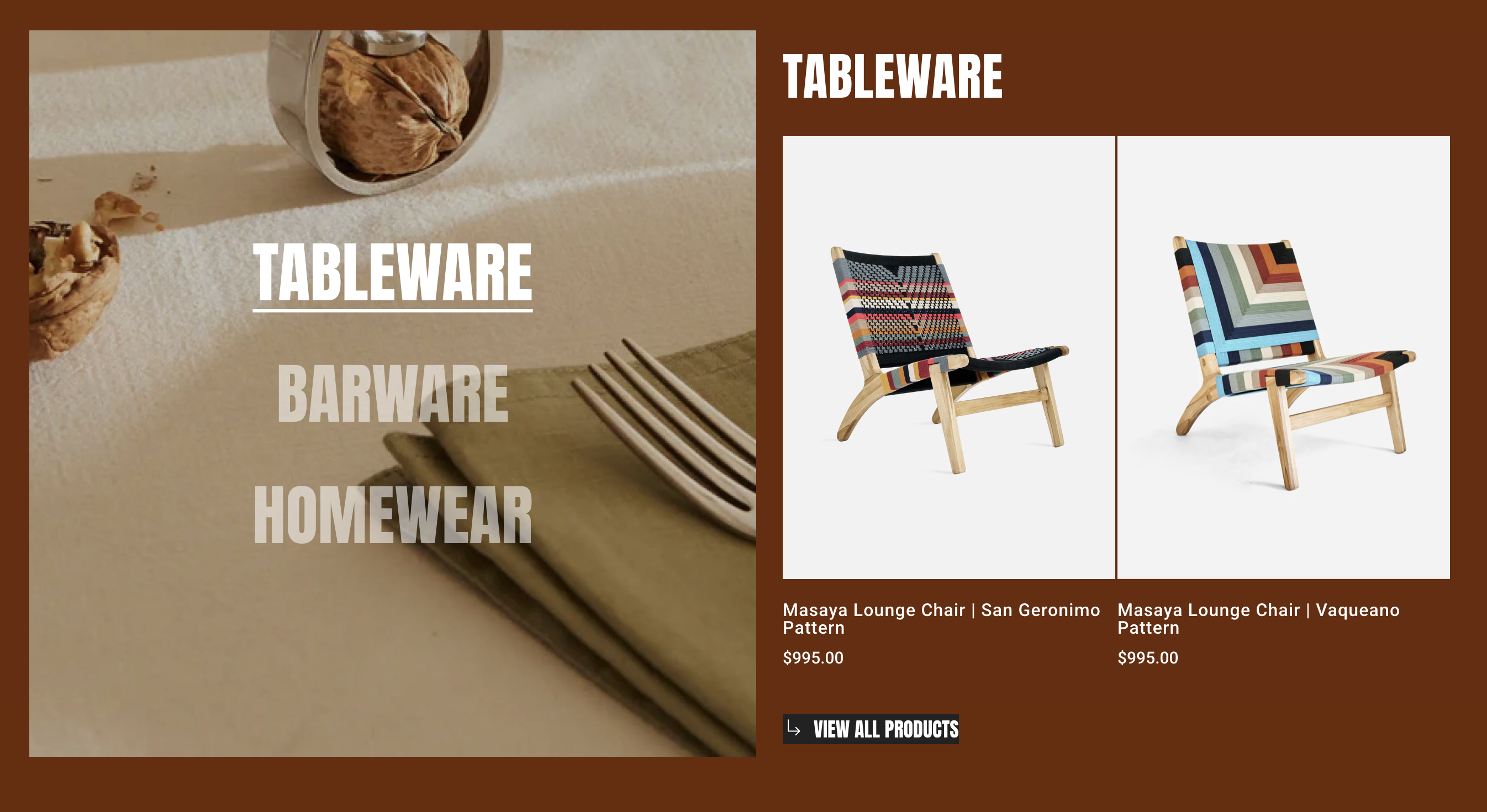
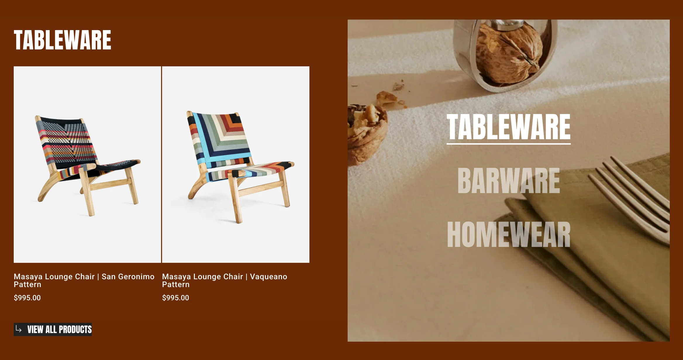
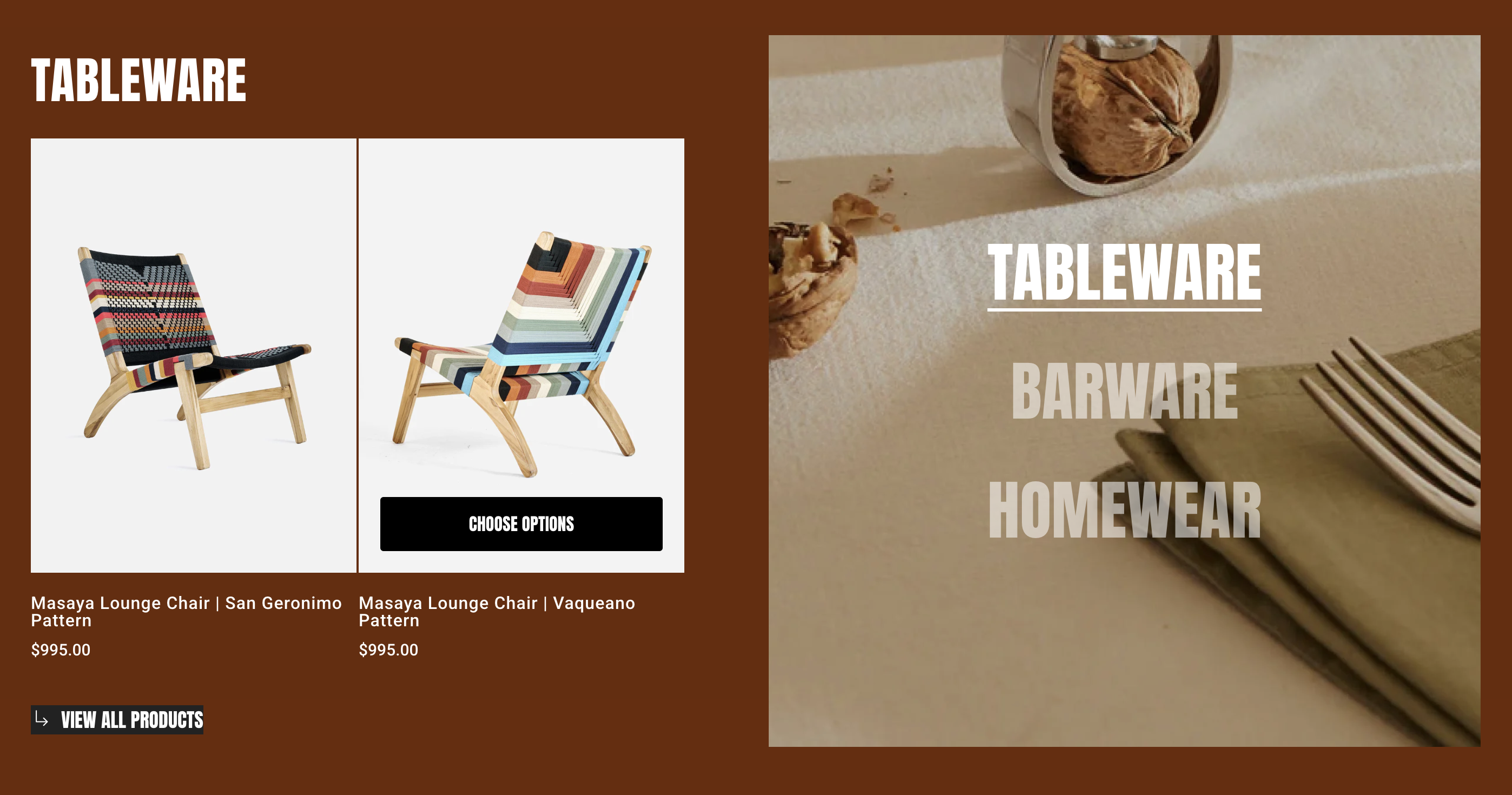
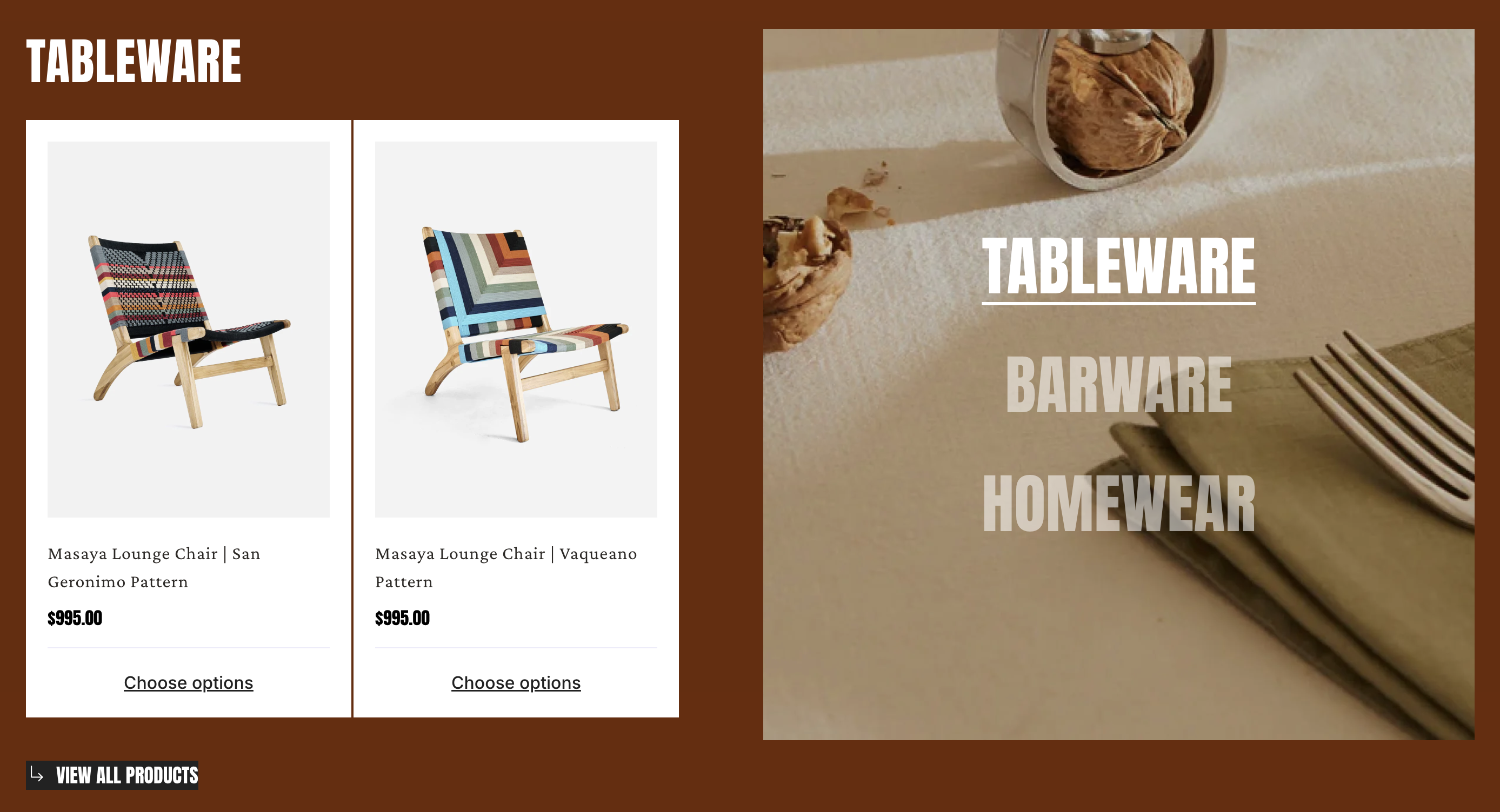
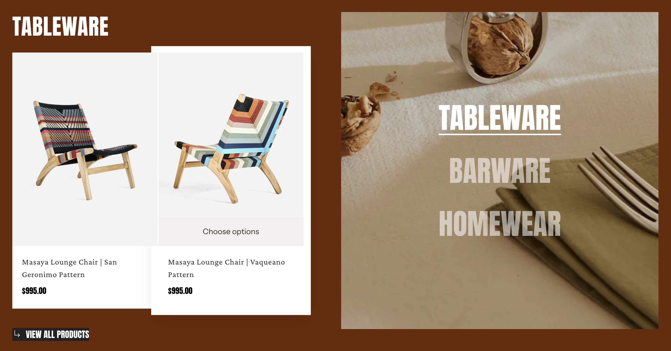
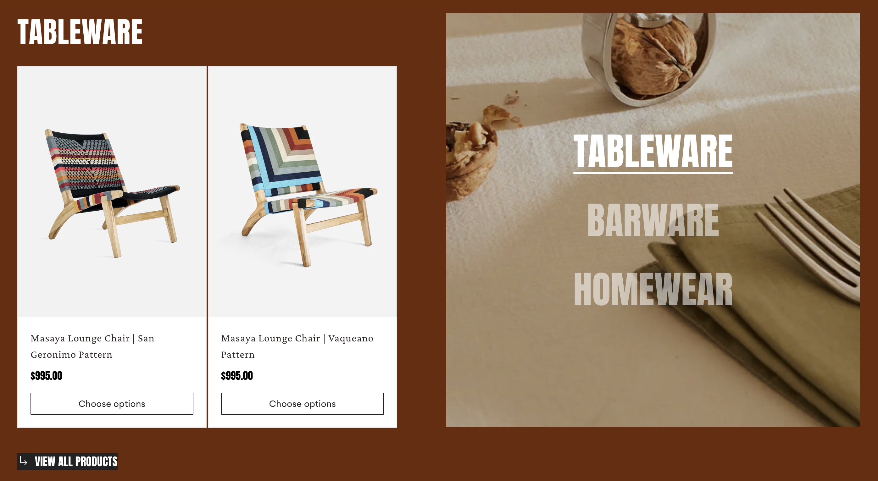
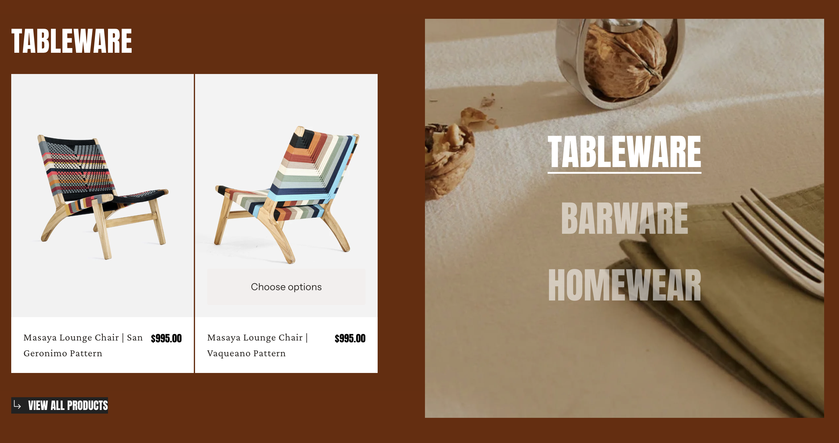
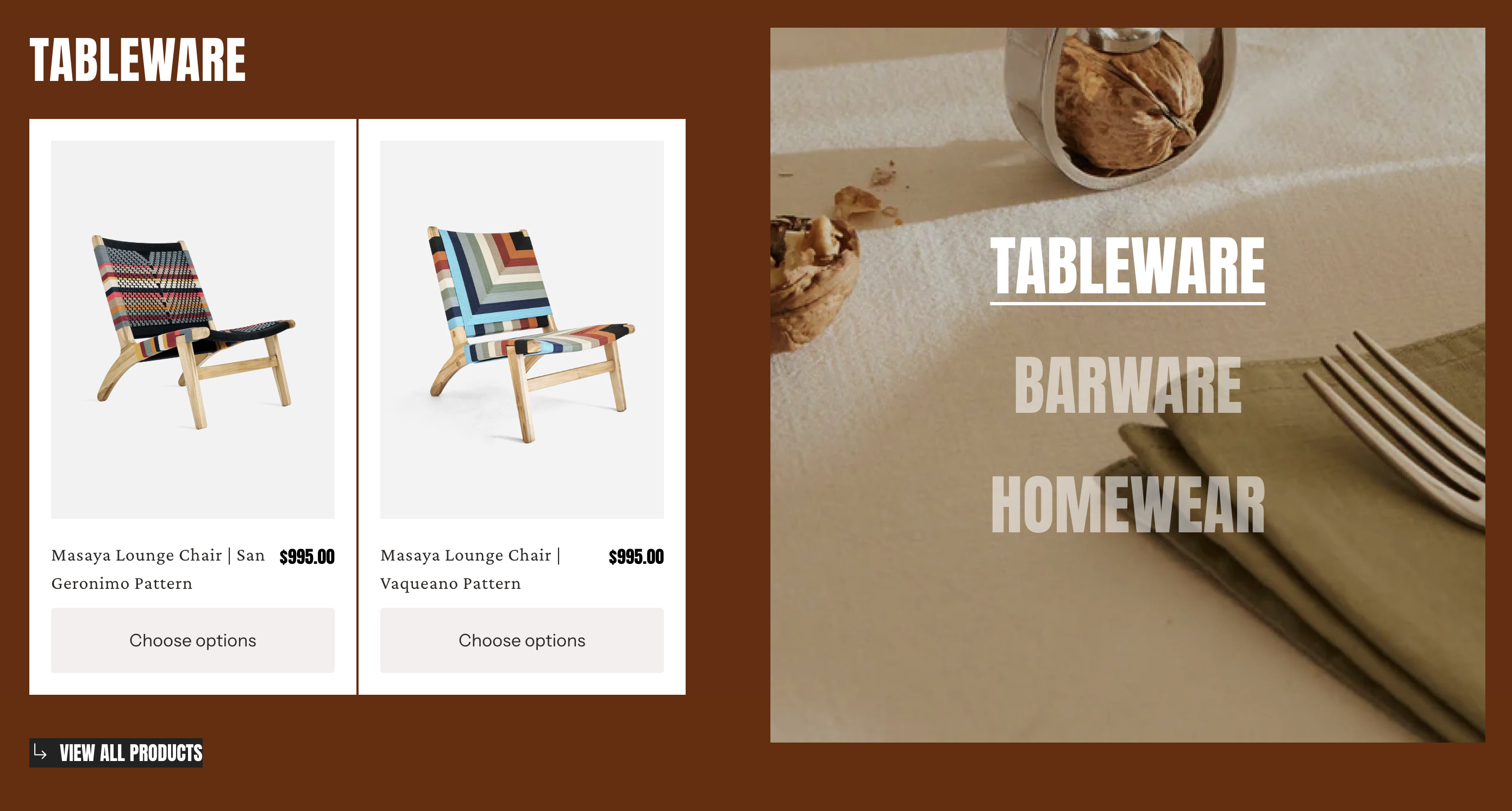
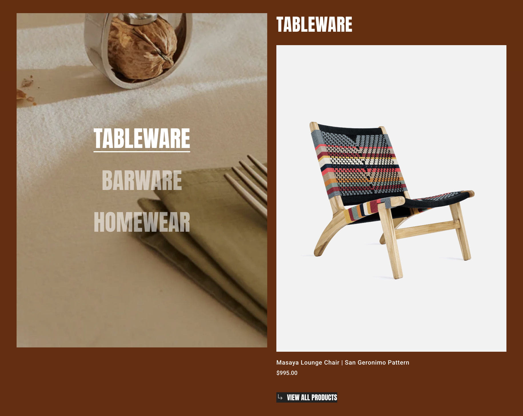
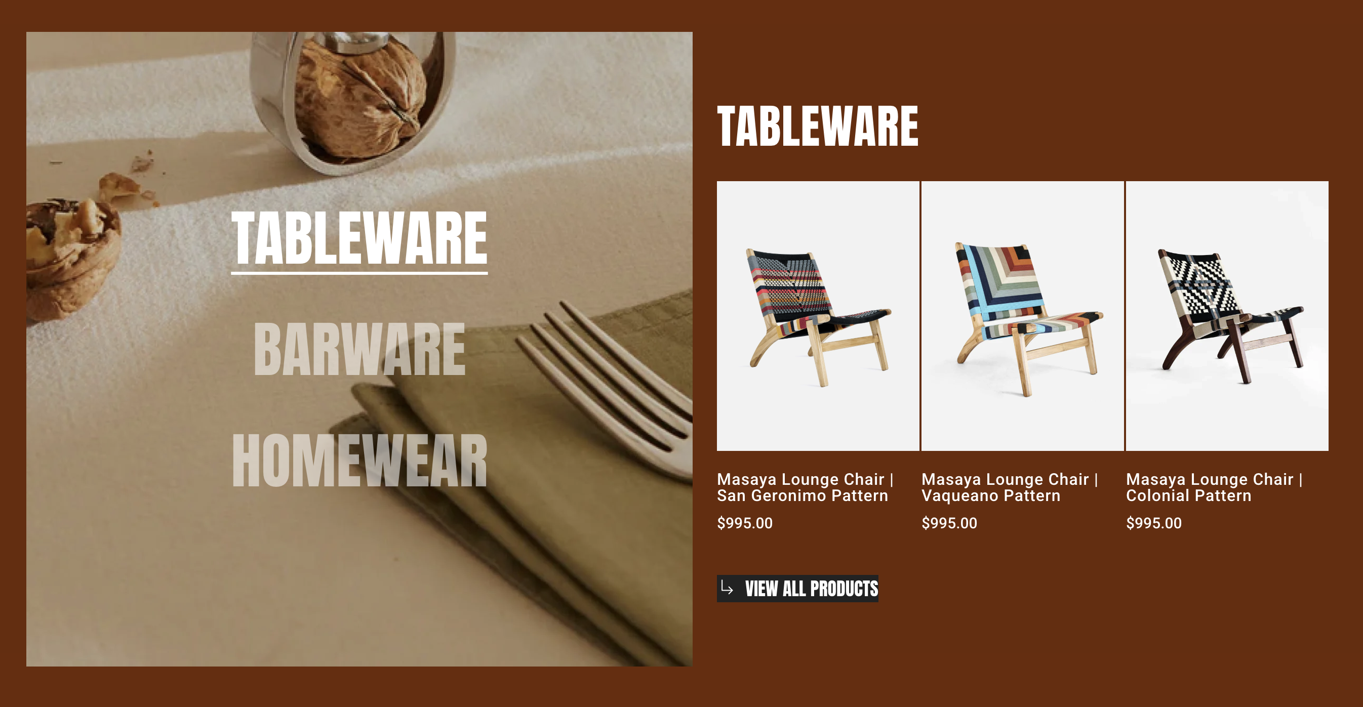
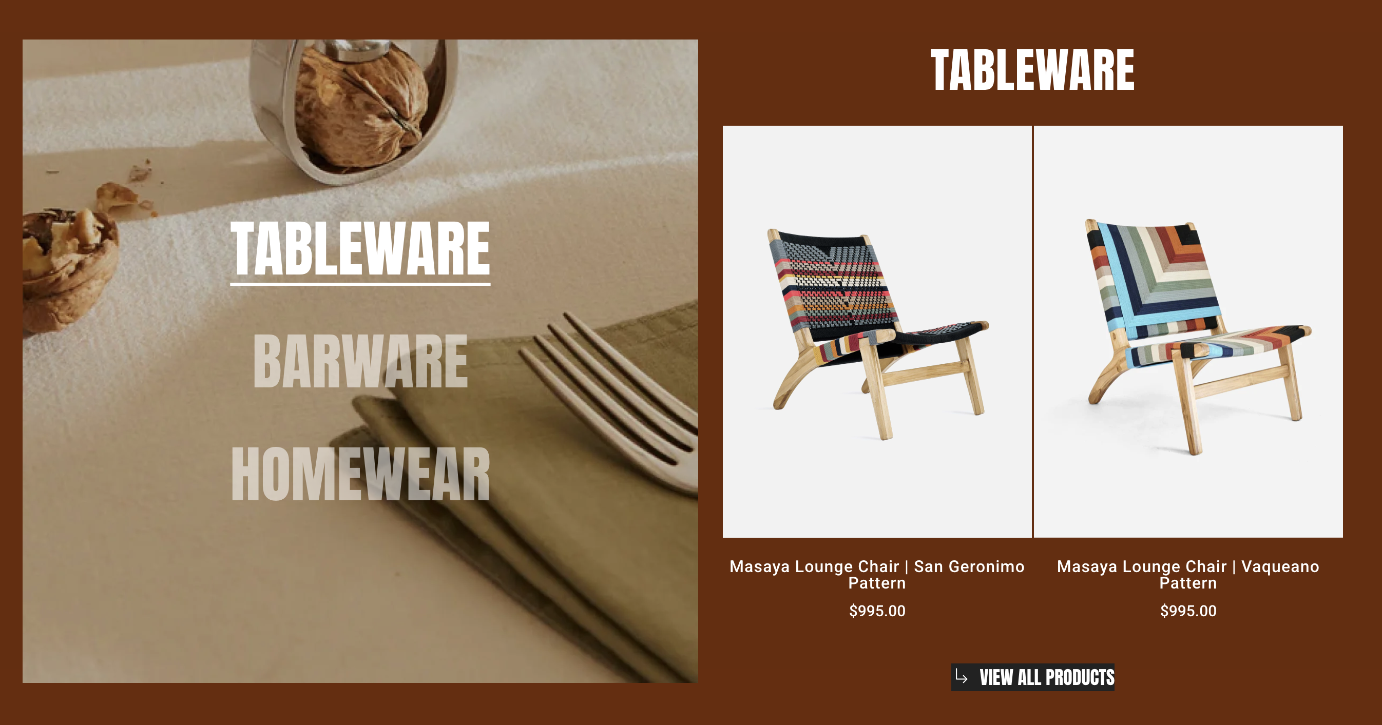
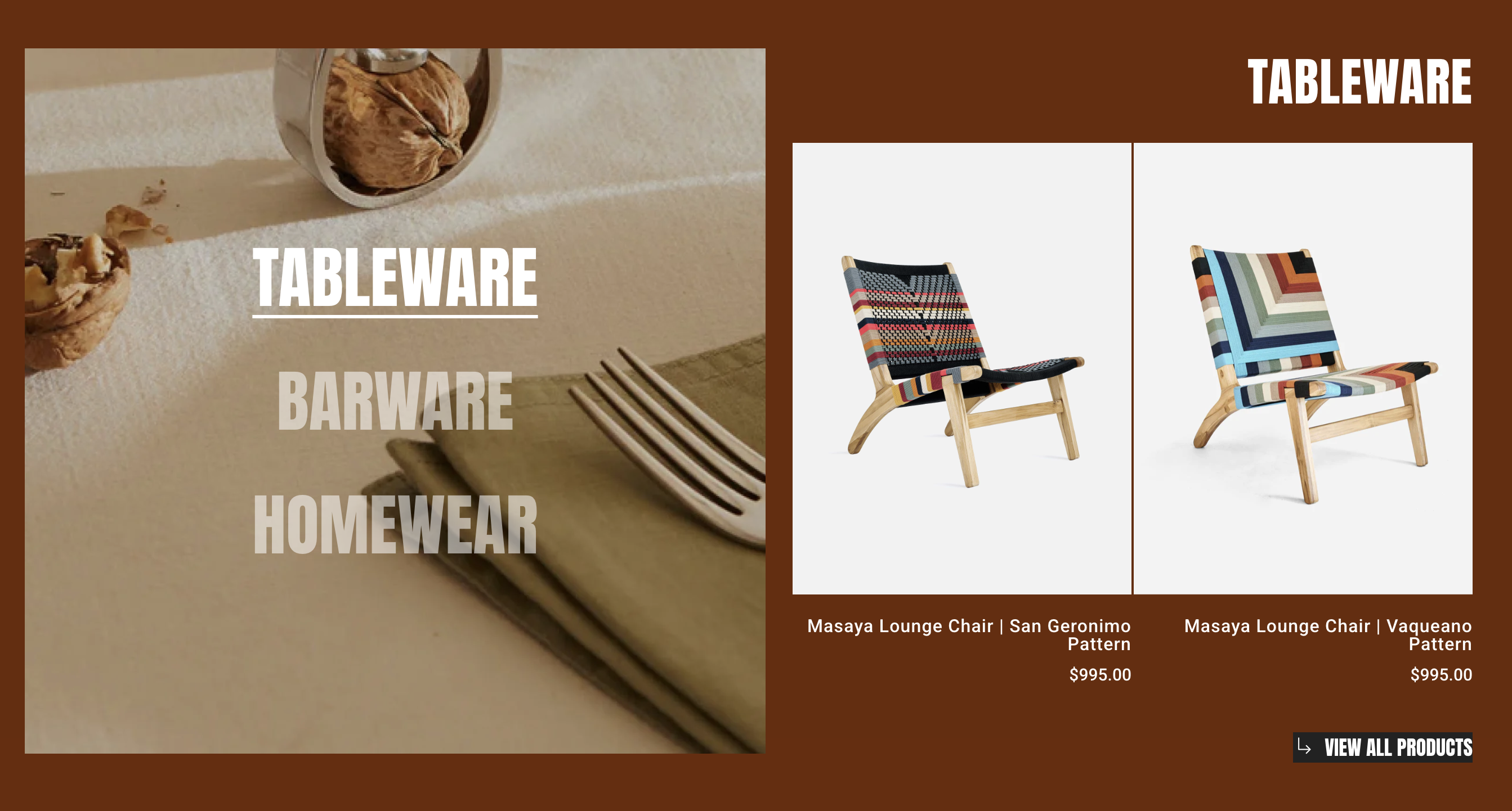
Collection showcase
4 min read
How to add a Collection showcase element
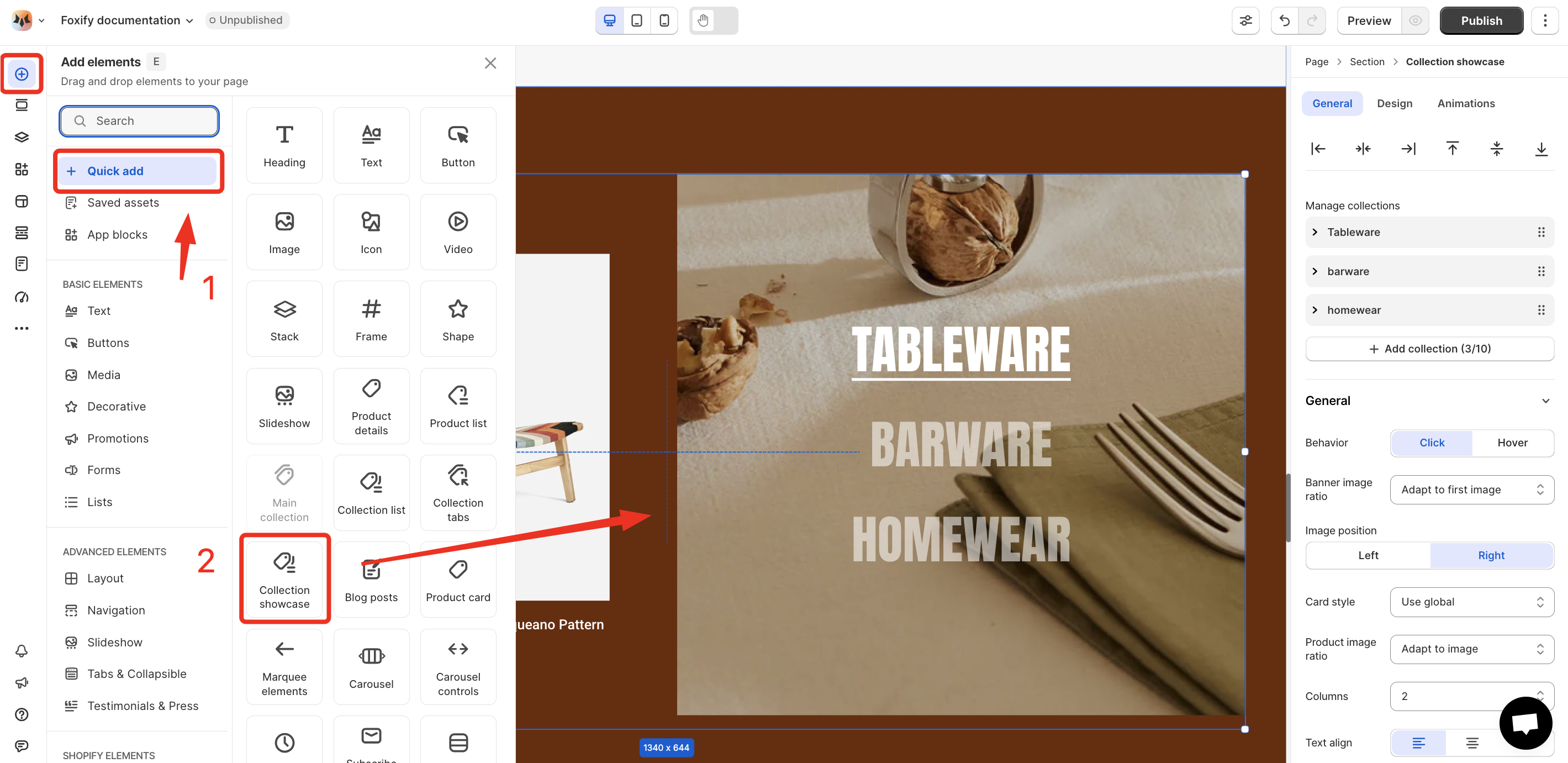
- In the FoxStudio editor, on the left Sidebar > Click Add elements, or press E.
- In Quick add, select Collection showcase.
- Drag the Collection showcase onto your canvas.
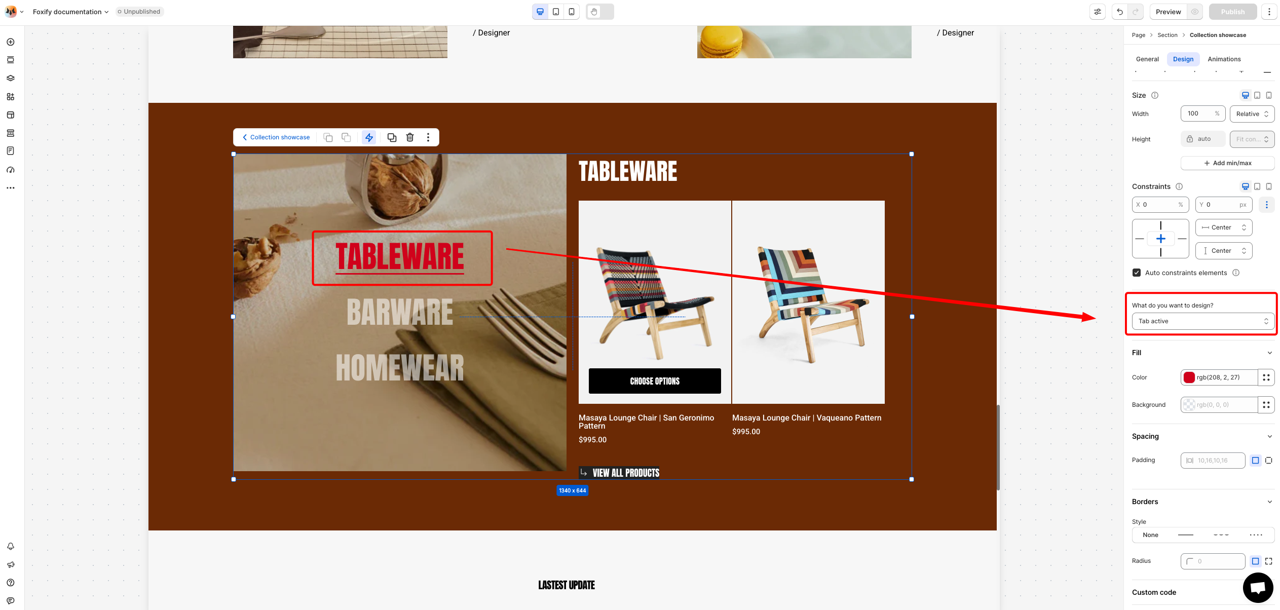
How to edit Collection showcase
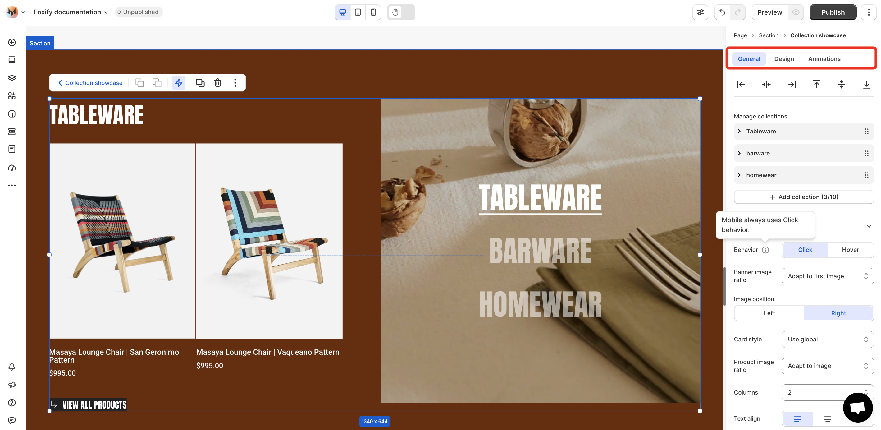
- Select the relevant Collection showcase element in the editor.
- Use the tools bar above the selected Collection showcase element to quickly edit it.
General settings
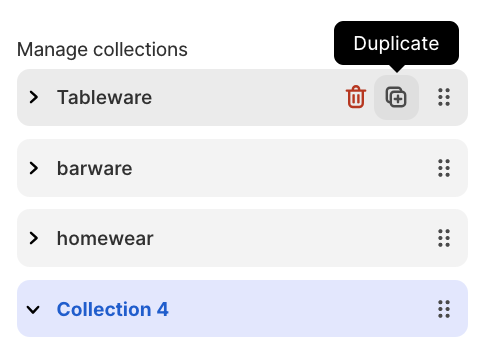
- Add collections to add a new collection. You can add up to 10 collections within the Collection tabs element.
- You can also remove/duplicate/reorder a collection within the collection tabs.
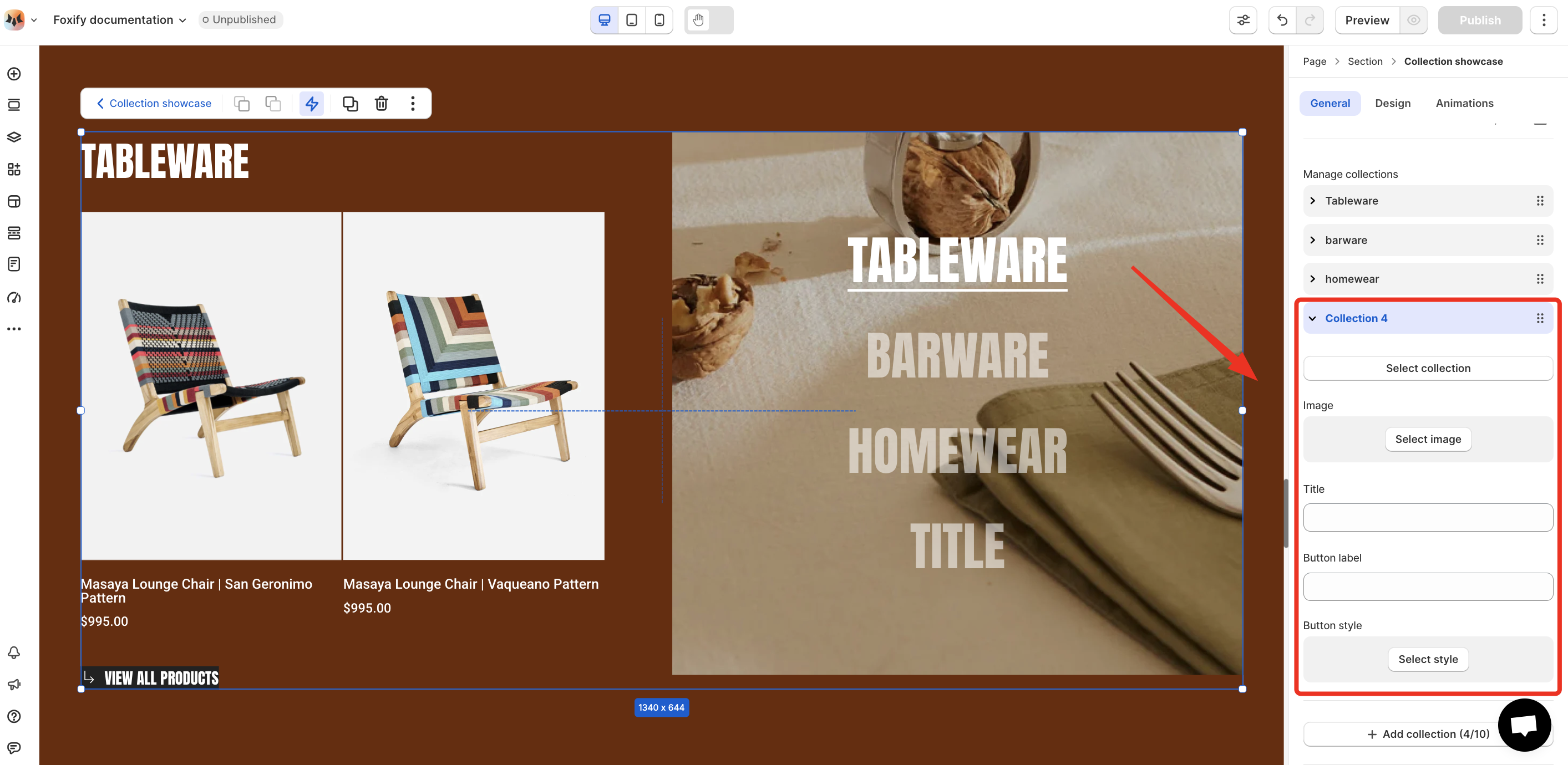
- Select collection: Choose a collection that you want to display.
- Image: Upload or select an image to visually represent the collection.
- Title: Set a custom name for the tab.
- Button label: Define the call-to-action text for the button
- Button style: Apply a style to the button for visual consistency with your page design.
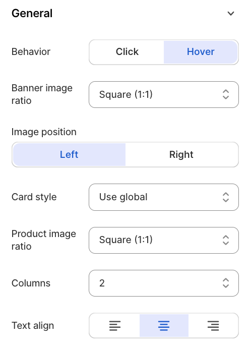
- Behavior: Choose how users switch between tabs (Click/Hover)
- Banner image ratio: Control how banner images are displayed.
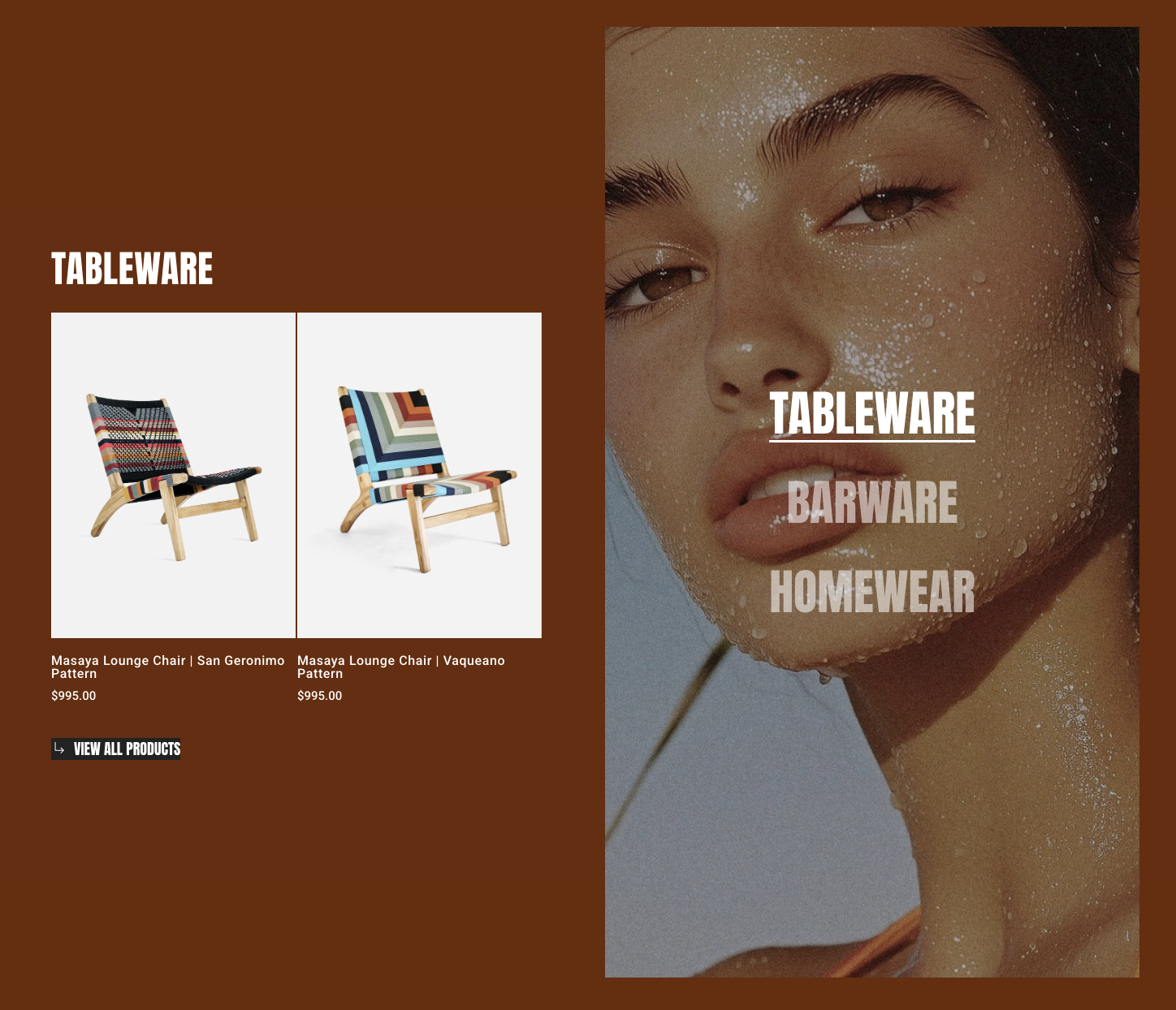
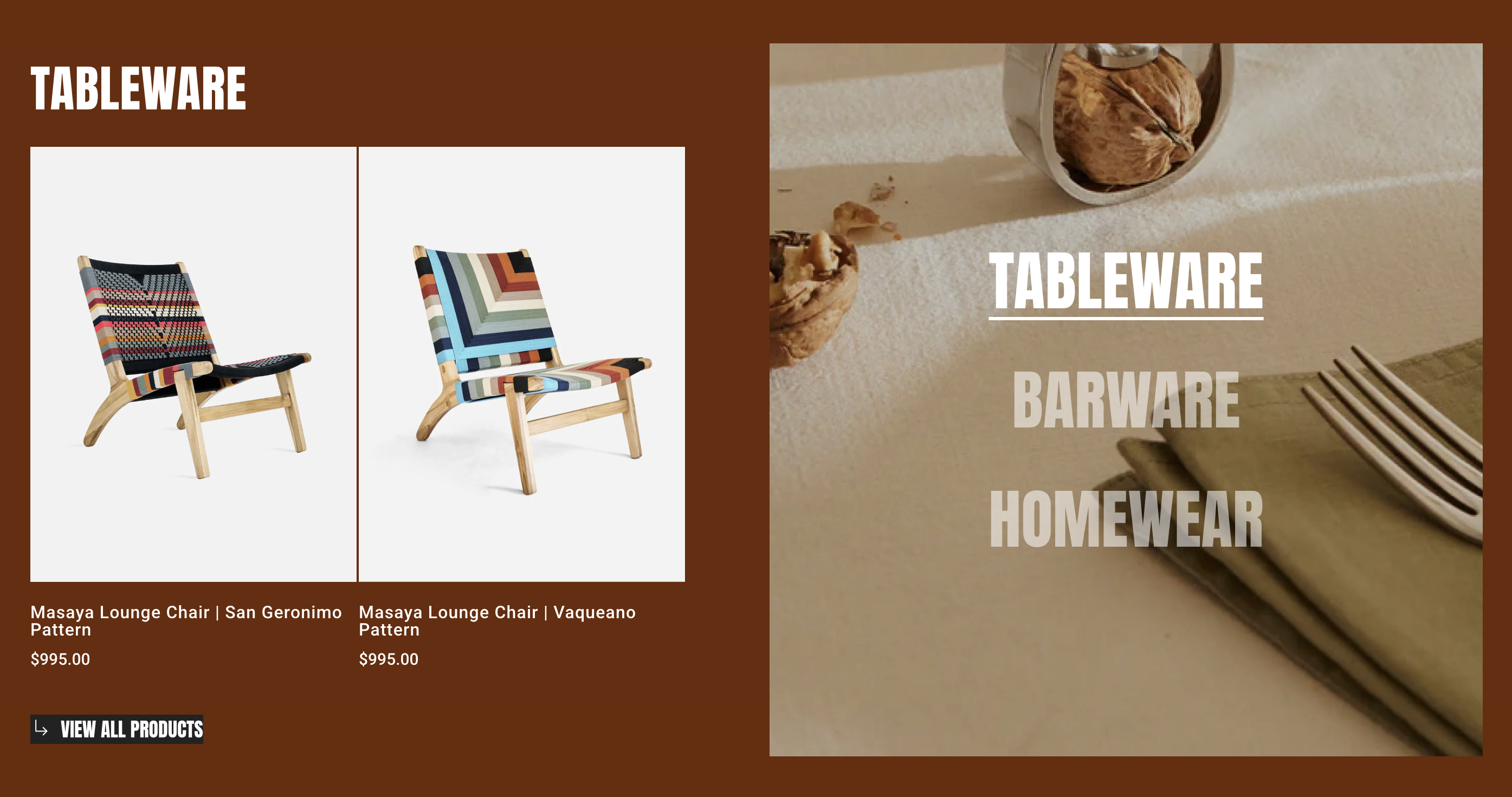
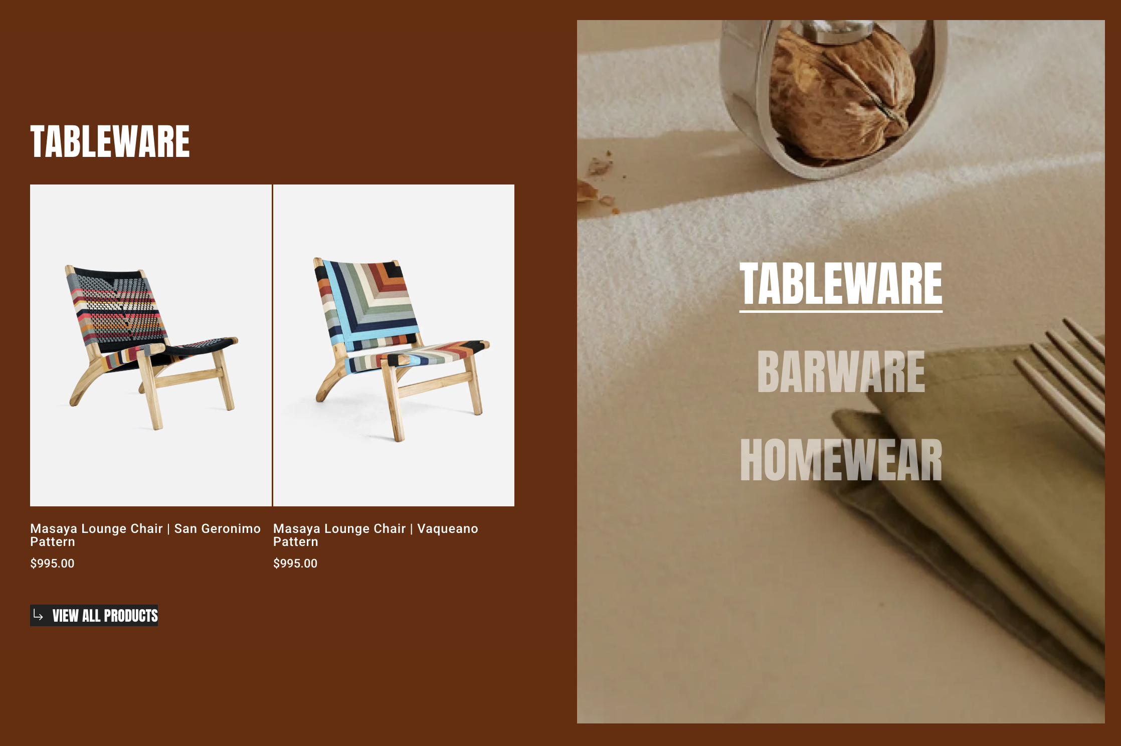
- Image position: Choose Left/Right.
- Card style: Choose styling for your product cards.
- Apply the product card styles defined in Theme settings > Product cards, ensuring consistent design across your store.
Learn more: Product Cards in Theme settings

- Product image ratio: Defines the ratio of product images.

- Apply the Image ratio defined in Theme settings > Product cards, ensuring consistent design across your store.
Learn more: Product Cards in Theme settings

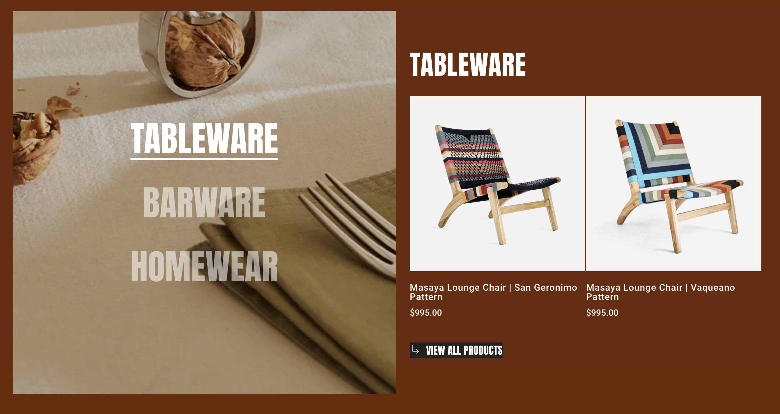
- Columns: Sets the number of product columns displayed.

- Text align: Controls the alignment of text within the Collection showcase element.

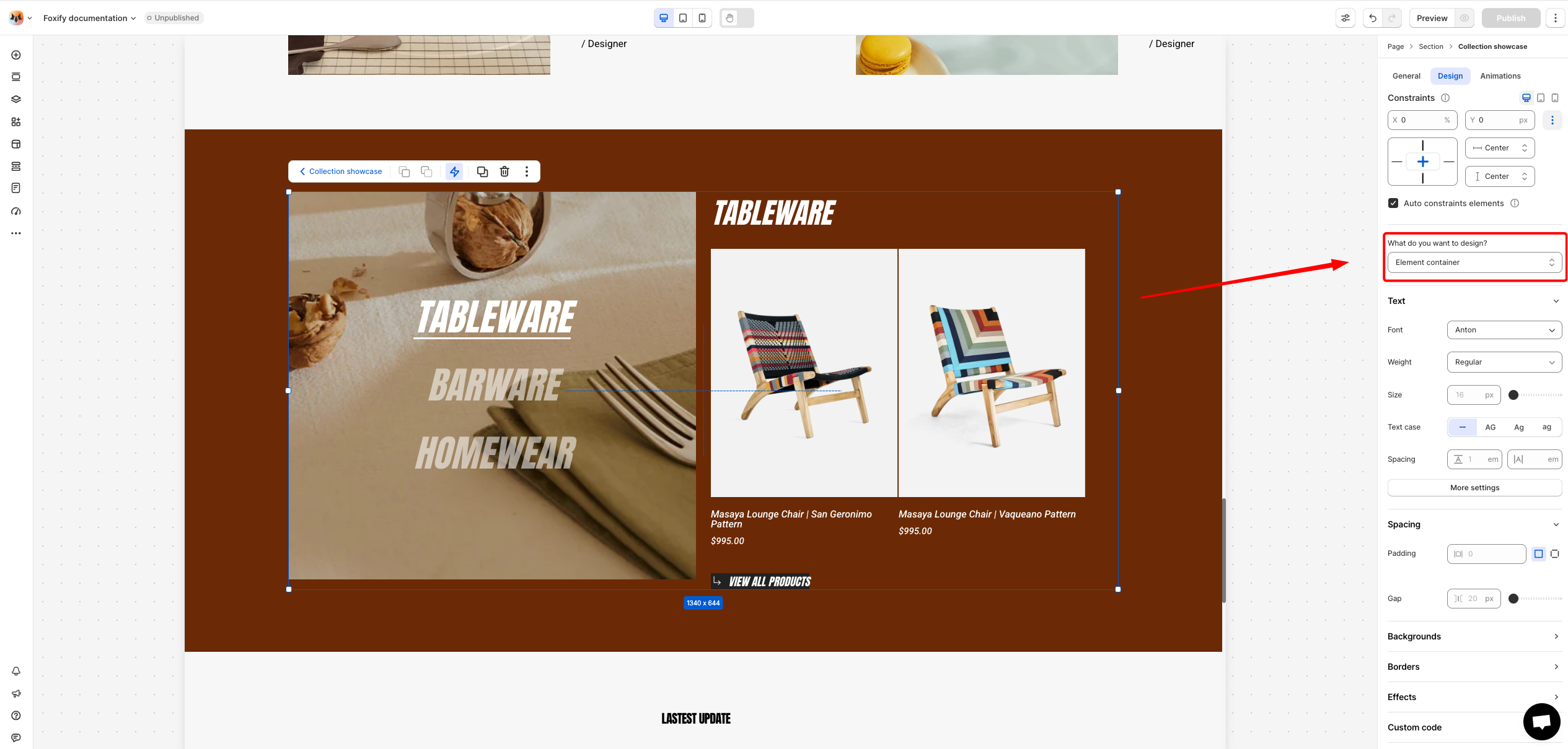
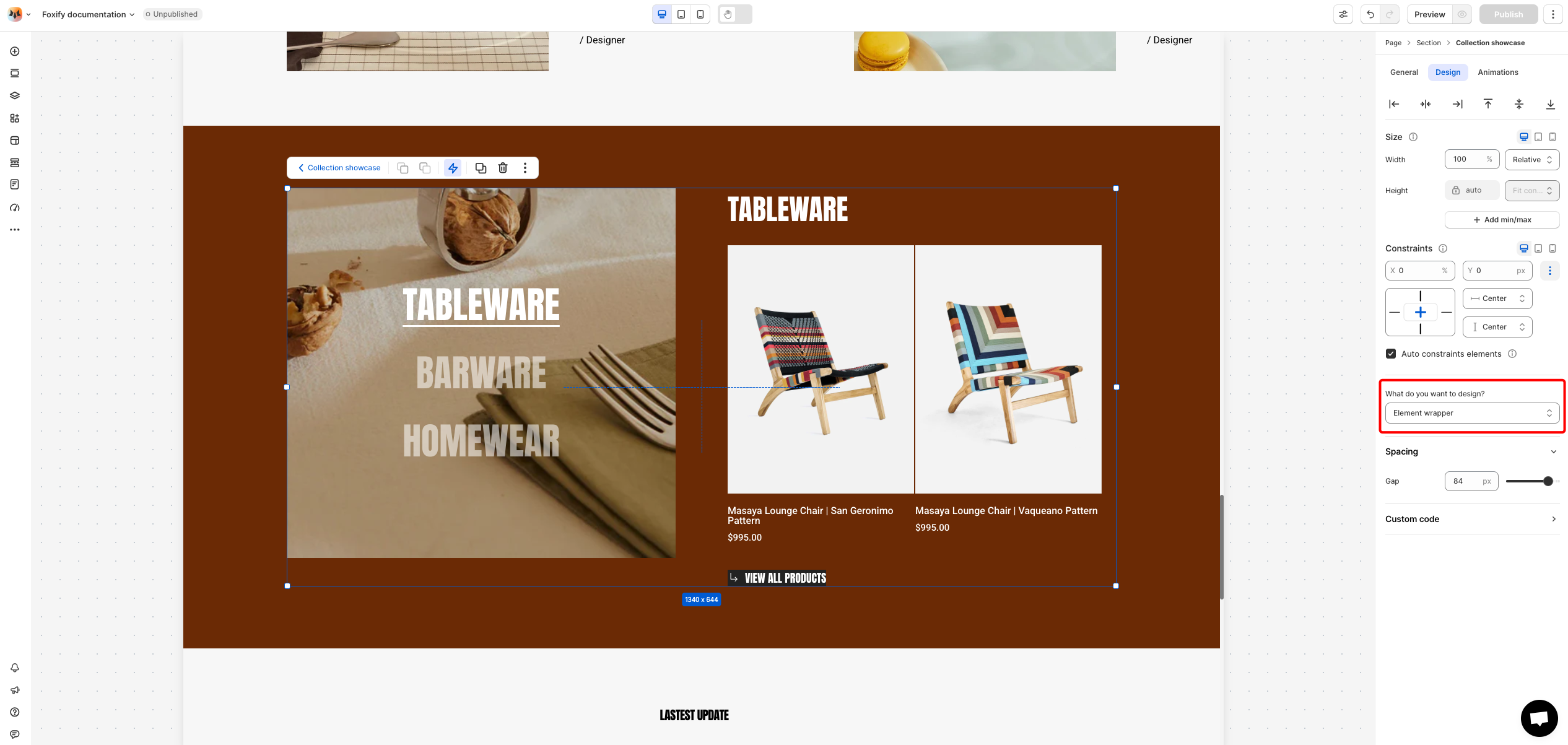
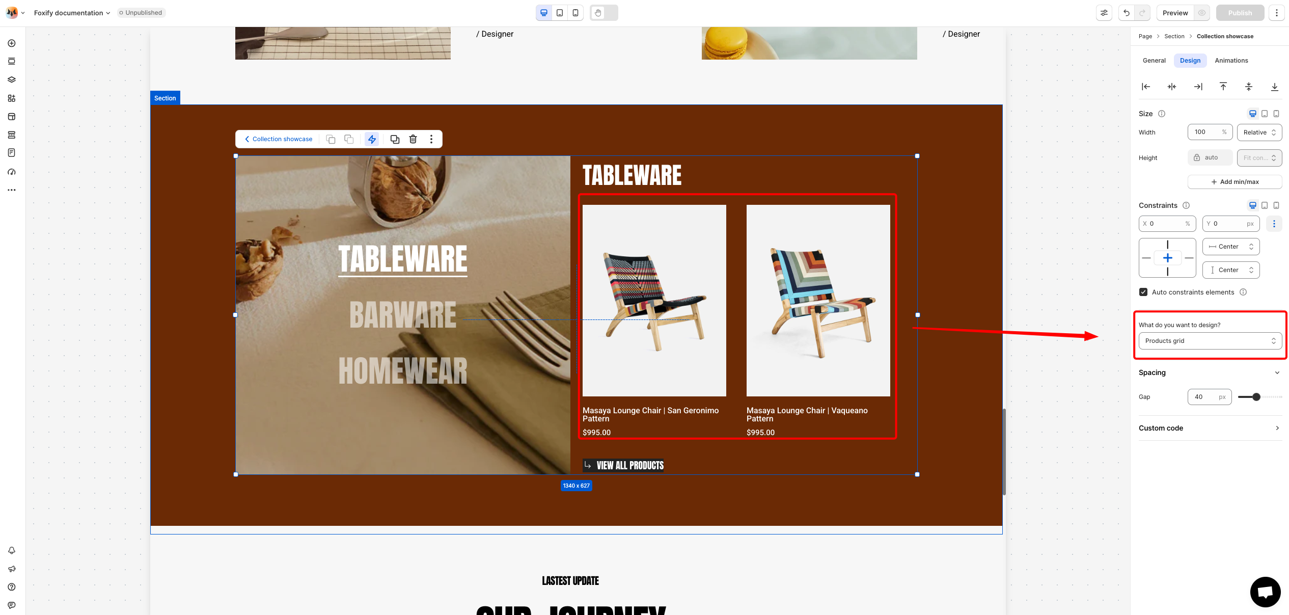
Design settings
Constraints
- Text Font, Spacing, and Styles
- Font: Choose from hundreds of fonts. You can also upload your own fonts to Foxify.
- Size: Define the font size of the text.
- Text case: Click the icons to set the text's capitalization: As typed — , Upper case AG, Title case Ag, or Lower case ag.
- Spacing: Change the spacing between the lines and characters in the text box.
- Text style: Normal/Italic.
- Spacing: Adjust the spacing (padding and gap) of the element.
- Backgrounds: Set background to the theme either with a color or a media. If a color and a media are set as the background of an element at the same time, it will prioritize the media.
- Borders: Apply a border to the element and define the border radius value.
- Effects: Enable/ disable the box shadow to make the element stand out
- Spacing: Adjust the gap of the element.
- Spacing: Adjust the gap of the product card.
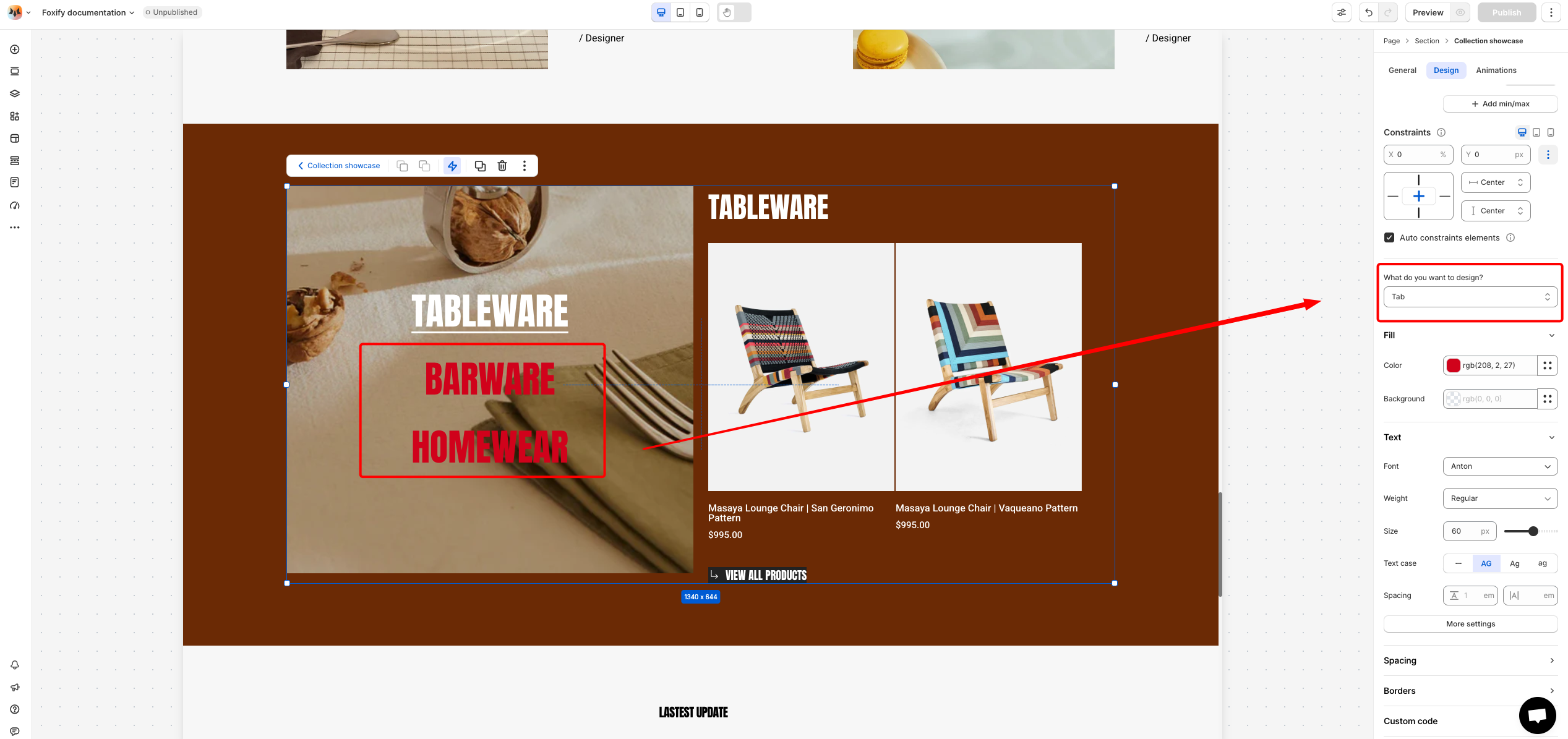
- Color Fill: Set the color and background color of the tabs.
- Text Font, Spacing, and Styles
- Font: Choose from hundreds of fonts. You can also upload your own fonts to Foxify.
- Size: Define the font size of the text.
- Text case: Click the icons to set the text's capitalization: As typed — , Upper case AG, Title case Ag, or Lower case ag.
- Spacing: Change the spacing between the lines and characters in the text box.
- Text style: Normal/Italic.
- Spacing: Adjust the padding of the element.
- Borders: Apply a border to the element and define the border radius value.
- Color Fill: Set the color and background color of the tab.
- Spacing: Adjust the padding of the element.
- Borders: Apply a border to the element and define the border radius value.
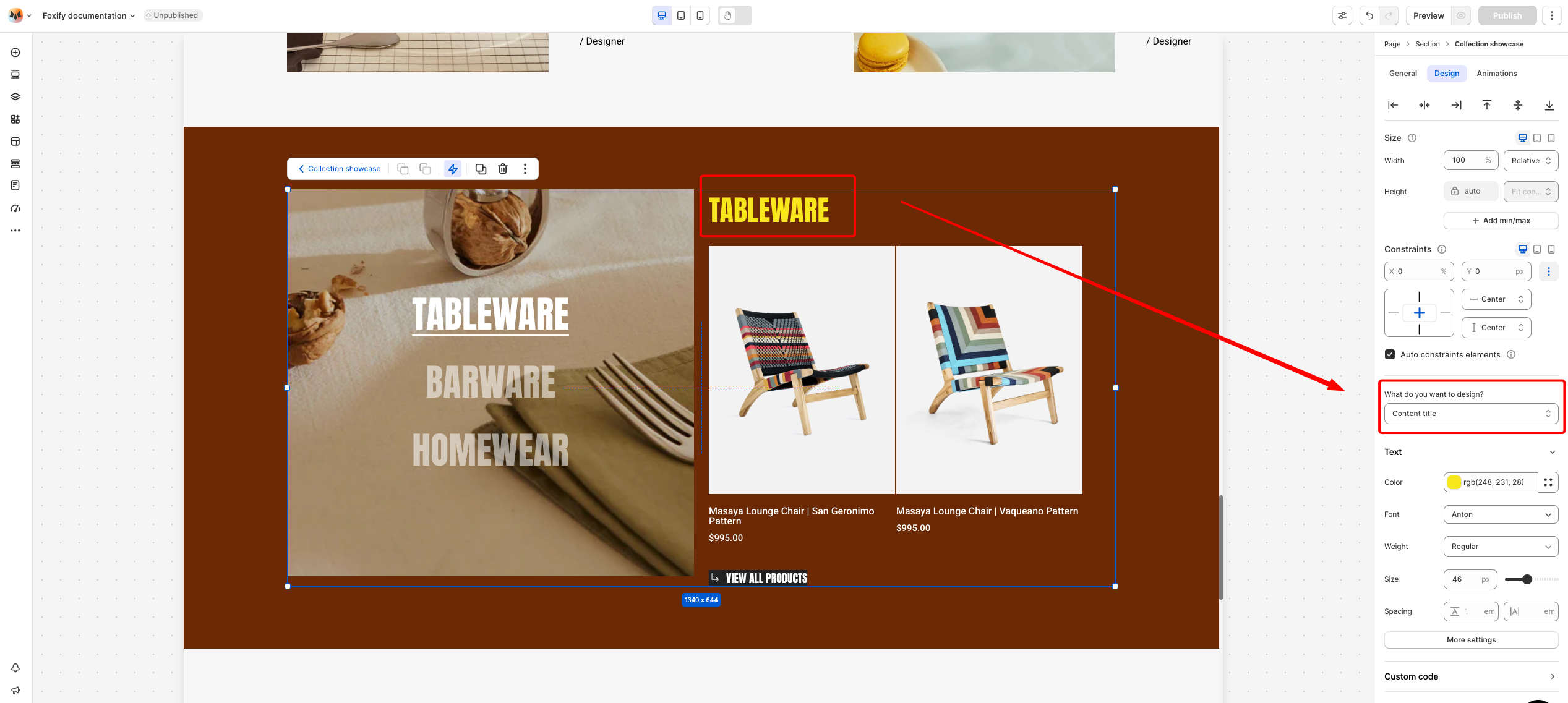
- Text Font, Spacing, and Styles
- Color: Choose the color of the title.
- Font: Choose from hundreds of fonts. You can also upload your own fonts to Foxify.
- Size: Define the font size of the text.
- Spacing: Change the spacing between the lines and characters in the text box.
- Text style: Normal/Italic.
Animations
Animations
Last updated