# Configure your theme settings
Theme settings control the overall look and feel across every Foxify page — card styles, currency formatting, variant pickers, and more — so you set it once and it stays consistent everywhere it's used.
## When to use this
Best fits for:
* You want product, collection, and article cards to look consistent across every Foxify page
* You need to change something globally — like currency format or variant picker style — instead of page by page
* You're doing advanced customization with custom CSS or JavaScript across your whole site
## How to access Theme settings
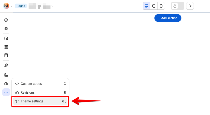
1. In the page editor, click the **•••** icon in the left sidebar.
2. Select **Theme settings**, or press **⌘,** (macOS) / **Ctrl+,** (Windows).
## Layout
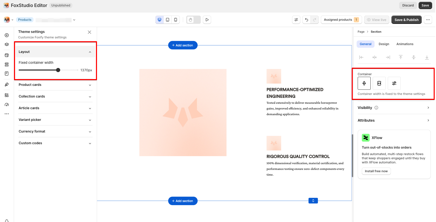
**Fixed container width** — adjusts your page content's width across all pages. Drag the slider to set it.
This applies to a section's **Fixed width** option. Learn: [Change the section container width](https://docs.foxecom.com/foxify-app/foxstudio/page-customization/edit-a-section#change-the-section-container-width)
## Product cards
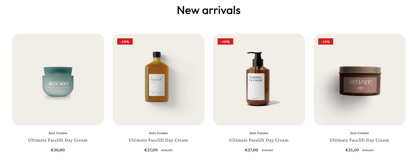
* **Card style**: Choose the display style for product cards. For custom card style, check out: [Product card](https://docs.foxecom.com/foxify-app/foxstudio/add-and-edit-elements/product-card)
* **Display price:** Show the default price (min price) or max price for variant-based products
* **Text align:** Align product info (title, price, description) left, center, or right
* **Image ratio**: Control how product images display inside the card
* **Show second image on hover**: Show a second product image on hover — useful for a different angle or feature
* **Placeholder image:** Image shown when a product has no image
* **Card radius**: Round the card's corners — 0px for sharp edges
* **Additional content**: Custom content shown at the bottom of the card
* **Other addons**: Enable other addons to show on product cards
* **Product vendor** — shows the brand or creator name on the card
* **Quick add button** — lets shoppers add to cart without leaving the page. If the product has variants, this becomes a **Select options** button instead, taking shoppers to the product page to pick a variant first. It's hidden automatically when an item is sold out.
* **Sold out badge** — flags out-of-stock products
* **Sale badge** — highlights discounted products, shown as either **Percentage** or **Fixed price**
Want a popup product preview instead of sending shoppers to the full product page? Use the [Quick View](https://docs.foxecom.com/foxify-app/pages/app-extensions/quick-view) extension.
To change the wording on the Quick add button or badges, go to **Translation > Default Foxify theme content**. [Learn more](https://docs.foxecom.com/foxify-app/pages/translation#translate-foxify-s-default-wording)
## Collection cards
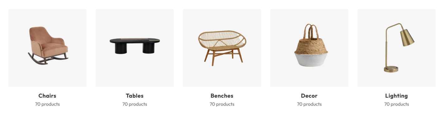
* **Card style**: Choose the display style for collection cards.
* **Image ratio**: Control how collection images display inside the card
* **Image radius**: Round the corners of the collection image
* **Background color**: Set the card's background color
* **Card radius**: Round the card's corners
## Article cards
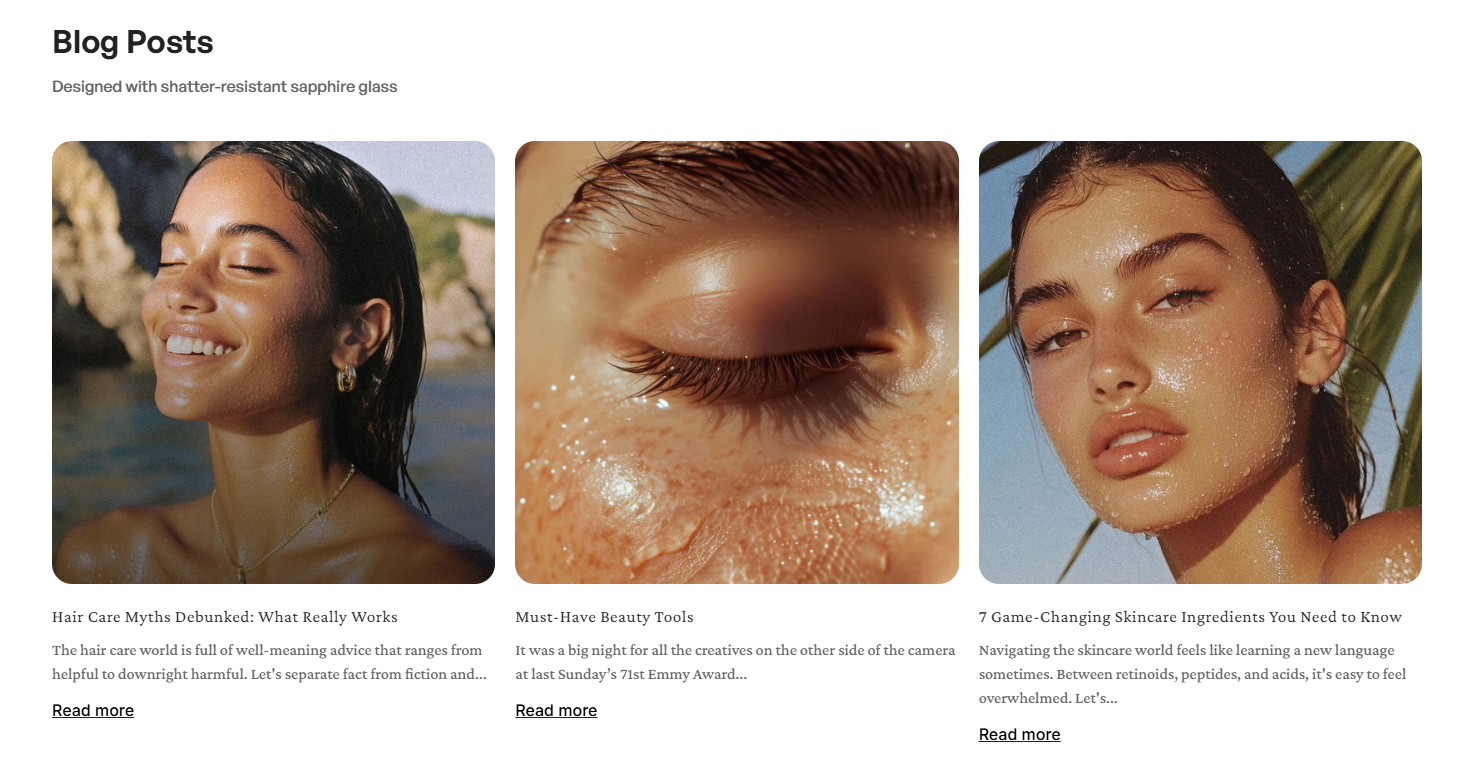
Set how blog article cards display.
* **Card style**: Choose the display style for the article cards. For custom layout, check out: [Custom card elements](https://docs.foxecom.com/foxify-app/foxstudio/add-and-edit-elements/blog-posts#custom-card-elements)
* **Text align:** Align article info left, center, or right
* **Show blog**: Show which blog the article belongs to
* **Show published date**: Show the article's publish date
* **Show excerpt**: Show a short preview of the article text
* **Show read more link**: Show a link to the full article
* **Background color**: Set the card's background color
* **Card radius**: Round the card's corners
## Variant picker
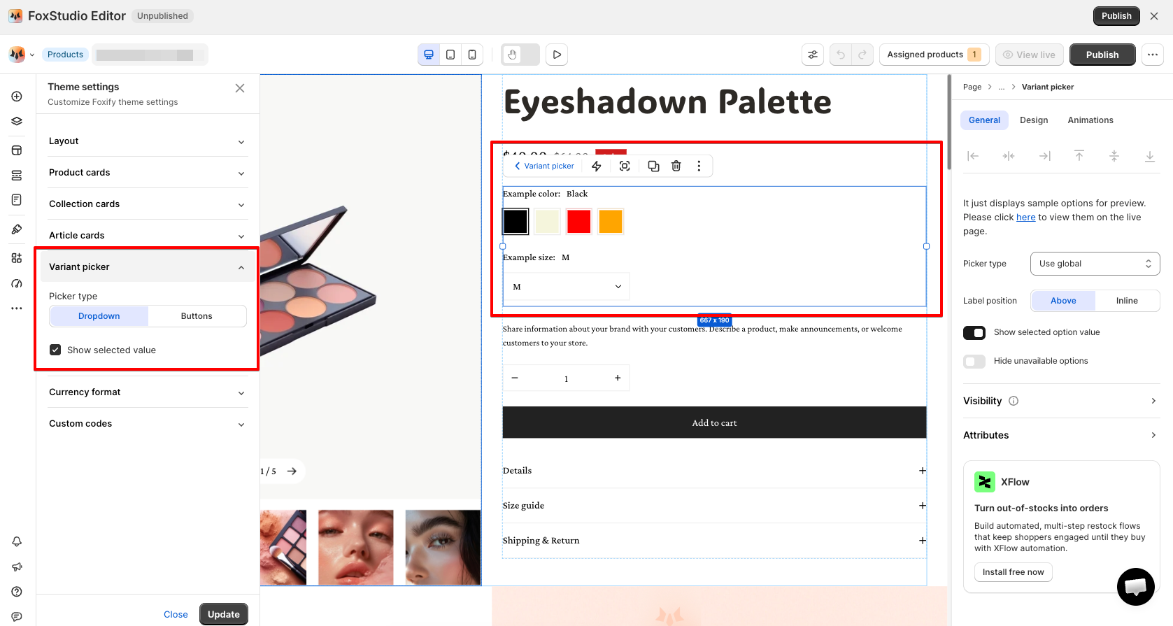
Sets the default variant picker style across your store — you can still override it on a specific product template. [Learn more](https://docs.foxecom.com/foxify-app/foxstudio/add-and-edit-elements/product-details#product-information)
* **Picker type**: Dropdown or Buttons
* **Show selected value**: Display the currently selected variant next to the picker
## Currency format
**Show currency codes** — toggle whether prices display a currency code alongside the amount (e.g. `$1.00 USD` vs. `$1.00`).
## Custom codes
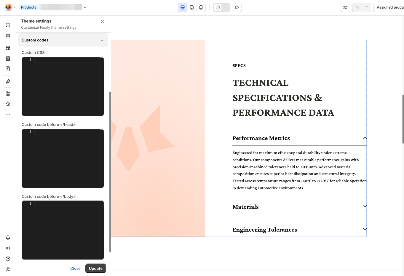
Add **Custom CSS**, **Custom code before \**, or **Custom code before \** for advanced, site-wide customization.
Only use this if you're comfortable with code — it applies site-wide. Back up before making changes, and consider a developer for complex customizations.
## FAQs
**Where do I access Theme settings?**