
Sales Boosting
Pop-up
6 min read
General
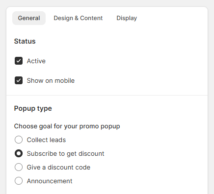
Status & Popup type
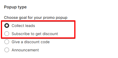
- Collect leads: A pop-up with a subscribe form to collect your customer's email.
- Give a discount code: A pop-up with a discount code to offer a promotion.
- Subscribe to get discount: A pop-up with a subscribe form to collect customer' email and offer your customer a discount code after they have subscribed.
- Announcement: A pop-up with news and a call-to-action button.
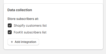
Data collection
- Shopify customers list
- FoxKit subscribers list
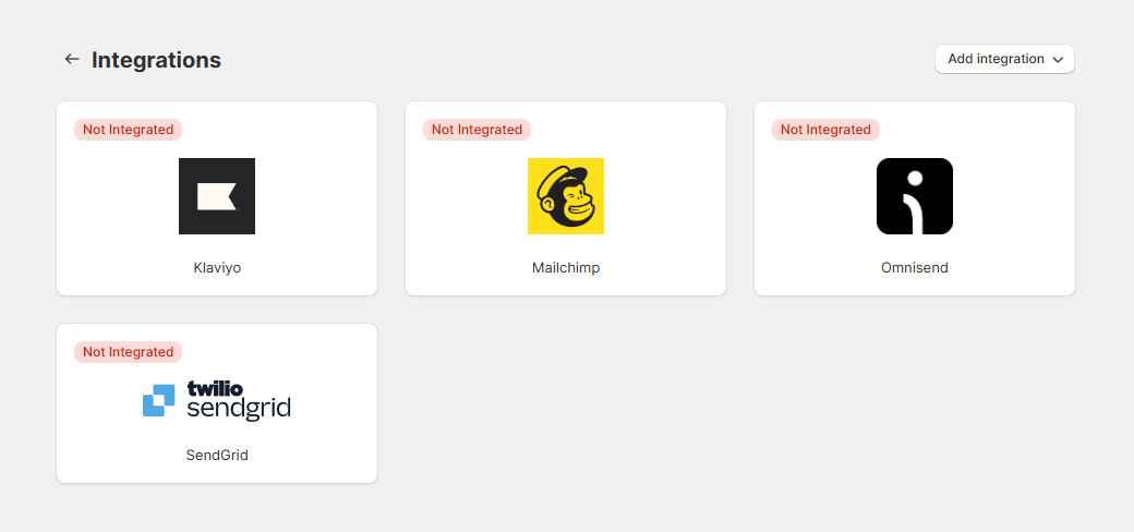
- Additional integrations like Klaviyo, Mailchimp, Omnisend, or SendGrid can be added through the integration menu.
Design
Pop-up template
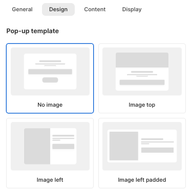
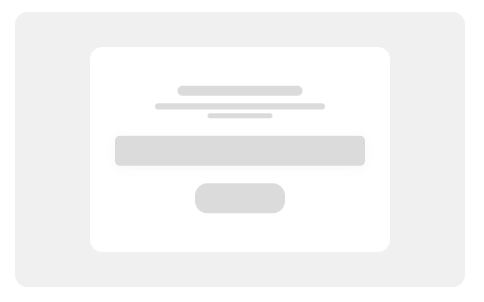 No image
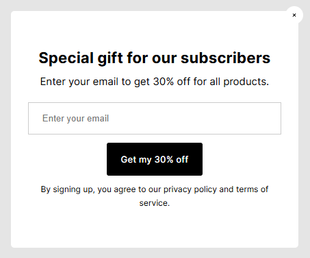
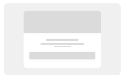 Image top
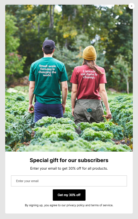
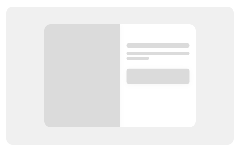 Image left
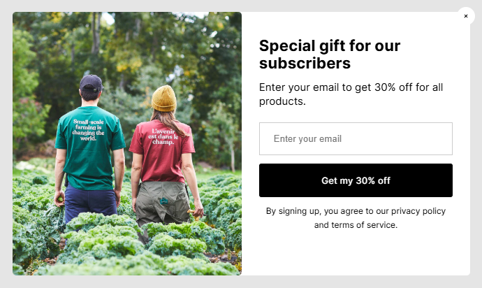
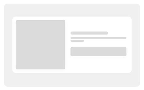 Image left padded
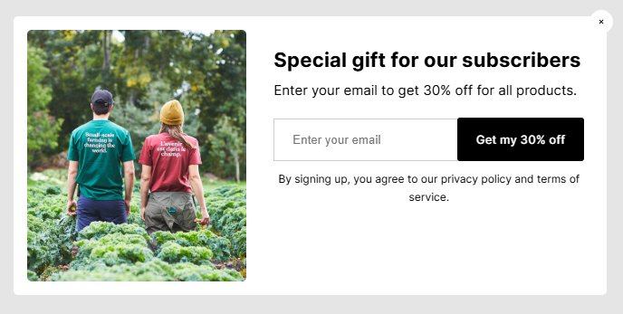
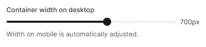
- Use the slider to increase or decrease the width (e.g., 550px).
- Note: Mobile width is automatically adjusted to ensure responsiveness.
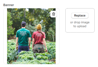
- Click Replace or drag and drop an image to upload.
- Ensure the image is visually engaging and fits your branding.
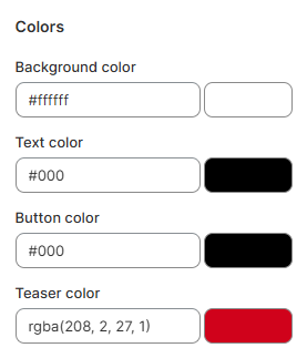
Colors
Content
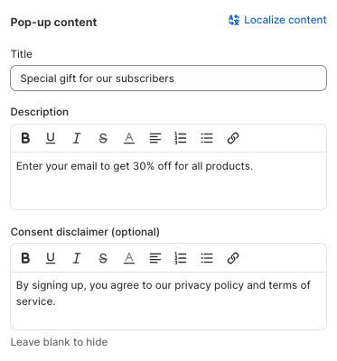
Pop-up content
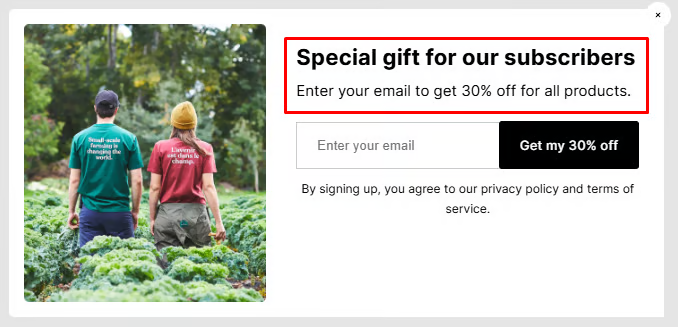
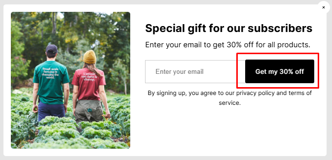
- Title: Use the field titled "Title" to create a headline for your popup. This should be a concise, attention-grabbing message. (e.g., "Special gift for our subscribers")
- Description: Add supporting text in the "Description" field. Use this area to provide details about the offer or message. (e.g., "Enter your email to get 30% off for all products.")
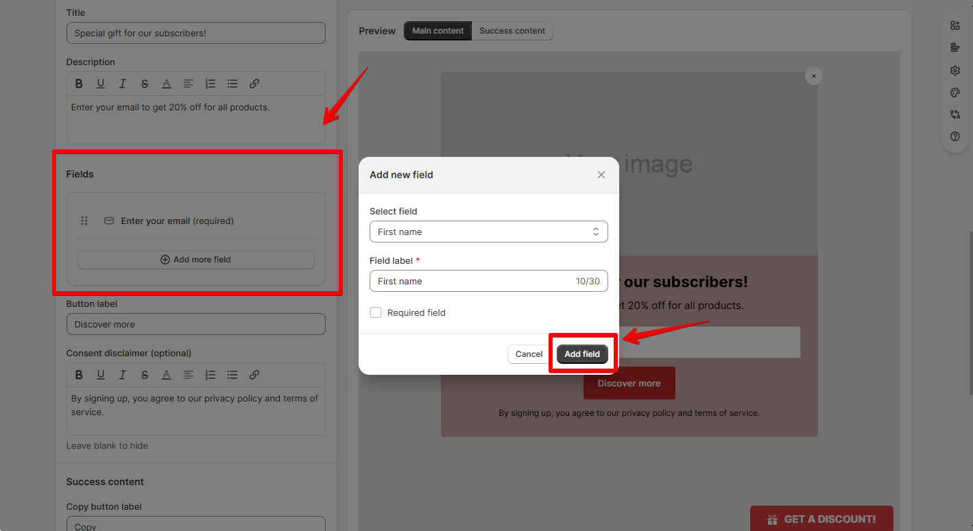
Fields
This setting is available for the Popup type as Collect leads or Subscribe to get discount.
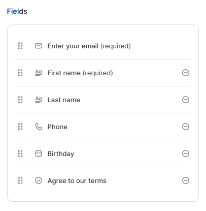
- The popup includes an "Enter your email" field by default.
- Use the Add more field button to include additional fields.
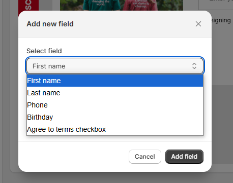
-
- First Name
- Last Name
- Phone
- Birthday
- Agree to Terms Checkbox
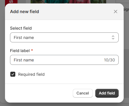
- Click the Add field button to save and include this field in your popup form.
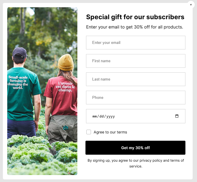
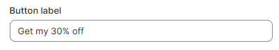
- In the Button label field, customize the text on the call-to-action button (e.g., "Get my 30% off").
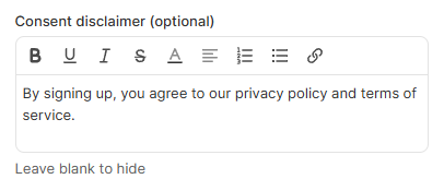
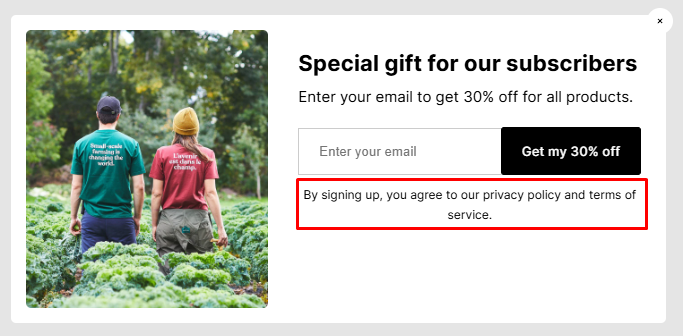
- Use the Consent disclaimer field to include a legal note, such as privacy policies and terms of service.
- Use rich text formatting (bold, italic, links) to ensure the message is clear and professional.
- Leave this field blank to hide.
Success content
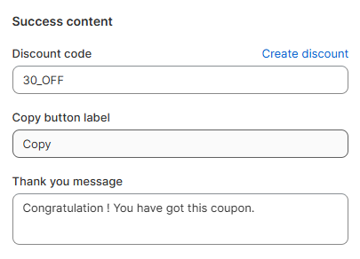
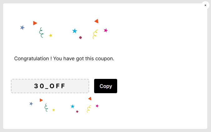
- Enter the discount code in the Discount Code field (e.g., "30_OFF").
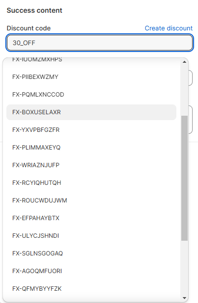
The Discount code must match an available discount code in your Shopify Discounts.
Easily search and select from a list of available Shopify Discount codes using the module discount codes picker.
- Change the Copy button label text if needed (default: "Copy"). This button allows users to easily copy the discount code.
- Write a custom thank-you message in the Thank you message field. Ensure the message is clear and aligns with your brand tone.
- For example: "Congratulations! You have got this coupon."
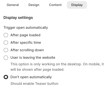
Display settings
Trigger
- After the page is loaded;
- After a specific time (seconds);
- After the visitor scrolls down the page;
- When the visitor is about to leave the website (desktop view only);
- Not open the pop-up automatically.
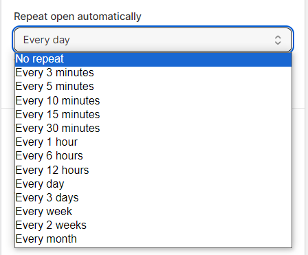
Display frequency
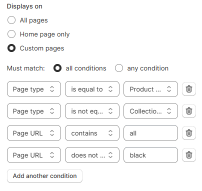
Display condition
- on all pages: Show the pop-up on every page
- on certain pages on your website:
- Home page only: Show the pop-up on the home page only.
- Custom pages: Show the pop-up on the specific pages that meet All conditions or Any condition you set.
- The condition can be set based on the page type or page URL. For page URL, don't forget the protocol "http://", "https://".
- Is equal to: Add the page type or page URL you want the pop-up to appear on.
- For example: 'Page type is equal to Product pages' to display the popup on all product pages of your website.
- Is equal to: Add the page type or page URL you want the pop-up to appear on.
- Is not equal to Add the page type or page URL you do not want the pop-up to appear on.
- Contains: Add the page type or page path segment value to display the pop-up on URLs that contain that value.
- For example: 'Page URL contains all' to display the pop-up on page URLs that have the word 'all'.
- Does not contain: Add the page type or page path segment to exclude the pop-up on certain a page type or URLs that contain that value.
- The condition can be set based on the page type or page URL. For page URL, don't forget the protocol "http://", "https://".
Teaser button
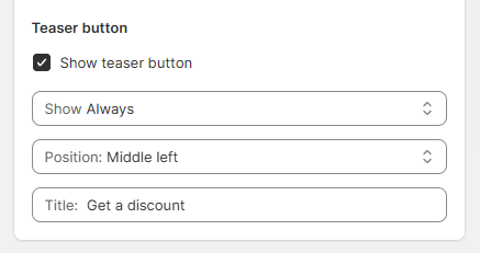
- Always: The teaser button remains visible at all times.
- If customers close the pop-up: The teaser button appears only after the customer closes the pop-up.
- Middle left
- Middle right
- Bottom left
- Bottom right
Last updated