
Sales Boosting
Mega menu
4 min read
- It provides a clear overview of your store's product categories and subcategories, allowing users to quickly find what they want.
- It reduces the number of clicks required to navigate through your site, enhancing user satisfaction and encouraging exploration of your product offerings.
Create a mega menu
- In FoxKit > FoxKit power > choose Mega menu
- Select Create menu
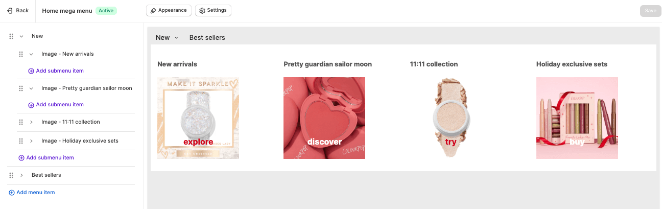
- Horizontal menu: In a horizontal mega menu, the parent menu items stand at the top; and sub-items, or child menu items, spread out underneath them.
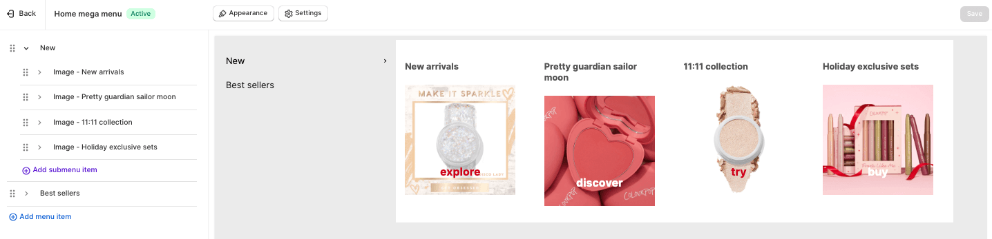
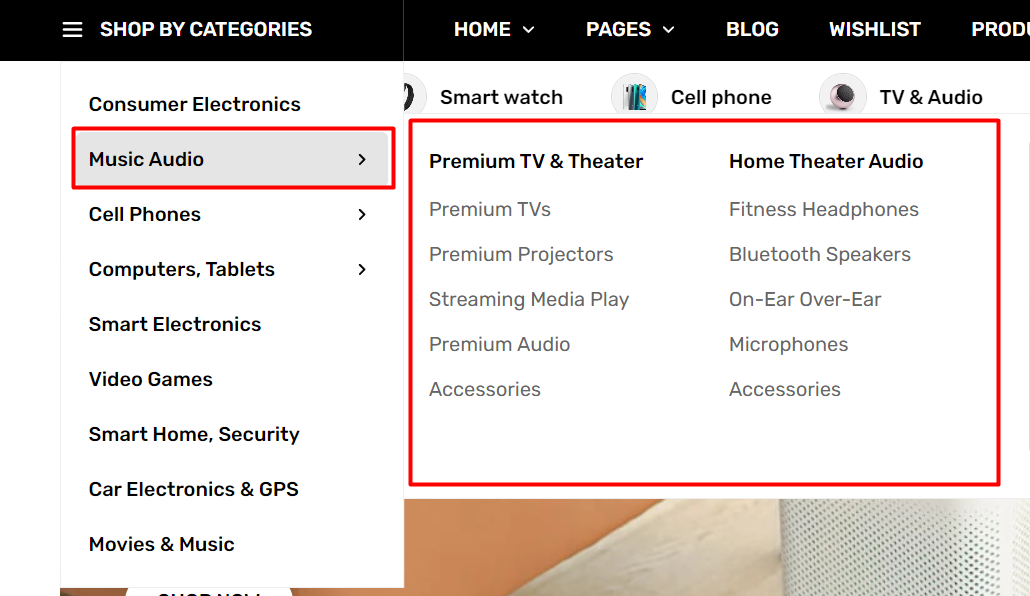
- Vertical menu: In a vertical mega menu, the parent menu items stand on the left side; and sub-items, or child menu items, branch out from them to the right.
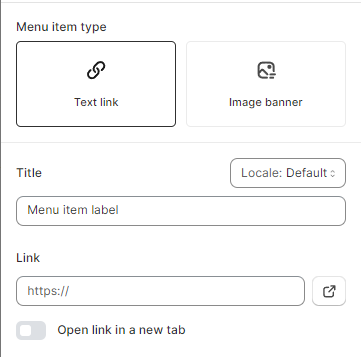
- Pure text link: Link the item to a certain collection, product, landing page, etc.
- Text link with image banner: A menu banner can attract customers' attention and communicate your messages more effectively.
General
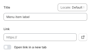
- Title: Insert your menu item label;
- Link: paste the page URL or select a page from your Shopify store that you want to link the menu item with, or simply leave it blank.
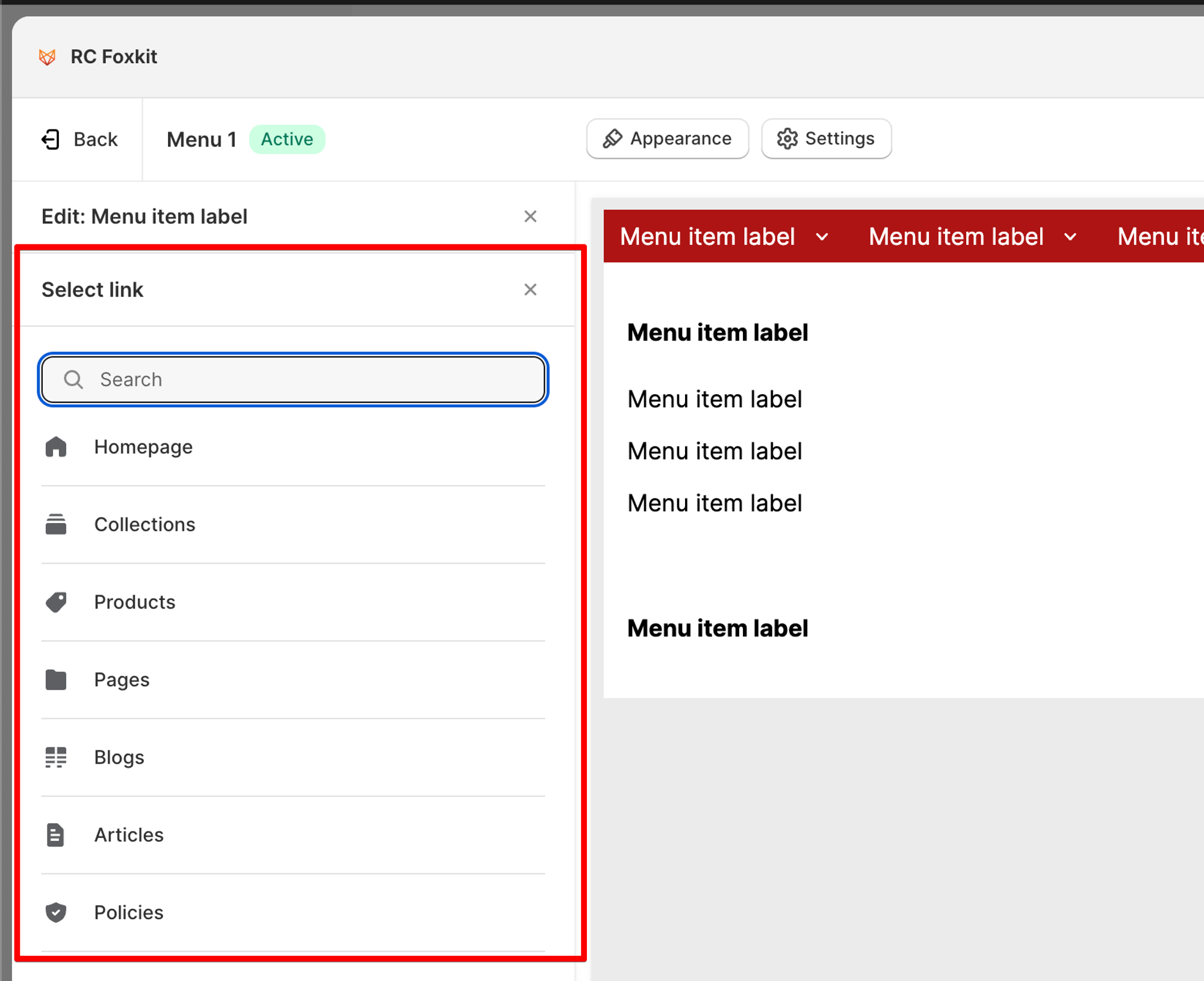
- Check the option Open link in a new tab if needed.
Submenu settings
- Determine your Submenu layout as Mega/Dropdown;
- Select how the submenu is opened: by hovering/clicking;
- Select the Dropdown container width: Full width/ Auto width;
- Enable to show content in the container if needed;
- Set the number of submenu columns: 1-6 columns or based on the number of submenu items being added to the menu item.
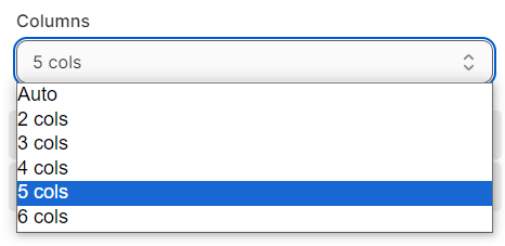
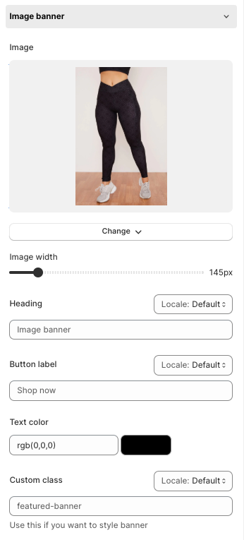
Image Banner
- Image
- Image Width
- Heading
- Button Label
- Text Color
- Custom Class
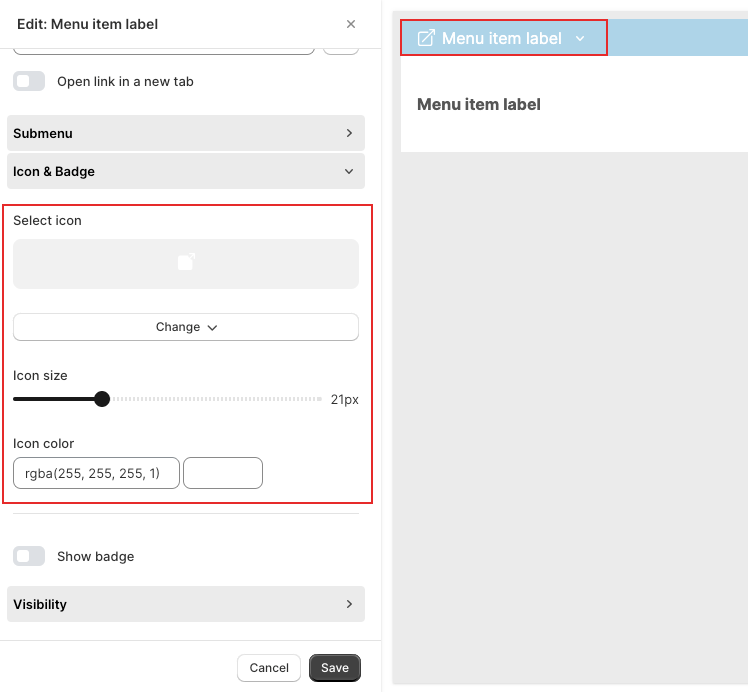
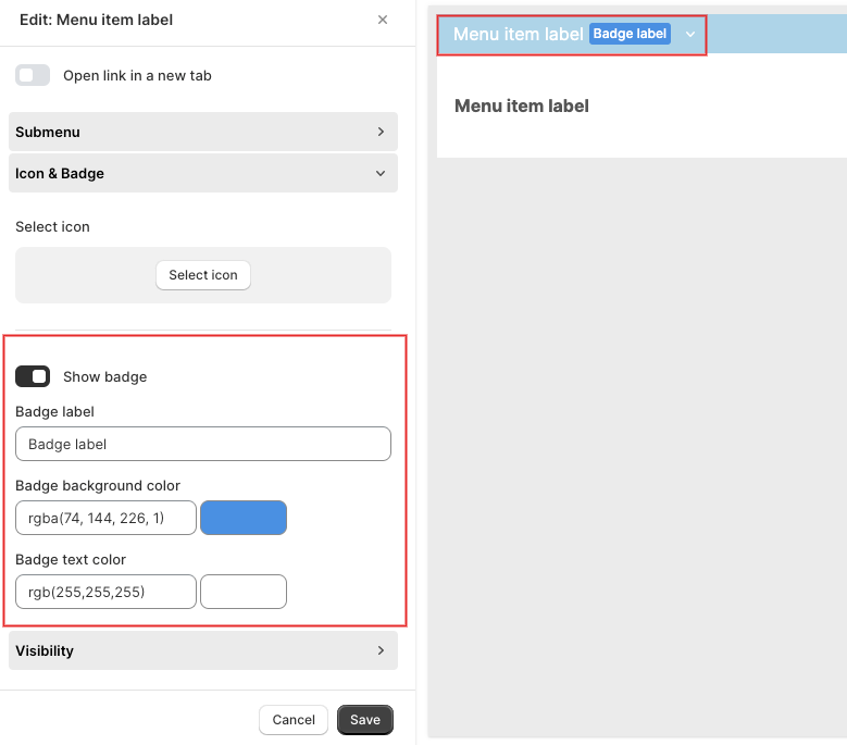
Icon & Badge


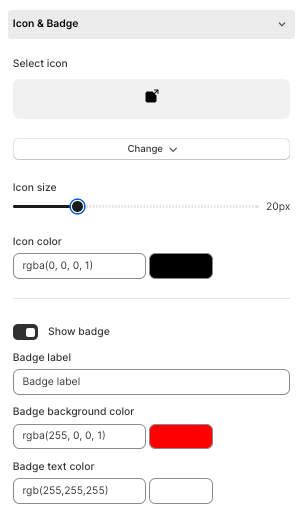
Icon
Badge
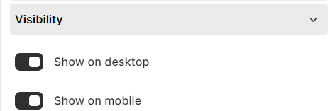
Visibility
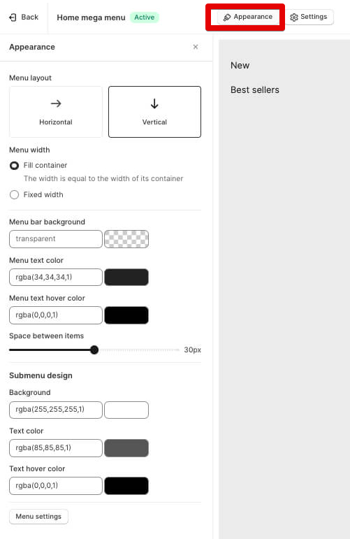
Style your mega menu
- Menu layout
- Horizontal
- Vertical
- Menu width
- Fill container
- Fixed width
- Menu bar background: Change color
- Menu text color
- Menu text hover color
- Space between items
- Submenu design
- Background: Change color
- Text: Change color
- Text hover: Change color
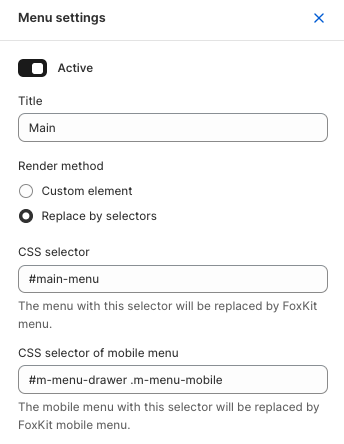
Change the settings of your mega menu
- Title
- Render method - we recommend you don't change this option if you're not sure what it does
- Custom element
- Replace by selectors
- CSS Selector
- CSS selector of mobile menu
Last updated