Foxify App
Foxify App
Build your store pages

Check and adjust mobile view

4 min read

A page that looks great on desktop can still break on mobile — overlapping text, cut-off buttons, elements wider than the screen. Since most shoppers browse on their phones, checking and fixing the mobile view isn't optional polish, it's part of finishing the page.

Below are some handful of tips and best practices that catch the most common mobile issues.

Start from something already responsive

If you're starting fresh, a premade template or a pre-built section is already designed to work across screen sizes — you'll have far less to fix than building freeform from a blank canvas. See Templates or browse premade sections for inspiration.

Design desktop-first, then adjust down

Build and finalize your layout on Desktop first, then switch to Tablet and Mobile in the device switcher to adjust. Changes made while a specific device is selected apply to that view only, without affecting the others.

Build with Stack or Grid instead of free positioning

Group related elements into a Stack rather than positioning them freely. A Stack keeps elements from overlapping or drifting apart as the screen shrinks.
For grid layouts, Cells and grids let you set a different number of columns per breakpoint — for example, 2 columns on desktop, 1 on mobile. On mobile, you can also enable cells to be swipeable instead of stacking them all vertically.

Use Relative sizing instead of Fixed on mobile
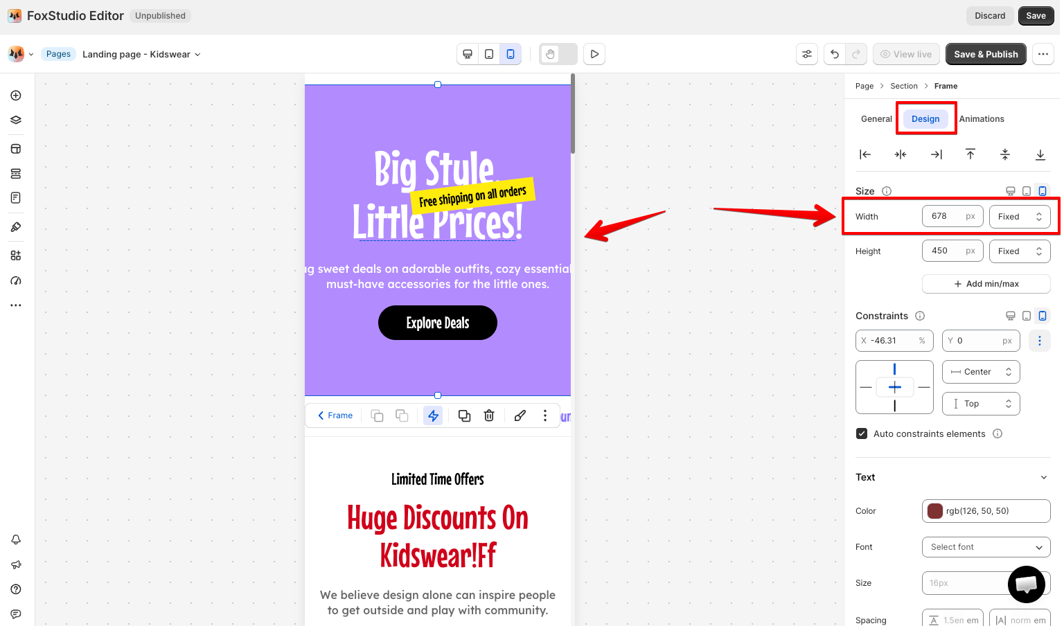
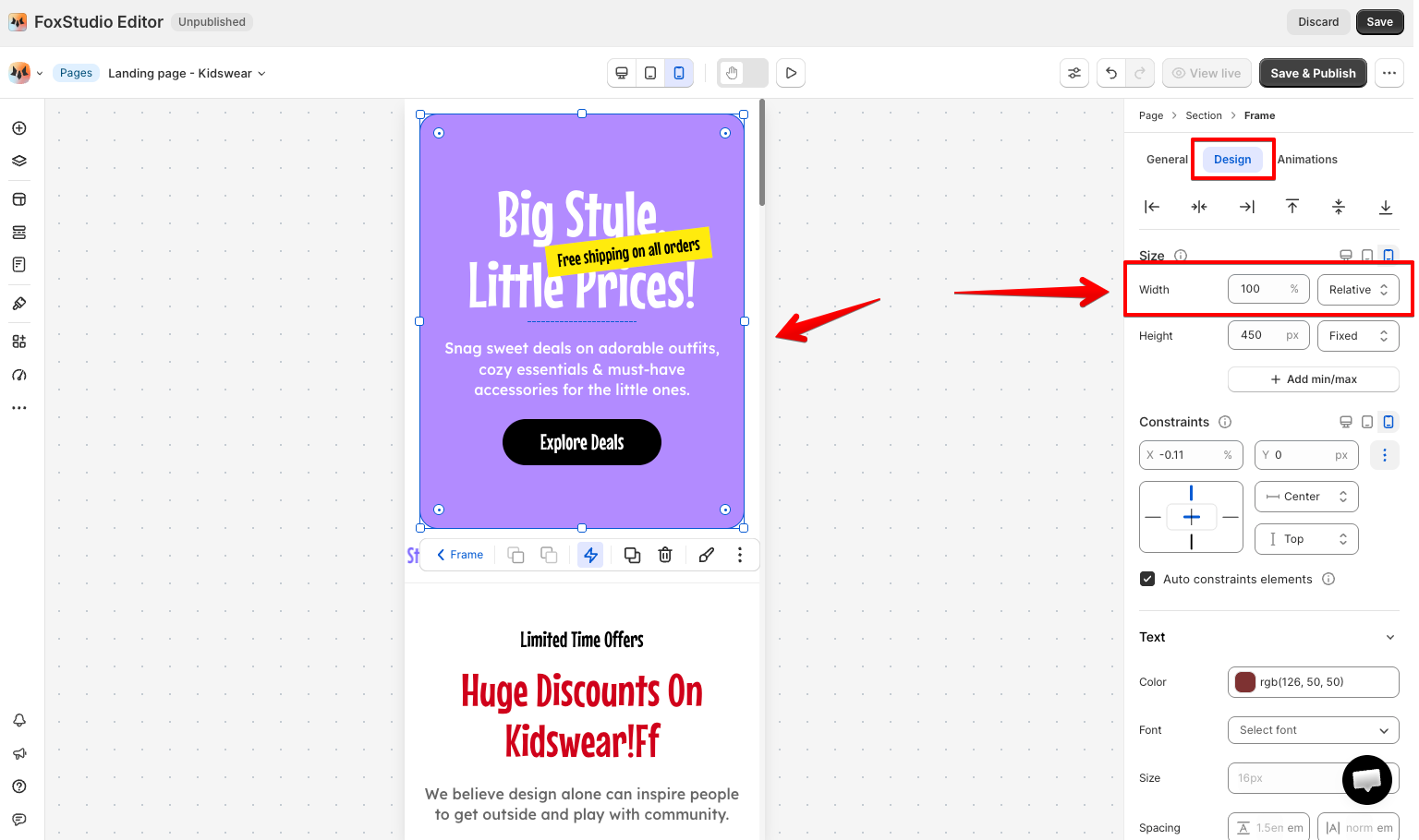
In the Inspector panel's Size settings, an element can be set to Fixed (px — stays the same regardless of screen size) or Relative (% — scales in proportion to its parent). A fixed-width element can easily end up wider than the mobile screen itself, forcing an ugly horizontal scroll — Relative sizing avoids that.

Avoid setting a fixed width on mobile

Instead, use relative width so it adapts to fit the screen

Resize and reposition per device

You can set an element's size per screen size directly — switch to Mobile, then drag its size handles or enter new width/height values in the Inspector. For elements not inside a Stack, check their Constraints too — horizontal constraints (left/right) use %, vertical constraints (top/bottom) use px, so an element can stay correctly anchored as the screen resizes.
This also applies to Text elements — font size, weight, and spacing can all be set differently per breakpoint. A heading sized for desktop often reads too large on mobile; switch to Mobile view and reduce the size directly, independent of the desktop setting.

Hide elements that don't belong on mobile
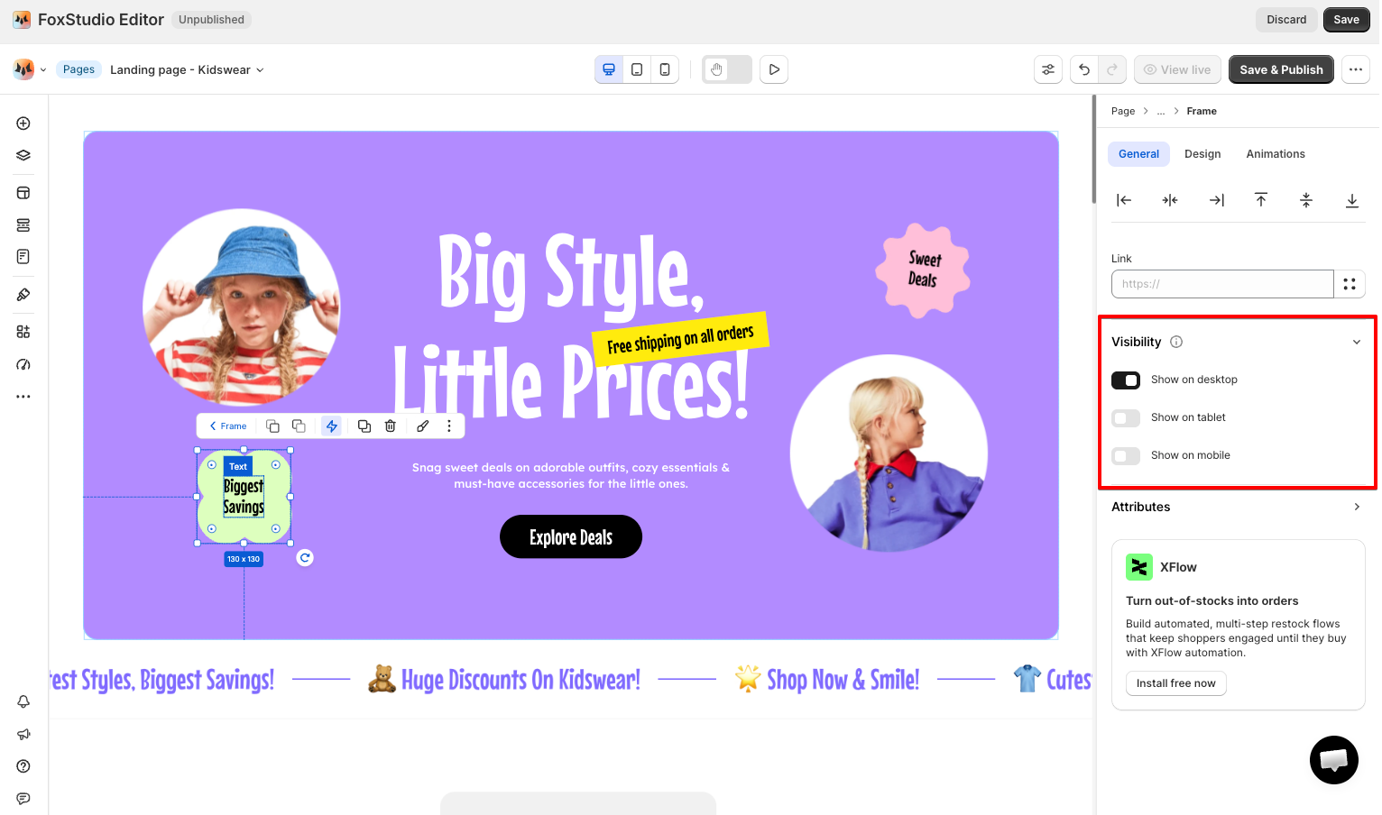
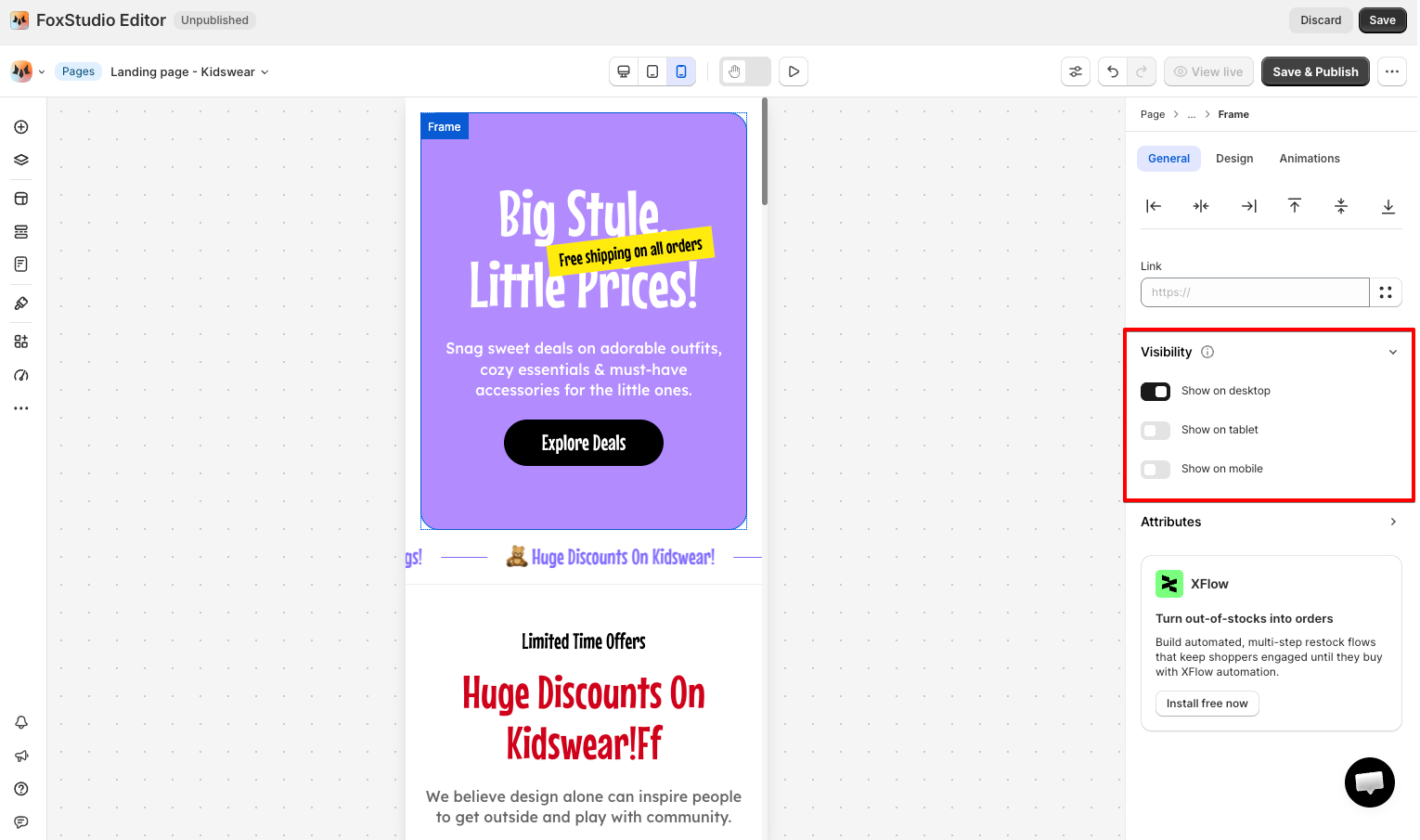
Not everything needs to shrink to fit — some elements are better hidden entirely. Use the Visibility setting in the Inspector panel to show or hide an element on specific views (desktop, tablet, mobile).

Let AI Responsive take a first pass

Select a section and run AI Responsive to automatically adjust spacing and alignment and prevent overlap. Review its suggestions before clicking Apply changes — it's a helper, not a replacement for a manual check.

FAQs

Will adjusting mobile view break my desktop layout?
No — size, position, and styles changes made while Mobile is selected apply only to that view. Desktop and tablet stay as you left them.

What's the difference between Fixed and Relative sizing?
Fixed (px) keeps an element the exact same size regardless of screen width. Relative (%) scales the element in proportion to its parent container — generally the safer choice for anything that needs to fit a mobile screen.

Why is my page scrolling sideways on mobile?
Something on the page is wider than the mobile screen — usually a Fixed-width element or image. Switch it to Relative sizing, or check its Constraints in the Inspector panel.

AI responsive

Cells and grids

Stack elements

Text

Last updated