This guide covers recommended image sizes for the Zest theme to help your store display correctly across all devices. Since Zest supports flexible aspect ratios per section, preparing images to match those settings will give you the best results.
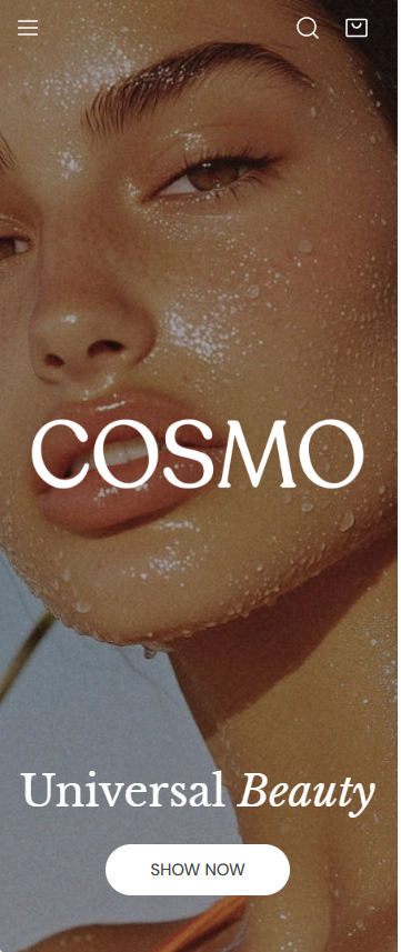
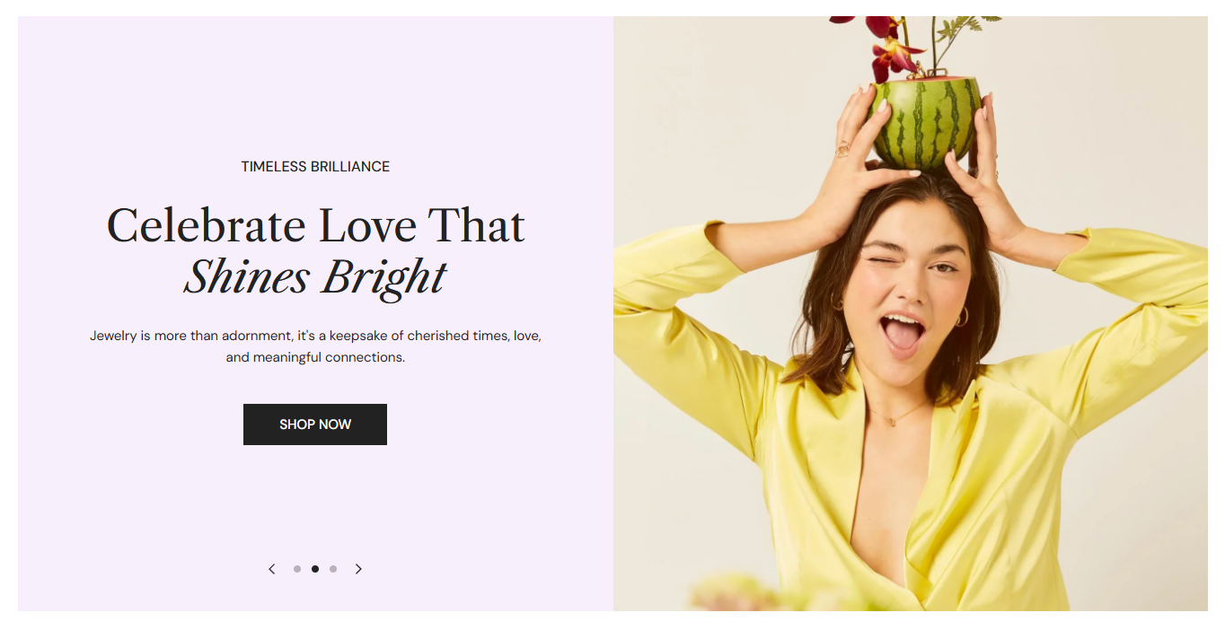
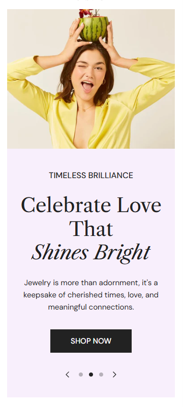
Using separate desktop and mobile images is strongly recommended to ensure optimal composition on different screen sizes.
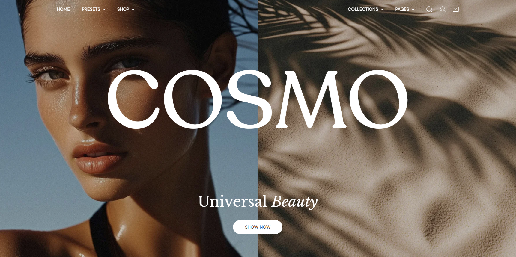
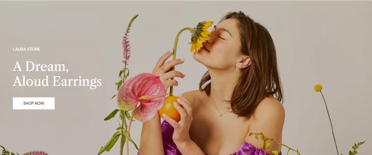
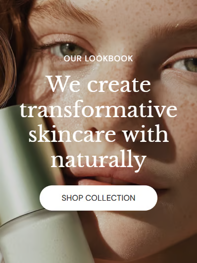
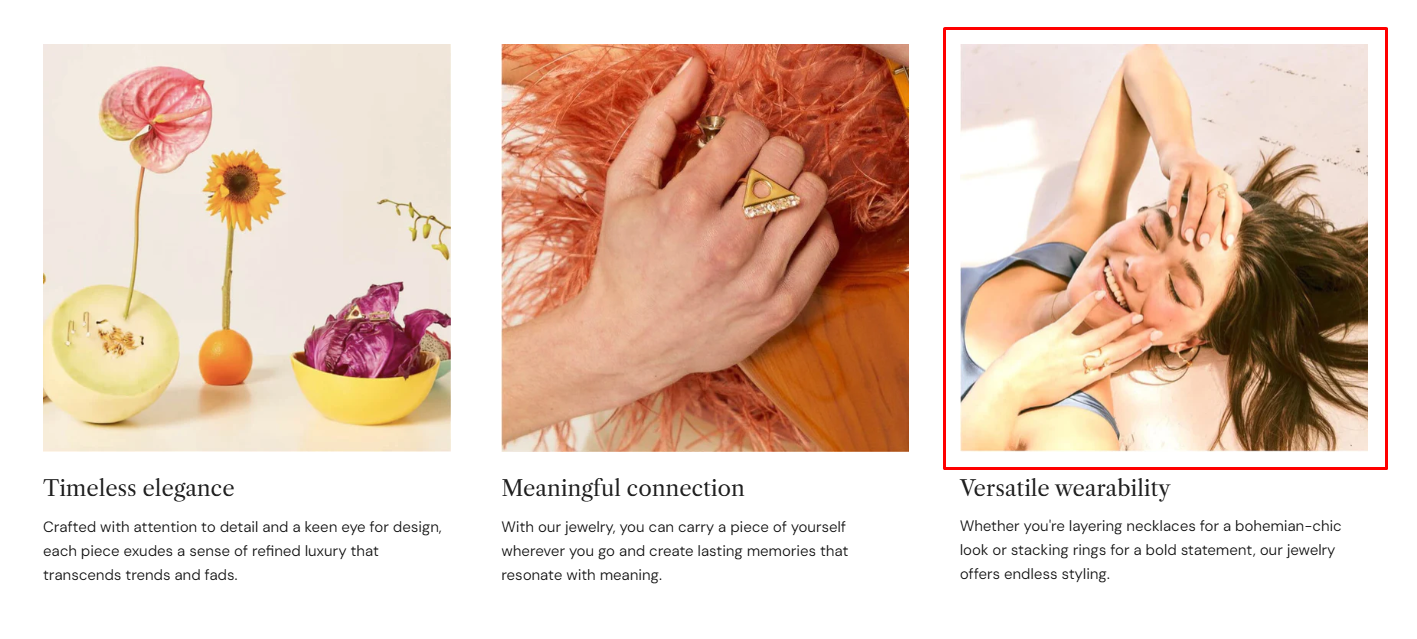
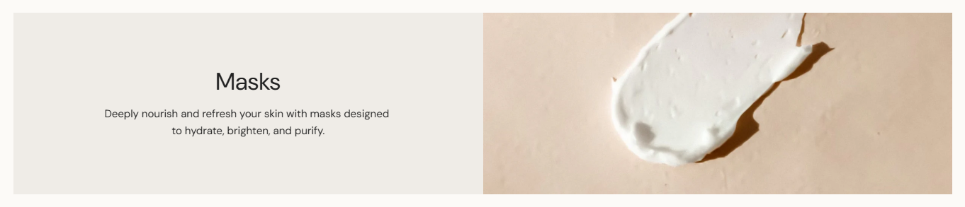
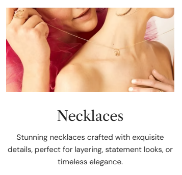
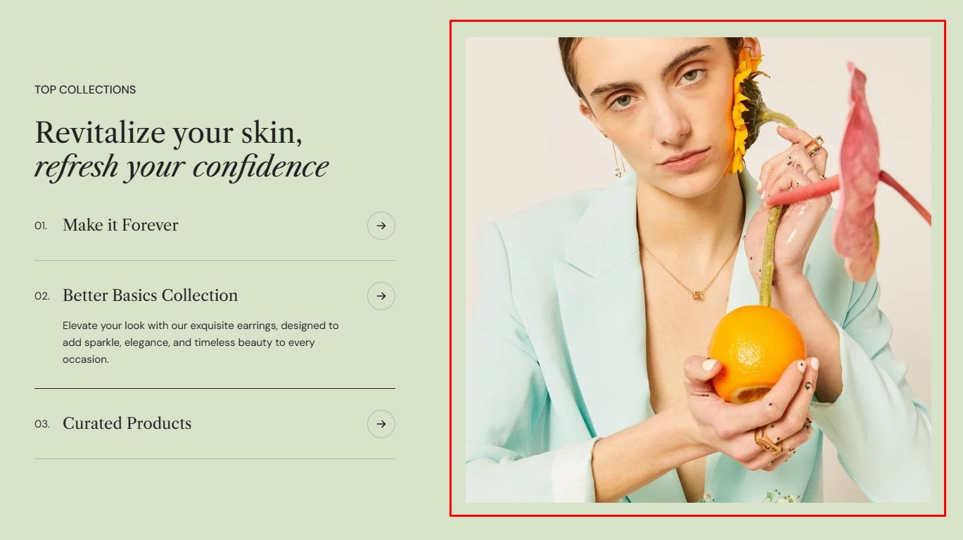
For best results, use an image with a 2:3 aspect ratio. Learn more
Banner height options:
Option
Desktop height
Mobile height
Behavior
Adapt to image
Auto
Auto
Follows the image’s original aspect ratio (no fixed height)
Small
420px
290px
Cropped to fixed height
Medium
560px
360px
Cropped to fixed height
Large
720px
420px
Cropped to fixed height
How it works:
Adapt to image: The section height is determined by the image’s aspect ratio. This helps preserve proportions and reduces unexpected cropping.
Fixed height options: Selecting a predefined height (e.g., Small, Medium, Large) ensures consistent section height but may crop images depending on their original ratio.
Using separate desktop and mobile images is strongly recommended to ensure optimal composition on different screen sizes.
Image height options:
Option
Desktop height
Mobile height
Behavior
Adapt to image
Auto
Auto
Height adapts to the first image ratio
Small
420px
280px
Cropped to fixed height
Medium
560px
340px
Cropped to fixed height
Large
720px
420px
Cropped to fixed height
How it works:
Adapt to first image: Preserving the original proportions of your first image slide. All other slides will follow the same aspect ratio as the first image.
Small / Medium / Large: Applying fixed heights, so images may be cropped depending on their ratio.
We strongly recommend uploading separate images for desktop and mobile. If the same image is used, it will be center-cropped on mobile, potentially cutting off important details.
Slide height options:
Option
Desktop height
Mobile height
Behavior
Adapt to first image
Auto
Auto
Height adapts to the first image ratio
Small
420px
280px
Cropped to fixed height
Medium
560px
340px
Cropped to fixed height
Large
720px
420px
Cropped to fixed height
How it works:
Adapt to first image: Preserving the original proportions of your first image slide. All other slides will follow the same aspect ratio as the first image.
Small / Medium / Large: Applying fixed heights, so images may be cropped depending on their ratio.
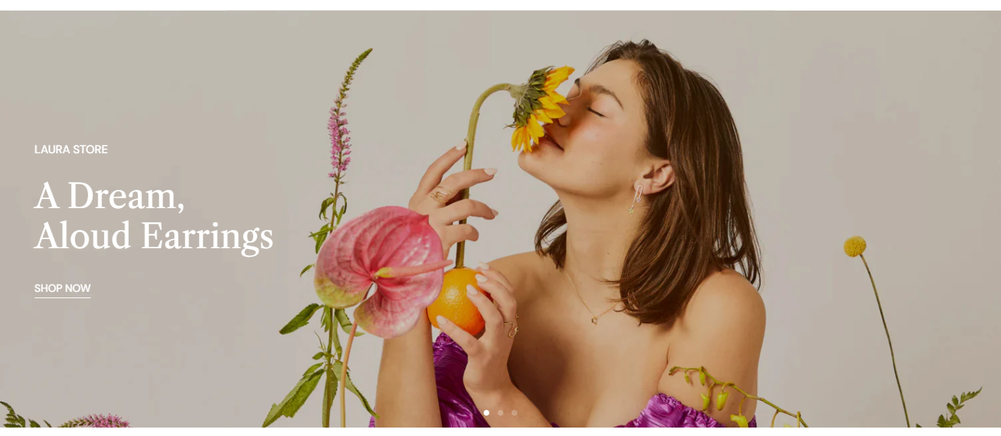
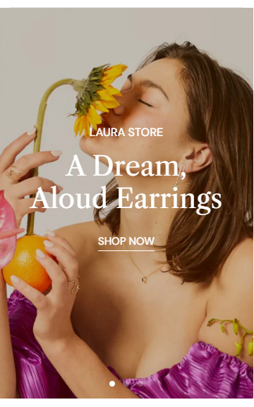
2680 × 480 px (for image position: Top, Bottom, or Use image as background)
1240 × 480 px (for image position: Left or Right)
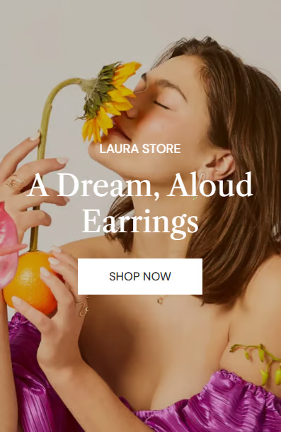
Mobile image: 1080 × 540 px
Use images with the correct dimensions based on the selected image position.
Banner height options:
Option
Desktop height
Mobile height
Behavior
Adapt to image
Auto
Auto
Follows the image’s original aspect ratio (no fixed height)
Small
248px
180px
Cropped to fixed height
Medium
320px
240px
Cropped to fixed height
Large
360px
320px
Cropped to fixed height
How it works:
Adapt to image: The section height is determined by the image’s aspect ratio, preserving its original proportions and minimizing cropping.
Fixed height options: Selecting a predefined height (e.g., Small, Medium, Large) ensures consistent section height but may crop images depending on their original ratio.
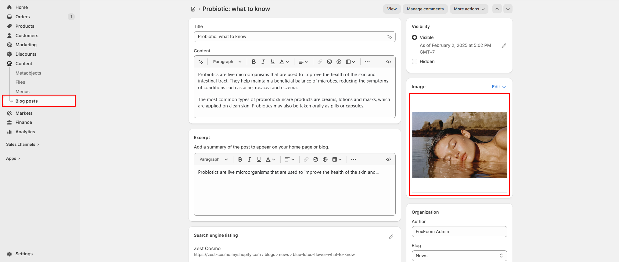
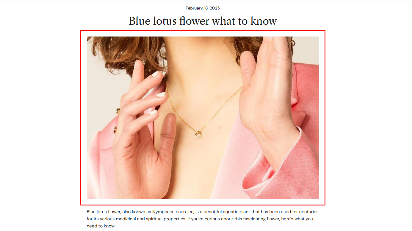
To set the blog post featured image, go to Online Store > Blog posts in your Shopify admin. Then open the post and locate the Featured image field on the right-hand side to upload your image.
On your website, the blog post featured image is displayed in two places:
Post’s thumbnail image (Blog listing page):
Displayed in blog cards. The appearance depends on the Blog posts section > Article card > Image ratio.
You can choose images with square, portrait, or landscape ratios to achieve the best visual result.
The recommended sizes are:
Square (1:1): at least 2000 x 2000 px
Portrait (3:4): at least 2000 × 2667 px
Landscape (4:3): at least 2400 x 1800 px
You can also use Adapt to image to preserve the original image ratio.
Post’s featured image banner (Blog post page):
Displayed as the main image at the top of the article. This is controlled by the Image width and Featured image height settings in the blog post template (Blog post section > Featured image block).
Featured image height options:
Option
Desktop height
Mobile height
Behavior
Adapt to image
Auto
Auto
Follows the image’s original aspect ratio (no fixed height)
Small
270px
110px
Cropped to fixed height
Medium
550px
220px
Cropped to fixed height
Large
750px
220px
Cropped to fixed height
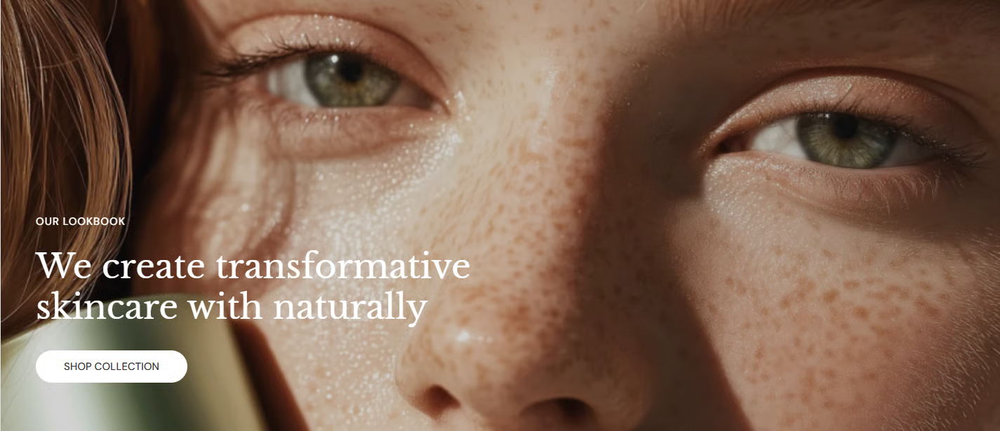
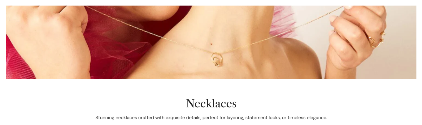
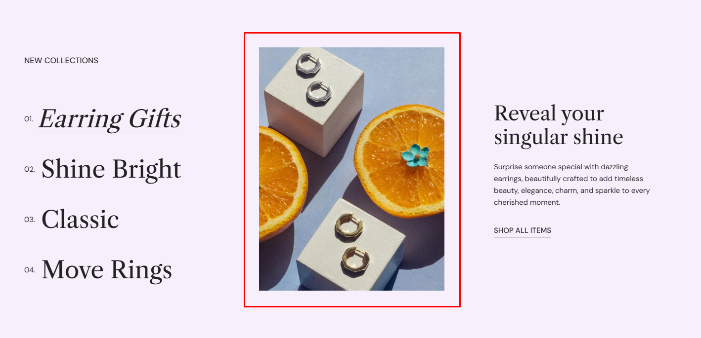
For best results, use an image with a 16:9 aspect ratio. Learn more
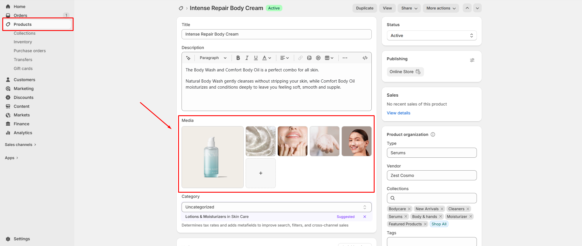
From the Products tab in your Shopify admin, you can easily add new products along with their images.
These products will automatically appear across product-related sections in your Zest theme, such as Featured Collection, Favorite Collection, Product Recommendations, Product Tabs, Handpicked Products and Recently Viewed Products.
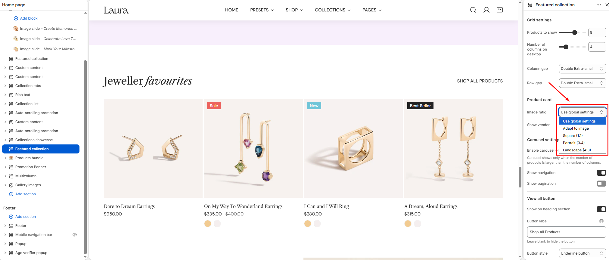
Within Theme settings or individual section settings, you can also control how product images are displayed. Available image ratio options include:
Adapt to image: Images are displayed in their original aspect ratio, without cropping or forcing them into a fixed shape.
Square (1:1)
Portrait (3:4)
Landscape (4:3)
These settings allow you to present your product images in the format that best fits your store’s design.
For optimal display quality on the Zest theme, we recommend the following image sizes:
Square (1:1): at least 2000 x 2000 px
Portrait (3:4): at least 2000 × 2667 px
Landscape (4:3): at least 2400 x 1800 px
These are general recommendations to ensure your images look sharp and consistent across all sections.