---
description: >-
Create a stunning Image gallery section that showcases compelling images like
a gallery
---
# Image gallery
The Image gallery section visually showcases products, portfolios, or photoshoots like a gallery effectively.
This feature allows you to present multiple images in a visually appealing manner, enhancing user engagement and increasing the likelihood of conversions by providing potential customers with a clearer view of what is being offered.
In this article, we will show you how to add an Image gallery section.
## How to add an Image gallery section to your Shopify store
{% hint style="success" %}
Steps
1. In the theme editor **(Customize)**, click **Add section.**
2. Select **Image gallery**.
3. Make necessary changes.
4. **Save** the settings.
{% endhint %}
## How to edit an Image gallery section
### Section settings
#### Section header
Change the **Layout** of the section header to your preferred direction: Vertical/ Horizontal.
Use the provided text fields to add a suitable **Heading**.
* Leave it blank if you do not want to display it
You can also change the **Heading size** to:
* Heading xs
* Heading sm
* Heading md
* Heading lg
* Heading xl
* Heading 2xl
* Display md
* Display lg
* Display xl
#### Highlight text
{% hint style="info" %}
See: [How to apply Highlight text to the section heading and block headings?](../../pages-global-sections/general-settings#highlight-text)
{% endhint %}
Use the provided text fields to add a suitable **Subheading** and **Description**.
* Leave them blank if you do not want to display them.
You can also change the **Description size** to Small/ Base size/ Large to make the content look balanced on your website.
Additionally, this section setting lets you add the call-to-action button to redirect customers to your desired page or social media page.
Provide a **Button label** and **Button link** for this button, then choose a **Button style** (Primary button/ Secondary button/ Underline button/ Bordered icon button).
Select a suitable **Social media** icon for this button (Instagram/ Facebook/ Twitter)
* Choose **None** to display the normal button without an icon.
For example:
#### Grid settings
Use the slider to adjust the **Number of columns on desktop** (between 2 and 6) for image blocks.
You can also control the suitable spacing between the Image blocks by selecting **Column gap** and **Row gap** options.
* **Column gap**: Extra large/ Large/Medium/Small/ Extra small/ None
* **Row gap**: Extra large/ Large/Medium/Small/ Extra small/ None/ Same as the column gap
**Image**
Select the **Image ratio** for images in the gallery as:
* Adapt to image
* Square (1:1)
* Portrait (3:4)
* Landscape (4:3)
**Mobile layout**
You can adjust the grid layout on mobile by changing the value of the **Number of columns on mobile** to 1 column or 2 columns.
If you are not into the grid layout, you can use the carousel layout by selecting the **Enable swipe on mobile** to make the image gallery swipeable.
### **Block settings**
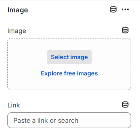
You can add multiple **Image** blocks to the **Image gallery** section.
Click _Select image_ to select a suitable **Image** for the block to display in the section.
Moreover, you can optionally add the specific **Link** for that image block.
.png?alt=media&token=e027b957-ed3d-45a7-b931-caeafc2dbc34)