
Theme Sections
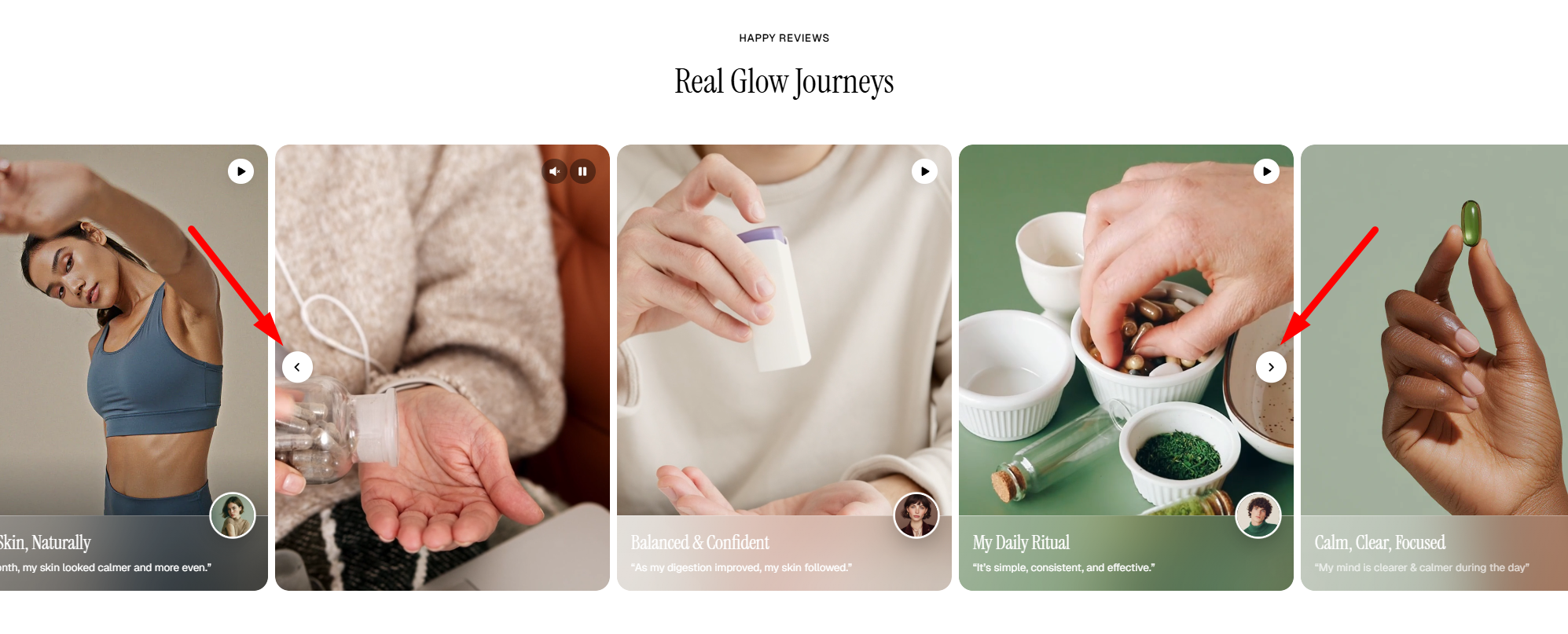
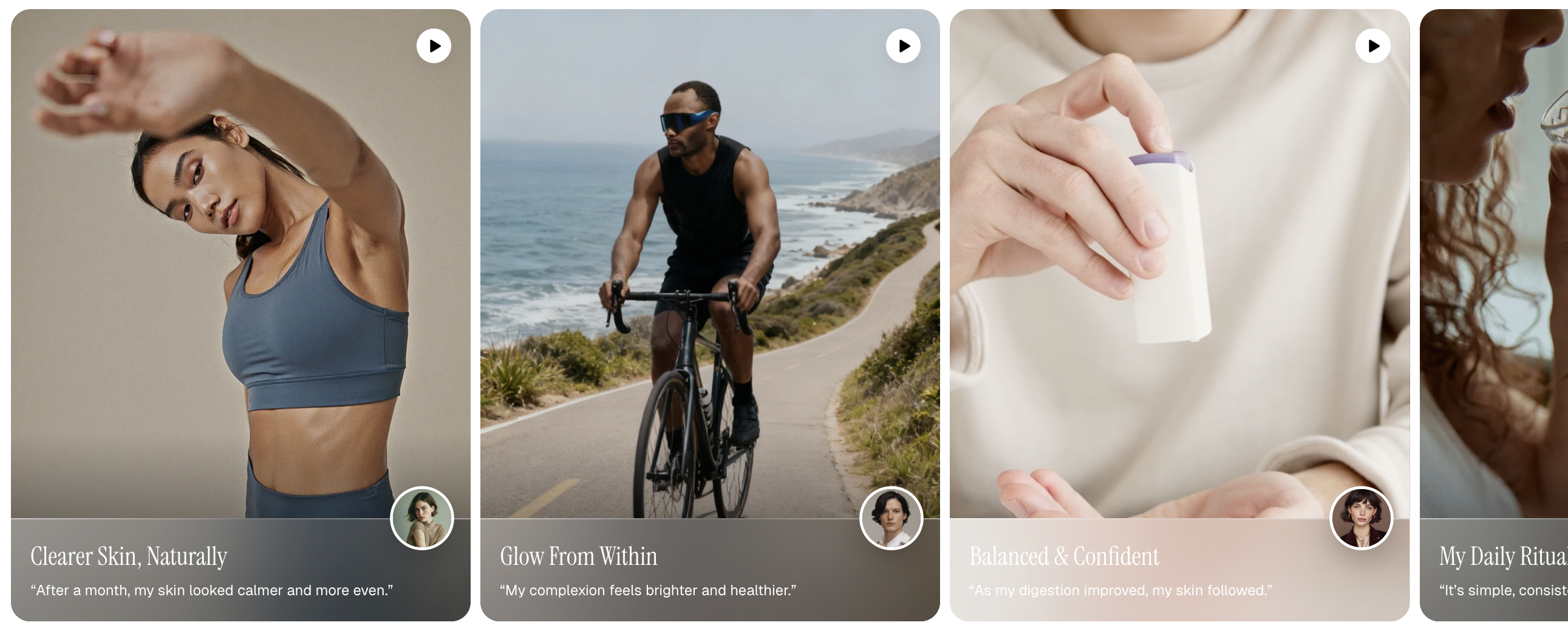
Video cards: Flex carousel
2 min read
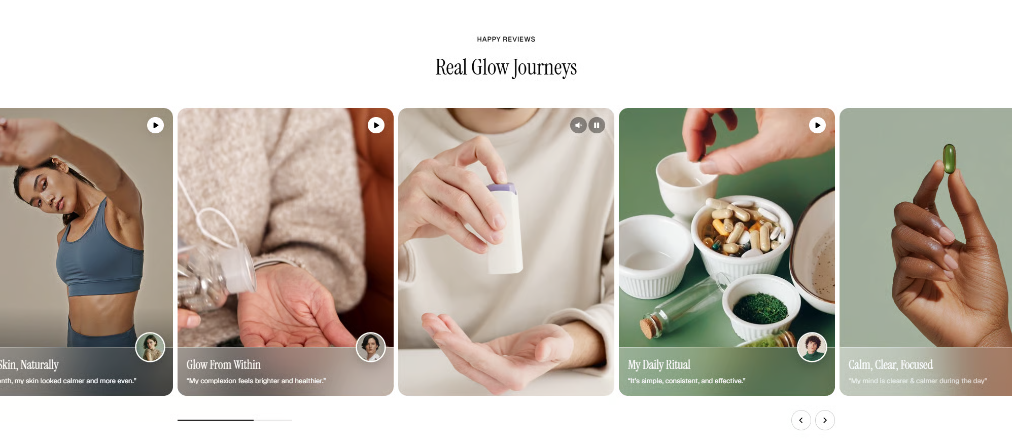
_1mdWxma5.jpg)
How to add a Video cards: Flex carousel to your Shopify store
- In the theme editor (Customize), click Add section.
- Select Video cards: Flex carousel section.
- Make necessary changes.
- Save.
How to customize a Video cards: Flex carousel section
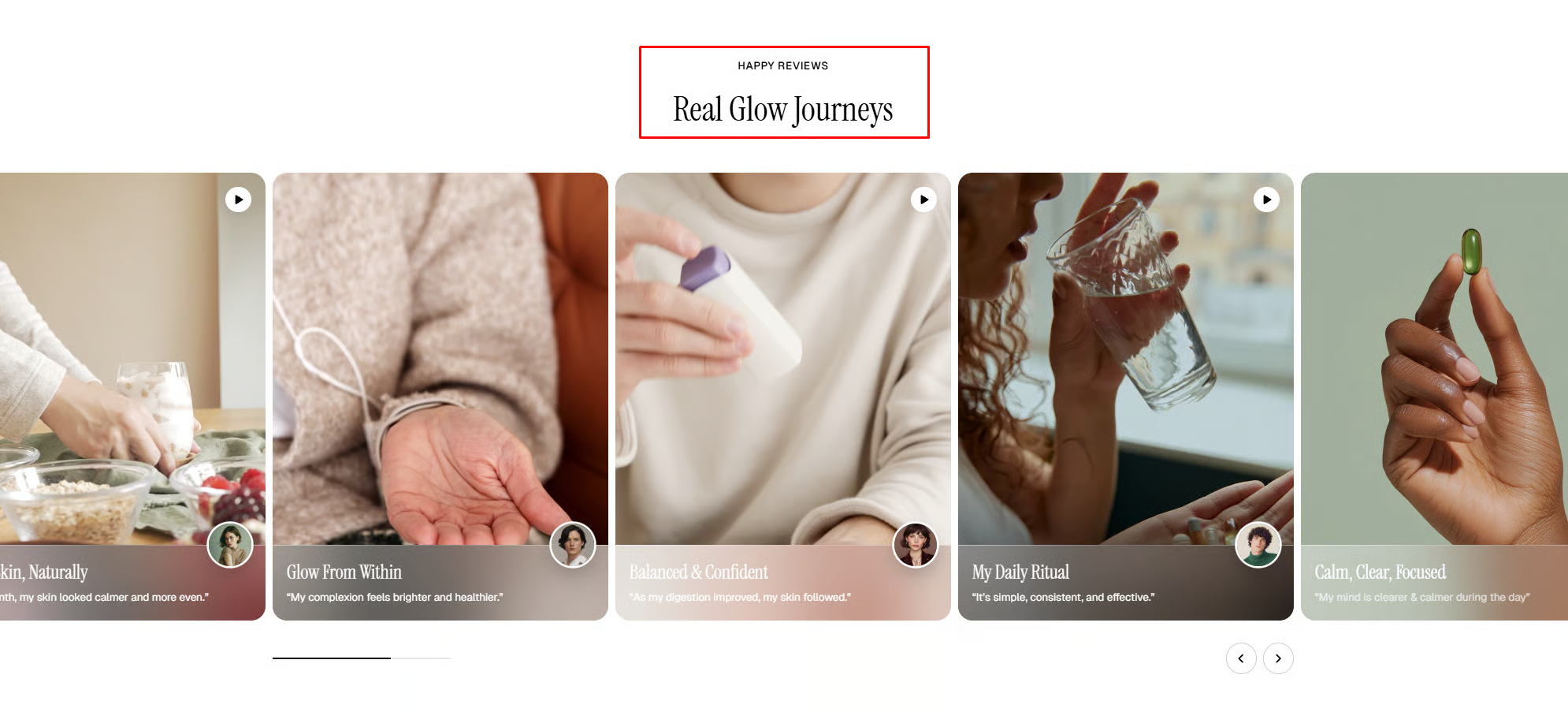
Section settings
| Setting | Description |
|---|---|
| Layout | Defines whether the section spans the full page width or stays within a fixed content width. |
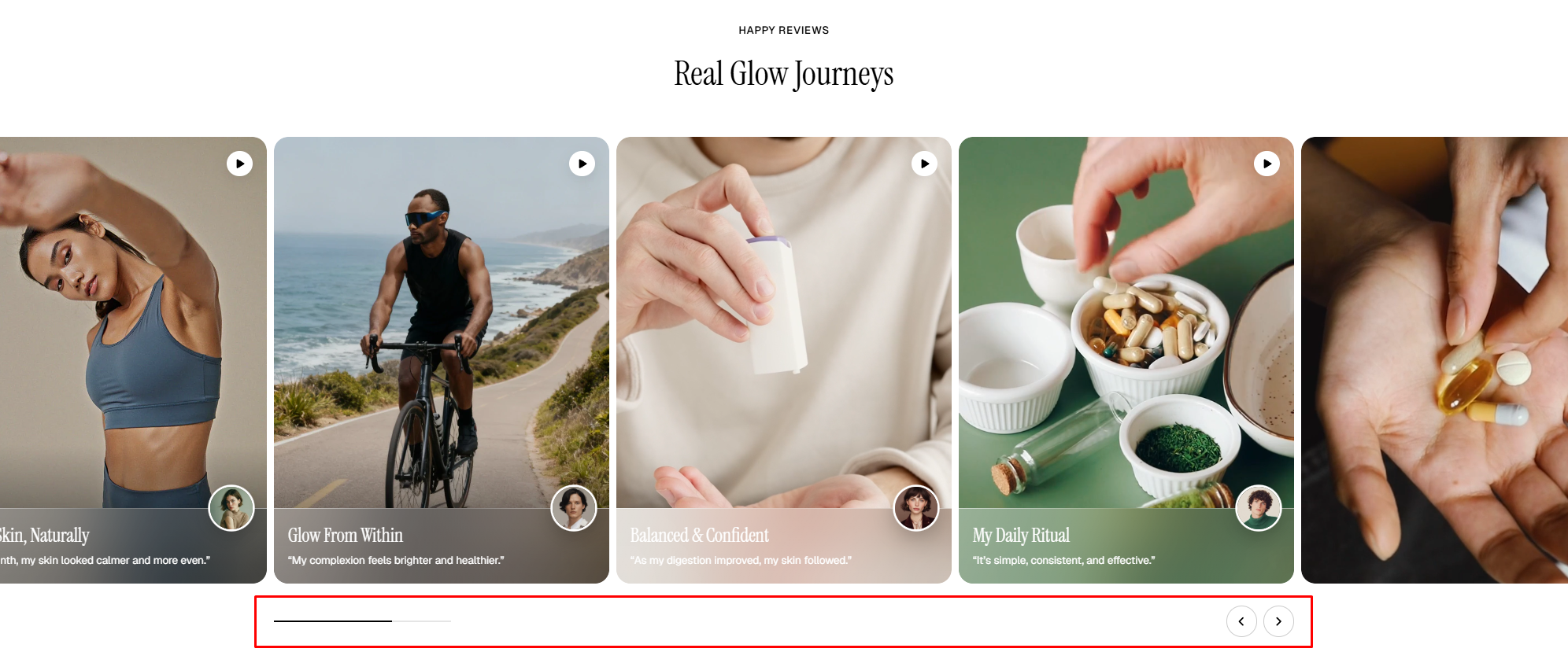
| Overflow content | Controls how content outside the visible area of the slider/container is displayed (Visible/Edge shadows). |
| Slide per view | • Defines how the number of visible slides is calculated. • Auto: Automatically adjusts the number of visible slides based on the container width and slide size. • Column: Uses a fixed number of columns set in the Columns setting. |
| Columns (Columns only) | Set the number of columns shown in the column layout. |
| Horizontal gap (Columns only) | Adjust the spacing between items horizontally. |
Mobile layout
| Setting | Description |
|---|---|
| Enable swipe on mobile | Allow users to swipe through items on mobile devices. |
| Custom column width | Enable custom sizing for columns instead of equal widths. |
| Mobile columns | Choose the number of columns displayed on mobile devices. |
| Mobile horizontal gap | Adjust spacing between items horizontally on mobile. |
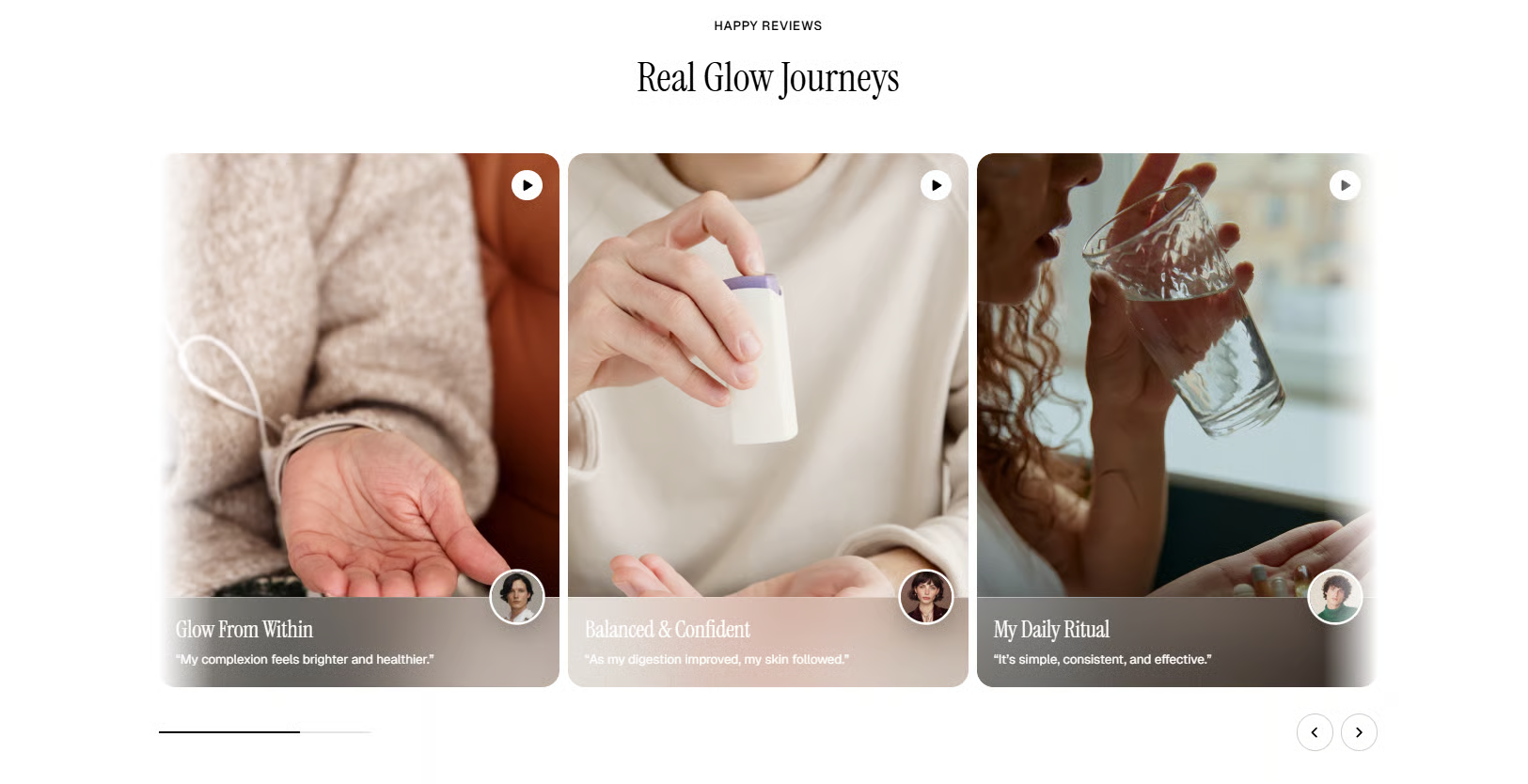
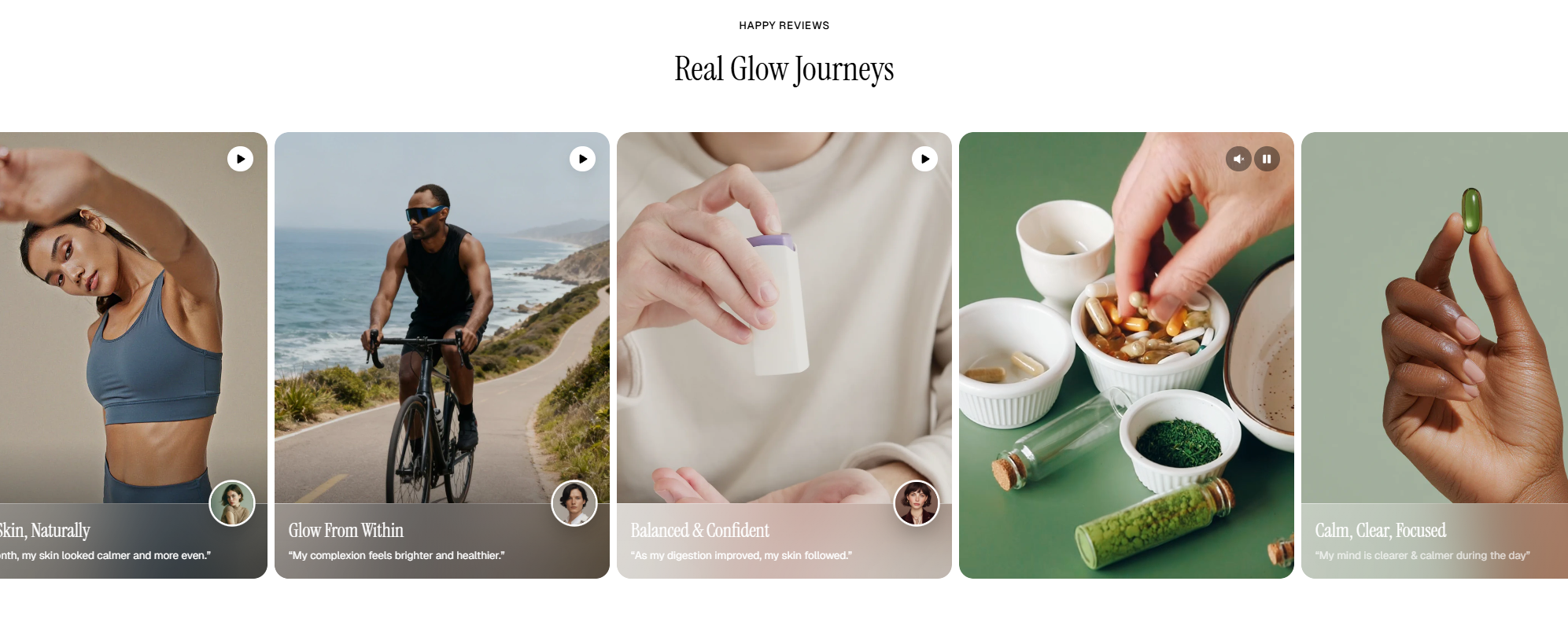
_opF4P1rR.jpg)
_lcRvRdqV.jpg)
_LyjRiayh.jpg)
Check out other section settings: Common settings available in most sections
Block settings
| Setting | Description |
|---|---|
| Alignment | Set the header alignment: left, center, or right. |
| Devices | Switch between desktop and mobile padding settings. |
| Bottom | Adjust the spacing below the header. |
📦 Nested dynamic blocks
- Heading – Add a main title
- Subheading – Provide supporting text above or below the heading
- Text – Include additional descriptions or details
- Image – Display an image or icon
- Button – Add a call-to-action
📝 Learn more: Basic
📝 Learn more: Basic
Last updated