# Progress timeline
_Q8RLRiyi.jpg)
Showcase a step-by-step progress timeline to highlight key milestones, benefits, or results over time in a clear and engaging layout.
## How to add a Progress timeline section to your Shopify store
1. In the theme editor **(Customize)**, click **Add section.**
2. Select **Progress timeline** section.
3. Make necessary changes.
4. **Save.**
## How to customize a Progress timeline section
### Section settings
| Setting | Description |
| --- | --- |
| **Container** | Choose the section width: full width or fixed within the page layout. |
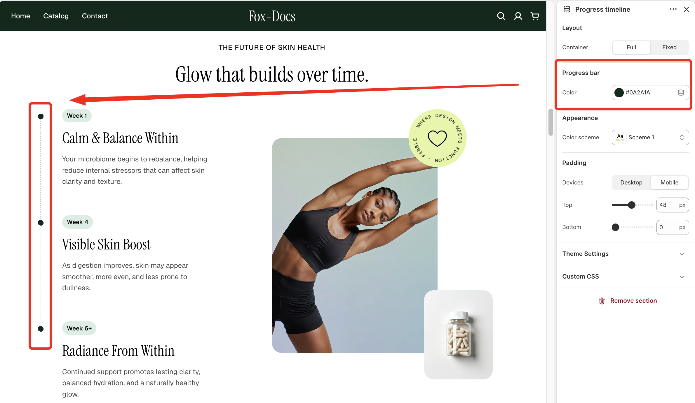
| **Progress bar color** | Set the color of the vertical timeline/progress indicator.
 |
Check out other section settings: [Common settings available in most sections](https://docs.foxecom.com/pebble-theme/theme-sections/overview#common-settings-available-in-most-sections)
### Block settings
The Progress timeline section consists of three main blocks: **Header**, **Media**, and **Timeline**.
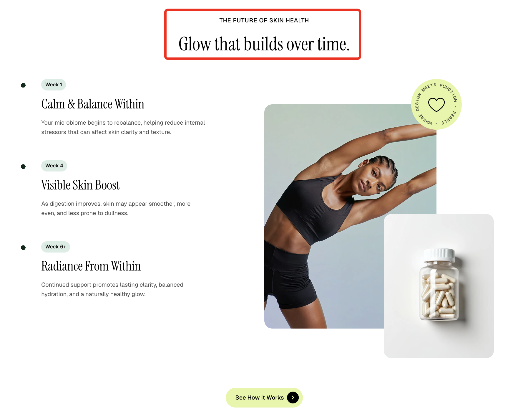
Use the **Header** block to create and customize the section’s heading and introductory content.
| Setting | Description |
| --- | --- |
| **Alignment** | Set the header alignment: left, center, or right. |
| **Devices** | Switch between desktop and mobile padding settings. |
| **Bottom** | Adjust the spacing below the header. |
* **Heading** – Add a main title
* **Subheading** – Provide supporting text above or below the heading
* **Text** – Include additional descriptions or details
* **Image** – Display an image or icon
* **Button** – Add a call-to-action
📝 Learn more: [Basic](https://docs.foxecom.com/pebble-theme/theme-blocks/basic)
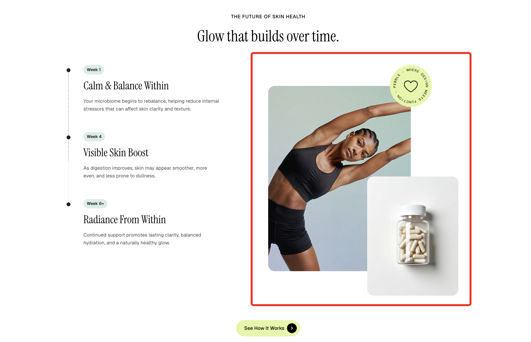
Add and customize images within the section, with controls for size, aspect ratio, and corner styling to fit your design.
| Setting | Description |
| --- | --- |
| **Image** | Upload or select images to display in the section. |
| **Aspect ratio** | Control how the image is scaled. |
| **Width** | Adjust the image width relative to its container. |
| **Corner radius** | Set the roundness of the image corners. |
#### How to create the overlapping image layout
1. Upload **2 images** in the **Media** block
2. Adjust the **width settings** for each image so that **Image #2 overlaps Image #1**
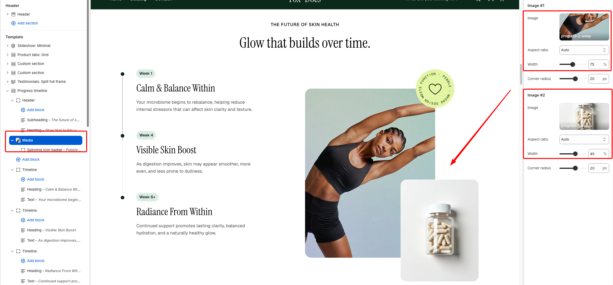
The Media block (images) becomes **sticky while scrolling** when the timeline content is long, keeping the visuals visible as users read through the timeline.
#### 💡 Best practices
* Keep **Image #2 smaller than Image #1** → avoids visual clutter.
* Use **simple backgrounds** for the overlay image.
* Add **corner radius (15–25px)** for a softer, modern feel.
* Make sure the overlap does **not cover important parts** (faces, product labels).
* Recommended **image ratio**:
* **Image #1 (main/background image):** Use a 4:5 or 3:4 portrait ratio to create a strong visual anchor and fill the space effectively.
* **Image #2 (overlay image):** Use a 1:1 or slightly portrait (4:5) ratio to keep it compact and clean when overlapping.
* Recommended **width settings**:
* Set **Image #1** to 70–80% width and **Image #2** to 40–50% width to create a clean, balanced overlap.
The Media block can also be combined with the **Spinning Icon Badge block** to create a more dynamic and eye-catching visual layout, helping highlight key products, promotions, or brand messages.
📝 Learn more: [Basic](https://docs.foxecom.com/pebble-theme/theme-blocks/basic#spinning-icon-badge)
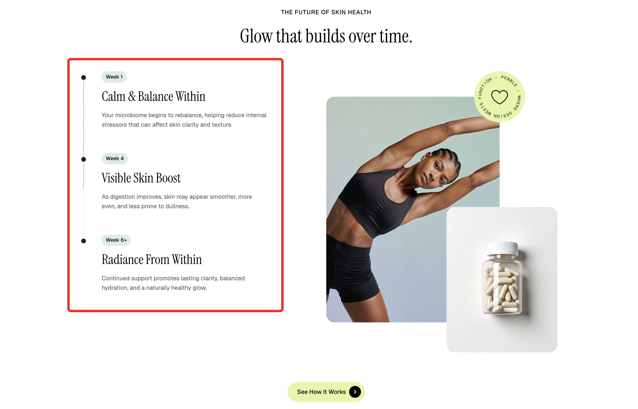
Displays a timeline item with customizable spacing and a badge to highlight key milestones or steps.
| Setting | Description |
| --- | --- |
| **Content row gap** | Adjust the spacing between timeline content elements. |
| **Badge text** | Set the label displayed inside the timeline badge. |
| **Badge color** | Choose the text color of the badge. |
| **Badge background color** | Set the background color of the badge. |
* **Heading** – Add a main title
* **Subheading** – Provide supporting text above or below the heading
* **Text** – Include additional descriptions or details
📝 Learn more: [Basic](https://docs.foxecom.com/pebble-theme/theme-blocks/basic#text)