# Product highlight points
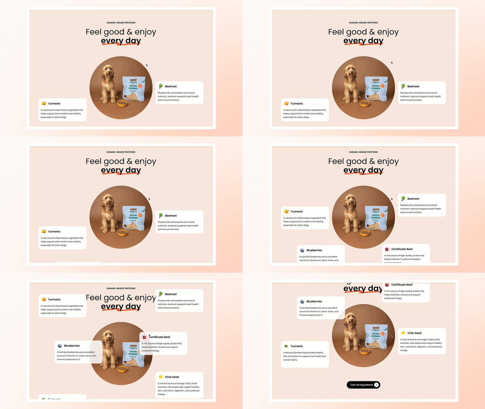
Highlight key product benefits with engaging visuals and brief descriptions, helping customers quickly understand what sets your product apart.
## How to add a Product highlight points section to your Shopify store
1. In the theme editor **(Customize)**, click **Add section.**
2. Select **Product highlight points** section.
3. Make necessary changes.
4. **Save.**
## How to customize a Product highlight points section
[Common settings available in most sections](https://docs.foxecom.com/pebble-theme/theme-sections/overview#common-settings-available-in-most-sections)
### Block settings
The Product highlight points section consists of 3 main blocks: **Header**, **Product highlight point**, and **Button**.
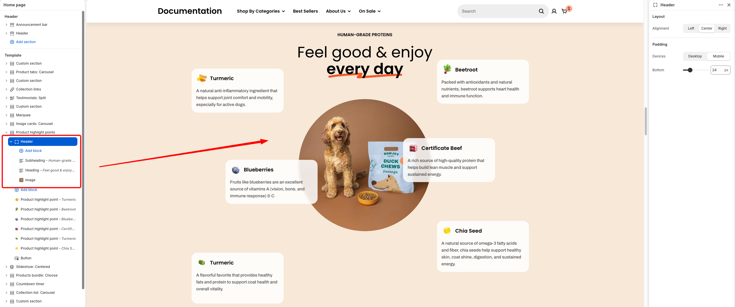
Use the **Header** block to create and customize the section’s heading and introductory content.
| Setting | Description |
| --- | --- |
| **Alignment** | Set the header alignment: left, center, or right. |
| **Devices** | Switch between desktop and mobile padding settings. |
| **Bottom** | Adjust the spacing below the header. |
* **Heading** – Add a main title
* **Subheading** – Provide supporting text above or below the heading
* **Text** – Include additional descriptions or details
* **Image** – Display an image or icon
* **Button** – Add a call-to-action
Learn more: [Basic](https://docs.foxecom.com/pebble-theme/theme-blocks/basic)
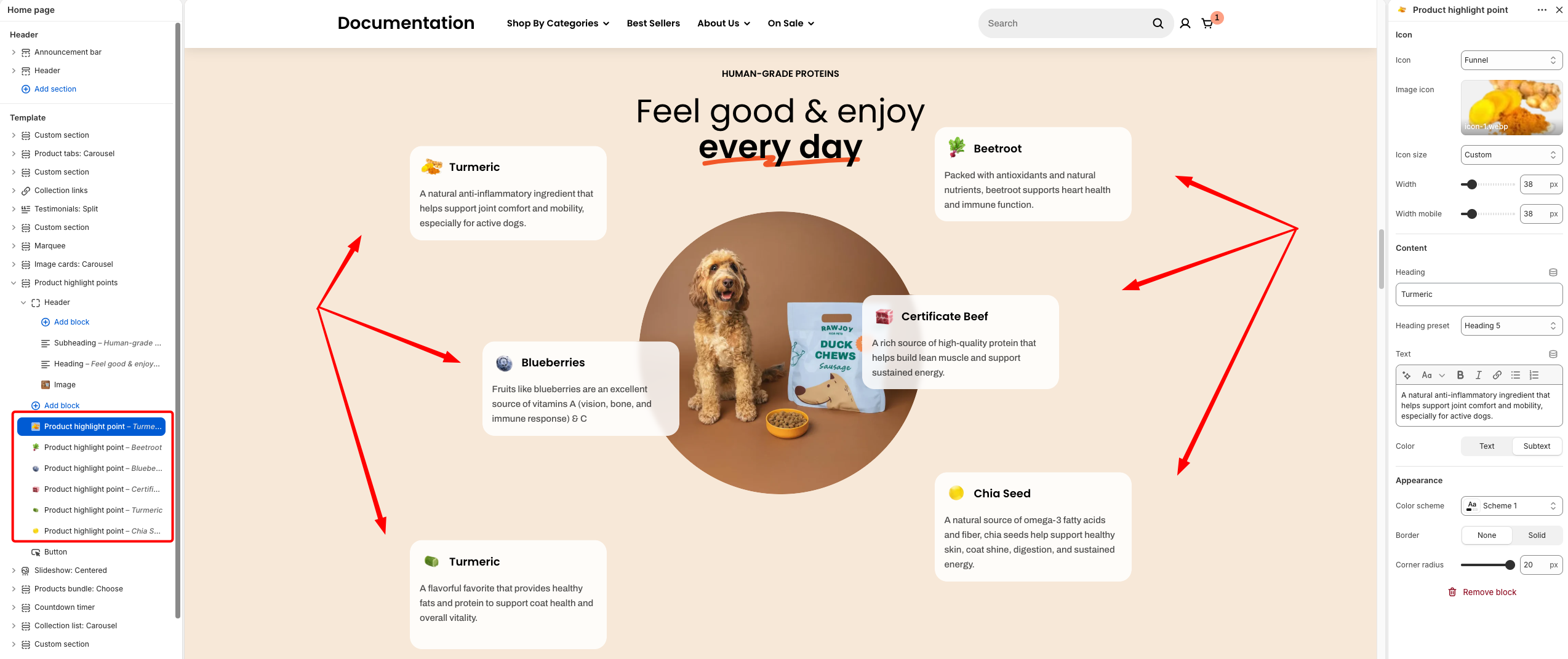
Add individual highlight points with icons, headings, and descriptions to showcase key product benefits in a visually engaging layout.
| Setting | Setting |
| --- | --- |
| **Icon** | Choose an icon to visually represent the highlight point. |
| **Image icon** | Upload a custom image to replace the default icon. |
| **Icon size** | Select a predefined or custom size for the icon. |
| **Width** | Adjust the icon width on desktop devices. |
| **Width mobile** | Adjust the icon width on mobile devices. |
| **Heading** | Enter the title for the highlight point. |
| **Heading preset** | Select the heading style (e.g., H1–H6) to control size and hierarchy. |
| **Text** | Add a short description or supporting content. |
| **Color** | Choose the text color style (e.g., primary or subtext). |
| **Color scheme** | Select a color scheme for the highlight card. |
| **Border** | Enable or disable a border around the card. |
| **Corner radius** | Adjust the roundness of the card corners. |
**Tip**: Use images as icons to make your highlights look nicer and stand out more.
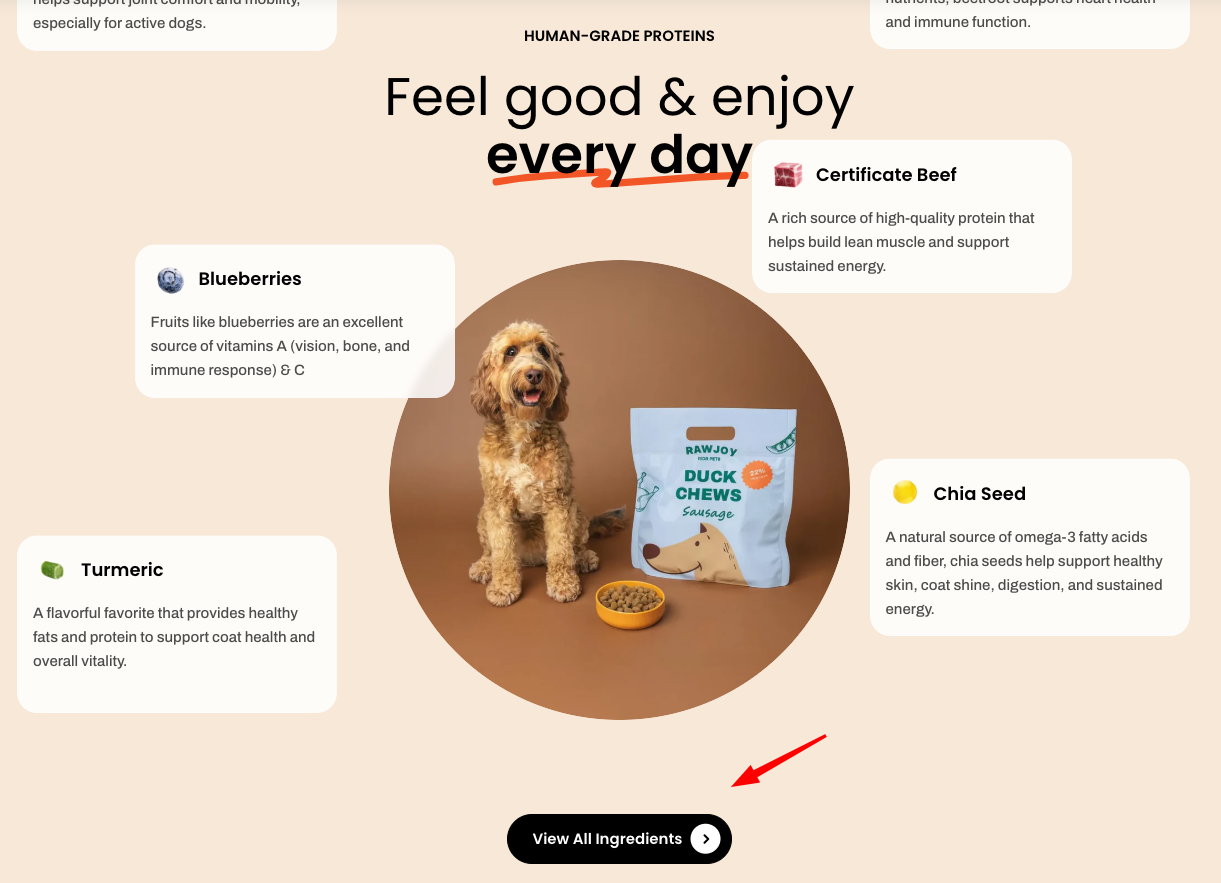
Learn more: [Basic](https://docs.foxecom.com/pebble-theme/theme-blocks/basic#button)