
Theme Sections
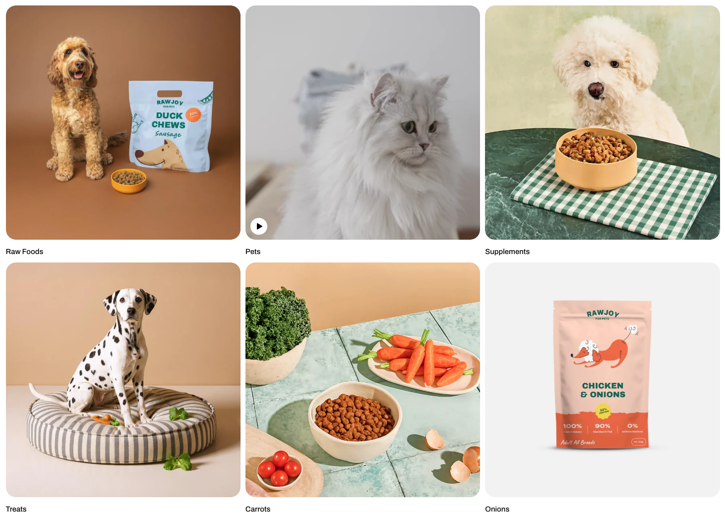
Media gallery
2 min read
_W9asWSiL.jpg)
How to add a Media gallery section to your Shopify store
- In the theme editor (Customize), click Add section.
- Select Media gallery section.
- Make necessary changes.
- Save.
How to customize a Media gallery section
Section settings
Layout
| Setting | Description |
|---|---|
| Container | Choose the layout width of the section (full width or fixed width). |
| Type | Select how media items are displayed (grid or carousel). |
| Columns | Set the number of columns shown in the grid layout. |
| Horizontal gap | Adjust the spacing between items horizontally. |
| Vertical gap | Adjust the spacing between items vertically. |
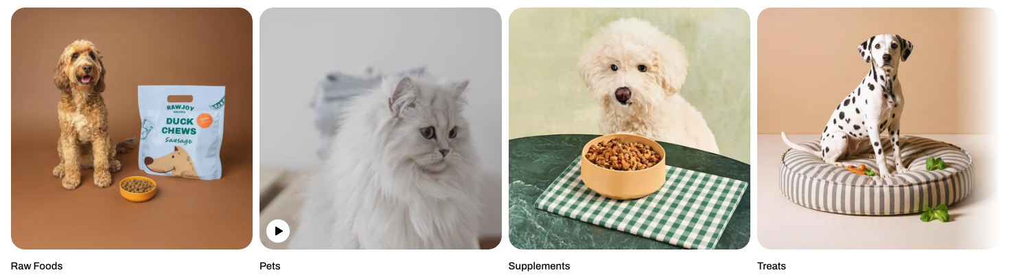
Mobile layout
| Setting | Description |
|---|---|
| Enable swipe on mobile | Allow users to swipe through items on mobile devices. |
| Custom column width | Enable custom sizing for columns instead of equal widths. |
| Mobile columns | Choose the number of columns displayed on mobile devices. |
| Mobile horizontal gap | Adjust spacing between items horizontally on mobile. |
_lQPVsb5w.jpg)
_sVUYfKGE.jpg)
_jLrsmgwe.jpg)
Check out other section settings: Common settings available in most sections
Block settings
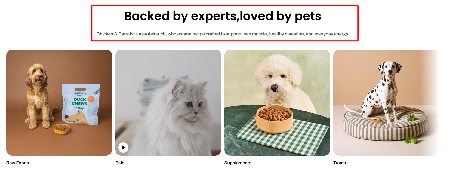
| Setting | Description |
|---|---|
| Alignment | Set the header alignment: left, center, or right. |
| Devices | Switch between desktop and mobile padding settings. |
| Bottom | Adjust the spacing below the header. |
📦 Nested dynamic blocks
- Heading – Add a main title
- Subheading – Provide supporting text above or below the heading
- Text – Include additional descriptions or details
- Image – Display an image or icon
- Button – Add a call-to-action
📝 Learn more: Basic
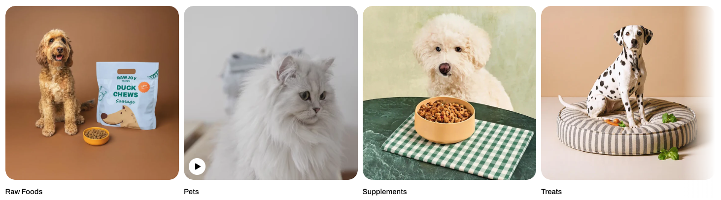
| Setting | Description |
|---|---|
| Type | Select the media type to display (image or video). |
| Image | Upload or choose the image shown in the gallery item. |
| Heading | Add a title or label displayed with the gallery item. |
| Preset | Choose the text style for the heading. |
| Corner radius | Adjust the roundness of the gallery item corners. |
Last updated