
Theme Sections
Icon boxes
2 min read
_YHYd39P2.jpg)
How to add an Icon boxes section to your Shopify store
- In the theme editor (Customize), click Add section.
- Select Icon boxes section.
- Make necessary changes.
- Save.
How to customize an Icon boxes section
Section settings
Layout
| Setting | Description |
|---|---|
| Type | Choose how icon boxes are displayed. |
| Columns | Set the number of columns displayed in the grid. |
| Column gap | Adjust the spacing between columns. |
| Row gap (Grid only) | Adjust the spacing between row. |
Mobile layout
| Setting | Description |
|---|---|
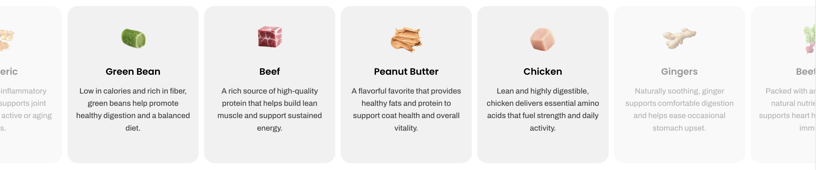
| Enable swipe on mobile | Allow users to swipe through items on mobile devices. |
| Custom column width | Enable custom width for columns instead of equal sizing. |
| Mobile columns | Select how many columns appear on mobile. |
| Horizontal gap | Adjust the spacing between items horizontally on mobile. |
_MiRc0HNe.jpg)
_YV5IjZjL.jpg)
_dSnQYiUn.jpg)
Check out other Icon boxes section settings: Common settings available in most sections
Block settings
| Setting | Description |
|---|---|
| Alignment | Set the header alignment: left, center, or right. |
| Devices | Switch between desktop and mobile padding settings. |
| Bottom | Adjust the spacing below the header. |
📦 Nested dynamic blocks
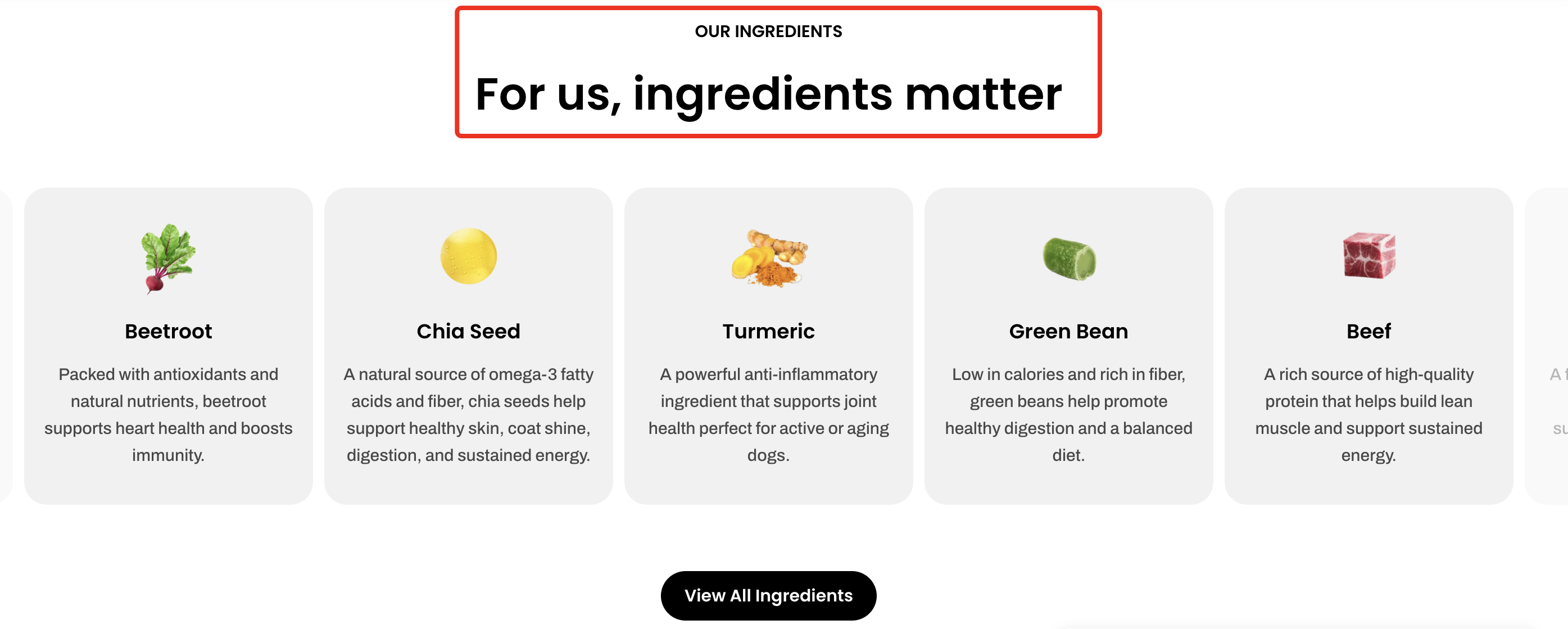
- Heading – Add a main title
- Subheading – Provide supporting text above or below the heading
- Text – Include additional descriptions or details
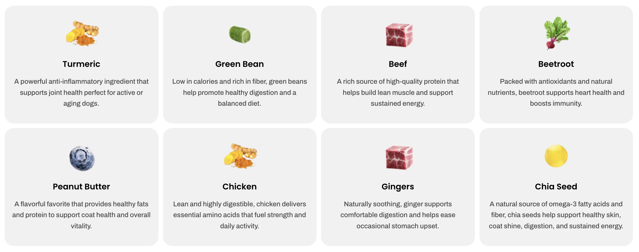
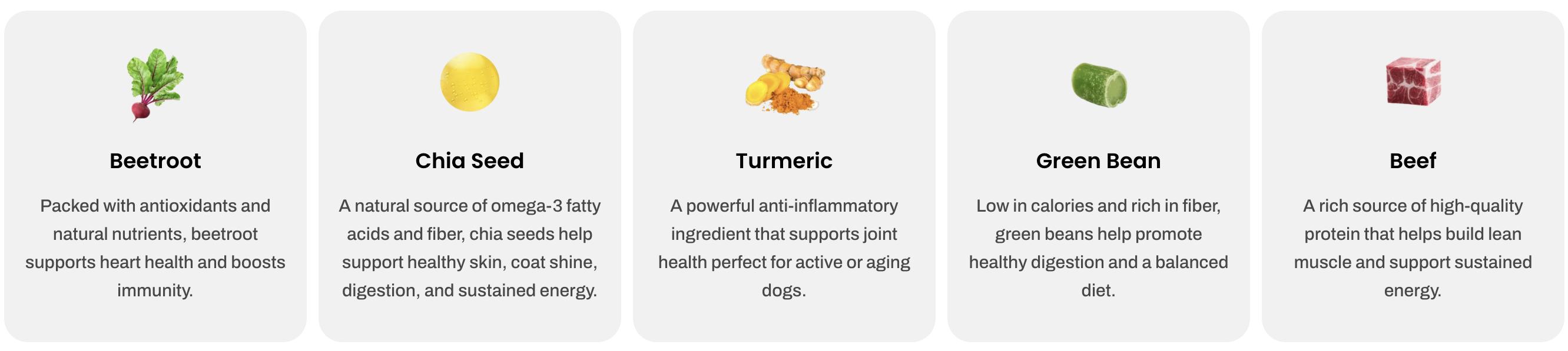
- Image – Display an image or icon
- Button – Add a call-to-action
📝 Learn more: Basic
📝 Learn more: Basic
_6G24f0bG.jpg)
| Setting | Description |
|---|---|
| Heading | Set the title displayed at the top of the quick view pop up. |
| Button | Customize the text shown on the action button. |
| Button style | Choose the visual style of the button. |
| Button size | Adjust the size of the button. |
| Button icon | Add or remove an icon displayed alongside the button label. |
| Enable button full width on mobile | Make the button stretch to full width on mobile devices for better usability. |
Last updated