# Collection list: Circle thumbnail
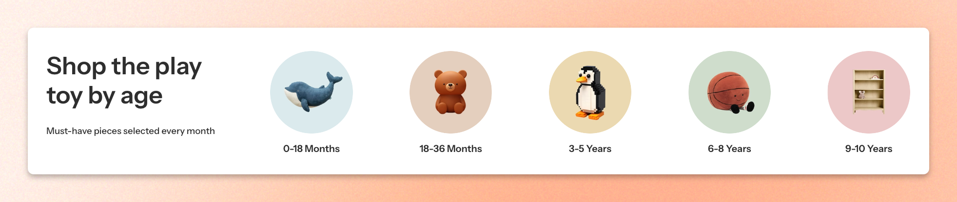
Showcase your product collections with eye-catching circular thumbnails. Create a clean, visually appealing layout that helps customers quickly explore collections and find their favorite products.
## How to customize a Collection list: Circle thumbnail section
1. Open the page where you want to display the section.
2. Click **Add section** and select **Collection list: Circle thumbnail**.
3. Configure the section layout, alignment, spacing, and appearance.
4. Customize the Header block to add headings and supporting content.
5. Add and customize Collection card blocks to display your desired collections.
6. Adjust the mobile layout and padding for smaller screens.
7. Click **Save**.
## Section settings
### Layout
| Setting | Description | Options |
| ---------------------- | ------------------------------------------------------------- | -------------------------------------------------------------------------------------------------------- |
| **Container** | Sets the width of the section container. | **Full** or **Fixed**. |
| **Direction** | Determines how the section content is arranged. | **Vertical** or **Horizontal**. |
| **Vertical on mobile** | Displays the section content vertically on mobile devices. | On or Off.
*Available when **Direction** is set to **Horizontal**.* |
| **Alignment** | Controls the alignment of the section content. | **Left**, **Center**, or **Right**. |
| **Position** | Sets the vertical position of the content within the section. | **Top**, **Center**, or **Bottom**.
*Available when **Direction** is set to **Horizontal**.* |
| **Horizontal gap** | Adjusts the horizontal spacing between content elements. | **0–100px**. |
| **Vertical gap** | Adjusts the vertical spacing between content elements. | **0–100px**. |
Choose **Vertical** to display the section header above the collections, or **Horizontal** to position the header beside the collection thumbnails.
Enable **Vertical on mobile** to stack the content vertically on smaller screens.
### Mobile layout
| Setting | Description | Options |
| ------------------ | ------------------------------------------------------------------ | ------------ |
| **Horizontal gap** | Adjusts the horizontal spacing between content elements on mobile. | **0–100px.** |
| **Vertical gap** | Adjusts the vertical spacing between content elements on mobile. | **0–100px**. |
### Appearance
| Setting | Description | Options |
| --------------------------------- | ---------------------------------------------------------------- | -------------------------------------------------------------------------- |
| **Use color scheme in container** | Applies the selected color scheme within the section container. | **On or Off.** |
| **Color scheme** | Adjusts the vertical spacing between content elements on mobile. | Available theme color schemes. |
| **Border** | Controls whether a border appears around the section. | **None** or **Solid**. |
| **Border width** | Adjusts the thickness of the section border. | **0–10px.**
*Available when **Border** is set to **Solid**.* |
| **Border opacity** | Controls the transparency of the section border. | **0 – 100%.**
*Available when **Border** is set to **Solid**.* |
| **Corner radius** | Adjusts the roundness of the section's corners. | **0–32px.** |
### Padding
| Settings | Description | Options |
| ----------- | ------------------------------------------------------------------------- | :------------------------- |
| **Devices** | Selects which device-specific padding values you are editing. | **Desktop** or **Mobile**. |
| **Top** | Controls the space above the section content. | **0–100px**. |
| **Bottom** | Controls the space below the section content. | **0–100px**. |
| **Left** | Controls the space between the content and the left edge of the section. | **0–100px**. |
| **Right** | Controls the space between the content and the right edge of the section. | **0–100px**. |
## Blocks
The **Collection list: Circle thumbnail** section uses content blocks to display collections in a customizable layout.
By default, the section includes three blocks:
* **Section header** — Displays introductory content above or beside the collection thumbnails.
* **Grid** — Organizes collection cards into a structured layout.
* **Collection card** — Displays a collection with a circular thumbnail and title.
You can also add other supported theme blocks to create more customized layouts.
Each block can be added, removed, and reordered independently. The section's layout settings determine how the blocks are arranged, while each block has its own content and customization options.
For detailed settings and customization options, see the documentation for each individual block:
Theme blocks
## FAQs
**How do I add more collections to the section?**
Open the **Grid** block within the Collection list: Circle thumbnail section. Click **Add block** and select **Collection card**. Choose the collection you want to display and repeat to add more collections.
**Can I display the section header beside the collection thumbnails?**
Yes. Under **Layout**, set **Direction** to **Horizontal**. This places the section header beside the collection grid. You can also adjust Alignment, Position, and spacing to refine the layout.
**Why are some collection thumbnails cropped differently?**
Circular thumbnails crop images to fit within a round frame. Images with different aspect ratios or subjects positioned near the edges may appear uneven when displayed together.
Use square images with the main subject centered and sufficient space around it to reduce unwanted cropping.