
Theme Sections
Collection links: Background
3 min read
_4WgSzSHN.jpg)
How to add a Collection links: Background section to your Shopify store
- In the theme editor (Customize), click Add section.
- Select Collection links: Background section.
- Make necessary changes.
- Save.
How to customize a Collection links: Background section
Section settings
✨ Check out other Collection links: Background section settings: Common settings available in most sections
Block settings
| Setting | Description |
|---|---|
| Alignment | Set the header alignment: left, center, or right. |
| Devices | Switch between desktop and mobile padding settings. |
| Bottom | Adjust the spacing below the header. |
📦 Nested dynamic blocks
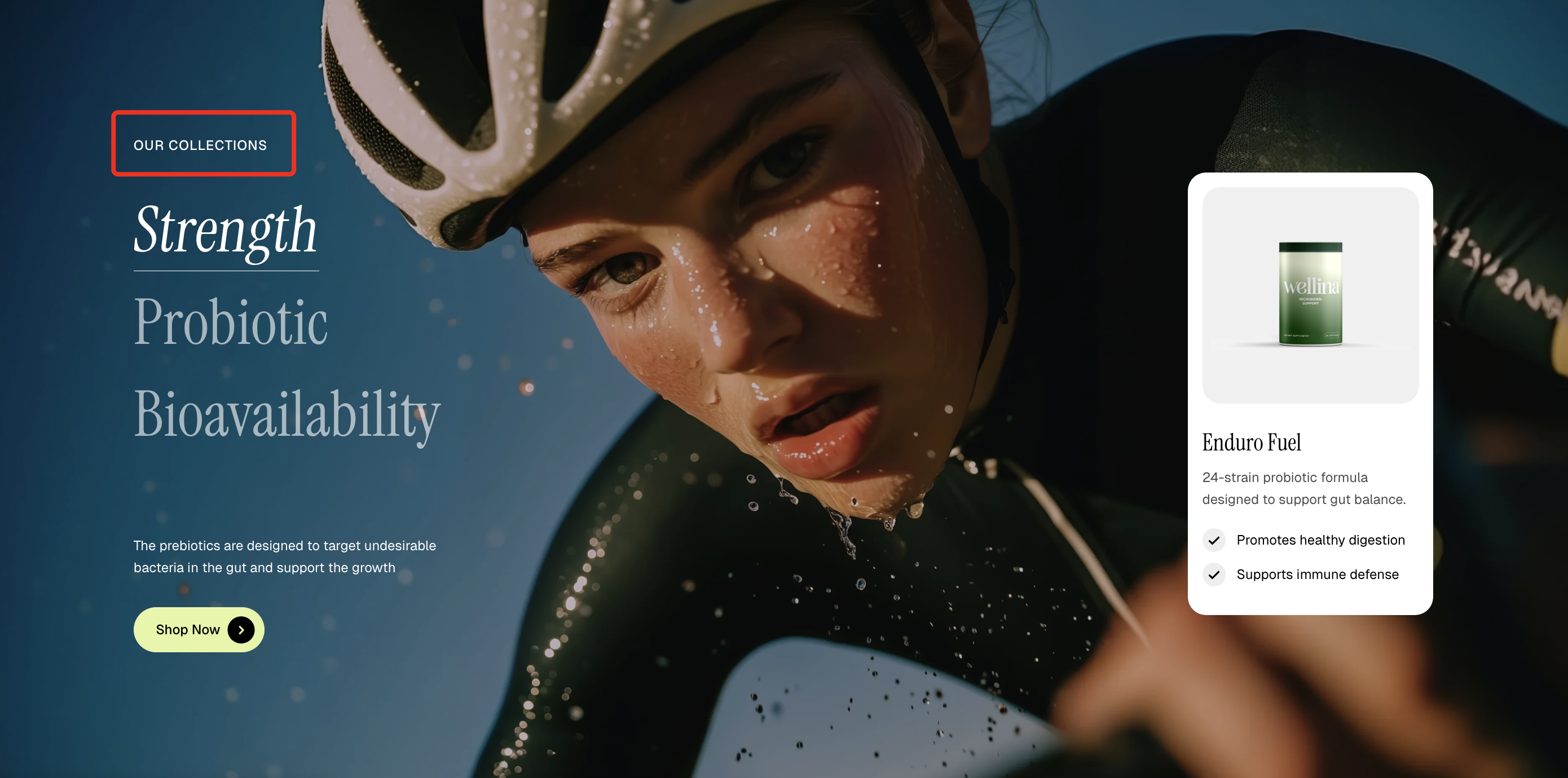
- Heading – Add a main title
- Subheading – Provide supporting text above or below the heading
- Text – Include additional descriptions or details
- Image – Display an image or icon
- Button – Add a call-to-action
📝 Learn more: Basic
| Setting | Description |
|---|---|
| Collection | Select the collection to display in this block. |
| Background image | Upload a custom background image for the collection. |
| Background image mobile | Set a separate background image optimized for mobile devices. |
| Media overlay | Enable or disable an overlay on top of the background image. |
| Overlay color | Choose the color and opacity of the image overlay. |
| Collection title – Text | Enter a custom title or leave blank to use the collection’s default name. |
| Description | Add a custom description or leave blank to use the collection’s description. |
📦 Nested dynamic blocks
_KF1yFjup.jpg)
📦 Nested dynamic blocks
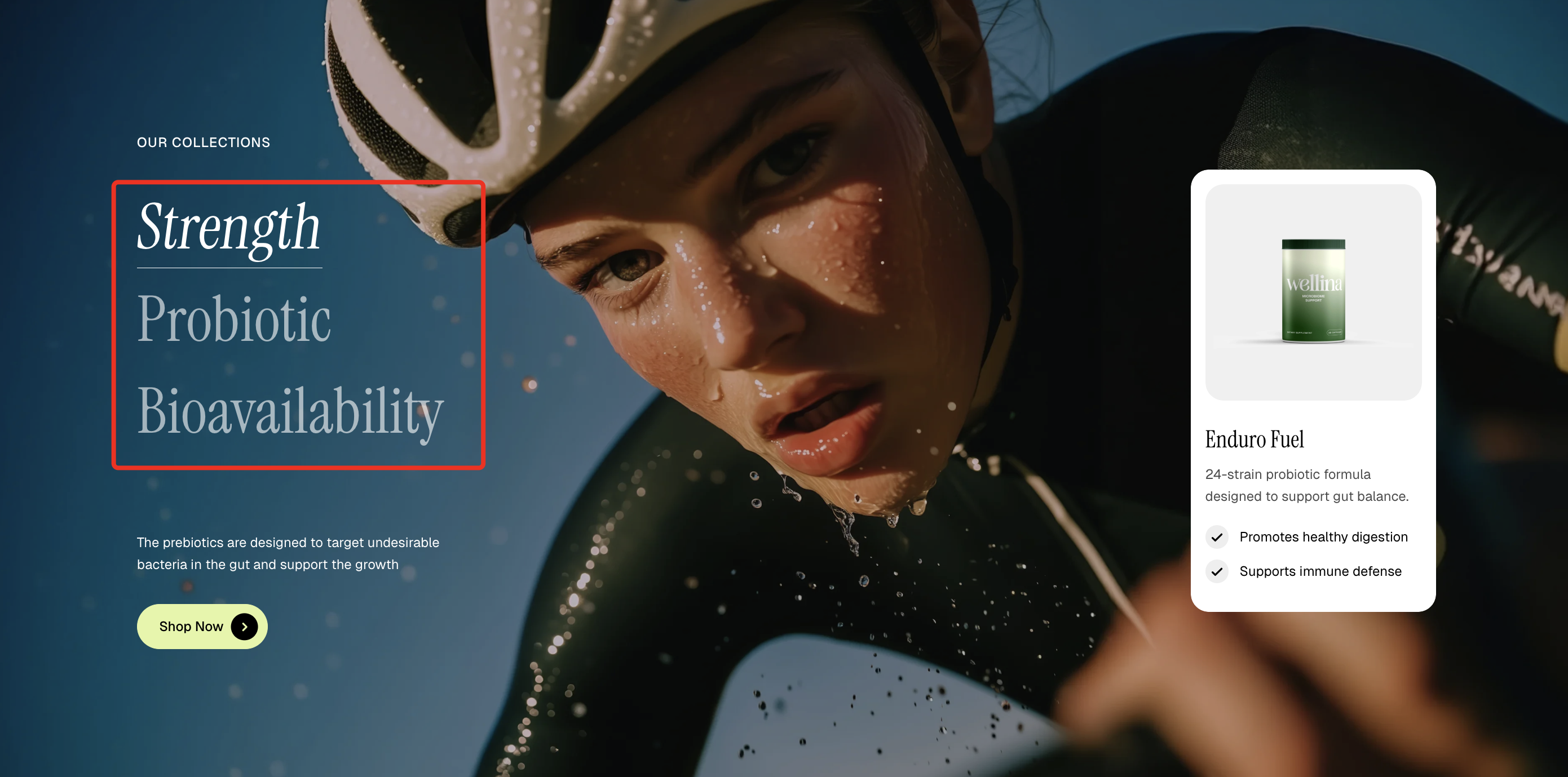
- Heading – Add a main title
- Subheading – Provide supporting text above or below the heading
- Product title – Display the name of the selected product
- Text – Add supporting product details or description
- Icon list – Highlight key features with icons
- Button – Add a call-to-action for the product
📝 Learn more: Basic
Last updated