# Text
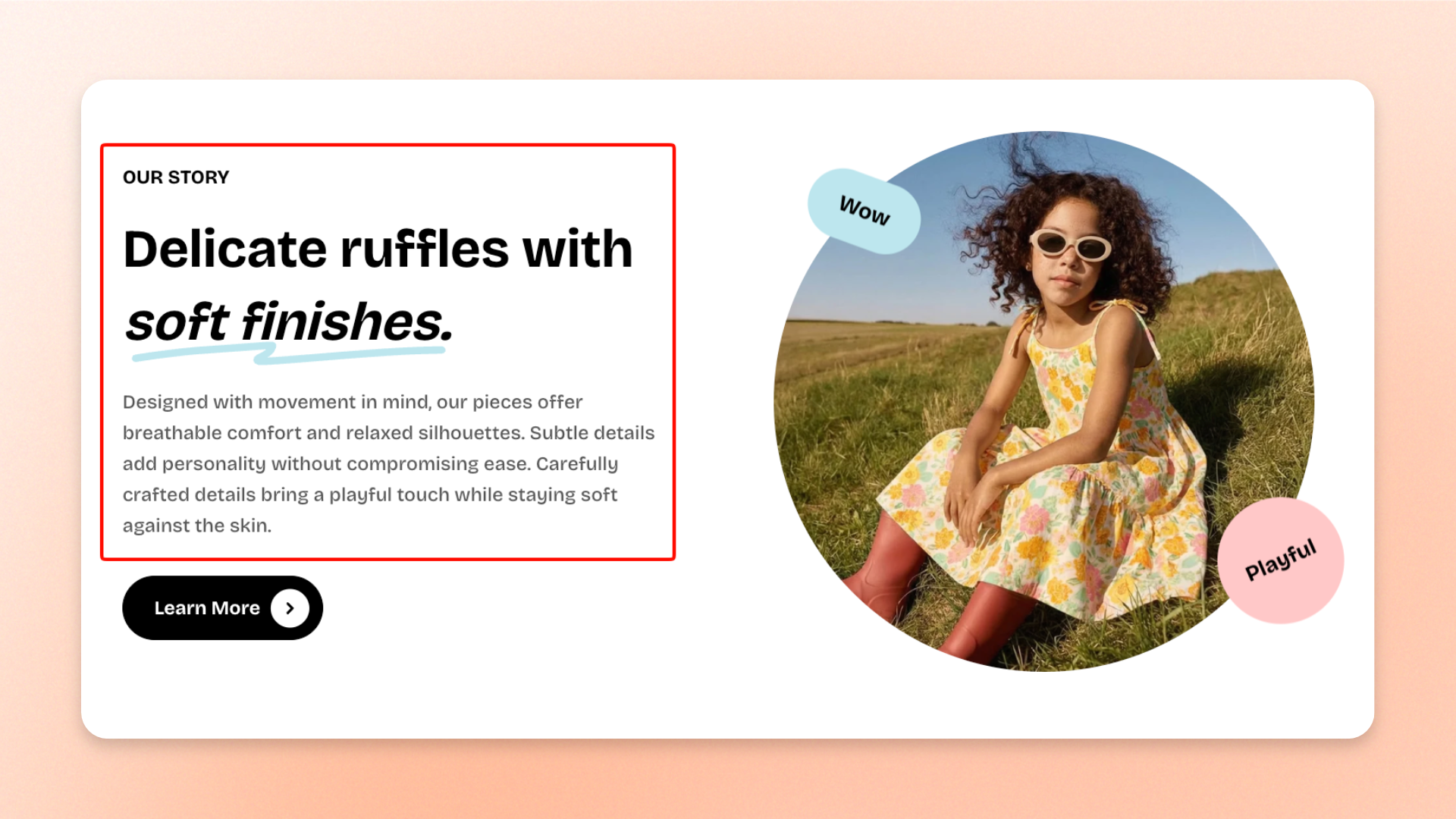
The **Text** block lets you add rich text content such as **headings, descriptions, taglines, announcements, product information, or supporting copy** inside a section.
You can format content directly in the text editor, highlight selected words or phrases, control typography and layout, adjust spacing, and add entrance animations.
## Settings
### Text
| Setting | Description | Options |
| ------------------------- | ----------------------------------------------------------- | --------------------------------------------------------------------------------------------------------------------- |
| **Text** | Sets the rich-text content displayed in the block. | Enter and format custom text. |
| **Highlight style** | Controls how italicized text is highlighted. | **None, Standard, Wavy underline, or Solid background** |
| **Highlight font style** | Controls whether highlighted text keeps its italic styling. | **Italic** or **Normal**
*Available when **Highlight style** is not set to **None**.* |
| **Highlight shape color** | Sets the color of the highlight shape. | Select a color.
*Available when **Highlight style** is set to **Wavy underline** or **Solid background**.* |
| **Highlight text color** | Sets the color of highlighted text. | Select a color.
*Available when **Highlight style** is not set to **None**.* |
To add a highlight, select the text you want to emphasize and click the **I** button in the text editor. Then choose a **Highlight style**.
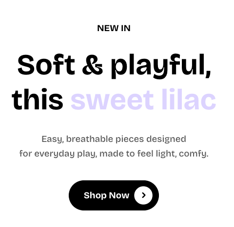
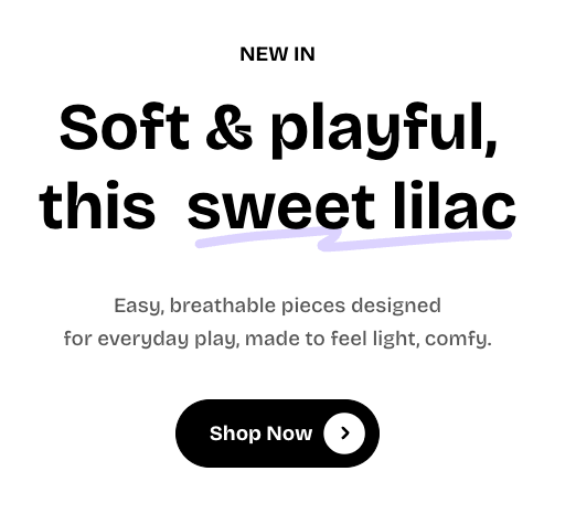
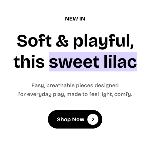
For details on highlight styles, font styling, shape colors, and text colors, see the [**Highlight text documentation**](https://docs.foxecom.com/pebble-theme/global-settings/highlight-text).
### Typography
Controls the appearance of the text.
| Setting | Description | Options |
| -------------------------------- | -------------------------------------------------------------------------- | ---------------------------------------------------------------------------------------------------------------------------------------- |
| **Preset** | Sets the overall typography style. | **Default, Paragraph, Subheading, Heading 1–6, or Custom** |
| **Font** | Selects which theme font is used. | **Body** or **Heading**.
*Available when **Preset** is set to **Custom**.* |
| **Font weight** | Controls how light or bold the text appears. | **Inherit, Light, Regular, Medium, Semi bold, Bold, Extra bold, or Black**.
*Available when **Preset** is set to **Custom**.* |
| **Font size** | Sets the text size on desktop. | **12–100px**.
*Available when **Preset** is set to **Custom**.* |
| **Font size mobile** | Sets the text size on mobile devices. | **12–60px**.
*Available when **Preset** is set to **Custom**.* |
| **Line height** | Controls the spacing between lines of text. | **Tight, Normal,** or **Loose**.
*Available when **Preset** is set to **Custom**.* |
| **Color** | Sets the text color. | **Text, Subtext,** or **Gradient** |
| **Gradient color** | Sets the gradient used for the text. | Select a gradient color.
*Available when **Color** is set to **Gradient**.* |
| **Disable line break on mobile** | Prevents manual line breaks from forcing separate lines on mobile devices. | **On** or **Off** |
### Layout
Controls how the Text block uses the available horizontal space on desktop and mobile.
| Setting | Description | Options |
| -------------------- | ------------------------------------------------------------- | ----------------------------------------------------------------------------------------------- |
| **Width** | Controls how much horizontal space the block uses on desktop. | **Fit** or **Fill** |
| **Alignment** | Controls the text alignment on desktop. | **Left, Center,** or **Right**
*Available when **Width** is set to **Fill**.* |
| **Width mobile** | Controls how much horizontal space the block uses on mobile. | **Fit** or **Fill** |
| **Alignment mobile** | Controls the text alignment on mobile. | **Left, Center,** or **Right**
*Available when **Width mobile** is set to **Fill**.* |
### Padding
Controls the space around the Text block. Padding can be adjusted separately for each side.
| Setting | Description | Options |
| ---------------- | ---------------------------------------------------------------------- | ---------------------------------------------------------------------------- |
| **Top** | Sets the space above the text. | **0–100px** |
| **Bottom** | Sets the space below the text. | **0–100px** |
| **Left** | Sets the space on the left side of the text. | **0–100px** |
| **Right** | Sets the space on the right side of the text. | **0–100px** |
| **Mobile scale** | Adjusts all padding values on mobile relative to their desktop values. | **20–100%**: Select the percentage of the desktop padding to keep on mobile. |
### Animation
Controls how the Text block appears when it enters the viewport.
| Setting | Description | Options |
| -------------- | -------------------------------------------------- | --------------------------------------------------------------------------- |
| **Type** | Sets the entrance animation applied to the block. | **None, Fade in, Fade up, Fade down, Slide in (left), or Slide in (right)** |
| **Delay (ms)** | Sets how long to wait before the animation begins. | **0–2000ms**
*Available when **Type** is not set to **None**.* |
## Tips and best practices
* Use **Highlight style** only for short words or phrases that need extra emphasis.
* Use a predefined **Preset** for consistent typography. Choose **Custom** only when you need more control over font styling.
* Use **Fit** when the block should only take up the space its content needs, and **Fill** when it should use the available width.
* Turn on **Disable line break on mobile** when desktop line breaks make the text feel cramped on smaller screens.
* Keep animation delays short when several blocks appear together so the content feels smooth and connected.