# Section header
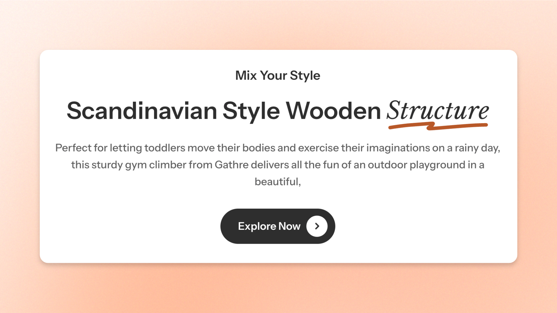
The **Section header** block is a prebuilt **Group** block designed to organize headings, descriptions, and buttons at the top of a section. Use it to introduce **section content, provide supporting information, or add a call-to-action**.
The block includes two presets:
* **Section header: Horizontal**: Includes a **Heading** and **Button**, arranged in a horizontal layout.
* **Section header: Vertical**: Includes a **Subheading**, **Heading**, and **Text**, arranged in a vertical layout.
Both presets use the same settings as the **Group** block. You can customize the layout, spacing, alignment, and appearance, as well as add, remove, or rearrange nested blocks to suit your needs.
## Settings
The **Section header** block uses the same settings as the standalone **Group** block.
For details about layout, alignment, spacing, size, and appearance settings, see the [**Group block documentation**](https://docs.foxecom.com/pebble-theme/theme-blocks/group).
## Section header – items
The Section header presets include the following nested blocks by default:
| Preset | Default blocks |
| ------------------------------ | ------------------------- |
| **Section header: Horizontal** | Heading, Button |
| **Section header: Vertical** | Subheading, Heading, Text |
These blocks can be customized, removed, or rearranged. You can also add other supported blocks to create a different section header layout.
For individual block settings, see the [**Heading**/**Subheading/Text**](https://docs.foxecom.com/pebble-theme/theme-blocks/text), and [**Button**](https://docs.foxecom.com/pebble-theme/theme-blocks/button) block documentation.
## Tips and best practices
* Use **Section header: Horizontal** when you want to place a heading alongside a button, such as "Shop all" or "View collection."
* Use **Section header: Vertical** when your section needs a subheading, main heading, and short supporting description.
* Keep headings concise and supporting text brief so shoppers can quickly understand what the section contains.
* Check the mobile layout and adjust alignment or spacing when longer headings or buttons make the header feel crowded.