# Product overlay card
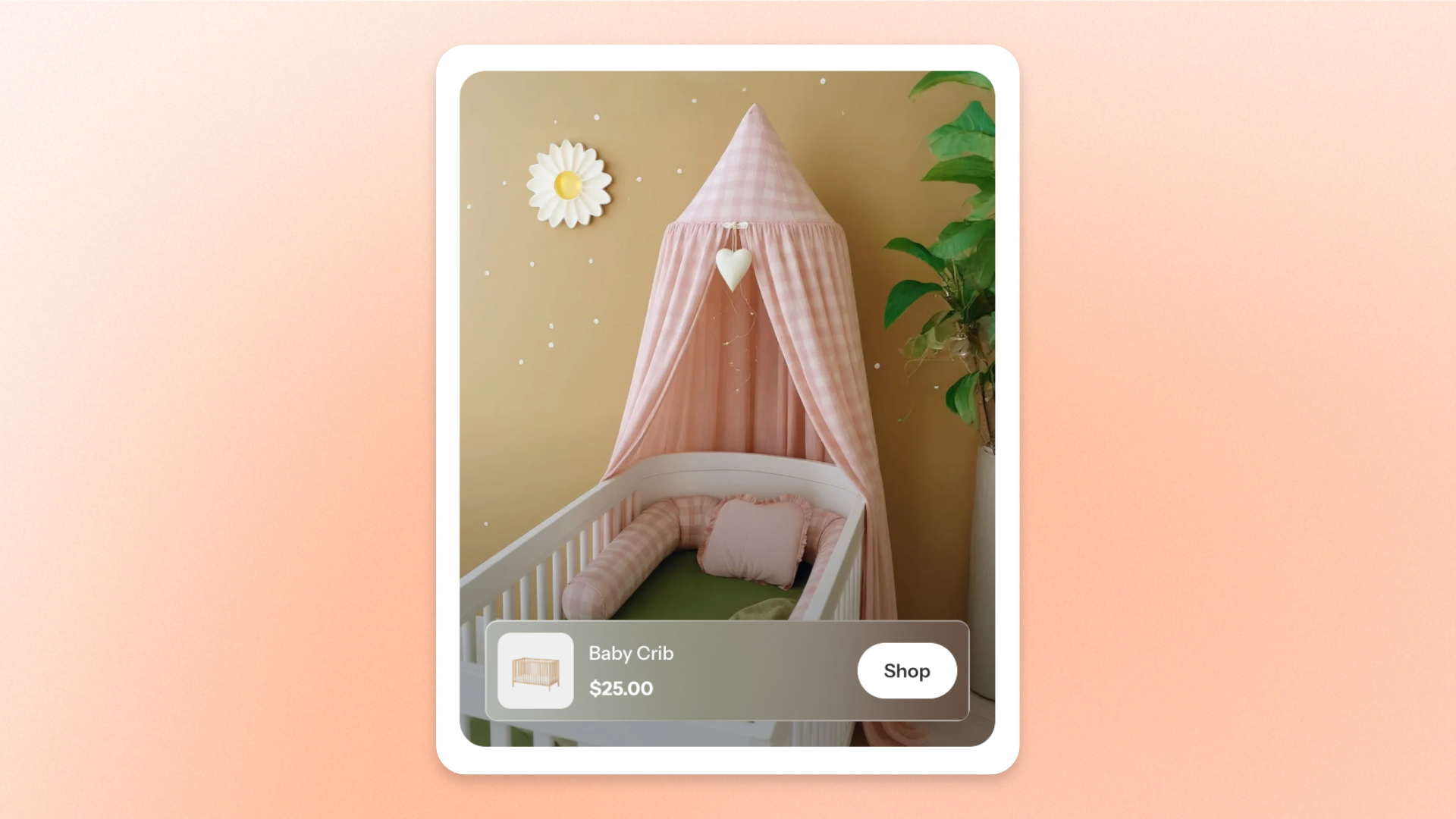
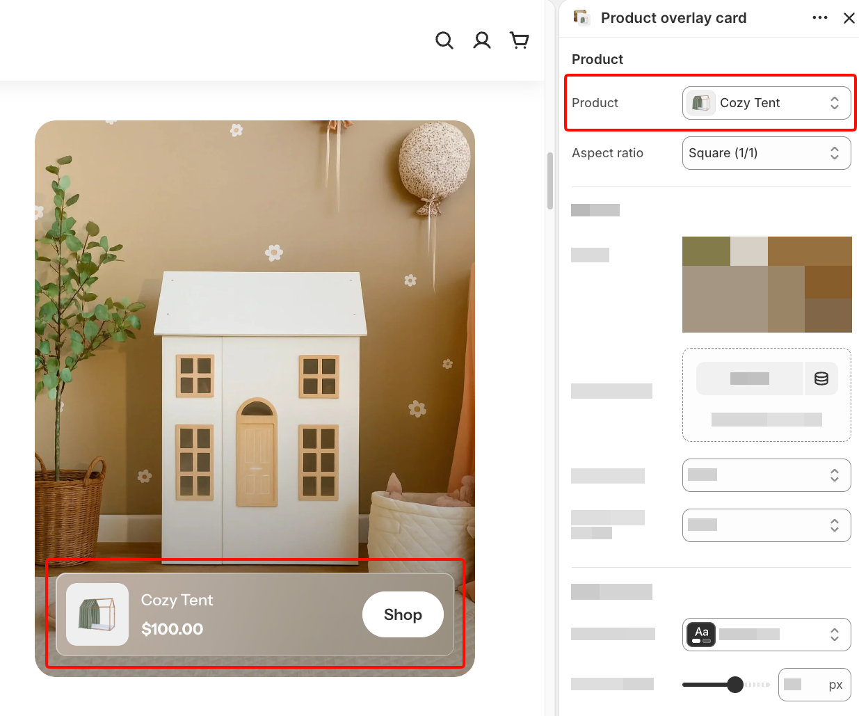
The **Product overlay card** block displays a featured Shopify product over a large banner image, with the product thumbnail, name, price, and shopping button in an overlay panel.
Use it to showcase **featured products, seasonal picks, or promotional items** while keeping the product information and shopping action easily accessible.
## Settings
### Product
Controls the product displayed in the card and its image proportions.
| Setting | Description | Options |
| ---------------- | ----------------------------------------------- | ------------------------------------------------------------------------------------------------------------------------------------------------------------------------- |
| **Product** | Sets the Shopify product displayed in the card. | Select a product from your Shopify store. |
| **Aspect ratio** | Controls the product thumbnail proportions. | **Auto**: Uses the image's original proportions.
**Square (1/1), Portrait (4/5), Portrait (3/4), Landscape (16/9), Landscape (4/3),** or **Landscape (21/9).** |
### Banner
Controls the banner images displayed on desktop and mobile devices and their proportions.
| Setting | Description | Options |
| ----------------------- | -------------------------------------------------------- | ------------------------------------------------------------------------------------------------------------------------------------------------------------------------- |
| **Image** | Sets the banner image displayed on desktop. | Select or upload an image. |
| **Image mobile** | Sets a separate banner image for mobile devices. | Select or upload an image.
*If left empty, the desktop image is used on mobile.* |
| **Aspect ratio** | Controls the banner image proportions on desktop. | **Auto**: Uses the image's original proportions.
**Square (1/1), Portrait (4/5), Portrait (3/4), Landscape (16/9), Landscape (4/3),** or **Landscape (21/9).** |
| **Aspect ratio mobile** | Controls the banner image proportions on mobile devices. | **Auto, Square (1/1), Portrait (4/5), Portrait (3/4), Landscape (16/9), Landscape (4/3),** or **Landscape (21/9).** |
### Appearance
Controls the card's color scheme and corner styling.
| Setting | Description | Options |
| ----------------- | ------------------------------------------------------------ | ---------------------------- |
| **Color scheme** | Sets the color scheme used by the product information panel. | Select a theme color scheme. |
| **Corner radius** | Controls how rounded the card corners are. | **0–32px.** |
### Advanced
Controls how the banner image is loaded when the page opens.
| Setting | Description | Options |
| ------------------------ | ---------------------------------------------------------------------------- | ------------------ |
| **Enable preload image** | Loads the banner image earlier to help it appear faster when the page loads. | **On** or **Off**. |
Use **Enable preload image** only when the **Product overlay card** is visible as soon as the page loads. Avoid enabling it for cards farther down the page, as unnecessary preloading can compete with more important images and slow down the initial page load.
## Tips and best practices
* Choose a **Banner image** that showcases the product or its real-life use, with a clear focal point that won't be obscured by the product information panel.
* Use **Image mobile** and **Aspect ratio mobile** to keep the banner's main subject visible on smaller screens.
* Choose a **Color scheme** that provides enough contrast between the product information panel, text, and shopping button.