# Product card
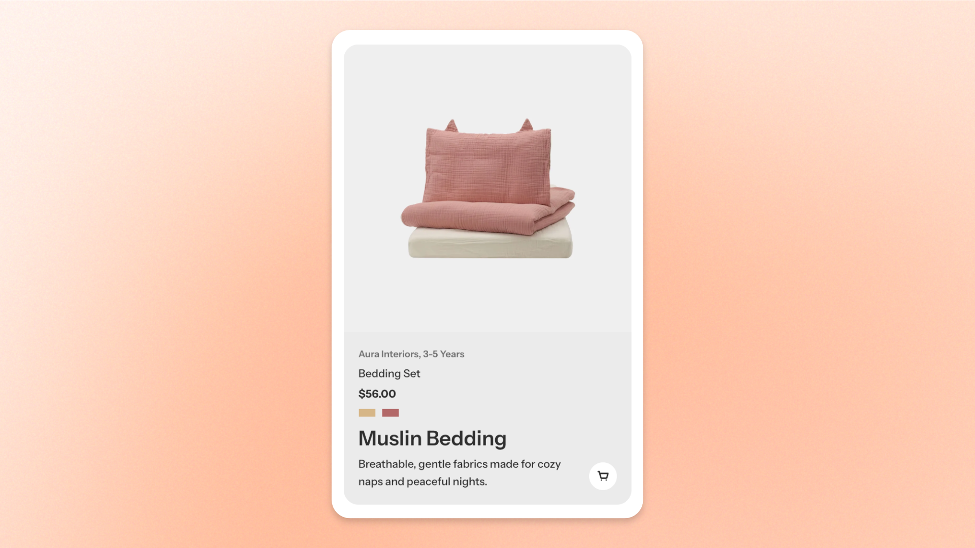
The **Product card** block displays a selected Shopify product with optional supporting text. Use it to highlight **featured products, promote specific items, or showcase product recommendations** within a page.
You can select a product and add headings, subheadings, or text to provide additional information.
## Settings
| Setting | Description | Options |
| ----------- | ----------------------------------------------- | ----------------------------------------- |
| **Product** | Sets the Shopify product displayed in the card. | Select a product from your Shopify store. |
To customize the product card's appearance and styling, go to **Theme settings > Product cards**. See the [**Product cards documentation**](https://docs.foxecom.com/pebble-theme/theme-settings/product-cards) for details.
## Product card – items
The **Product card** block supports three optional nested blocks: **Heading**, **Subheading**, and **Text**.
Each serves a different purpose:
* **Heading**: Displays the main heading or message related to the product.
* **Subheading**: Displays a short introductory line or supporting message.
* **Text**: Displays additional information, such as product benefits, features, or promotional details.
You can add, customize, remove, or reorder these blocks as needed.
### Heading, Subheading, and Text
These blocks support text formatting and styling to customize the content displayed within the **Product card**.
For detailed configuration instructions, see the [**Text block documentation**](https://docs.foxecom.com/pebble-theme/theme-blocks/text).
## Tips and best practices
* Select products that are relevant to the surrounding content, such as featured items, bestsellers, or complementary products.
* Use **Heading**, **Subheading**, or **Text** to highlight key product benefits or selling points. Avoid repeating information already displayed in the product card.