# Marquee
The **Marquee** block displays continuously scrolling content in a horizontal layout. Use it to highlight **promotional messages, store benefits, featured products, collections, brand announcements,** or other content you want shoppers to notice.
The block includes two presets:
* **Marquee: Lookbook cards**: Displays scrolling lookbook cards with product images and associated products, ideal for showcasing curated looks and shoppable collections.
* **Marquee: Icon with text**: Displays scrolling icons paired with short messages, such as shipping benefits, special offers, or store announcements.
Both presets support customizable scrolling direction, speed, rotation, hover behavior, spacing, colors, and padding.
## Settings
### General
Controls the marquee's scrolling behavior and visual effects.
| Setting | Description | Options |
| ------------------- | -------------------------------------------------------------------------------------------------------------------------------- | --------------------------- |
| **Direction** | Controls the direction in which the marquee content scrolls. | **Forward** or **Reverse**. |
| **Speed** | Controls how fast the marquee content scrolls. | **0.1–3x.** |
| **Rotate** | Controls the rotation angle of the marquee. | **-5° to 5°.** |
| **Pause on hover** | Pauses the scrolling animation when shoppers hover over the marquee, giving them more time to view or interact with its content. | **On** or **Off**. |
| **Show edge fade** | Gradually fades the marquee content near its edges for a smoother visual transition. | **On** or **Off**. |
| **Enable parallax** | Adds a parallax effect to the marquee as shoppers scroll through the page. | **On** or **Off**. |
### Layout
Controls the spacing between items in the marquee.
| Setting | Description | Options |
| --------------------- | ------------------------------------------------------------------ | ------------ |
| **Column gap** | Sets the horizontal space between marquee items on desktop. | **0–100px.** |
| **Column gap mobile** | Sets the horizontal space between marquee items on mobile devices. | **0–100px.** |
### Appearance
Controls the marquee's color scheme and corner styling.
| Setting | Description | Options |
| ----------------- | ----------------------------------------------- | ---------------------------- |
| **Color scheme** | Sets the color scheme used by the marquee. | Select a theme color scheme. |
| **Corner radius** | Controls how rounded the marquee's corners are. | **0–32px.** |
### Padding
Controls the vertical spacing around the marquee content.
| Setting | Description | Options |
| ---------- | ----------------------------------------- | ------------ |
| **Top** | Sets the space above the marquee content. | **0–100px.** |
| **Bottom** | Sets the space below the marquee content. | **0–100px.** |
## Marquee – items
The **Marquee** block supports different nested blocks, allowing you to combine scrolling text, images, icons, and product-focused content.
Available blocks include:
* [**Button**](https://docs.foxecom.com/pebble-theme/theme-blocks/button): Displays a clickable button that directs shoppers to another page or destination.
* **Gallery item**: Displays an image or video with optional text and a link.
* [**Heading**](https://docs.foxecom.com/pebble-theme/theme-blocks/text): Displays a prominent title or message.
* [**Icon**](https://docs.foxecom.com/pebble-theme/theme-blocks/icon): Displays a theme icon or custom image icon.
* [**Icon with text**](#icon-with-text): Combines an icon with supporting text.
* [**Image**](https://docs.foxecom.com/pebble-theme/theme-blocks/image): Displays an image inside the marquee.
* [**Subheading**](https://docs.foxecom.com/pebble-theme/theme-blocks/text): Displays a short introductory or supporting message.
* [**Text**](https://docs.foxecom.com/pebble-theme/theme-blocks/text): Displays customizable text content.
* [**Lookbook card**](#lookbook-card): Displays an image with a heading and associated products.
* [**Separator**](#separator): Adds a dot or line to separate marquee items.
The **Button**, **Heading**, **Subheading**, **Text**, **Image**, and **Icon** blocks use their existing standalone settings. See their respective block documentation for configuration details.
Blocks with additional or different settings in **Marquee** are documented below.
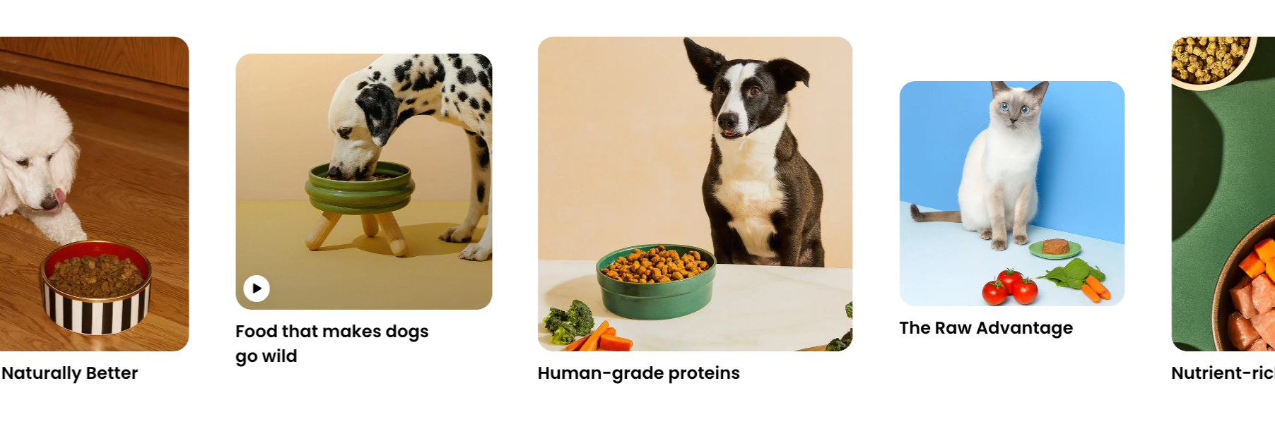
### Gallery item
The **Gallery item** block displays an image or video with an optional heading and link. Use it to showcase **products, promotional visuals, or other media** within the scrolling marquee.
#### Gallery item - Media
Controls the media displayed in the gallery item.
| Setting | Description | Options |
| --------------- | ----------------------------------------------------- | ------------------------------------------------------------------------------------ |
| **Type** | Selects the media type displayed in the gallery item. | **Image** or **Video**. |
| **Image** | Sets the image displayed in the gallery item. | Select or upload an image.
*Available when **Type** is set to **Image**.* |
| **Video** | Sets the video displayed in the gallery item. | Select a video.
*Available when **Type** is set to **Video**.* |
| **Cover image** | Sets the cover image displayed for the video. | Select or upload an image.
*Available when **Type** is set to **Video**.* |
#### Gallery item - Content
Controls the gallery item's link and heading.
| Setting | Description | Options |
| ----------- | ---------------------------------------------------------- | ------------------------------------------------- |
| **Link** | Sets the destination when shoppers click the gallery item. | Select or enter a link. |
| **Heading** | Sets the text displayed in the gallery item. | Enter custom text. Supports rich-text formatting. |
| **Preset** | Sets the typography style of the heading. | **Paragraph, Subheading,** or **Heading 1–6.** |
| **Color** | Sets the heading's text color style. | **Text** or **Subtext**. |
#### Gallery item - Size
Controls the gallery item's width across different devices.
| Setting | Description | Options |
| ---------------- | ---------------------------------------------- | -------------- |
| **Width** | Sets the gallery item width on desktop. | **150–500px.** |
| **Width tablet** | Sets the gallery item width on tablet devices. | **150–500px.** |
| **Width mobile** | Sets the gallery item width on mobile devices. | **150–500px.** |
#### Gallery item - Appearance
Controls the gallery item's corner styling.
| Setting | Description | Options |
| ----------------- | ---------------------------------------------------- | ----------- |
| **Corner radius** | Controls how rounded the gallery item's corners are. | **0–32px.** |
### Lookbook card
The **Lookbook card** block displays an image with a heading and associated products. Use it to showcase **curated looks, product combinations, or shoppable collections** within the scrolling marquee.
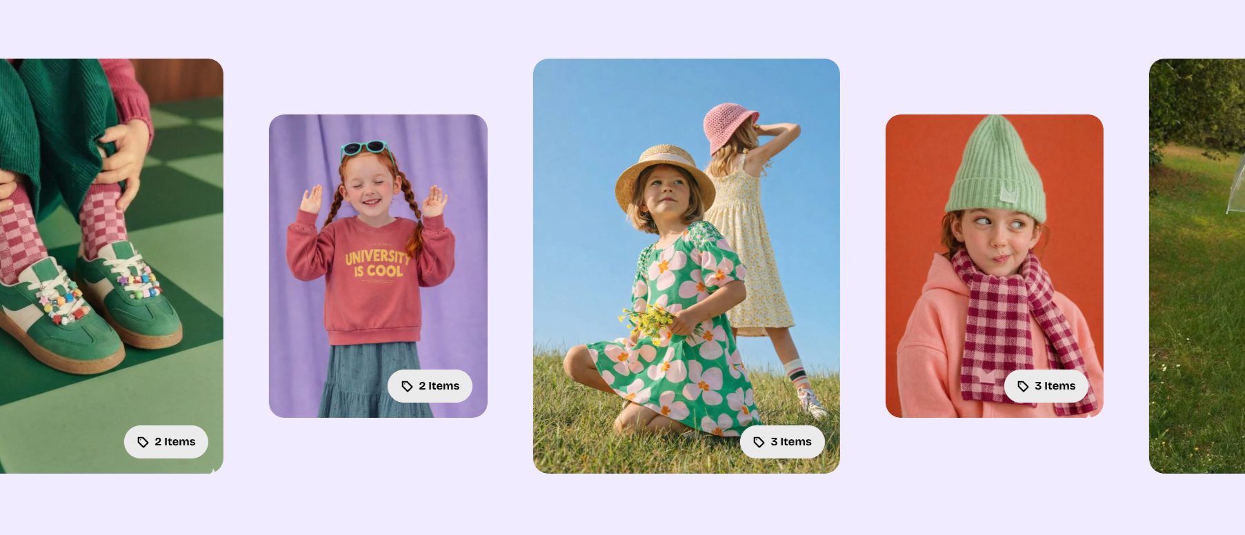
It uses the same settings as the standalone **Lookbook** card, with additional **Layout** options to control the card width.
#### Lookbook card - Layout
Controls the lookbook card width on desktop and mobile devices.
| Setting | Description | Options |
| ---------------- | ----------------------------------------------- | -------------- |
| **Width** | Sets the lookbook card width on desktop. | **200–500px.** |
| **Width mobile** | Sets the lookbook card width on mobile devices. | **200–500px.** |
For all other settings, including images, products, headings, and appearance, see the [**Lookbook card block documentation**](https://docs.foxecom.com/pebble-theme/theme-blocks/lookbook-card).
### Separator
The **Separator** block adds a visual divider between marquee items. Use it to distinguish **repeated promotional messages or separate different types of content**.
| Setting | Description | Options |
| --------- | ----------------------------------------- | -------------------- |
| **Style** | Controls the appearance of the separator. | **Dot** or **Line**. |


### Icon with text
The **Icon with text** block combines an icon with supporting text in a single marquee item. Use it to display short messages such as **free shipping, easy returns, special offers**, or other store benefits.


It includes two nested blocks:
* **Icon**: Displays a theme icon or custom image icon.
* **Text**: Displays a short message alongside the icon.
#### Icon with text - Layout
Controls the horizontal spacing between the icon and text.
| Setting | Description | Options |
| --------------------- | ---------------------------------------------------------------------- | ------------ |
| **Column gap** | Sets the horizontal space between the icon and text on desktop. | **0–100px.** |
| **Column gap mobile** | Sets the horizontal space between the icon and text on mobile devices. | **0–100px.** |
#### Icon block
The **Icon** nested block displays a theme icon or custom image icon alongside the text.
| Setting | Description | Options |
| ---------------- | ---------------------------------------- | ----------------------------------------------------------------------------------- |
| **Icon** | Selects the icon displayed in the block. | Select a theme icon. |
| **Image icon** | Sets a custom image to use as the icon. | Select or upload an image.
*If provided, it replaces the selected Icon.* |
| **Icon size** | Controls the size of the icon. | **Extra small, Small, Medium, Large, Extra large,** or **Custom.** |
| **Width** | Sets the icon width on desktop. | **12–200px.**
*Available when **Icon size** is set to **Custom**.* |
| **Width mobile** | Sets the icon width on mobile devices. | **12–200px.**
*Available when **Icon size** is set to **Custom**.* |
#### Text block
The **Text** nested block displays supporting text alongside the icon.
It shares most settings with the standalone **Text** block but does not include **Layout, Left/Right padding, Gradient text color,** or **Disable line break on mobile**.
For all other settings, including rich-text formatting, text highlighting, typography, padding, and animations, see the [**Text block documentation**](https://docs.foxecom.com/pebble-theme/theme-blocks/text).
## Tips and best practices
* Keep scrolling messages short so shoppers can read them easily while the marquee is moving.
* Use a slower **Speed** for **Lookbook cards** or longer messages, and enable **Pause on hover** when items contain clickable links or buttons.
* Adjust **Column gap mobile** and item widths to keep content properly spaced and visible on smaller screens.
* Use **Rotate** and **Enable parallax** sparingly to avoid distracting shoppers from the main page content.
* Use optimized images and videos in **Gallery items** and **Lookbook cards** to help maintain page loading performance.