# Lookbook card
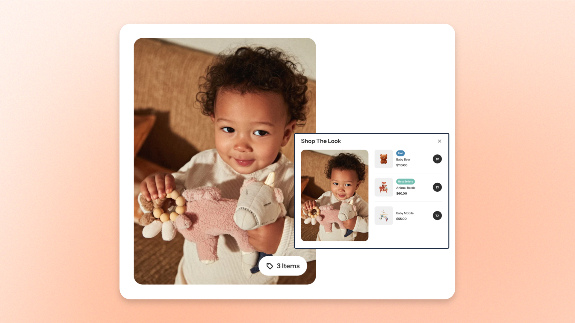
The **Lookbook card** block combines a lifestyle image with up to 3 shoppable products, allowing shoppers to explore and purchase items featured in a look. Use it to showcase **outfit combinations, beauty routines, home décor setups, or curated product collections**.
Shoppers can click the product indicator on the image to open a product popup, where they can view product details and add items to their cart. On mobile devices, the product list opens in a bottom panel for easier browsing.
## Settings
### Content
Controls the images, products, and heading displayed in the Lookbook card.
| Setting | Description | Options |
| ------------------ | ------------------------------------------------------------------------------ | ------------------------------------------------------------------ |
| **Image** | Sets the main image displayed in the Lookbook card. | Select an image from the Shopify file library or upload a new one. |
| **Image mobile** | Sets a separate image for mobile devices. | Select an image from the Shopify file library or upload a new one. |
| **Image ratio** | Controls the shape and proportions of the Lookbook image. | **Adapt to image**: Uses the image's original proportions.
|
| **Products** | Selects the products shoppers can explore and purchase from the Lookbook card. | Select up to **3 products** from your Shopify store. |
| **Heading** | Sets the heading displayed in the product popup. | Enter and format text using the rich text editor. |
| **Heading preset** | Controls the heading's typography style. | **Heading 1–6.** |
### Appearance
Controls the color scheme and corner rounding of the Lookbook card.
| Setting | Description | Options |
| ----------------- | ------------------------------------------------------- | ---------------------------- |
| **Color scheme** | Sets the color scheme of the Lookbook card. | Select a theme color scheme. |
| **Corner radius** | Controls how rounded the Lookbook image corners appear. | **0–32px.** |
## Tips and best practices
* Use lifestyle images that clearly show how the selected products look or work together.
* Select products that are visible in the image so shoppers can easily identify them in the product popup.
* Upload a separate **Image mobile** when the desktop image's composition makes featured products difficult to see on smaller screens.
* Keep the **Heading** short and relevant to the featured products so shoppers immediately understand what they can explore, such as "Shop The Look" or "Get The Look".