# Locator
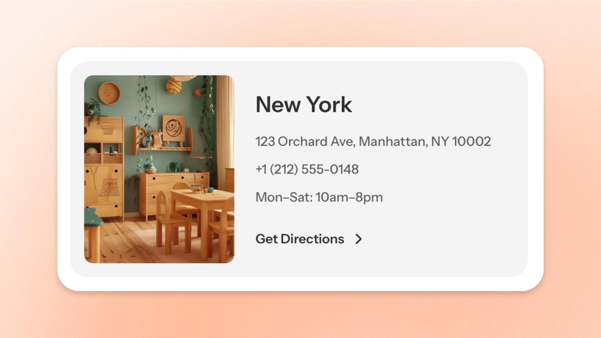
The **Locator** block displays store or business information in a customizable layout. Use it to showcase **store locations, contact details, or other information** that helps shoppers find and connect with your business.
## Settings
### Appearance
Controls the block's display style, color scheme, border, and corner styling.
| Setting | Description | Options |
| ------------------ | ---------------------------------------------------------- | ----------------------------------------------------------------------------------------------------------------------------------- |
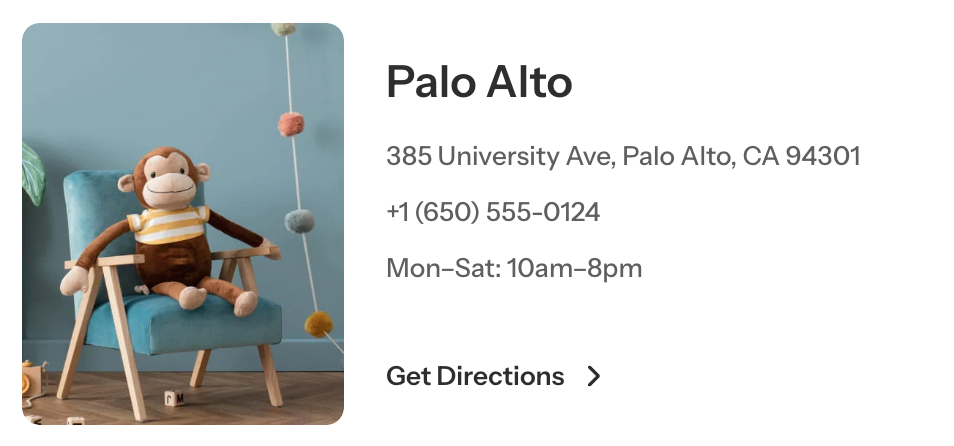
| **Style** | Controls how the Locator block is displayed. | **Standard**: Displays the content without an outer card background.
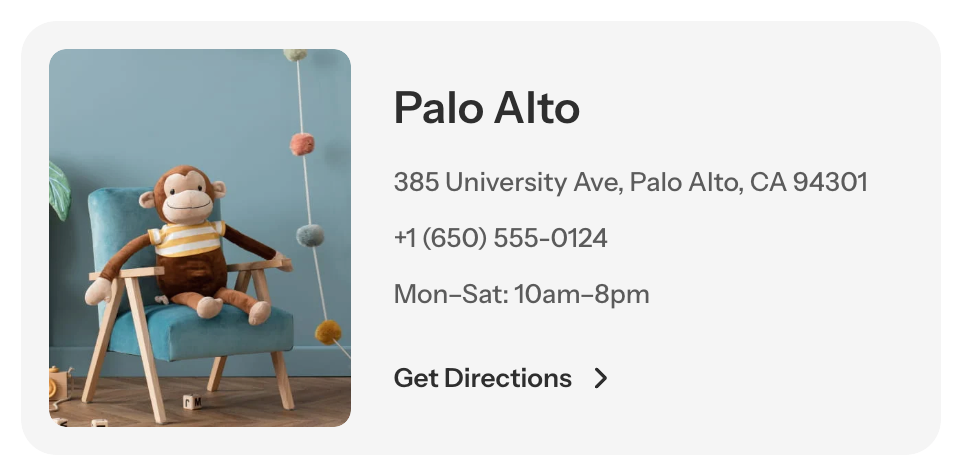
**Card**: Displays the content inside a styled card. |
| **Color scheme** | Sets the color scheme used by the card. | Select a theme color scheme.
*Available when **Style** is set to **Card**.* |
| **Border** | Controls whether the card has an outer border. | **None** or **Solid**.
*Available when **Style** is set to **Card**.* |
| **Border width** | Controls the thickness of the card border. | **0–10px.**
*Available when **Style** is set to **Card** and **Border** is set to **Solid**.* |
| **Border opacity** | Controls how solid or transparent the card border appears. | **0–100%.**
*Available when **Style** is set to **Card** and **Border** is set to **Solid**.* |
| **Corner radius** | Controls how rounded the card corners are. | **0–32px.**
*Available when **Style** is set to **Card**.* |
## Locator – items
The **Locator** block includes four built-in static blocks: **Image**, **Heading**, **Text**, and **Button**.
Each serves a different purpose within the block:
* **Image**: Displays an image, such as a storefront photo, store interior, or location visual.
* **Heading**: Displays the store name or a main heading.
* **Text**: Displays supporting information, such as an email address, physical address, or contact details.
* **Button**: Displays a call-to-action button that directs shoppers to another page or destination.
The **Image**, **Heading**, **Text**, and **Button** blocks are built into the **Locator** and cannot be removed or reordered. You can customize their settings and hide individual blocks when needed.
### Image
The **Image** block displays a visual inside the Locator. Use it to show your storefront, physical location, or another relevant image.
#### Image
Controls the images displayed on desktop and mobile devices, including the image overlay.
| Setting | Description | Options |
| ----------------- | -------------------------------------------------------- | -------------------------------------------------------------------------------------------- |
| **Image** | Sets the image displayed on desktop. | Select or upload an image. |
| **Image mobile** | Sets a separate image for mobile devices. | Select or upload an image.
*If left empty, the desktop image is used on mobile.* |
| **Media overlay** | Controls whether a color overlay appears over the image. | **On** or **Off**. |
| **Overlay color** | Sets the color of the image overlay. | Select a color.
*Available when **Media overlay** is turned **on**.* |
#### Size
Controls the image proportions on desktop and mobile devices.
| Setting | Description | Options |
| ----------------------- | ------------------------------------------------- | ------------------------------------------------------------------------------------------------------------------------------------------------------------------------ |
| **Aspect ratio** | Controls the image proportions on mobile devices. | **Auto**: Uses the image's original proportions.
**Square (1/1), Portrait (4/5), Portrait (3/4), Landscape (16/9), Landscape (4/3),** or **Landscape (21/9).** |
| **Aspect ratio mobile** | Sets a separate image for mobile devices. | **Auto, Square (1/1), Portrait (4/5), Portrait (3/4), Landscape (16/9), Landscape (4/3),** or **Landscape (21/9).** |
#### Borders
Controls the image border and corner styling.
| Setting | Description | Options |
| ------------------ | ----------------------------------------------------------- | --------------------------------------------------------------------- |
| **Border** | Controls whether the image has an outer border. | **None** or **Solid**. |
| **Border width** | Controls the thickness of the image border. | **0–10px.**
*Available when **Border** is set to **Solid**.* |
| **Border opacity** | Controls how solid or transparent the image border appears. | **0–100%.**
*Available when **Border** is set to **Solid**.* |
| **Corner radius** | Controls how rounded the image corners are. | **0–32px.** |
### Heading and Text
The **Heading** and **Text** blocks share the same settings for rich-text formatting, text highlighting, typography, padding, and animation.
Their settings are similar to the standalone **Text** block, but with fewer layout and styling controls.
Unlike the standalone **Text** block, these built-in blocks do not include **Layout**, **Left/Right padding**, **Gradient text color**, or **Disable line break on mobile** settings.
For all other settings, including rich-text formatting, highlight styles, typography, padding, and animations, see the [**Text block documentation**](https://docs.foxecom.com/pebble-theme/theme-blocks/text).
### Button
The **Button** block adds a call-to-action button to the Locator. Use it to direct shoppers to a store location page, contact page, map, or another relevant destination.
This built-in block uses the same settings as the standalone **Button** block.
For details on button text, links, styles, sizing, and other customization options, see the [**Button block documentation**](https://docs.foxecom.com/pebble-theme/theme-blocks/button).
## Tips and best practices
* Use a clear storefront or location image to help shoppers recognize your business.
* Keep the **Heading** focused on the store name and use **Text** for essential details, such as the address, email, or opening hours.
* Use a specific **Button** label, such as "Get Directions" or "Contact Store," and link it to the appropriate destination.
* Check the image and contact details on mobile to make sure everything is clearly visible and easy to read.