# Image with badges
The **Image with badges** block combines an image with customizable badges that highlight **product features, qualities, promotions, or other key messages**. Use it to draw attention to important details while keeping the main image as the visual focus.
The block includes two presets:
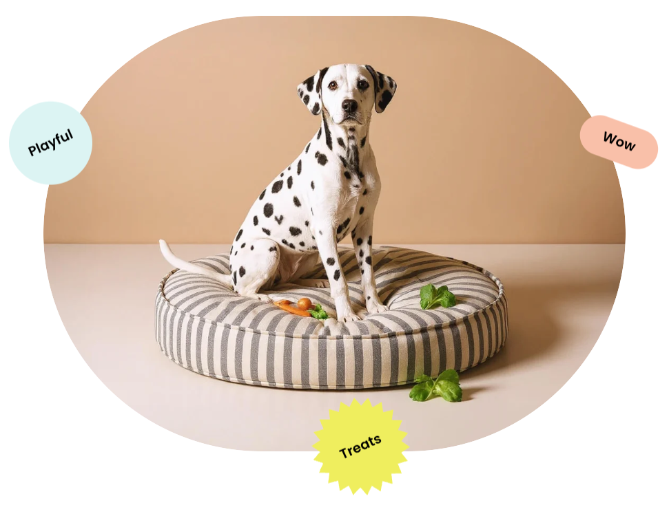
* **Image with badges: Circle**: Displays the image in a circular layout.
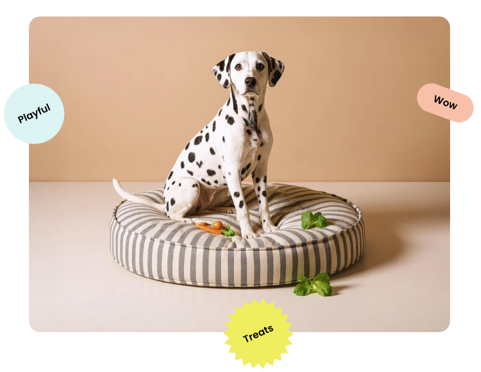
* **Image with badges: Rectangle**: Displays the image in a rectangular layout.
Both presets support separate desktop and mobile images, adjustable image proportions, border styling, and customizable badges.
## Settings
### Image
Controls the images displayed on desktop and mobile devices.
| Setting | Description | Options |
| ---------------- | ----------------------------------------- | -------------------------------------------------------------------------------------------- |
| **Image** | Sets the image displayed on desktop. | Select or upload an image. |
| **Image mobile** | Sets a separate image for mobile devices. | Select or upload an image.
*If left empty, the desktop image is used on mobile.* |
### Size
Controls the image proportions on desktop and mobile devices.
| Setting | Description | Options |
| ----------------------- | ------------------------------------------------- | -------------------------------------------------------------------------------------------------------------------------------------------------------------------------- |
| **Aspect ratio** | Controls the image proportions on desktop. | **Auto**: Uses the image's original proportions.
**Square (1/1), Portrait (4/5), Portrait (3/4), Landscape (16/9), Landscape (4/3),** or **Landscape (21/9).** |
| **Aspect ratio mobile** | Controls the image proportions on mobile devices. | **Auto, Square (1/1), Portrait (4/5), Portrait (3/4), Landscape (16/9), Landscape (4/3),** or **Landscape (21/9).** |
### Borders
Controls the image shape, border, and corner styling.
| Setting | Description | Options |
| ------------------ | ----------------------------------------------------------- | ---------------------------------------------------------------------------------------- |
| **Rounded image** | Controls whether the image is displayed in a rounded shape. | **On** or **Off**. |
| **Border** | Controls whether the image has an outer border. | **None** or **Solid**.
*Available when **Rounded image** is turned **off**.* |
| **Border width** | Controls the thickness of the image border. | **0–10px.**
*Available when **Border** is set to **Solid**.* |
| **Border opacity** | Controls how solid or transparent the image border appears. | **0–100%.**
*Available when **Border** is set to **Solid**.* |
| **Corner radius** | Controls how rounded the image corners are. | **0–32px.**
*Available when **Rounded image** is turned **off**.* |
Rounded image - ON
Rounded image - OFF
## Image with badges – items
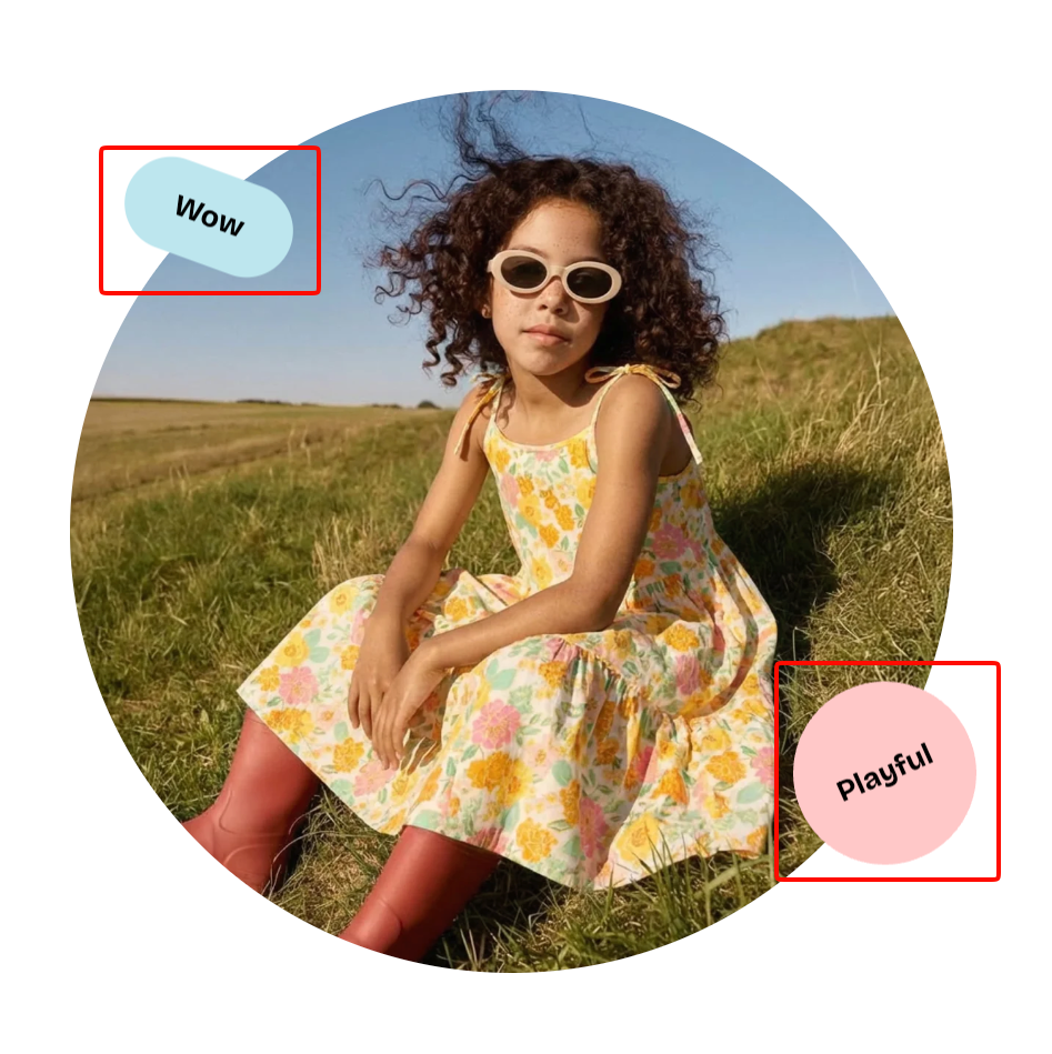
The Image with badges block supports **Badge** as a nested block. You can add multiple **Badge** blocks to display different labels or highlights around the image.
Each **Badge** block lets you customize its shape, text, colors, size, position, and animation.
### **Badge -** General
Controls the badge visibility and shape.
| Setting | Description | Options |
| -------------------- | ------------------------------------------------------- | --------------------------------------------------------------------------------------- |
| **Hidden on mobile** | Controls whether the badge is hidden on mobile devices. | **On** or **Off**. |
| **Shape** | Sets the overall shape of the badge. | **None, Petal star, Multi-point star, Circle, Scalloped circle,** or **Custom.** |
| **Image** | Sets a custom image to use as the badge shape. | Select or upload an image.
*Available when **Shape** is set to **Custom**.* |
### **Badge -** Subtext and Text
The **Subtext** and **Text** sections control the secondary and main text displayed inside the badge.
Both sections share the same settings for typography, font size, and color.
| Setting | Description | Options |
| -------------------- | -------------------------------------------- | --------------------------------------------------------------------------------------------------------------------------------------------- |
| **Text** | Sets the text displayed in the badge. | Enter custom text. |
| **Preset** | Sets the overall typography style. | **Paragraph, Subheading, Heading 1–6,** or **Custom.** |
| **Font** | Selects which theme font is used. | **Body** or **Heading**.
*Available when **Preset** is set to **Custom**.* |
| **Font weight** | Controls how light or bold the text appears. | **Inherit, Light, Regular, Medium, Semi bold, Bold, Extra bold,** or **Black.**
*Available when **Preset** is set to **Custom**.* |
| **Font size** | Sets the text size on desktop. | **12–100px.**
*Available when **Preset** is set to **Custom**.* |
| **Font size mobile** | Sets the text size on mobile devices. | **12–60px.**
*Available when **Preset** is set to **Custom**.* |
| **Line height** | Controls the spacing between lines of text. | **Tight, Normal,** or **Loose.**
*Available when **Preset** is set to **Custom**.* |
| **Color** | Sets the text color. | Select a color. |
### **Badge -** Appearance
Controls the badge background color, corners, and rotation.
| Setting | Description | Options |
| -------------------- | ------------------------------------------- | ---------------- |
| **Background color** | Sets the background color of the badge. | Select a color. |
| **Corner radius** | Controls how rounded the badge corners are. | **0–32px.** |
| **Rotate** | Controls the rotation angle of the badge. | **-90° to 90°.** |
### **Badge -** Size
Controls the badge width on desktop and mobile devices.
| Setting | Description | Options |
| ---------------- | --------------------------------------- | ------------- |
| **Width** | Sets the badge width on desktop. | **50–250px.** |
| **Width mobile** | Sets the badge width on mobile devices. | **50–150px.** |
### **Badge -** Position
Controls the badge position relative to the image, with separate settings for desktop and mobile devices.
| Setting | Description | Options |
| ---------------------- | ---------------------------------------------------------- | ----------------- |
| **Offset top** | Adjusts the badge's vertical position on desktop. | **-10% to 110%.** |
| **Offset left** | Adjusts the badge's horizontal position on desktop. | **-10% to 110%.** |
| **Offset top mobile** | Adjusts the badge's vertical position on mobile devices. | **-10% to 110%.** |
| **Offset left mobile** | Adjusts the badge's horizontal position on mobile devices. | **-10% to 110%.** |
### **Badge -** Animation
Controls the badge's repeating animation.
| Setting | Description | Options |
| ------------------ | -------------------------------------------------- | -------------------------------------- |
| **Loop animation** | Sets a repeating floating animation for the badge. | **None, Float up,** or **Float down.** |
## Tips and best practices
* Use **Image mobile** and **Aspect ratio mobile** when the desktop image is cropped awkwardly or doesn't display well on smaller screens.
* Keep badge text short and use contrasting text and background colors to make key messages easy to read.
* Adjust **Offset top** and **Offset left** separately for desktop and mobile to keep badges from covering important parts of the image or appearing outside the visible area.
* Use **Loop animation** sparingly to highlight important badges without distracting from the main image.