# Image card
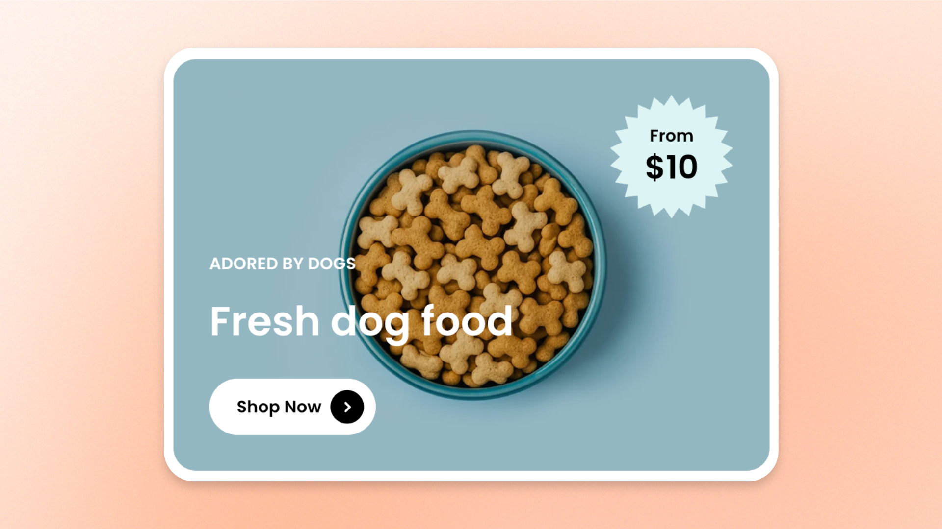
The **Image card** block combines an image with text, buttons, and other content in a customizable card layout. Use it to showcase **featured products, collections, promotions, brand messages, or special offers** that pair visuals with supporting information.
## Settings
### Layout
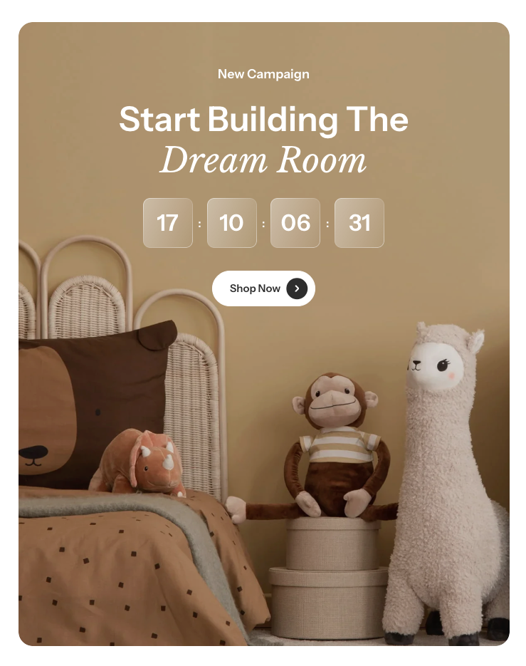
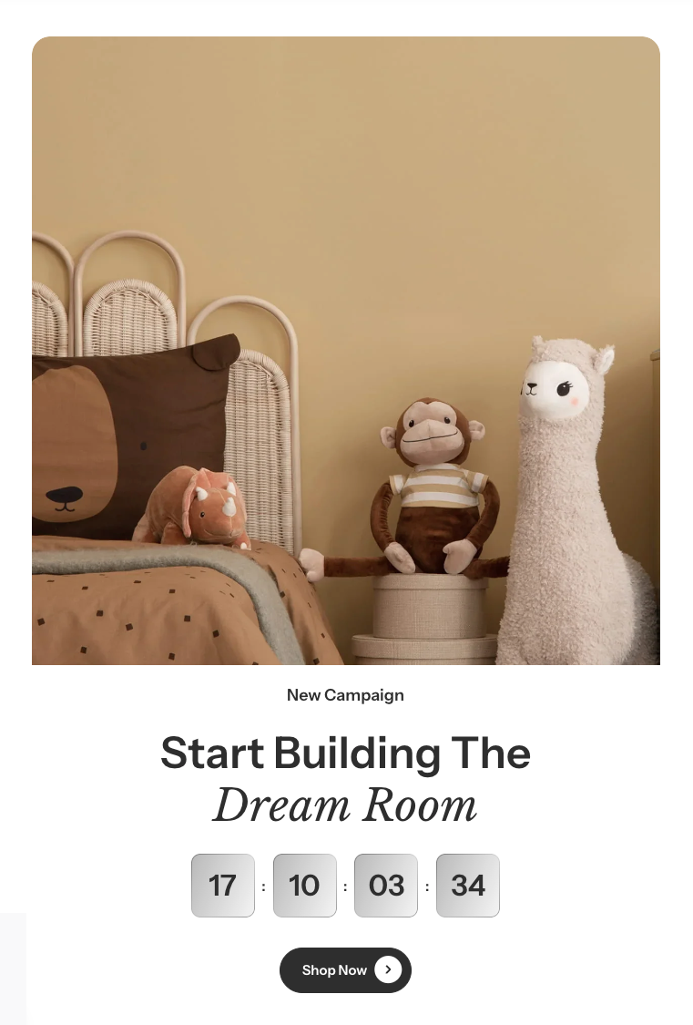
Controls whether the card content appears over or below the image.
| Setting | Description | Options |
| ---------------------------- | ---------------------------------------------------------------------------------- | --------------------------------------------------------------------------------------- |
| **Show content below image** | Controls whether the card content is displayed below the image instead of over it. | **On** or **Off.** |
| **Gap** | Controls the space between the image and the content. | **0–50px**.
*Available when **Show content below image** is turned **on**.* |
| **Gap mobile** | Controls the space between the image and the content on mobile devices. | **0–50px**.
*Available when **Show content below image** is turned **on**.* |
### Image
Controls the card's image, proportions, overlay, border, and link.
| Setting | Description | Options |
| ----------------------- | ----------------------------------------------------------- | ------------------------------------------------------------------------------------------------------------------------------------------------------------------------- |
| **Image** | Sets the image displayed on desktop. | Select or upload an image. |
| **Image mobile** | Sets a separate image for mobile devices. | Select or upload an image.
*If left empty, the desktop image is used on mobile.* |
| **Media overlay** | Controls whether a color overlay appears over the image. | **On** or **Off.** |
| **Overlay color** | Sets the color of the image overlay. | Select a color.
*Available when **Media overlay** is turned **on**.* |
| **Aspect ratio** | Controls the image proportions on desktop. | **Auto**: Uses the image's original proportions.
**Square (1/1), Portrait (4/5), Portrait (3/4), Landscape (16/9), Landscape (4/3),** or **Landscape (21/9)** |
| **Aspect ratio mobile** | Controls the image proportions on mobile devices. | **Auto, Square (1/1), Portrait (4/5), Portrait (3/4), Landscape (16/9), Landscape (4/3),** or **Landscape (21/9)** |
| **Border** | Controls whether the image has an outer border. | **None** or **Solid.** |
| **Border width** | Controls the thickness of the image border. | **0–10px**.
Available when **Border** is set to **Solid**. |
| **Border opacity** | Controls how solid or transparent the image border appears. | **0–100%**.
Available when **Border** is set to **Solid**. |
| **Corner radius** | Controls how rounded the image corners are. | **0–32px.** |
| **Link** | Sets the destination when shoppers click the card. | Select or enter a link. |
The **Border** and **Corner radius** settings in the **Image** section apply to the image only. To style the outer card, use the corresponding settings under **Appearance**.
### Content
Controls the spacing, direction, and alignment of the content inside the card.
| Setting | Description | Options |
| ---------------------- | ----------------------------------------------------------------------------------------------- | -------------------------------------------------------------------------------------------------------------------------------- |
| **Padding** | Controls the space inside the card around its content. | **None, Small, Medium, Large,** or **Extra large.** |
| **Direction** | Controls how the content elements are arranged. | **Vertical**: Arranges content from top to bottom.
**Horizontal**: Arranges content side by side. |
| **Vertical on mobile** | Controls whether horizontally arranged content switches to a vertical layout on mobile devices. | **On** or **Off**.
*Available when **Direction** is set to **Horizontal**.* |
| **Alignment** | Controls how content elements are aligned or distributed. | When **Vertical: Left, Center,** or **Right.**
When **Horizontal: Left, Center, Right,** or **Space between.** |
| **Position** | Controls the vertical position of the content within the card. | **Top, Center,** or **Bottom.**
Available when **Direction** is set to **Horizontal**. |
| **Alignment mobile** | Controls the content alignment on mobile devices. | **Inherit, Left, Center,** or **Right.** |
| **Row gap** | Controls the vertical space between content elements. | **0–100px.**
*Available when **Direction** is set to **Vertical**.* |
| **Row gap mobile** | Controls the vertical space between content elements on mobile devices. | **0–100px.**
*Available when **Direction** is set to **Vertical**, or when **Vertical on mobile** is turned **on**.* |
| **Column gap** | Controls the horizontal space between content elements. | **0–100px.**
*Available when **Direction** is set to **Horizontal**.* |
| **Column gap mobile** | Controls the horizontal space between content elements on mobile devices. | **0–100px.**
*Available when **Direction** is set to **Horizontal** and **Vertical on mobile** is turned **off**.* |
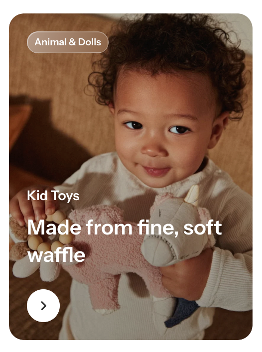
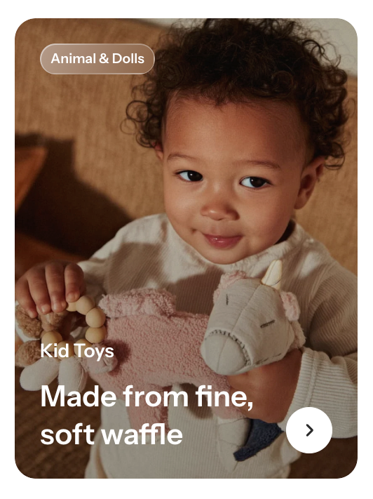
When using **Horizontal** direction, turn on **Vertical on mobile** if the content becomes too crowded on smaller screens. You can then adjust **Row gap mobile** to control spacing between elements.
### Size
Controls how much space the card occupies on desktop and mobile.
| Setting | Description | Options |
| ----------------------- | --------------------------------------------------------------- | ---------------------------------------------------------------------------------------------------------------------------------------------------------------------- |
| **Width** | Controls the card width on desktop. | **Fit**: Keeps the card sized to its content.
**Fill**: Expands the card to fill the available width.
**Custom**: Lets you set a custom width. |
| **Custom width** | Sets the card width as a percentage on desktop. | **0–100%.**
Available when **Width** is set to **Custom**. |
| **Width mobile** | Controls the card width on mobile devices. | **Fit, Fill,** or **Custom.** |
| **Custom width mobile** | Sets the card width as a percentage on mobile devices. | **0–100%.**
Available when **Width mobile** is set to **Custom**. |
| **Enable full height** | Controls whether the card expands to fill the available height. | **On** or **Off**. |
### Appearance
Controls the card's color scheme, border, and corner styling.
| Setting | Description | Options |
| ------------------------ | ----------------------------------------------------------------- | ---------------------------------------------------------------------------------------------------- |
| **Inherit color scheme** | Controls whether the card uses the parent section's color scheme. | **On** or **Off**. |
| **Color scheme** | Sets the color scheme used by the card. | Select a theme color scheme.
*Available when **Inherit color scheme** is turned **off**.* |
| **Border** | Controls whether the card has an outer border. | **None** or **Solid.** |
| **Border width** | Controls the thickness of the card border. | **0–10px.**
*Available when **Border** is set to **Solid**.* |
| **Border opacity** | Controls how solid or transparent the card border appears. | **0–100%.**
Available when **Border** is set to **Solid**. |
| **Corner radius** | Controls how rounded the card corners are. | **0–32px.** |
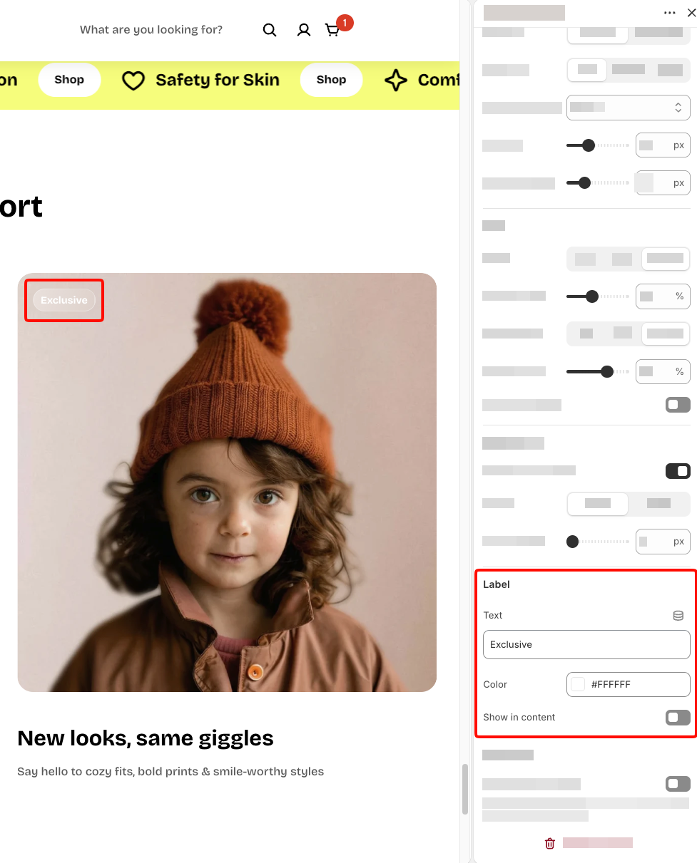
### Label
Controls an optional label displayed on the card.
| Setting | Description | Options |
| ------------------- | ------------------------------------------------------------------ | ------------------ |
| **Text** | Sets the label text. | Enter custom text. |
| **Color** | Sets the label color. | Select a color. |
| **Show in content** | Controls whether the label appears inside the card's content area. | **On** or **Off**. |
### Advanced
Controls how the card image is loaded when the page opens.
| Setting | Description | Options |
| ------------------------ | --------------------------------------------------------------------------------------------------------- | ------------------ |
| **Enable preload image** | Loads the card image earlier to help it appear faster when the card is visible as soon as the page loads. | **On** or **Off.** |
Use **Enable preload image** only when the **Image card** is visible as soon as the page loads. Avoid enabling it for cards farther down the page, as unnecessary preloading can compete with more important images and slow down the initial page load.
## Image card – items
The **Image card** block includes four built-in static blocks: **Subheading**, **Heading**, **Text**, and **Button**. Each serves a different purpose within the card:
* **Subheading**: Displays a short introductory line above the main heading.
* **Heading**: Displays the main title or message of the card.
* **Text**: Displays supporting information or a short description.
* **Button**: Displays a call-to-action button that directs shoppers to another page or destination.
You can also add the following blocks:
* **Countdown timer**: Displays a countdown to a specified date and time.
* **Badge**: Displays a customizable promotional badge with text, shape, and positioning options.
The **Subheading**, **Heading**, **Text**, and **Button** blocks are built into the Image card and cannot be removed or reordered. **Countdown timer** and **Badge** are optional blocks that can be added as needed.
### Subheading, Heading, and Text
All three blocks share the same settings for rich-text formatting, text highlighting, typography, padding, and animation, similar to the standalone **Text** block.
However, they have fewer customization options and do not include **Layout**, **Left/Right padding**, **Gradient text color**, or **Disable line break on mobile** settings.
For all other settings, including rich-text formatting, highlight styles, typography, padding, and animations, see the [**Text block documentation**](https://docs.foxecom.com/pebble-theme/theme-blocks/text).
### Button
The **Button** block adds a clickable call-to-action to the image card. Use it to direct shoppers to a product, collection, promotion, or another page.
This built-in block uses the same settings as the standalone **Button** block.
For details on button text, links, styles, sizing, and other customization options, see the [**Button block documentation**](https://docs.foxecom.com/pebble-theme/theme-blocks/button).
### Countdown timer
The **Countdown timer** block displays a countdown inside the image card. Use it to highlight upcoming events, limited-time offers, or promotion deadlines.
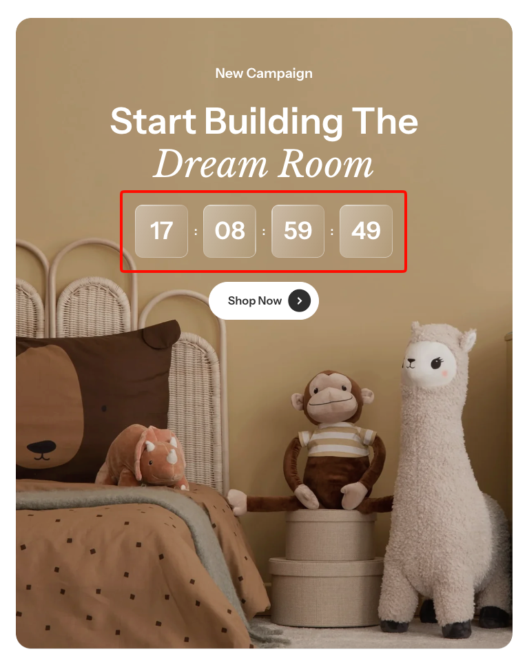
It uses the same settings as the standalone **Countdown timer** block.
For details on countdown configuration, display options, and styling, see the [**Countdown timer block documentation**](https://docs.foxecom.com/pebble-theme/theme-blocks/countdown-timer).
### Badge
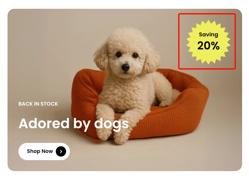
The **Badge** block displays a customizable label or promotional highlight on the image card. Use it to showcase **discount percentages, limited-time offers, featured messages, or other short promotional details**.
Customize the badge shape, text, colors, size, rotation, and position to match your card design.
#### Badge - Shape
Controls the overall shape of the badge.
| Setting | Description | Options |
| --------- | ---------------------------------------------- | --------------------------------------------------------------------------------------- |
| **Shape** | Sets the shape of the badge. | **None, Petal star, Multi-point star, Circle, Scalloped circle,** or **Custom.** |
| **Image** | Sets a custom image to use as the badge shape. | Select or upload an image.
*Available when **Shape** is set to **Custom**.* |
#### Badge - Subtext and Text
The **Subtext** and **Text** settings control the secondary and main text displayed within the badge. Both share the same options for typography, font size, and color.
| Setting | Description | Options |
| -------------------- | -------------------------------------------- | --------------------------------------------------------------------------------------------------------------------------------------------- |
| **Text** | Sets the text displayed in the badge. | Enter custom text. |
| **Preset** | Sets the overall typography style. | **Paragraph, Subheading, Heading 1–6,** or **Custom.** |
| **Font** | Selects which theme font is used. | **Body** or **Heading**.
*Available when **Preset** is set to **Custom**.* |
| **Font weight** | Controls how light or bold the text appears. | **Inherit, Light, Regular, Medium, Semi bold, Bold, Extra bold,** or **Black.**
*Available when **Preset** is set to **Custom**.* |
| **Font size** | Sets the text size on desktop. | **12–100px.**
*Available when **Preset** is set to **Custom**.* |
| **Font size mobile** | Sets the text size on mobile devices. | **12–60px.**
*Available when **Preset** is set to **Custom**.* |
| **Line height** | Controls the spacing between lines of text. | **Tight, Normal,** or **Loose.**
*Available when **Preset** is set to **Custom**.* |
| **Color** | Sets the text color. | Select a color. |
#### Badge - Appearance
Controls the badge's background color and rotation.
| Setting | Description | Options |
| -------------------- | ------------------------------------------------------------- | --------------------------------------------------------------------------------------------- |
| **Background color** | Sets the background color of the badge. | Select a color.
*Available when **Shape** is set to **None** or a built-in shape.* |
| **Rounded** | Controls whether the custom badge image uses rounded styling. | **On** or **Off**.
*Available when **Shape** is set to **Custom**.* |
| **Corner radius** | Controls how rounded the badge's corners are. | **0–32px.**
*Available when **Shape** is set to **None** or **Custom**.* |
| **Rotate** | Controls the rotation angle of the badge. | **-90° to 90°.** |
#### Badge - Size
Controls the badge width on desktop and mobile devices.
| Setting | Description | Options |
| ---------------- | --------------------------------------- | ------------- |
| **Width** | Sets the badge width on desktop. | **50–250px.** |
| **Width mobile** | Sets the badge width on mobile devices. | **50–150px.** |
#### Badge - Layout
Controls where the badge appears within the image card.
| Setting | Description | Options |
| ------------ | --------------------------------------------- | ------------------------------------------------------------------------------------------------------------------------------ |
| **Position** | Sets the badge position relative to the card. | **Top left, Top center, Top right, Middle left, Middle center, Middle right, Bottom left, Bottom center,** or **Bottom right** |
## Tips and best practices
* Use **Image mobile** and **Aspect ratio mobile** when the desktop image doesn't display well on smaller screens.
* Apply **Media overlay** when text appears over a busy or bright image to improve readability.
* Keep the **Heading** short and use **Text** for supporting details to avoid overcrowding the card.
* Use **Show content below image** when you want to keep the image unobstructed or need more space for text and buttons.
* Keep **Badge** text short and use a contrasting background color to make important offers easy to notice. Avoid placing badges over key parts of the image.