# Icon list
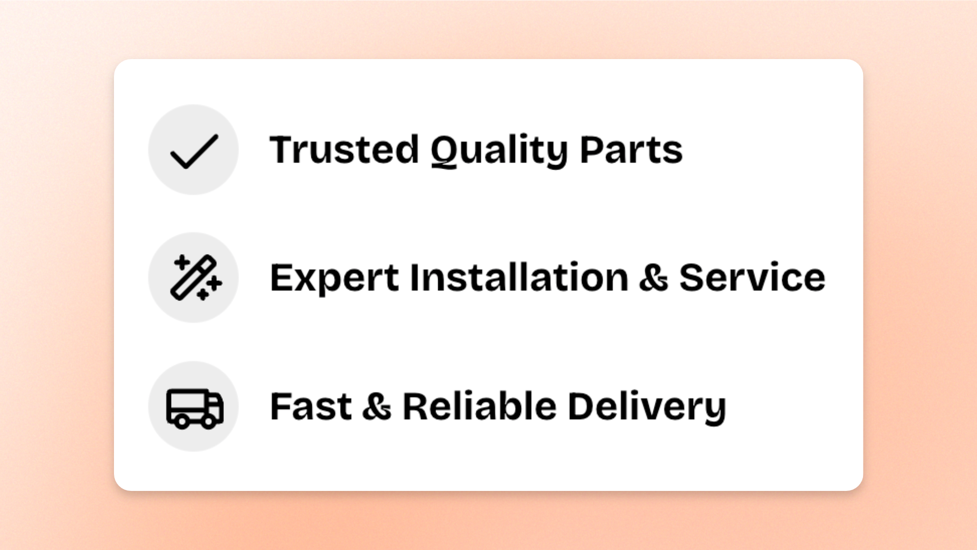
The **Icon list** block displays a vertical list where each row pairs an icon with text. Use it for **feature checklists, product benefits, included items, service highlights, key selling points, or other short details** that shoppers can scan quickly.
Add one **List item** block for each point, then choose the icon and text for that row. Control the spacing, icon style, alignment, and padding for the whole list.
## Settings
### Layout
Controls the spacing between rows in the list.
| Setting | Description | Options |
| ---------------- | ----------------------------------------- | ---------- |
| **Vertical gap** | Controls the vertical space between rows. | **0–40px** |
### Mobile settings
Controls the spacing between rows on mobile devices.
| Setting | Description | Options |
| ---------------- | --------------------------------------------------- | ---------- |
| **Vertical gap** | Controls the vertical space between rows on mobile. | **0–40px** |
### List items
Controls how the icons are styled and aligned across all rows.
| Setting | Description | Options |
| ------------ | ------------------------------------------------------ | ------------------------------------------------------------------------------------------------------------- |
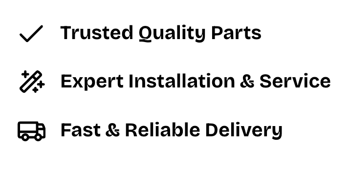
| **Style** | Controls how the icon is displayed on each row. | **Standard**: Displays the icon on its own.
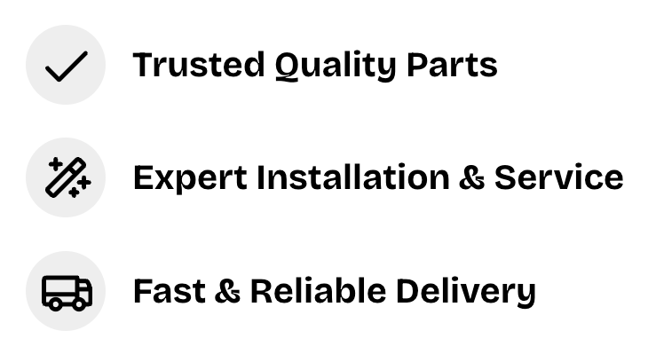
**Circle**: Displays the icon inside a circular badge. |
| **Position** | Controls how the icon aligns vertically with its text. | **Top, Center,** or **Bottom** |
Style - Standard
Style - Circle
### Padding
Controls the space inside the Icon list separately for desktop and mobile.
| Setting | Description | Options |
| ----------- | ------------------------------------------------------------- | ------------------------- |
| **Devices** | Selects which device-specific padding values you are editing. | **Desktop** or **Mobile** |
| **Top** | Controls the space above the list content. | **0–100px** |
| **Bottom** | Controls the space below the list content. | **0–100px** |
| **Left** | Controls the space to the left of the list content. | **0–100px** |
| **Right** | Controls the space to the right of the list content. | **0–100px** |
## Icon list — items
The **Icon list** supports only one type of nested block: **List item**. You can add multiple List item blocks to create a vertical list, but you cannot add other block types inside the Icon list.
Each **List item** represents one row in the list, combining an icon with a piece of text. For example, you can use List items to display product benefits, feature checklists, shipping information, or other key selling points.
You can add, duplicate, remove, or reorder List items to organize your list.
### Icon
Controls the icon displayed on an individual row.
| Setting | Description | Options |
| ---------------- | -------------------------------------------- | ----------------------------------------------------------------------------- |
| **Icon** | Sets the icon displayed in the block. | Select an icon from the built-in icon set. |
| **Icon size** | Controls the overall size of the icon. | **Extra small, Small, Medium, Large, Extra large,** or **Custom** |
| **Width** | Sets the exact icon width on desktop. | **12–200px**.
*Available when **Icon size** is set to **Custom**.* |
| **Width mobile** | Sets the exact icon width on mobile devices. | **12–200px**.
*Available when **Icon size** is set to **Custom**.* |
### Text
Controls the text displayed on an individual row.
| Setting | Description | Options |
| -------------------- | -------------------------------------------- | ---------------------------------------------------------------------------------------------------------------------------------------- |
| **Text** | Sets the text displayed on the row. | Enter and format custom text. |
| **Preset** | Sets the overall typography style. | **Default, Paragraph, Subheading, Heading 1–6,** or **Custom** |
| **Font** | Selects which theme font is used. | **Body** or **Heading**.
*Available when **Preset** is set to **Custom**.* |
| **Font weight** | Controls how light or bold the text appears. | **Inherit, Light, Regular, Medium, Semi bold, Bold, Extra bold, or Black**.
*Available when **Preset** is set to **Custom**.* |
| **Font size** | Sets the text size on desktop. | **12–100px**.
*Available when **Preset** is set to **Custom**.* |
| **Font size mobile** | Sets the text size on mobile devices. | **12–60px**.
*Available when **Preset** is set to **Custom**.* |
| **Line height** | Controls the spacing between lines of text. | **Tight, Normal, or Loose**.
*Available when **Preset** is set to **Custom**.* |
| **Color** | Controls the text color. | **Text, Subtext,** or **Gradient** |
| **Gradient color** | Sets the gradient used for the text. | Select a gradient.
*Available when **Color** is set to **Gradient**.* |
## Tips and best practices
* Use **Circle** style when you want the icons to have a softer, badge-like appearance.
* Keep the same icon across rows for a clean, consistent checklist, or use different icons when each point represents a distinct feature.
* Keep each List item short and focused on one benefit or key detail to make the list easy to scan.