# Icon box
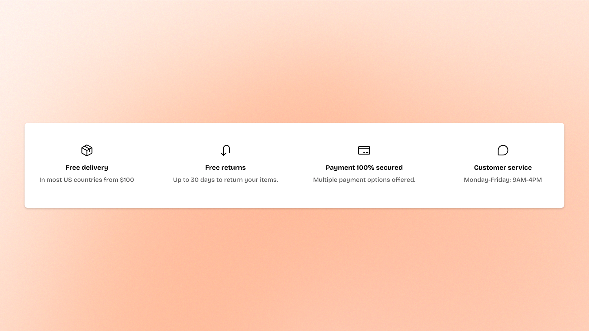
The **Icon box** block combines an icon or image with a heading and description to highlight product features, benefits, services, or key selling points. Use multiple Icon boxes together to present important information in a clear, easy-to-scan layout.
Arrange the icon above or beside the text, customize its size and spacing, and display the content in a **Standard** or **Card** style. You can also link the Icon box to another page, product, or destination.
## Settings
### Layout
Controls how the icon and text are arranged.
| Setting | Description | Options |
| ------------------ | ----------------------------------------------------------- | --------------------------------------------------------------------------------------------------------- |
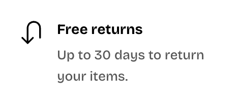
| **Direction** | Controls whether the icon appears above or beside the text. | **Vertical**: Places the icon above the text.
**Horizontal**: Places the icon beside the text. |
| **Text alignment** | Controls the horizontal alignment of the icon and text. | **Left, Center,** or **Right.**
*Available when **Direction** is set to **Vertical**.* |
Vertical
Horizontal
### Icon
Controls the icon or image displayed in the Icon box.
| Setting | Description | Options |
| ---------------- | ----------------------------------------------------- | ------------------------------------------------------------------------------------------------------------------------------------------------------- |
| **Icon** | Sets the icon displayed in the block. | Select an icon from the built-in icon set. |
| **Image icon** | Replaces the built-in icon with an image. | Select an image from the Shopify file library or upload a new one.
*When added, the **Image icon** takes priority over the built-in **Icon**.* |
| **Icon spacing** | Controls the space between the icon and text content. | **0–32px** |
| **Icon size** | Controls the overall size of the icon or image. | **Extra small, Small, Medium, Large, Extra large,** or **Custom** |
| **Width** | Sets the exact icon width on desktop. | **12–200px**.
*Available when **Icon size** is set to **Custom**.* |
| **Width mobile** | Sets the exact icon width on mobile devices. | **12–200px**.
*Available when **Icon size** is set to **Custom**.* |
### Content
Controls the heading, description, and link displayed in the Icon box.
| Setting | Description | Options |
| ------------------ | ------------------------------------------------------------------------------ | -------------------------------------------------------------------------------------------------------------------- |
| **Heading** | Sets the main title displayed in the Icon box. | Enter custom text. |
| **Heading preset** | Controls the heading's typography style. | **Heading 3–6** |
| **Text** | Sets the supporting description below the heading. | Enter and format text using the rich text editor. |
| **Color** | Controls the description text color. | **Text** or **Subtext** |
| **Link** | Makes the Icon box clickable and directs shoppers to the selected destination. | Select a page, product, collection, or enter a URL. |
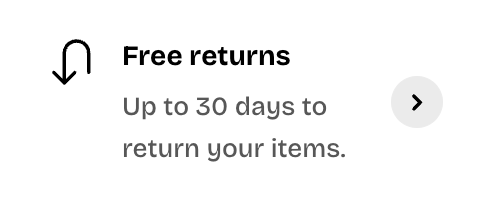
| **Show link icon** | Displays an arrow icon to indicate that the Icon box is clickable. | **On** or **Off**.
*The arrow appears when a **Link** is set and **Direction** is set to **Horizontal**.* |
| **Row gap** | Controls the vertical space between the heading and description. | **0–32px** |
Show link icon - OFF
Show link icon - ON
### Appearance
Controls the visual style, color scheme, and border of the Icon box.
| Setting | Description | Options |
| ------------------------ | ---------------------------------------------------------------------- | ----------------------------------------------------------------------------------------------------------------------------------- |
| **Style** | Controls the overall appearance of the Icon box. | **Standard**: Displays the icon and text without a card container.
**Card**: Displays the content inside a card container. |
| **Inherit color scheme** | Controls whether the card uses the surrounding section's color scheme. | **On** or **Off**.
*Available when **Style** is set to **Card**.* |
| **Color scheme** | Sets the card's color scheme. | Select a color scheme.
*Available when **Style** is set to **Card** and **Inherit color scheme** is turned off.* |
| **Border** | Controls whether the card has an outline. | **None** or **Solid**.
*Available when **Style** is set to **Card**.* |
| **Border width** | Controls the thickness of the card border. | **0–3px**.
*Available when **Style** is set to **Card** and **Border** is set to **Solid**.* |
| **Border opacity** | Controls the transparency of the card border. | **0–100%**.
*Available when **Style** is set to **Card** and **Border** is set to **Solid**.* |
| **Corner radius** | Controls how rounded the card corners appear. | **0–60px**.
*Available when **Style** is set to **Card**.* |

## Tips and best practices
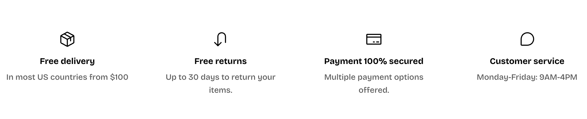
* Use **Vertical** direction for compact feature highlights, or **Horizontal** when you want the icon and text to appear side by side.
* Use **Card** style with a subtle border when a group of Icon boxes needs to stand apart from the surrounding content.
* Add a **Link** and keep **Show link icon** turned on when the entire box is clickable, so shoppers can recognize it as an interactive element.
* Use consistent icon sizes and spacing when displaying multiple Icon boxes together.