# Icon
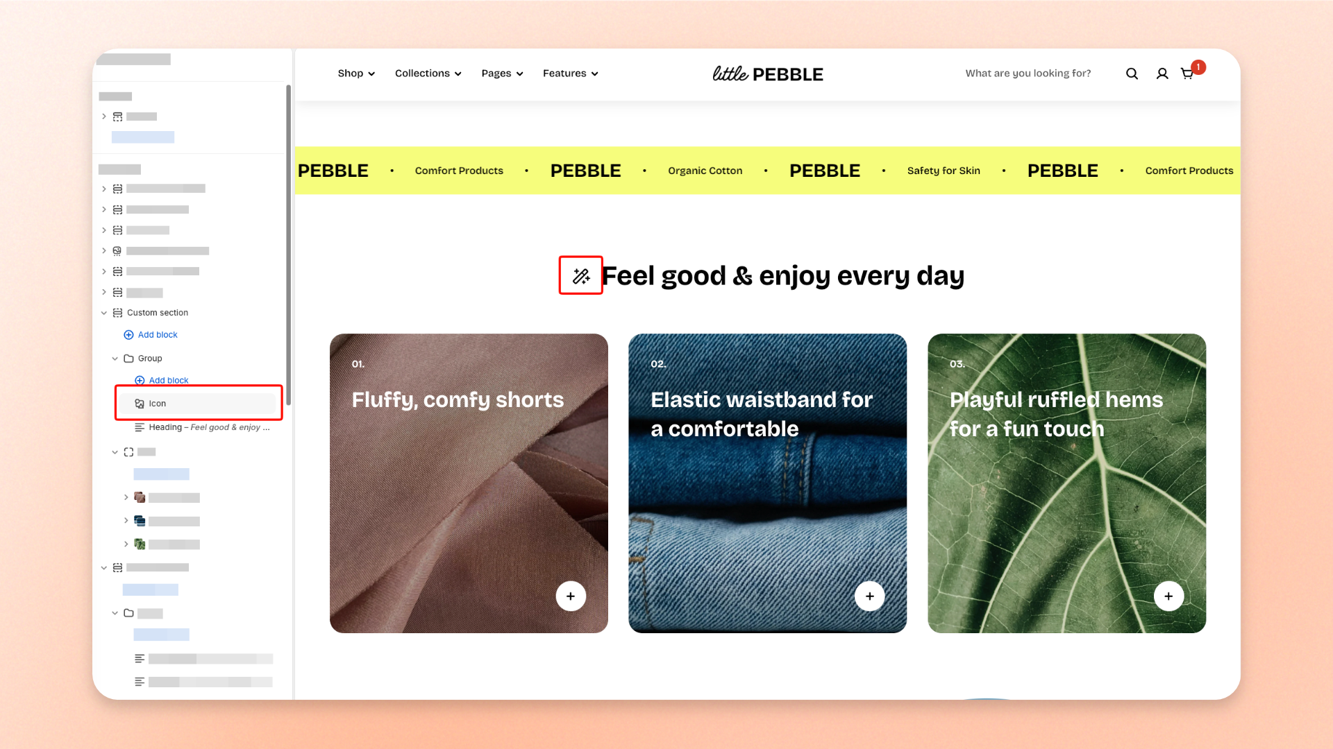
The **Icon** block adds a standalone icon to your layout. Use it for **decorative symbols, navigation cues, social icons, linked icons, or small visual elements** that support nearby content.
Choose an icon from the built-in icon set or upload your own image. You can also control its size separately for desktop and mobile and add a link to make the icon clickable.
## Settings
### General
| Setting | Description | Options |
| ---------------- | -------------------------------------------------- | ----------------------------------------------------------------------------- |
| **Icon** | Sets the built-in icon displayed in the block. | Select an icon from the built-in icon set. |
| **Image icon** | Replaces the built-in icon with an uploaded image. | Select or upload an image. |
| **Icon size** | Controls the overall size of the icon. | **Extra small, Small, Medium, Large, Extra large,** or **Custom** |
| **Width** | Sets the exact icon width on desktop. | **12–200px.**
*Available when **Icon size** is set to **Custom**.* |
| **Width mobile** | Sets the exact icon width on mobile devices. | **12–200px.**
*Available when **Icon size** is set to **Custom**.* |
| **Link** | Adds a clickable link to the icon. | Paste or select a link. |
### Appearance
*Available when an **Image icon** is uploaded.*
| Setting | Description | Options |
| ----------- | ---------------------------------------- | ----------------- |
| **Rounded** | Rounds the uploaded image into a circle. | **On** or **Off** |
Rounded - ON
Rounded - OFF
## Tips and best practices
* Upload an **Image icon** when you need a custom graphic instead of one of the built-in icons.
* Use **Custom** for **Icon size** when you need precise control over the desktop and mobile width.
* Turn on **Rounded** when a circular or rounded image icon fits the design better.
* Keep icon sizes consistent when using multiple Icon blocks together.

