# Group
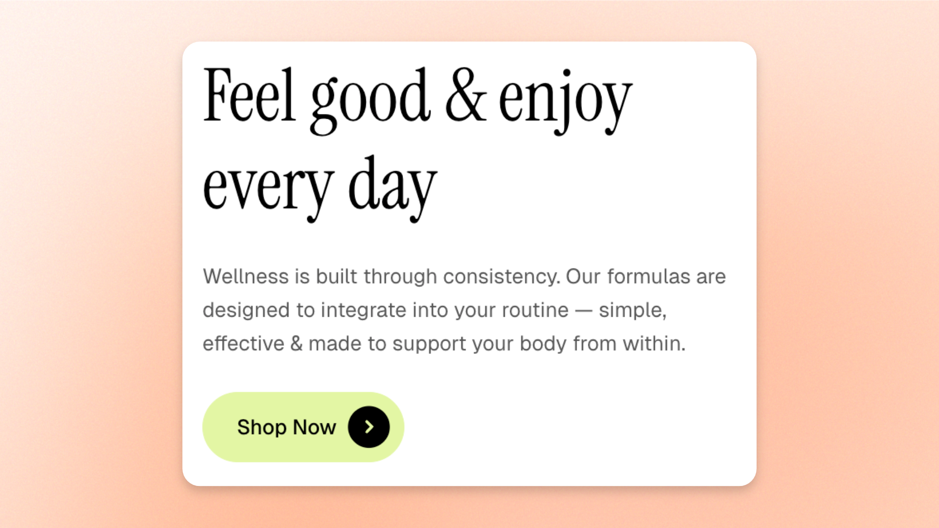
The **Group** block is a layout container that keeps related blocks together and arranges them vertically or side by side. Use it to create **heading-and-button combinations, image-and-text layouts, grouped content, navigation rows, sticky content, or other layouts** that need consistent alignment, spacing, and styling.
Customize the direction, alignment, width, appearance, and spacing, with separate layout options for mobile devices.
## Settings
### Layout
Controls how blocks are arranged and aligned inside the Group.
| Setting | Description | Options |
| ---------------------------- | ------------------------------------------------------------------ | --------------------------------------------------------------------------------------------------------------------------------- |
| **Direction** | Controls whether blocks are stacked or placed side by side. | **Vertical:** Stacks blocks from top to bottom.
**Horizontal:** Places blocks side by side. |
| **Vertical on mobile** | Stacks horizontally arranged blocks vertically on mobile. | **On** or **Off**.
*Available when **Direction** is set to **Horizontal**.* |
| **Alignment** | Controls how blocks align within the Group. | When **Vertical**: **Left, Center,** or **Right**.
When **Horizontal**: **Left, Center, Right,** or **Space between**. |
| **Position** | Controls how blocks align vertically within a horizontal Group. | **Top, Center,** or **Bottom**
*Available when **Direction** is set to **Horizontal**.* |
| **Horizontal gap** | Sets the horizontal space between blocks. | **0–100px** |
| **Vertical gap** | Sets the vertical space between blocks. | **0–100px** |
| **Enable sticky on desktop** | Keeps the Group visible while shoppers scroll the page on desktop. | **On** or **Off**. |
### Size
Controls how much horizontal space the Group occupies on desktop and mobile devices.
| Setting | Description | Options |
| ----------------------- | ----------------------------------------------- | --------------------------------------------------------------------------------------------------------------------------------------------------------------- |
| **Width** | Controls the Group width on desktop. | **Fit:** Sizes the Group to fit its content.
**Fill:** Expands the Group to fill the available width.
**Custom:** Uses a specified width. |
| **Custom width** | Sets the Group width as a percentage. | **0–100%**
*Available when **Width** is set to **Custom**.* |
| **Width mobile** | Controls the Group width on mobile devices. | **Fit, Fill, or Custom** |
| **Custom width mobile** | Sets the Group width on mobile as a percentage. | **0–100%**
*Available when **Width mobile** is set to **Custom**.* |
### Appearance
Controls the color scheme, border, and corner rounding of the Group.
| Setting | Description | Options |
| ------------------------ | ------------------------------------------------------------------------------------ | -------------------------------------------------------------------------------------------------- |
| **Inherit color scheme** | Controls whether the Group uses the color scheme of its parent section or container. | **On:** Uses the parent color scheme.
**Off:** Lets you choose a separate color scheme. |
| **Color scheme** | Sets a separate color scheme for the Group. | Select a theme color scheme.
*Available when **Inherit color scheme** is turned off.* |
| **Border** | Adds an outer border around the Group. | **None** or **Solid** |
| **Border width** | Controls the thickness of the border. | **0–10px**
*Available when **Border** is set to **Solid**.* |
| **Border opacity** | Controls how solid or transparent the border appears. | **0–100%**
*Available when **Border** is set to **Solid**.* |
| **Corner radius** | Controls how rounded the Group's corners are. | **0–32px** |
### Mobile layout
Controls how blocks are displayed, spaced, and ordered on mobile devices.
| Setting | Description | Options |
| -------------------------- | -------------------------------------------------------------------------------------- | --------------------------------------------------------------------------------------------------------------------------------------- |
| **Enable swipe on mobile** | Displays Group items in a horizontally swipeable layout on mobile devices. | **On** or **Off**. |
| **Custom column width** | Controls whether swipeable items use a custom width. | **On** or **Off**.
*Available when **Enable swipe on mobile** is turned **on**.* |
| **Custom width** | Sets the width of each swipeable item as a percentage of the available space. | **20–90%.**
*Available when **Custom column width** is turned **on**.* |
| **Mobile columns** | Sets the number of columns displayed in the mobile swipe layout. | **1–3 columns.**
*Available when **Enable swipe on mobile** is turned **on** and **Custom column width** is turned **off**.* |
| **Horizontal gap** | Sets the horizontal space between blocks on mobile. | **0–100px**. |
| **Vertical gap** | Sets the vertical space between blocks on mobile. | **0–100px**. |
| **Column order** | Controls where this Group appears on mobile relative to neighboring columns or groups. | Enter an order value.
Lower values, such as `-9`, appear earlier; higher values, such as `9`, appear later. |
### Padding
Adds space inside the Group around its content, with separate controls for desktop and mobile.
| Setting | Description | Options |
| ----------- | -------------------------------------------------------- | ------------------------- |
| **Devices** | Selects which device's padding settings you are editing. | **Desktop** or **Mobile** |
| **Top** | Sets the space inside the top edge of the Group. | **0–100px** |
| **Bottom** | Sets the space inside the bottom edge of the Group. | **0–100px** |
| **Left** | Sets the space inside the left edge of the Group. | **0–100px** |
| **Right** | Sets the space inside the right edge of the Group. | **0–100px** |
## Group — items
Add **dynamic theme blocks** inside the **Group** to build the content you want to keep together. You can add any block that appears in the Group’s **block picker**, then reorder or remove those blocks as needed.
**Private blocks** are only available in the specific sections or blocks they were designed for, while **static blocks** are built into a parent block and can’t be manually added, removed, or reordered.
Each block keeps its own content and styling settings. The Group controls how those blocks are **arranged, aligned, and spaced**.
Blocks that support nesting can contain their own child blocks.
[*See the documentation for each block you add for its available settings.*](https://docs.foxecom.com/pebble-theme/theme-blocks/overview)
## Tips and best practices
* Use **Horizontal** direction with **Space between** to place elements such as a heading and button at opposite sides of a row.
* Turn on **Vertical on mobile** when side-by-side content needs more room on smaller screens.
* Use **Enable sticky on desktop** for important content that should remain visible while shoppers scroll, such as product details or action buttons.