# Grid
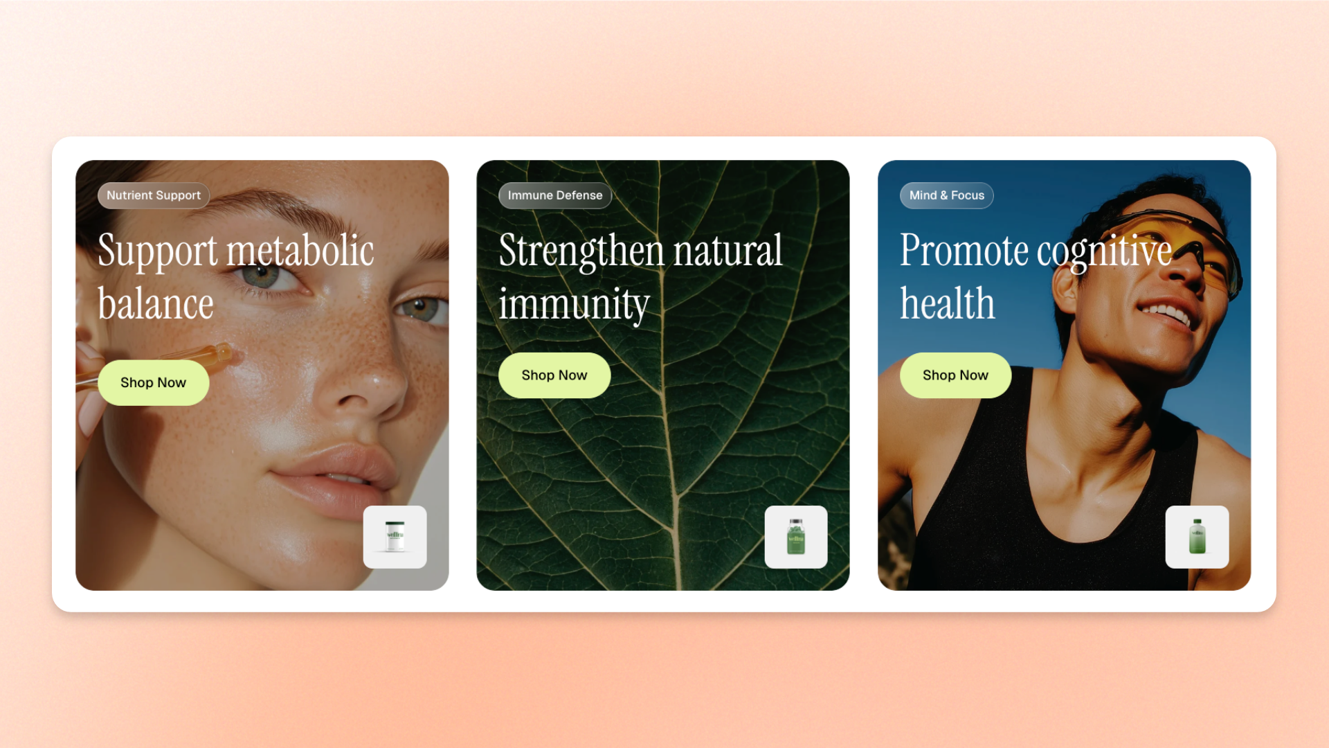
The **Grid** block is a layout container that arranges multiple blocks into a structured grid of columns and rows. Use it to create **feature grids, card collections, image galleries, product highlights, service lists, comparisons, or mixed layouts** with images, text, buttons, and other supported blocks.
Customize the number of columns, alignment, spacing, and appearance, with separate layout options for desktop and mobile devices.
## Settings
### Layout
Controls how blocks are arranged and aligned within the Grid on desktop.
| Setting | Description | Options |
| ------------------ | ----------------------------------------------------------------------- | --------------------------------------------------------------------------------------------------------------------------------------------------------------------------------------------------------------------- |
| **Position** | Controls how items align vertically when they are shorter than the row. | **Top:** Aligns items to the top.
**Middle:** Centers items vertically.
**Bottom:** Aligns items to the bottom.
**Stretch:** Makes items in the same row stretch to the same height. |
| **Columns** | Sets how many columns appear across the Grid on desktop. | **1–12 columns** |
| **Horizontal gap** | Sets the space between columns. | **0–100px**
*Available when **Columns** is more than 1.* |
| **Vertical gap** | Sets the space between rows. | **0–100px** |
### Size
Controls how much horizontal space the Grid occupies on desktop and mobile devices.
| Setting | Description | Options |
| ----------------------- | --------------------------------------------------- | ------------------------------------------------------------------------------------------------------------------------------------------------------------- |
| **Width** | Controls the width of the Grid on desktop. | **Fit:** Sizes the Grid to fit its content.
**Fill:** Expands the Grid to fill the available width.
**Custom:** Uses a specified width. |
| **Custom width** | Sets a custom Grid width as a percentage. | **0–100%**
*Available when **Width** is set to **Custom**.* |
| **Width mobile** | Controls the Grid width on mobile devices. | **Fit, Fill,** or **Custom** |
| **Custom width mobile** | Sets a custom Grid width on mobile as a percentage. | **0–100%**
*Available when **Width mobile** is set to **Custom**.* |
### Appearance
Controls the color scheme, border, and corner rounding of the Grid.
| Setting | Description | Options |
| ------------------------ | ----------------------------------------------------------------------------------- | -------------------------------------------------------------------------------------------------- |
| **Inherit color scheme** | Controls whether the Grid uses the color scheme of its parent section or container. | **On:** Uses the parent color scheme.
**Off:** Lets you choose a separate color scheme. |
| **Color scheme** | Sets a separate color scheme for the Grid. | Select a theme color scheme.
*Available when **Inherit color scheme** is turned off.* |
| **Border** | Adds an outer border around the Grid. | **None** or **Solid** |
| **Border width** | Controls the thickness of the outer border. | **0–10px**
*Available when **Border** is set to **Solid**.* |
| **Border opacity** | Controls how solid or transparent the outer border appears. | **0–100%**
*Available when **Border** is set to **Solid**.* |
| **Corner radius** | Controls how rounded the Grid's outer corners are. | **0–32px** |
### Mobile layout
Controls how Grid items are arranged and spaced on mobile devices.
| Setting | Description | Options |
| -------------------------- | -------------------------------------------------------------------------------------- | ------------------------------------------------------------------------------------------------------------------------------------------------ |
| **Enable swipe on mobile** | Displays Grid items as a horizontally swipeable row instead of a standard mobile grid. | **On** or **Off.** |
| **Custom column width** | Lets you set a custom width for each item in the swipeable row. | **On** or **Off.**
*Available when **Enable swipe on mobile** is turned on.* |
| **Custom width** | Sets how much horizontal space each swipeable item occupies. | **20–90%**
A smaller width can leave part of the next item visible.
*Available when **Custom column width** is turned on.* |
| **Mobile columns** | Sets how many columns appear on mobile. | **1–3 columns**
*Available when **Enable swipe on mobile** is off, or when **Custom column width** is off.* |
| **Horizontal gap** | Sets the space between columns or swipeable items on mobile. | **0–100px**
*Available when **Enable swipe on mobile** is on, or when **Mobile columns** is more than 1.* |
| **Vertical gap** | Sets the space between rows on mobile. | **0–100px**
*Available when **Enable swipe on mobile** is turned off.* |
### Padding
Controls the space inside the Grid separately for desktop and mobile devices.
| Setting | Description | Options |
| ----------- | -------------------------------------------------------- | ------------------------- |
| **Devices** | Selects which device's padding settings you are editing. | **Desktop** or **Mobile** |
| **Top** | Sets the space inside the top edge of the Grid. | **0–100px** |
| **Bottom** | Sets the space inside the bottom edge of the Grid. | **0–100px** |
| **Left** | Sets the space inside the left edge of the Grid. | **0–100px** |
| **Right** | Sets the space inside the right edge of the Grid. | **0–100px** |
### Advanced
Controls the number of columns at specific responsive breakpoints.
| Setting | Description | Options |
| ------------------ | -------------------------------------------------------------------------------------------------------- | ------------------------------------------------------------------------------------------------------------------------------------------------------------------------------- |
| **Custom columns** | Gives you fine-grained control over the number of columns displayed at different responsive breakpoints. | Enter comma-separated breakpoint values, for example: `mb:1,md:2,lg:3,xl:4,xxl:5`.
Custom values override the standard column settings at the specified breakpoints. |
[*See the **Custom columns** documentation for detailed instructions on configuring responsive breakpoints*](https://docs.foxecom.com/pebble-theme/global-settings/custom-columns)
## Grid – items
Add **dynamic theme blocks** inside the **Grid** to create the items in the layout. You can add any block that appears in the Grid’s **block picker**, then reorder or remove those blocks as needed.
**Private blocks** are only available in the specific sections or blocks they were designed for, while **static blocks** are built into a parent block and can’t be manually added, removed, or reordered.
Each block keeps its own content and styling settings. The Grid controls only how those blocks are **arranged, aligned, and spaced** across desktop and mobile.
Blocks that support nesting can contain their own child blocks.
[*See the documentation for each block you add for its available settings.*](https://docs.foxecom.com/pebble-theme/theme-blocks/overview)
## Tips and best practices
* Choose **Stretch** under **Position** when you want every item in a row to have the same height, even when the amount of content differs.
* Turn on **Enable swipe on mobile** for card or feature layouts that would feel cramped or too long when stacked on smaller screens.
* Set a smaller **Custom column width** when using mobile swipe to leave part of the next item visible and encourage shoppers to explore.
* Use consistent spacing and similar block styles when creating feature grids or card collections.
* Avoid using too many columns for text-heavy content, as narrow columns can make the content difficult to read.