# Featured collection
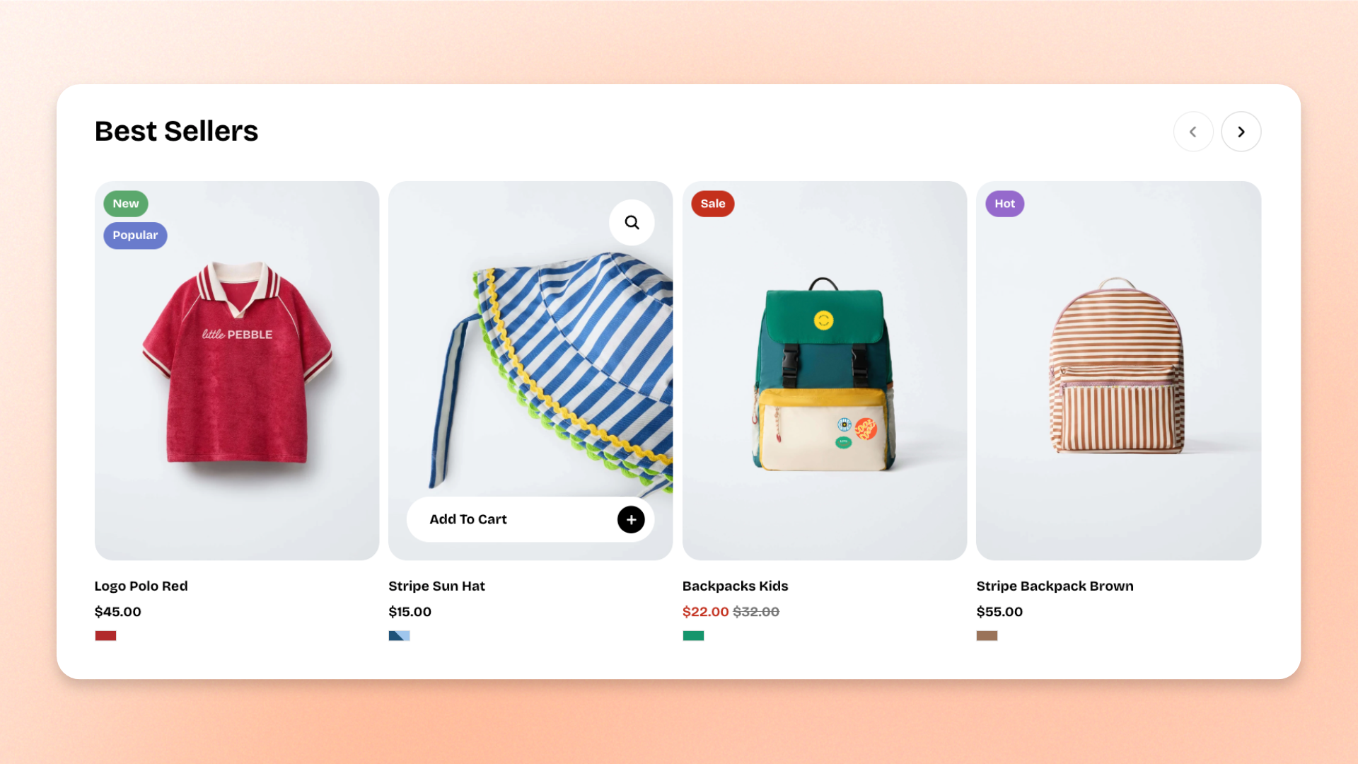
The **Featured collection** block displays products from a selected collection as either a grid or carousel. Use it to showcase **best sellers, new arrivals, seasonal products, featured categories**, or other curated product groups within a section.
Choose a collection, control how many products are displayed, and adjust the layout, spacing, mobile presentation, size, appearance, and padding.
## Settings
### General
| Setting | Description | Options |
| ----------------- | ---------------------------------------------------------------------- | -------------------------------------------------------------------------------- |
| **Collection** | Selects the collection whose products are displayed. | Select a collection.
Leave blank to display placeholder product cards. |
| **Product count** | Controls how many products from the selected collection are displayed. | **1–12 products** |
### Layout
Controls how products are arranged on desktop.
| Setting | Description | Options |
| ------------------ | ------------------------------------------------------------------ | ------------------------------------------------------------------------------------------------------------- |
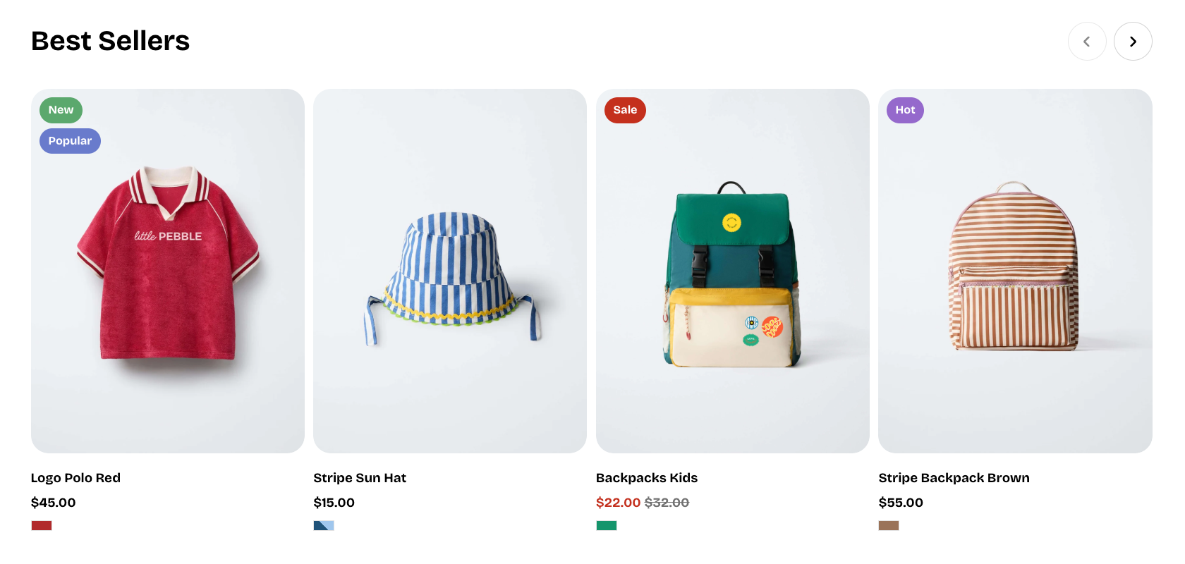
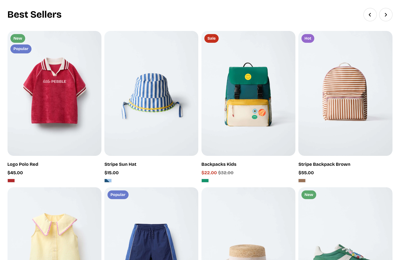
| **Type** | Controls how the products are displayed. | **Carousel:** Displays products in a horizontal carousel.
**Grid:** Displays products in fixed rows. |
| **Columns** | Controls the number of product cards displayed per row on desktop. | **2–4 columns** |
| **Horizontal gap** | Controls the horizontal space between product cards. | **0–100px** |
| **Vertical gap** | Controls the vertical space between product rows. | **0–100px**
*Available when **Type** is set to **Grid**.* |
### Mobile layout
Controls how products are arranged on mobile devices.
| Setting | Description | Options |
| -------------------------- | ---------------------------------------------------------------------- | ------------------------------------------------------------------------------------------------------------------------------------------------ |
| **Enable swipe on mobile** | Allows shoppers to swipe horizontally through product cards on mobile. | **On** or **Off.** |
| **Custom column width** | Allows you to set a custom width for each product card on mobile. | **On** or **Off**.
*Available when* ***Enable swipe on mobile*** *is turned on.* |
| **Custom width** | Controls each product card's width as a percentage. | **20–90%**.
*Available when* ***Custom column width*** *is turned on.* |
| **Mobile columns** | Controls the number of product cards displayed per row on mobile. | **1 column** or **2 columns**
*Available when **Custom column width** is turned off, or when **Enable swipe on mobile** is turned off.* |
| **Horizontal gap** | Controls the horizontal space between product cards on mobile. | **0–100px** |
| **Vertical gap** | Controls the vertical space between product rows on mobile. | **0–100px**
*Available when **Enable swipe on mobile** is turned off.* |
### Size
Controls the width of the Featured collection on desktop and mobile.
| Setting | Description | Options |
| ----------------------- | ---------------------------------------------------------------- | -------------------------------------------------------------------------------------- |
| **Width** | Controls the width of the Featured collection on desktop. | **Fill:** Fills the available width.
**Custom:** Lets you set a custom width. |
| **Custom width** | Sets the block width on desktop as a percentage. | **0–100%**
*Available when **Width** is set to **Custom**.* |
| **Width mobile** | Controls the width of the Featured collection on mobile devices. | **Fill** or **Custom** |
| **Custom width mobile** | Sets the block width on mobile as a percentage. | **0–100%**
*Available when **Width mobile** is set to **Custom**.* |
### Appearance
Controls the color scheme, border, and corner shape of the Featured collection.
| Setting | Description | Options |
| ------------------------ | ---------------------------------------------------------------------------- | ------------------------------------------------------------------------------------------------------- |
| **Inherit color scheme** | Controls whether the block uses the color scheme of the surrounding section. | **On** or **Off**. |
| **Color scheme** | Sets a separate color scheme for the block. | Select an available color scheme.
*Available when* ***Inherit color scheme*** *is turned off.* |
| **Border** | Controls whether the block has an outer border. | **None** or **Solid** |
| **Border width** | Controls the thickness of the block border. | **0–3px**.
*Available when **Border** is set to **Solid**.* |
| **Border opacity** | Controls how solid or transparent the block border appears. | **0–100%**.
*Available when **Border** is set to **Solid**.* |
| **Corner radius** | Controls how rounded the block corners are. | **0–20px**. |
### Padding
Controls the space between the edges of the Featured collection and its content. Set padding separately for desktop and mobile.
| Setting | Description | Options |
| ----------- | ------------------------------------------------------------- | ------------------------- |
| **Devices** | Selects which device-specific padding values you are editing. | **Desktop** or **Mobile** |
| **Top** | Controls the space above the block content. | **0–100px** |
| **Bottom** | Controls the space below the block content. | **0–100px** |
| **Left** | Controls the space to the left of the block content. | **0–100px** |
| **Right** | Controls the space to the right of the block content. | **0–100px** |
## Featured collection - items
The **Featured collection** automatically includes one built-in static **Product card** block. It is used automatically for every product displayed from the selected collection, so you don’t need to add, remove, or reorder Product card blocks manually.
### Product card
The **Product card** represents each product displayed in the Featured collection.
There are no customizable settings available for the Product card inside this block. Its layout, content, and appearance are configured globally in **Theme settings >** [Product cards](https://docs.foxecom.com/pebble-theme/theme-settings/product-cards).
## Tips and best practices
* Choose **Carousel** when you want shoppers to browse more products in a compact horizontal layout. Use **Grid** when you want products displayed in fixed rows.
* On mobile, turn on **Custom column width** when you want more control over how much of each product card is visible while shoppers swipe.