# Divider
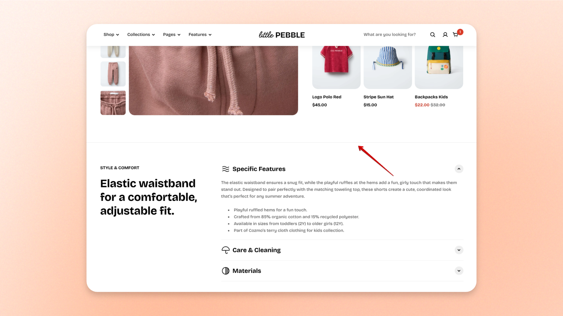
The **Divider** block adds a horizontal line between content to create separation and improve the visual structure of a section. Use it to **break up content, separate groups of blocks, or add extra breathing room between elements** without creating a new section.
You can adjust the divider’s thickness and length, control its visibility by device, and set different spacing for desktop and mobile.
## Settings
### Layout
| Setting | Description | Options |
| ---------------------- | ----------------------------------------------------------------- | ----------------- |
| **Thickness** | Controls the thickness of the divider line. | **0.5–5px** |
| **Length** | Controls how wide the divider appears within the available space. | **5–100%** |
| **Disable on desktop** | Hides the divider on desktop devices. | **On** or **Off** |
| **Disable on mobile** | Hides the divider on mobile devices. | **On** or **Off** |
### Padding
Controls the vertical space above and below the divider. Desktop and mobile spacing can be adjusted separately.
| Setting | Description | Options |
| ----------- | --------------------------------------------------------- | ------------------------- |
| **Devices** | Selects which device the padding settings apply to. | **Desktop** or **Mobile** |
| **Top** | Sets the space above the divider for the selected device. | **0–100px** |
| **Bottom** | Sets the space below the divider for the selected device. | **0–100px** |
## Tips and best practices
* Use a thin divider, such as **1px**, for subtle separation between content.
* Reduce the **Length** when you want the divider to work more like a visual accent than a full-width separator.
* Adjust desktop and mobile padding separately to keep spacing balanced across different screen sizes.
* Use **Disable on desktop** or **Disable on mobile** when the divider is only useful for a specific device layout.
* Avoid using too many dividers in one section, as excessive lines can make the layout feel visually crowded.