# Counter
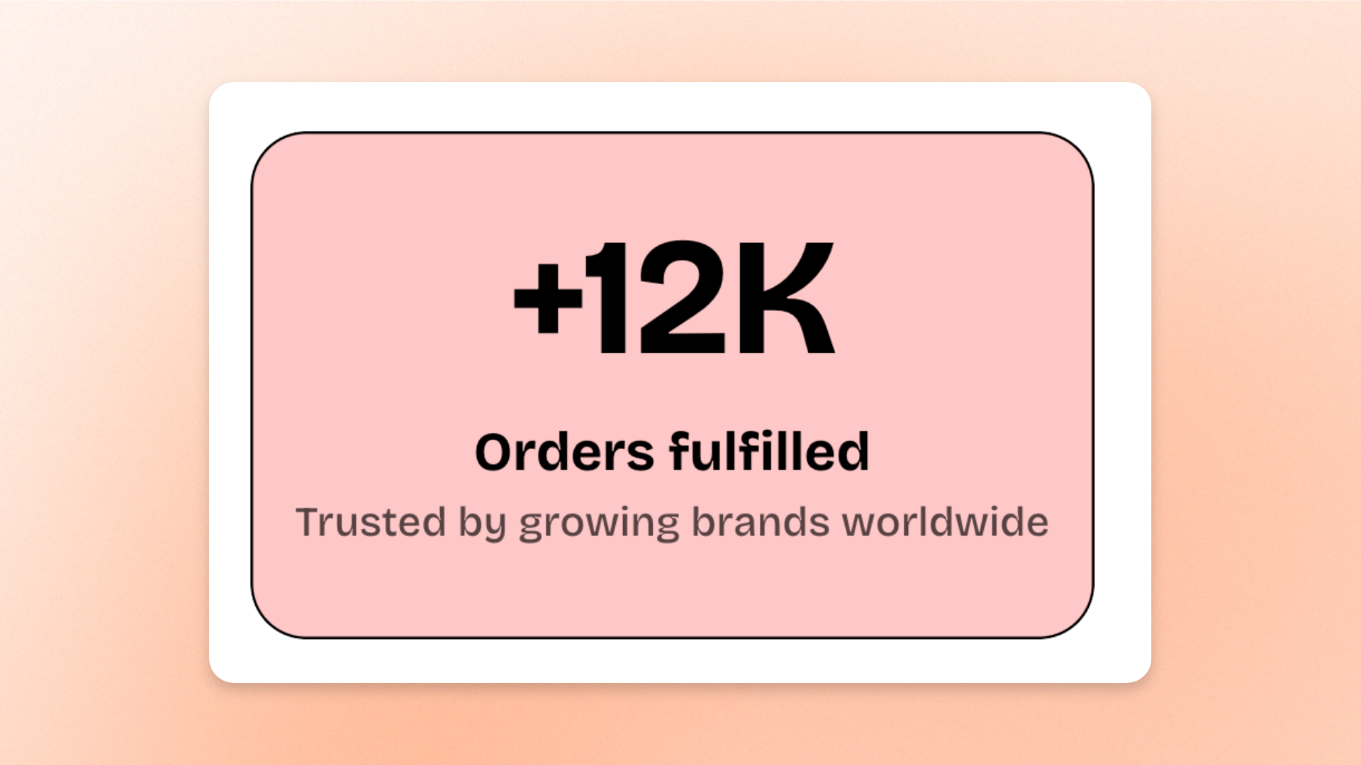
The **Counter** block displays a number with optional supporting content. Use it to highlight **statistics, milestones, percentages, customer numbers, years of experience, products sold, sustainability metrics**, or other key figures such as **75% recycled materials** or **10k+ happy customers**.
Each Counter includes one built-in **Number** block. You can also add optional **Text** and **Button** blocks to provide context or a related call to action.
## Settings
### Layout
Controls how the number and supporting content are arranged on desktop.
| Setting | Description | Options |
| ------------- | ----------------------------------------------------------------------------------------- | ------------------------------------------------------------------------------------------------------------- |
| **Direction** | Controls whether the number and supporting content are stacked or displayed side by side. | **Vertical:** Stacks the number and content.
**Horizontal:** Places the number beside the content. |
| **Alignment** | Controls the horizontal alignment of the number and content. | **Left, Center,** or **Right**.
*Available when* **Direction** *is set to* **Vertical**. |
| **Position** | Controls the vertical alignment of the number and supporting content. | **Top, Middle,** or **Bottom**.
*Available when* **Direction** *is set to* **Horizontal**. |
### Mobile layout
Controls how the Counter is arranged on mobile devices.
| Setting | Description | Options |
| ------------- | --------------------------------------------------------------------------------------------------- | ----------------------------------------------------------------------------------------------------- |
| **Direction** | Controls whether the number and supporting content are stacked or displayed side by side on mobile. | **Vertical** or **Horizontal** |
| **Alignment** | Controls the horizontal alignment on mobile. | **Left, Center,** or **Right**.
*Available when* **Direction** *is set to* **Vertical**. |
| **Position** | Controls the vertical alignment on mobile. | **Top, Middle,** or **Bottom**.
*Available when* **Direction** *is set to* **Horizontal**. |
### Appearance
Controls whether the Counter appears as plain content or as a styled card.
| Setting | Description | Options |
| ------------------------ | ------------------------------------------------------------------------------ | ----------------------------------------------------------------------------------------------------------------------------------------------------------- |
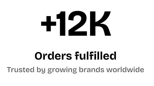
| **Style** | Controls the overall appearance of the Counter. | **Standard:** Displays the Counter without its own panel.
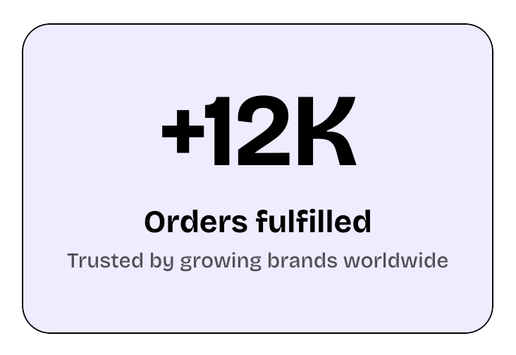
**Card:** Displays the Counter inside a styled card. |
| **Inherit color scheme** | Controls whether the Counter card uses the surrounding section’s color scheme. | **On** or **Off**.
*Available when* **Style** *is set to* **Card**. |
| **Color scheme** | Sets a separate color scheme for the Counter card. | Select one of the available theme color schemes.
*Available when* **Style** *is set to* **Card** *and* **Inherit color scheme** *is turned off*. |
| **Border** | Controls whether the Counter card has an outline. | **None** or **Solid**.
*Available when* **Style** *is set to* **Card**. |
| **Border width** | Controls the thickness of the card border. | **0–3px**.
*Available when* **Style** *is set to* **Card** *and* **Border** *is set to* **Solid**. |
| **Border opacity** | Controls how transparent or solid the card border appears. | **0–100%**.
*Available when* **Style** *is set to* **Card** *and* **Border** *is set to* **Solid**. |
| **Corner radius** | Controls how rounded the card corners are. | **0–20px**.
*Available when* **Style** *is set to* **Card**. |
## Counter — items
Every Counter includes one built-in **Number** block, so you do not need to add it manually.
You can also add optional **Text** and **Button** blocks to give more context around the number or add a related action.
### Number
The **Number** block displays the Counter's animated figure. The value counts up from zero to the configured number when the Counter first scrolls into view.
#### Content
| Setting | Description | Options |
| ---------- | -------------------------------------------------------- | ------------------------------------------------------------------------------------------------------------------------------------------------------------------------------------------------------ |
| **Number** | Sets the value the Counter counts up to. | Enter a number, for example **75**. |
| **Prefix** | Adds text immediately before the number. | Enter text such as a currency symbol, for example **$**. |
| **Suffix** | Adds text immediately after the number. | Enter text such as **%**, **+**, or **k**. |
| **Format** | Controls how thousands and decimal values are separated. | **1,234.56:** Comma for thousands and period for decimals.
**1 234.56:** Space for thousands and period for decimals.
**1.234,56:** Period for thousands and comma for decimals. |
Use **Prefix** and **Suffix** for symbols or units instead of including them in the Number value. This keeps the animated value numeric and the count-up animation clean. For example:
* `75` + `%` → **75%**
* `$` + `500` → **$500**
* `10` + `k+` → **10k+**
#### Typography
The Number block can use one of the theme’s heading presets or a custom typography setup.
| Setting | Description | Options |
| -------------------- | ------------------------------------------------ | -------------------------------------------------------------------------------------------------------------------------------------------- |
| **Preset** | Sets the overall typography style of the number. | **Heading 1–6** or **Custom** |
| **Font** | Selects which theme font is used. | **Body** or **Heading**.
*Available when* **Preset** *is set to* **Custom**. |
| **Font weight** | Controls how light or bold the number appears. | **Inherit, Light, Regular, Medium, Semi bold, Bold, Extra bold,** or **Black**.
*Available when **Preset** is set to **Custom**.* |
| **Font size** | Sets the number size on desktop. | **12–100px**.
*Available when* **Preset** *is set to* **Custom**. |
| **Font size mobile** | Sets the number size on mobile devices. | **12–60px**.
*Available when* **Preset** *is set to* **Custom**. |
| **Line height** | Controls the vertical spacing around the number. | **Tight, Normal,** or **Loose**.
*Available when* **Preset** *is set to* **Custom**. |
| **Color** | Sets the number color. | **Text, Subtext,** or **Gradient** |
| **Gradient color** | Sets the gradient used for the text. | Select a gradient.
*Available when **Color** is set to **Gradient**.* |
### Text
Add a **Text** block to provide a caption, label, or short description that explains or reinforces the statistic.
See the [Text block documentation](https://docs.foxecom.com/pebble-theme/theme-blocks/text) for its available settings.
### Button
Add a **Button** block when the Counter needs a related call to action.
See the [Button block documentation](https://docs.foxecom.com/pebble-theme/theme-blocks/button) for its available settings.
## Tips and best practices
* Choose a **Number** that reads clearly while counting up, because the animation starts at **0** and runs to the target value the first time the Counter scrolls into view.
* Use **Prefix** and **Suffix** for symbols, units, or abbreviations such as `$`, `%`, or `+` instead of adding them to the Number itself, so the count-up animation remains clean.
* When placing multiple Counter blocks in a row, keep their typography, spacing, alignment, and styling consistent to create a clean “by the numbers” layout.