# Countdown timer: Icon with text
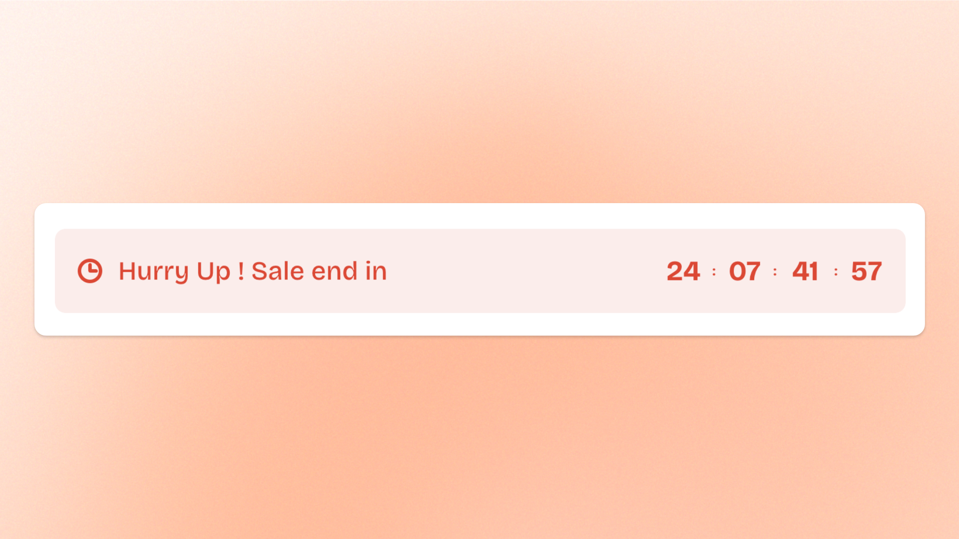
The **Countdown timer: Icon with text** block combines an icon, a short heading, and a live countdown in one compact layout. Use it for **limited-time sales, product launches, event starts, registration deadlines**, or other time-sensitive messages that need a short explanation and visual cue.
The block includes a built-in **Countdown timer** block for the live countdown. Configure the timer separately to control its timing, labels, number styling, colors, and mobile spacing.
## Settings
### Size
Controls how much horizontal space the block occupies.
| Setting | Description | Options |
| ---------------- | ------------------------------------------- | ------------------------------------------------------------------------------------------------------------------ |
| **Width** | Controls the block width on desktop. | **Fit:** Keeps the block sized to its content.
**Fill:** Expands the block to fill the available width. |
| **Width mobile** | Controls the block width on mobile devices. | **Fit** or **Fill.** |
### Icon
Controls the icon displayed alongside the heading and countdown.
| Setting | Description | Options |
| ---------------- | ------------------------------------------------------- | ----------------------------------------------------------------------------------------------------------------- |
| **Icon** | Selects a built-in icon to display. | Select an available icon.
*The built-in icon is not displayed when an **Image icon** is added.* |
| **Image icon** | Lets you use your own image instead of a built-in icon. | Select or upload an image.
*When added, the **Image icon** takes priority over the built-in **Icon**.* |
| **Icon size** | Controls the size of the icon or image. | **Extra small, Small, Medium, Large, Extra large,** or **Custom** |
| **Width** | Sets the exact icon width on desktop. | **12–200px**
*Available when **Icon size** is set to **Custom**.* |
| **Width mobile** | Sets the exact icon width on mobile devices. | **12–200px**
*Available when **Icon size** is set to **Custom**.* |
### Content
Controls the text displayed with the icon and countdown.
| Setting | Description | Options |
| ------------------ | ----------------------------------------------------------------------- | -------------------------------- |
| **Heading** | Sets the short line of text displayed alongside the icon and countdown. | Enter custom text. |
| **Heading preset** | Sets the typography style of the heading. | **Paragraph** or **Heading 3–6** |
### Appearance
Controls whether the block appears as plain content or as a styled card.
| Setting | Description | Options |
| ------------------------ | ------------------------------------------------------------------------------------------- | --------------------------------------------------------------------------------------------------------------------------------- |
| **Style** | Controls the overall appearance of the block. | **Standard:** Displays the content without card styling.
**Card:** Displays the content inside a styled card. |
| **Inherit color scheme** | Controls whether the card uses the color scheme of the section or container it sits inside. | **On** or **Off.**
*Available when **Style** is set to **Card**.* |
| **Color scheme** | Sets a separate color scheme for the card. | Select a theme color scheme.
*Available when **Style** is set to **Card** and **Inherit color scheme** is turned off.* |
| **Border** | Controls whether the card has an outer border. | **None** or **Solid**
*Available when **Style** is set to **Card**.* |
| **Border width** | Controls the thickness of the card border. | **0–3px**
*Available when **Style** is set to **Card** and **Border** is set to **Solid**.* |
| **Border opacity** | Controls how solid or transparent the card border appears. | **0–100%**
*Available when **Style** is set to **Card** and **Border** is set to **Solid**.* |
| **Corner radius** | Controls how rounded the card corners are. | **0–20px**
*Available when **Style** is set to **Card**.* |


## Countdown timer: Icon with text - items
The **Countdown timer: Icon with text** block includes one built-in static **Countdown timer** block. It provides the live countdown and is part of the block’s required structure, so it doesn’t need to be added manually and can’t be removed or reordered.
Additional nested blocks can’t be added.
### Countdown timer
The built-in **Countdown timer** block controls the live countdown.
Select it in the theme editor to configure whether it uses an **Evergreen** schedule or **Fixed time**, along with its duration or end time, number style, colors, and mobile spacing.
[*See the **Countdown timer** block documentation for the full list of available settings.*](https://docs.foxecom.com/pebble-theme/theme-blocks/countdown-timer)
## Tips and best practices
* Keep the **Heading** short so shoppers can understand the message and countdown at a glance.
* Use a built-in **Icon** for a simple, consistent look. Add an **Image icon** when you need a custom graphic; it will replace the built-in icon.