# Collection card
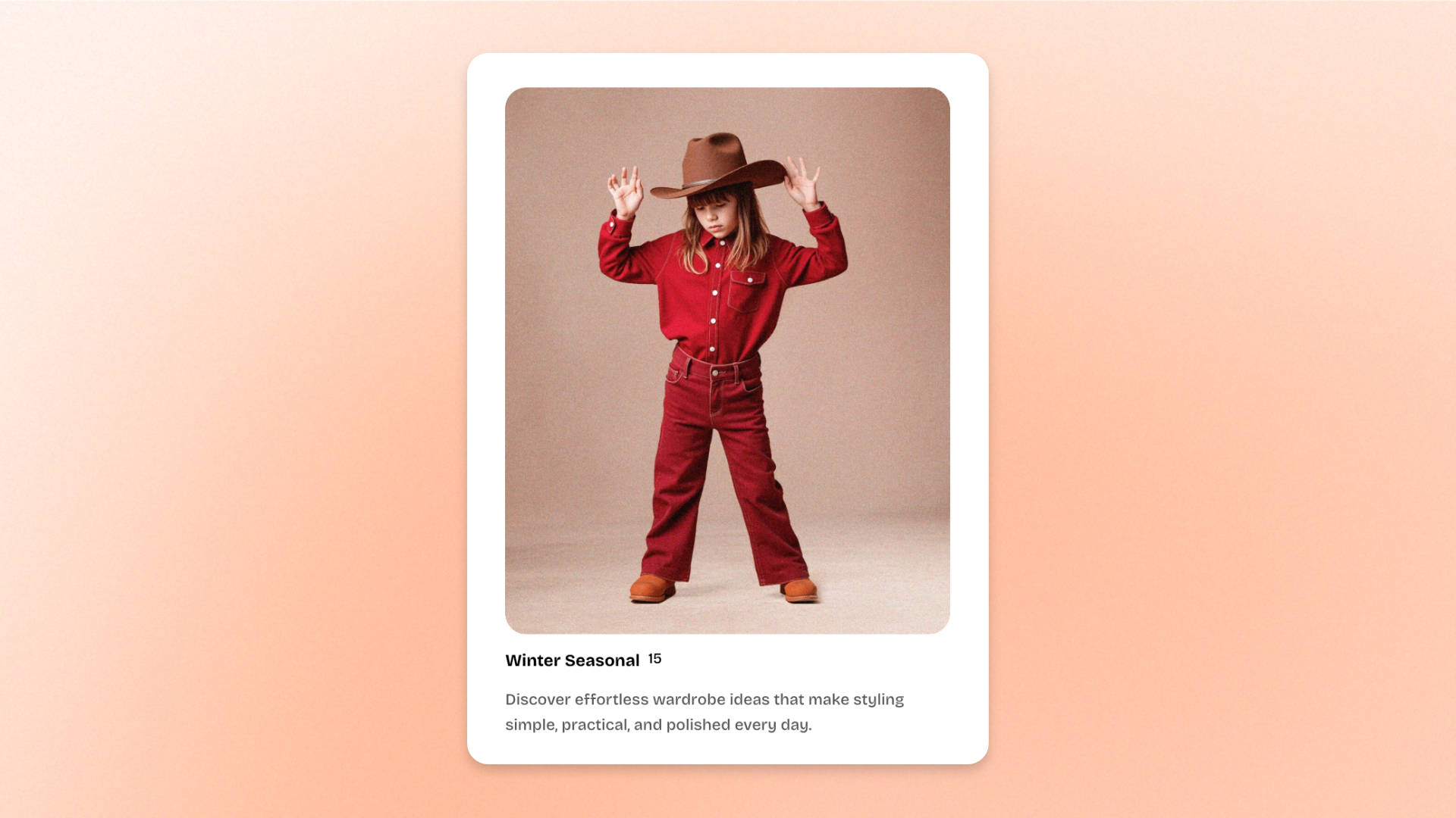
The **Collection card** block displays a single collection as a visual card using its image, title, product count, and optional description.
Use it for **Shop by category sections, featured collections, seasonal collections, or other collection-based navigation** across your store.
Select a collection to automatically use its content, or override the image, title, and description when you want a more customized card.
## Settings
### General
| Setting | Description | Options |
| -------------- | --------------------------------------------- | -------------------- |
| **Collection** | Selects the collection displayed in the card. | Select a collection. |
### Layout
| Setting | Description | Options |
| ------------- | ------------------------------------------- | ------------------------------------ |
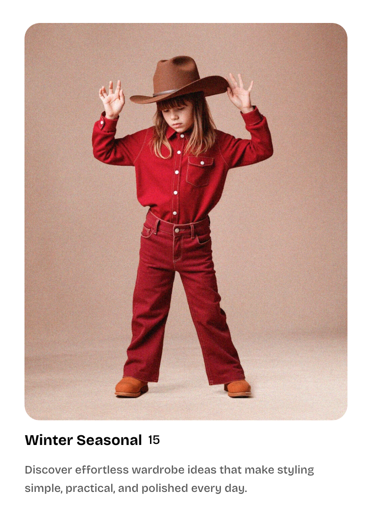
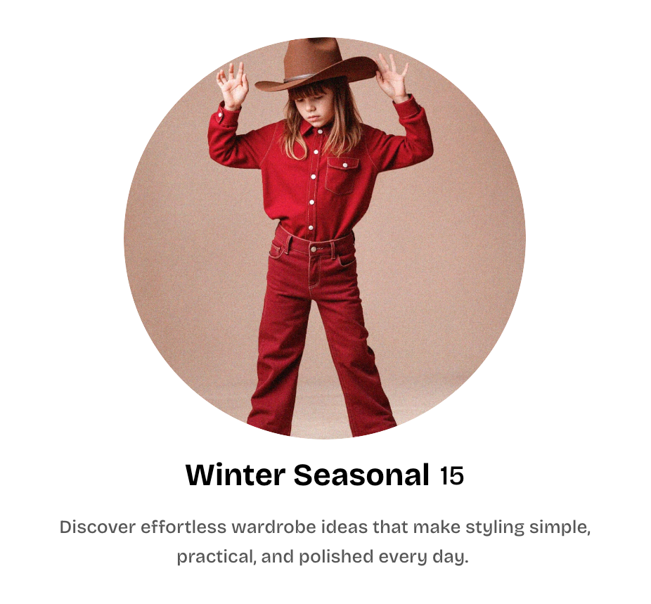
| **Layout** | Controls the overall card layout. | **Standard** or **Circle thumbnail** |
| **Alignment** | Controls the alignment of the card content. | **Left, Center,** or **Right** |
### Media
| Setting | Description | Options |
| ---------------- | ------------------------------------- | -------------------------------------------------------------------------------------------------------------------------------------------------------------------------------------------------------------------------------- |
| **Image** | Sets a custom image for the card. | Select or upload an image.
Leave blank to use the selected collection’s image. |
| **Aspect ratio** | Controls the shape of the card image. | **Use global settings:** Uses the theme’s default image ratio.
**Auto:** Uses the image’s original proportions.
**Square (1/1), Portrait (4/5), Portrait (3/4), Landscape (16/9),** or **Landscape (4/3)** |
### Content
| Setting | Description | Options |
| ---------------------- | ----------------------------------------------------------------------- | ----------------------------------------------------------------------------------------------------------------------------------------------------------------- |
| **Title** | Sets a custom title for the card. | Enter custom text.
Leave blank to use the selected collection’s title. |
| **Title preset** | Controls the typography used for the card title. | **Heading 3, Heading 4, Heading 5,** or **Heading 6** |
| **Show product count** | Controls whether the number of products in the collection is displayed. | **On** or **Off** |
| **Show description** | Controls whether the collection description is displayed. | **On** or **Off** |
| **Description** | Sets a custom description for the card. | Enter and format custom text.
Leave blank to use the selected collection’s description.
*Available when **Show description** is turned on.* |
### Advanced
| Setting | Description | Options |
| ------------------------ | ------------------------------------------------------------------------------------- | ----------------- |
| **Enable preload image** | Preloads the card image when the section is visible on page load to help improve LCP. | **On** or **Off** |
Use **Enable preload image** only for Collection cards that are visible when the page first loads. Avoid enabling it for cards further down the page.
## Tips and best practices
* Leave **Image, Title, and Description** blank to automatically use the selected collection’s content and keep the card in sync with future collection updates.
* Keep collection images consistent in style and aspect ratio when displaying multiple cards together for a cleaner layout.
* Use **Show product count** only when it helps shoppers understand the collection at a glance.
* Enable **preload image** only for cards that are visible when the page first loads.