# Collapsible text
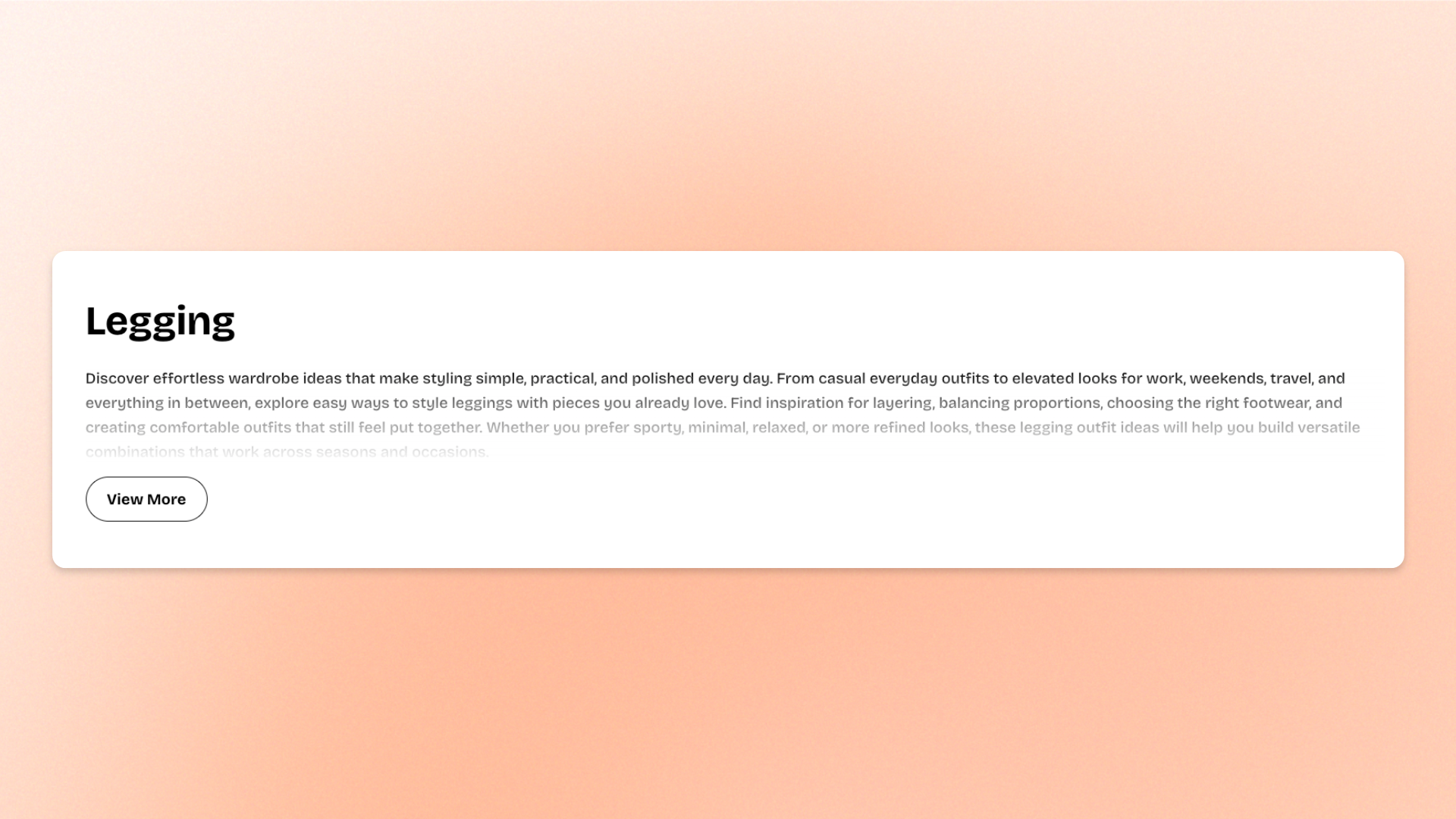
The **Collapsible text** block displays rich text that can be shortened to a set number of lines, with a button shoppers can use to reveal or hide the full content.
Use it for **product descriptions, brand stories, care instructions, ingredient details, sizing notes, additional product information**, or other text-heavy content you want to keep compact while still making the full details available.
## Settings
### General
| Setting | Description | Options |
| -------- | -------------------------------------------------- | ----------------------------- |
| **Text** | Sets the rich-text content displayed in the block. | Enter and format custom text. |
### Typography
Controls the appearance of the text.
| Setting | Description | Options |
| -------------------- | -------------------------------------------- | ------------------------------------------------------------------------------------------------------------------------------------------- |
| **Preset** | Sets the overall typography style. | **Default, Paragraph, Subheading, Heading 1–6,** or **Custom** |
| **Font** | Selects which theme font is used. | **Body** or **Heading**.
*Available when **Preset** is set to **Custom**.* |
| **Font weight** | Controls how light or bold the text appears. | **Inherit, Light, Regular, Medium, Semi bold, Bold, Extra bold,** or **Black**.
*Available when **Preset** is set to **Custom**.* |
| **Font size** | Sets the text size on desktop. | **12–100px**.
*Available when **Preset** is set to **Custom**.* |
| **Font size mobile** | Sets the text size on mobile devices. | **12–60px**.
*Available when **Preset** is set to **Custom**.* |
| **Line height** | Controls the spacing between lines of text. | **Tight, Normal,** or **Loose**.
*Available when **Preset** is set to **Custom**.* |
| **Color** | Sets the text color. | **Text, Subtext, or Custom** |
### Collapsible settings
| Setting | Description | Options |
| ------------------- | ----------------------------------------------------------------------------------------------- | ------------------------------------------------------------------------------------------------------------------------------------------------- |
| **Text line limit** | Sets how many lines are visible before the rest of the text is hidden behind the expand button. | **No limit, 1 line, 2 lines, 3 lines, 4 lines, or 5 lines**.
**No limit** shows the full text and removes the expand/collapse button. |
| **Button style** | Sets the style of the expand/collapse button. | **Primary, Secondary, White,** or **Outline** |
### Padding
Controls the space inside the Collapsible text block. Padding can be adjusted separately for each side.
| Setting | Description | Options |
| ---------------- | ------------------------------------------------------------ | ---------------------------------------------------------------------------- |
| **Top** | Sets the space above the text. | **0–100px** |
| **Bottom** | Sets the space below the text. | **0–100px** |
| **Left** | Sets the space on the left side of the text. | **0–100px** |
| **Right** | Sets the space on the right side of the text. | **0–100px** |
| **Mobile scale** | Scales the padding on mobile relative to the desktop values. | **20–100%:** Select the percentage of the desktop padding to keep on mobile. |
## Tips and best practices
* Set a **Text line limit** based on how much context shoppers need before deciding to expand the content.
* Use **No limit** when the full text should always remain visible and no expand/collapse interaction is needed.
* Keep the visible opening lines meaningful, since they are what shoppers see before expanding the block.
* For longer text, a **3–4 line limit** can keep the layout compact while still giving shoppers enough context.
* Combine the block with **Image** or **Group** blocks to balance longer copy with visual content.