# Button
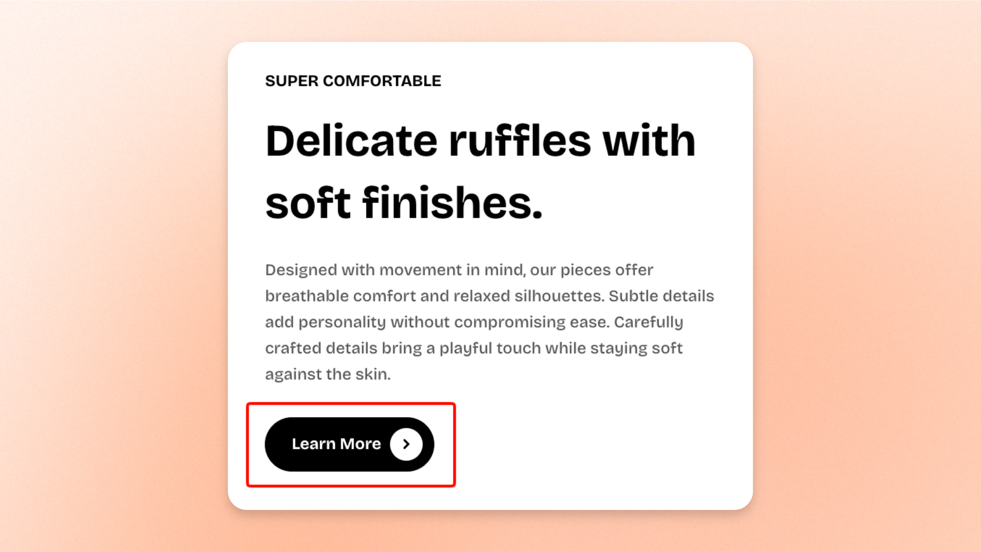
The **Button** block adds a clickable call-to-action that directs shoppers to a product, collection, page, blog post, or another link.
Use it for actions such as **Shop now**, **Learn more**, **View collection**, or **Read more**. You can customize the button style, size, icon, mobile width, and entrance animation.
Customize the overall appearance of the buttons in **Theme settings >** [**Buttons**](https://docs.foxecom.com/pebble-theme/theme-settings/buttons).
## Settings
### General
| Setting | Description | Options |
| -------------- | ----------------------------------------------------------- | ----------------------------------------------------------------------------- |
| **Label** | Sets the text displayed on the button. | Enter custom text. |
| **Link** | Sets where shoppers are taken when they click the button. | Select or enter a link. |
| **Style** | Controls the visual style of the button. | **Primary**, **Secondary**, **Outline**, or **Plain** |
| **Size** | Controls the overall size of the button. | **Extra small**, **Small**, **Medium**, or **Large** |
| **Icon** | Adds an optional icon to the button. | Select an available icon or **None**. |
| **Icon only** | Hides the button label and displays only the selected icon. | **On** or **Off**
*Available when an **Icon** is selected.* |
| **Icon style** | Controls the appearance of the selected icon. | **Default** or **Solid**
*Available when an **Icon** is selected.* |
### Mobile settings
| Setting | Description | Options |
| ------------------------------ | --------------------------------------------------------------------- | ----------------- |
| **Enable full wide on mobile** | Expands the button to use the full available width on mobile devices. | **On** or **Off** |
## Animation
The **Animation** settings control how the button appears when shoppers scroll it into view.
These options are available when animations are enabled in **Theme settings >** [**Animations**](https://docs.foxecom.com/pebble-theme/theme-settings/animations).
| Setting | Description | Options |
| -------------- | ------------------------------------------------------------ | -------------------------------------------------------------------------------- |
| **Type** | Sets the entrance animation used for the button. | **None**, **Fade in**, **Fade up**, **Slide in (left)**, or **Slide in (right)** |
| **Delay (ms)** | Sets how long the theme waits before starting the animation. | **0–2000ms**
*Available when **Type** is not set to **None**.* |
## Tips and best practices
* Keep the button label short and action-focused, such as **Shop now**, **Learn more**, or **View collection**.
* Use **Primary** for the main action and **Secondary**, **Outline**, or **Plain** for supporting actions.
* Use **Icon only** only when the action is clear from a familiar icon.
* Use **Enable full wide on mobile** when you want the button to be easier to notice and tap on smaller screens.