# Article card
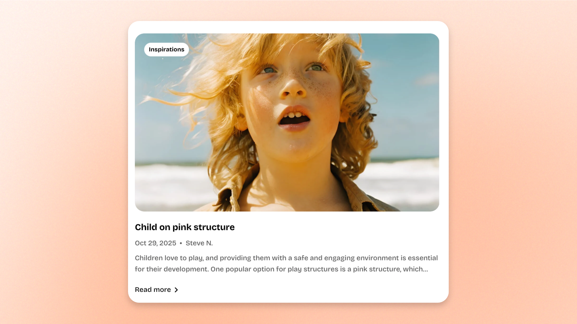
The **Article card** block displays a selected blog article as a card using its featured image and article content. Use it to highlight stories, guides, tutorials, updates, or other editorial content across homepages, landing pages, and custom content sections.
Choose the article you want to feature, then customize the card layout, image ratio, alignment, and supporting content such as tags, publication details, excerpt, and a read more button.
## Settings
### General
| Setting | Description | Options |
| ----------- | ------------------------------------------------ | ---------------------------------------------------------------------------------------------------------------------------------------------------------------------------------------------------- |
| **Article** | Selects the blog article displayed in the card. | Select an article. |
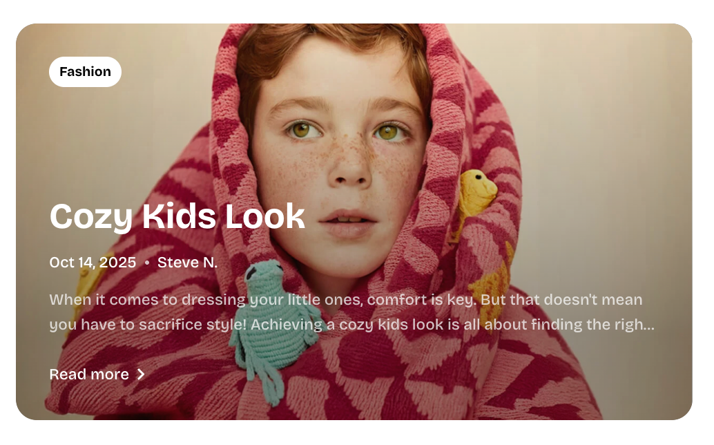
| **Type** | Controls the overall layout of the Article card. | **Overlay:** Places the article content over the image.
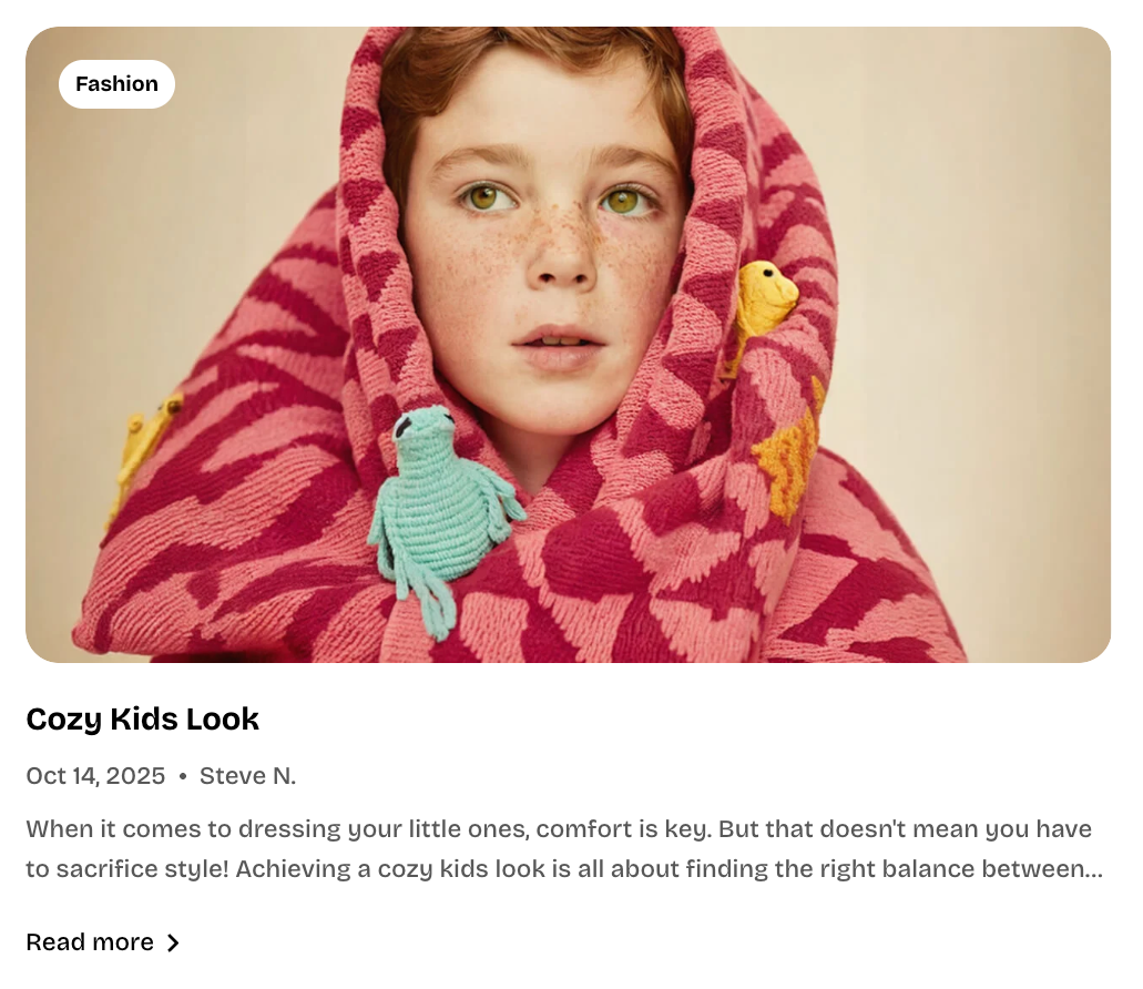
**Vertical:** Places the image above the article content.
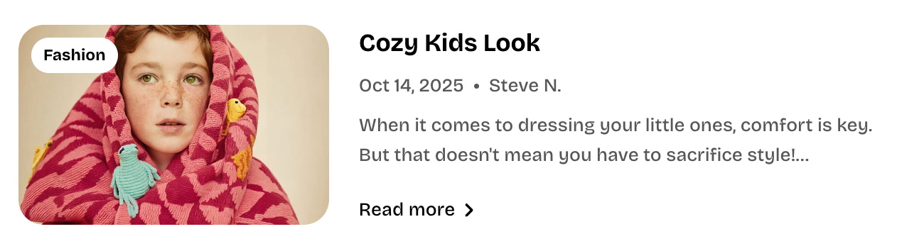
**Horizontal:** Places the image beside the article content. |
### Size
| Setting | Description | Options |
| ----------------------- | ---------------------------------------------------------- | ------------------------------------------------------------------------------------------------------------------------------------------------------ |
| **Aspect ratio** | Controls the shape of the article image on desktop. | **Auto:** Uses the image’s original proportions.
**Square (1/1), Portrait (4/5), Portrait (3/4), Landscape (16/9),** or **Landscape (4/3)** |
| **Aspect ratio mobile** | Controls the shape of the article image on mobile devices. | **Auto, Square (1/1), Portrait (4/5), Portrait (3/4), Landscape (16/9),** or **Landscape (4/3)** |
### Card settings
| Setting | Description | Options |
| ------------------------- | ------------------------------------------------------------------- | ------------------------------ |
| **Alignment** | Controls the alignment of the article content inside the card. | **Left, Center,** or **Right** |
| **Show tags** | Displays the tags assigned to the selected article. | **On** or **Off** |
| **Show date** | Displays the publication date of the selected article. | **On** or **Off** |
| **Show author** | Displays the author assigned to the selected article. | **On** or **Off** |
| **Show excerpt** | Displays a short preview of the selected article’s content. | **On** or **Off** |
| **Show read more button** | Controls whether a button linking to the full article is displayed. | **On** or **Off** |
## Tips and best practices
* Use the same **Type** and **Aspect ratio** across multiple Article cards to keep the layout visually consistent.
* Turn on only the supporting details that help shoppers understand the article quickly.
* Use **Show excerpt** when the title alone does not provide enough context.
* Use **Show read more button** when you want a clearer call to action to open the full article.