# Accordion
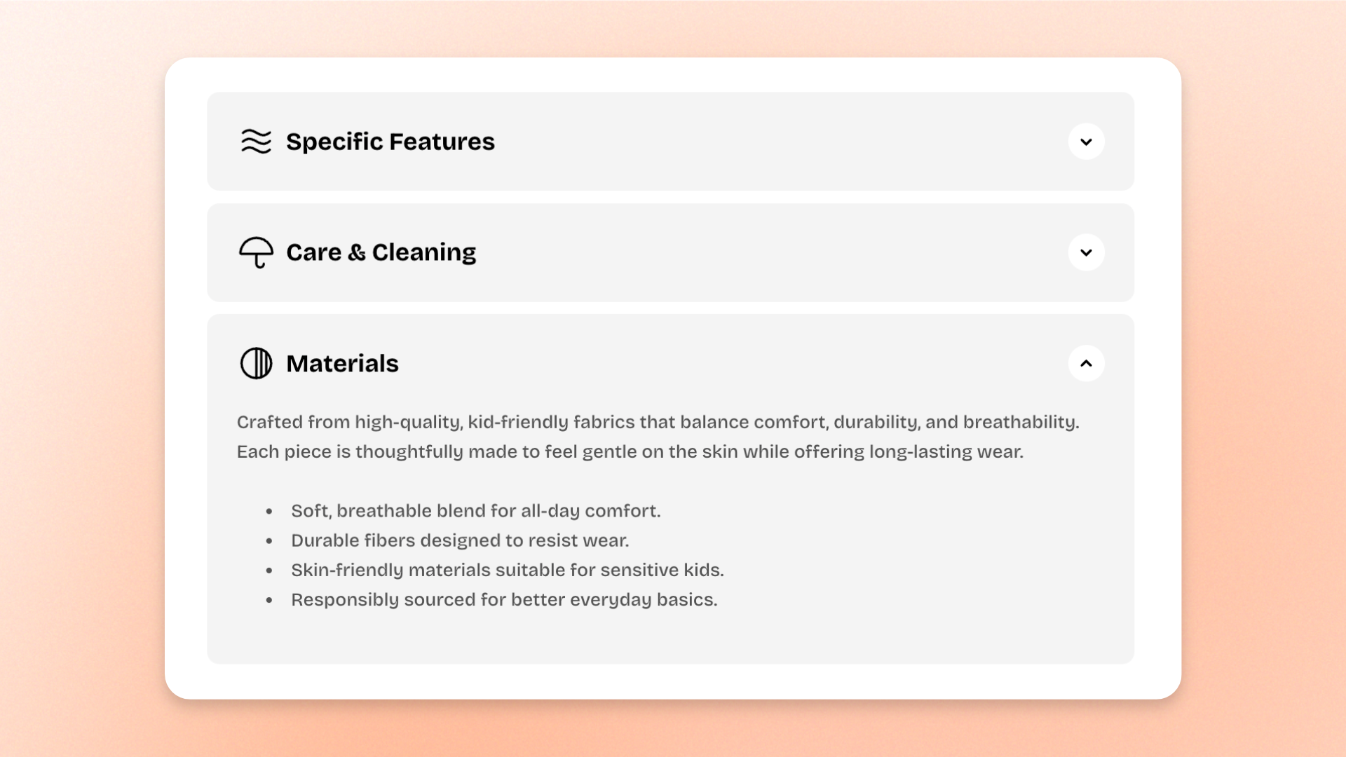
The **Accordion** block displays a stack of expandable rows that keeps detailed information compact and easy to scan. Each row shows a title that shoppers can click to reveal content underneath.
Use it for FAQs, shipping and delivery details, return policies, product specifications, materials and care instructions, size and fit information, warranty details, store policies, and other information shoppers may only need occasionally.
Add one **Accordion row** for each question or topic, then place text, images, buttons, or other supported content inside. For example, on a product page you can create separate rows for **Shipping**, **Return policy**, **Materials & care**, and **Size & fit**, so shoppers can open only the information they need.
## Settings
### General
Controls how accordion rows behave when shoppers open them.
| Setting | Description | Options |
| ----------------- | -------------------------------------------------------------------- | ------------------------------------------------------------------------------------------------------------------------------------------------------------- |
| **Open behavior** | Controls how rows open when a customer interacts with the accordion. | **Multiple:** Allows several rows to stay open at the same time.
**Single:** Keeps only one row open; opening another row closes the previous one. |
### Accordion row settings
Controls the appearance shared by every row in the Accordion.
| Setting | Description | Options |
| ------------------ | ----------------------------------------------------------- | -------------------------------------------------------------------------------------------------------- |
| **Heading preset** | Controls the typography used for accordion row titles. | **Default, Paragraph, or Heading 1–6** |
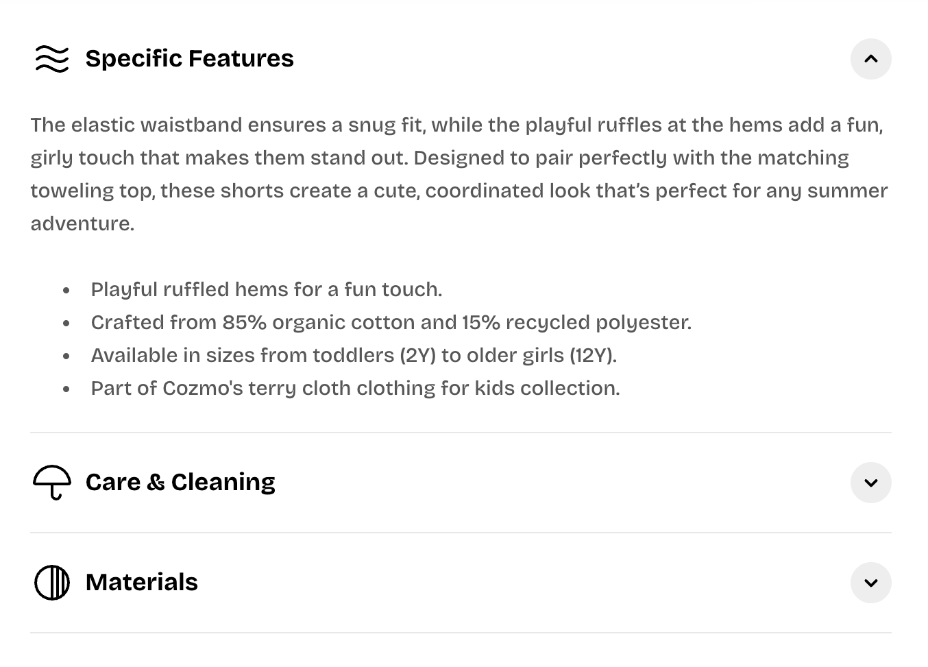
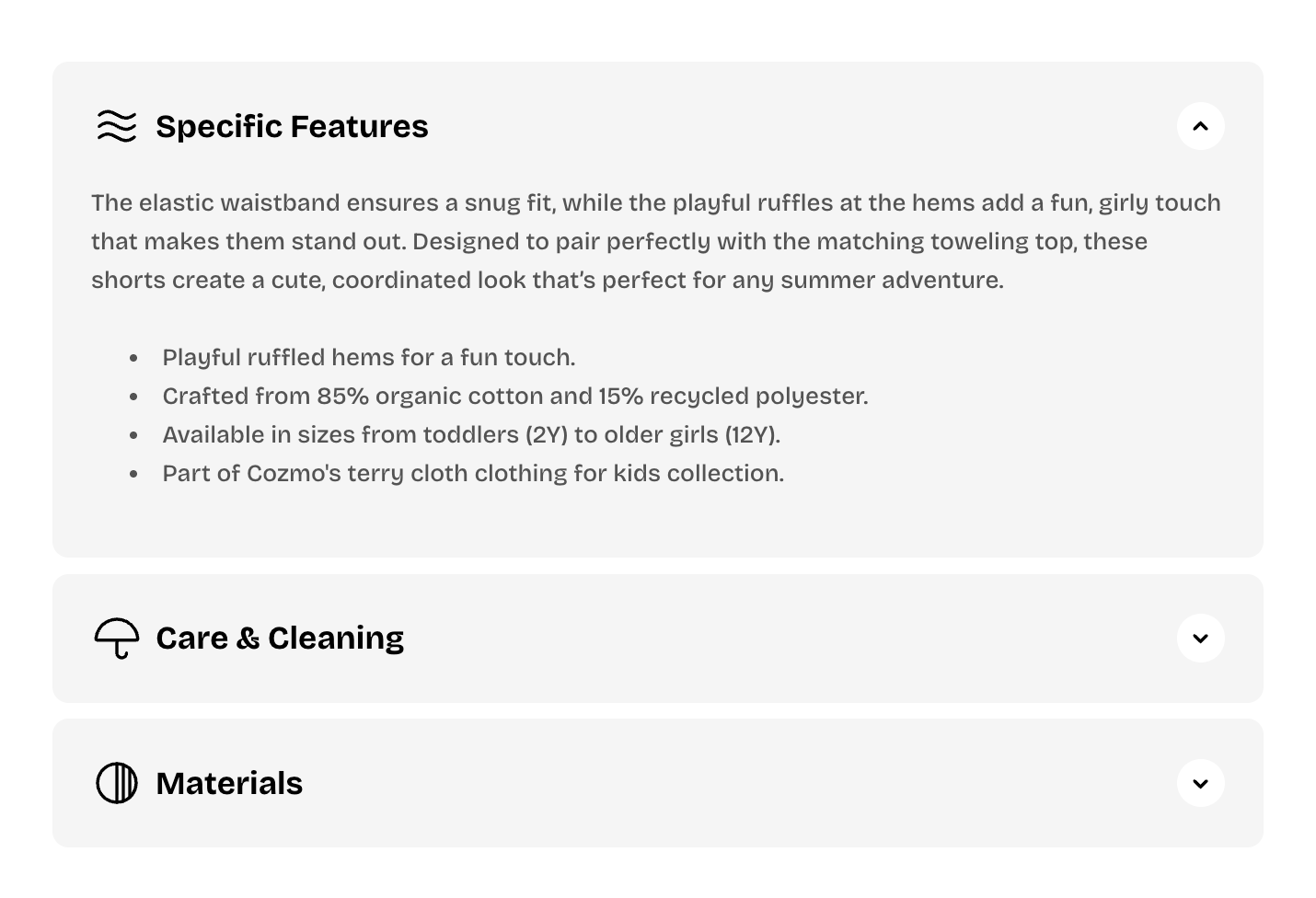
| **Style** | Controls the visual style of each row. | **Standard:** Displays simple accordion rows.
**Card:** Displays each row as a separate card. |
| **Color scheme** | Sets the color scheme used by each row card. | Select a theme color scheme.
*Available when **Style** is set to **Card**.* |
| **Icon arrow** | Controls the expand/collapse indicator shown on each row. | **Caret:** Shows a caret-style indicator.
**Plus:** Shows a plus-style indicator. |
| **Icon style** | Controls the visual style of the expand/collapse indicator. | **Default** or **Solid** |
### Size
Controls the width of the Accordion on desktop and mobile.
| Setting | Description | Options |
| ----------------------- | -------------------------------------------------------- | ----------------------------------------------------------------------------------------------------------------------------------------------------- |
| **Width** | Controls the width of the Accordion on desktop. | **Fit:** Uses only the width needed by the block.
**Fill:** Fills the available width.
**Custom:** Lets you set a custom width. |
| **Custom width** | Sets a custom Accordion width as a percentage. | **0–100%.**
*Available when **Width** is set to **Custom**.* |
| **Width mobile** | Controls the width of the Accordion on mobile devices. | **Fit, Fill,** or **Custom** |
| **Custom width mobile** | Sets a custom Accordion width on mobile as a percentage. | **0–100%.**
*Available when **Width mobile** is set to **Custom**.* |
### Appearance
Controls how the Accordion uses the theme color scheme.
| Setting | Description | Options |
| ------------------------ | ------------------------------------------------------------------------------------------------ | -------------------------------------------------------------------------------------------------------------------- |
| **Inherit color scheme** | Controls whether the Accordion uses the color scheme of the section or container it sits inside. | **On:** Uses the parent color scheme.
**Off:** Lets you choose a separate color scheme for the Accordion. |
| **Color scheme** | Sets a separate color scheme for the Accordion. | Select a theme color scheme.
*Available when **Inherit color scheme** is turned off.* |
### Borders
Controls the outer border of the Accordion block.
| Setting | Description | Options |
| ---------------------- | ------------------------------------------------------------------- | -------------------------------------------------------------------------------------------------------------------- |
| **Border** | Controls whether an outer border is displayed around the Accordion. | **None** or **Solid** |
| **Border width** | Controls the thickness of the outer border. | **0–10px**.
*Available when **Border** is set to **Solid**.* |
| **Border** **opacity** | Controls how solid or transparent the outer border appears. | **0–100%**
*Available when **Border** is set to **Solid**.* |
| **Corner radius** | Controls how rounded the outer corners of the Accordion block are. | **0–32px**
*Applies when **Border** is set to **Solid**, or when **Inherit color scheme** is turned off.* |
### Padding
Adds space inside the Accordion block around its content.
| Setting | Description | Options |
| ---------- | -------------------------------------------------------------- | ----------- |
| **Top** | Controls the space above the Accordion content. | **0–100px** |
| **Bottom** | Controls the space below the Accordion content. | **0–100px** |
| **Left** | Controls the space on the left side of the Accordion content. | **0–100px** |
| **Right** | Controls the space on the right side of the Accordion content. | **0–100px** |
## Accordion row - items
Add one **Accordion row** for each question, topic, or piece of expandable information.
The row controls the clickable title and optional icon. Add the actual answer or supporting content inside the row as separate blocks, such as text, images, or buttons.
### Row settings
| Setting | Description | Options |
| ----------------------- | ------------------------------------------------------------- | ------------------ |
| **Text** | Sets the row title shoppers click to expand or collapse it. | Enter custom text. |
| **Open row by default** | Controls whether the row starts expanded when the page loads. | **On** or **Off** |
### Icon
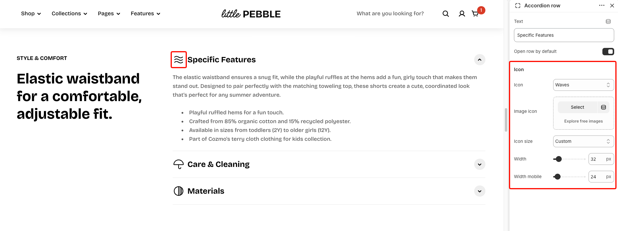
Each Accordion row can display an optional icon before its title.
| Setting | Description | Options |
| ---------------- | ------------------------------------------------------------- | ----------------------------------------------------------------------------- |
| **Icon** | Adds a built-in icon before the row title. | Select an available icon or **None**. |
| **Image icon** | Lets you use your own small image instead of a built-in icon. | Select or upload an image. |
| **Icon size** | Controls the size of the icon or image. | **Extra small, Small, Medium, Large, Extra large,** or **Custom** |
| **Width** | Sets an exact icon width on desktop. | **12–200px.**
*Available when **Icon size** is set to **Custom**.* |
| **Width mobile** | Sets an exact icon width on mobile devices. | **12–200px.**
*Available when **Icon size** is set to **Custom**.* |
## Tips and best practices
* Add the detailed content inside each **Accordion row** as separate blocks, such as text, images, or buttons. The row itself is mainly used for the clickable title and optional icon.
* Use **Single** open behavior for FAQs or other content where shoppers usually read one item at a time. Use **Multiple** when shoppers may need to view or compare several items together.
* Keep row titles short and descriptive so shoppers can quickly scan and find the information they need.