# Store locator 🔥
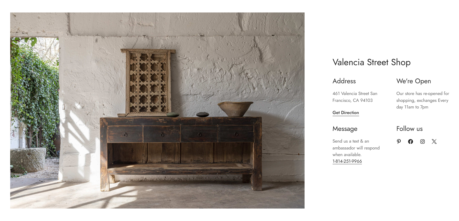
The **Store locator** section lets you easily display store locations with their exact addresses to make the shopping experience easier and more seamless for customers.
You can showcase:
* Store addresses
* Opening hours
* Contact information
* Social media links
* Store images
* Additional store details
Whether you are opening new branches, relocating stores, or updating business hours, simply edit the Store locator section to keep customers informed.
The **Store locator** section is only available in Minimog **version 6.0.0 and above**. ✨
See [Changelog](/minimog-theme/changelog).
## How to add a Store locator section to your Shopify store
**Steps:**
1. In the theme editor **(Customize)**, click **Add section.**
2. Select **Store locator.**
3. Make necessary changes.
4. **Save** the settings.
## How to edit a Store locator section
### Section settings
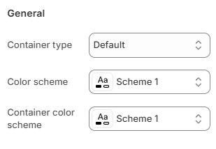
#### General
You can choose your **Container type** for the collection list as:
* Default
* Full width
* Use container box
Select the **Color scheme** for the section.
Set up your Color schemes anytime in the Theme settings > [Colors](page://06f63b5e-e921-4319-88d7-bcdcf65d77f2).
Select the **Container color scheme** for the content area inside the section.
This allows you to create contrast between:
* The section background
* The store information container
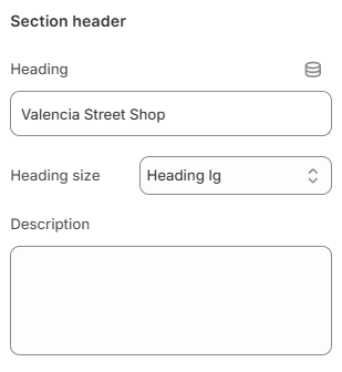
#### Section header
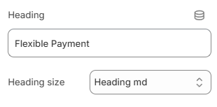
Enter the **Heading** for the Store locator section.
Choose the **Heading size** as:
* Heading xs
* Heading sm
* Heading md
* Heading lg
* Heading xl
* Heading 2xl
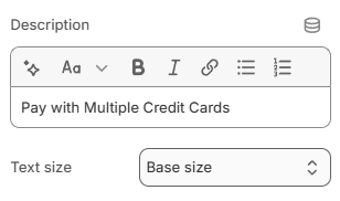
Add an optional **Description** using the rich text editor.
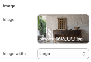
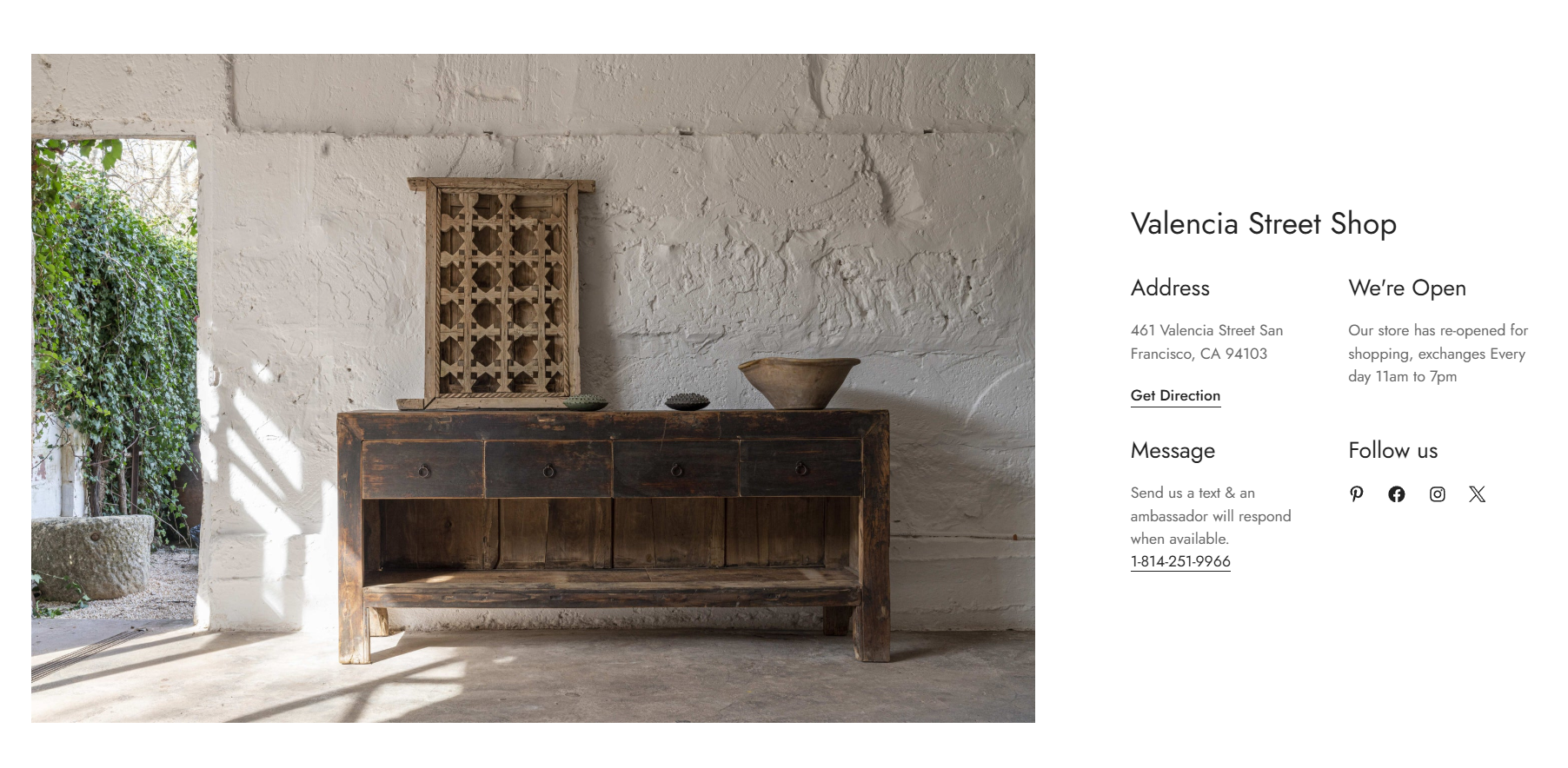
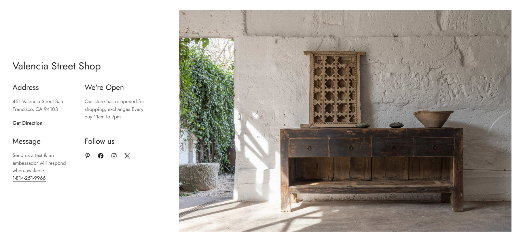
#### Image
Upload an **Image** for the store location.
Choose the **Image width** as:
* Small
* Medium
* Large
Choose the **Image position desktop** as:
* Left
* Right
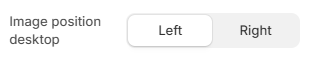
This setting controls whether the image appears before or after the store information on desktop devices.
#### Content
Choose the number of **Columns** for the store information layout:
* 1 column
* 2 columns
* 3 columns
Adjust the **Item column gap** to control the horizontal spacing between content blocks (0-100px).
Adjust the **Item row gap** to control the vertical spacing between content blocks (0-100px).
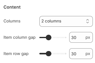
These settings help create a cleaner and more organized store information layout.
#### Mobile settings
Choose the number of **Item columns** displayed on mobile devices:
* 1 column
* 2 columns
Adjust the **Item column gap** for mobile spacing (0-50px).
Adjust the **Item row gap** for mobile spacing (0-50px).
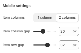
Use smaller gaps for compact layouts or larger gaps for improved readability.
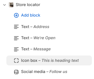
### Block settings
The Store locator section supports the following blocks:
* [Text](#text)
* [Icon box](#icon-box)
* [Social media](#social-media)
You can combine multiple blocks to build a flexible store information layout.
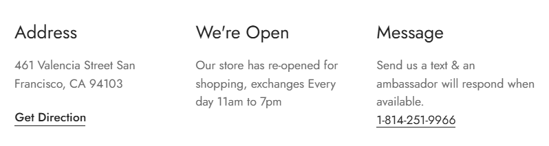
#### Text
The **Text** block is commonly used for:
* Store address
* Opening hours
* Phone numbers
* Email information
* Direction links
* Store notices
**Content settings**
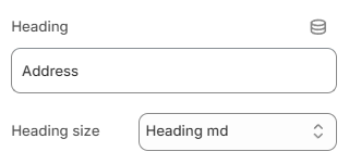
Enter the **Heading** for the text block.
Choose the **Heading size** as:
* Heading xs
* Heading sm
* Heading md
* Heading lg
* Heading xl
* Heading 2xl
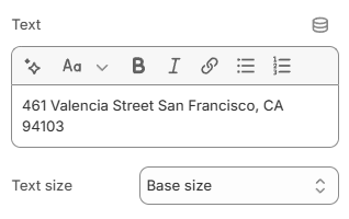
Add the **Text** content using the rich text editor.
Select the **Text size** as:
* Small
* Base size
* Large
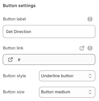
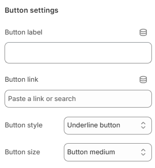
**Button settings**
Display a call-to-action button to redirect customers to your desired pages.
Add a **Label** and **Link** for one or both, then choose a **Button style:**
* Primary button
* Secondary button
* Underline button/White button
Leave the **Button label** field blank to hide the button.
and adjust the **Button size:**
* Button small
* Button medium
* Button large
#### Icon box
The **Icon box** block is commonly used for store services, feature highlights, brand values, promotional content, and support information.
Choose the **Layout** for the Icon box:
* Vertical
* Horizontal
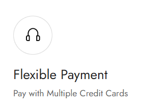
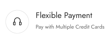
**Image settings**
Upload an **Image** for the Icon box block.
You can also use **Image from URL** to display an external image.
Supported image formats: .svg, .png or .jpg
*Example: [https://example.com/icon.svg](https://example.com/icon.svg)*
Adjust the **Image width** in pixels. Leave the field blank to use the original image width.
Add an **Image link** to make the image clickable.
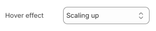
Choose the **Hover effect** for the image:
* None
* Zoom in
* Scaling up
* Scaling down
**Content settings**
Enter the **Heading** text for the Icon box.
Choose the **Heading size** as:
* Heading xs
* Heading sm
* Heading md
* Heading lg
* Heading xl
* Heading 2xl
Add a **Description** using the rich text editor.
Select the **Text size** for the description:
* Small
* Base size
* Large
**Button settings**
Display a call-to-action button to redirect customers to your desired pages.
Add a **Label** and **Link** for one or both, then choose a **Button style:**
* Primary button
* Secondary button
* Underline button
* White button
Leave the **Button label** field blank to hide the button.
and adjust the **Button size:**
* Button small
* Button medium
* Button large
#### Social media
The **Social media** block displays your store’s social media icons. This helps customers follow your brand, stay updated and connect through social platforms.
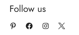
Enter the **Heading** for the social media block.
Choose the **Heading size** as:
* Heading xs
* Heading sm
* Heading md
* Heading lg
* Heading xl
* Heading 2xl
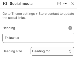
Update your social media links anytime in **Theme settings >** [Store contact](page://b0facb2b-cd70-4db5-965a-edbaf0055cb2).