# Common section settings
Most Hyper sections share the same groups of settings: **General**, **Section header**, **Section padding**, and **Section divider**. They work the same way in every section, so they're explained once on this page. Each section's own page covers only the settings that belong to that section.
Not every section has all of these settings. For example, the **Section header** of **Collection tabs** and **Favorite products** has only **Heading** and its highlight settings.
## How to find these settings
1. Go to **Online Store > Themes** in your Shopify admin.
2. Click **Edit theme** next to Hyper.
3. Click a section in the sidebar.
4. Scroll the section's settings to the group you want to change.
5. Click **Save**.
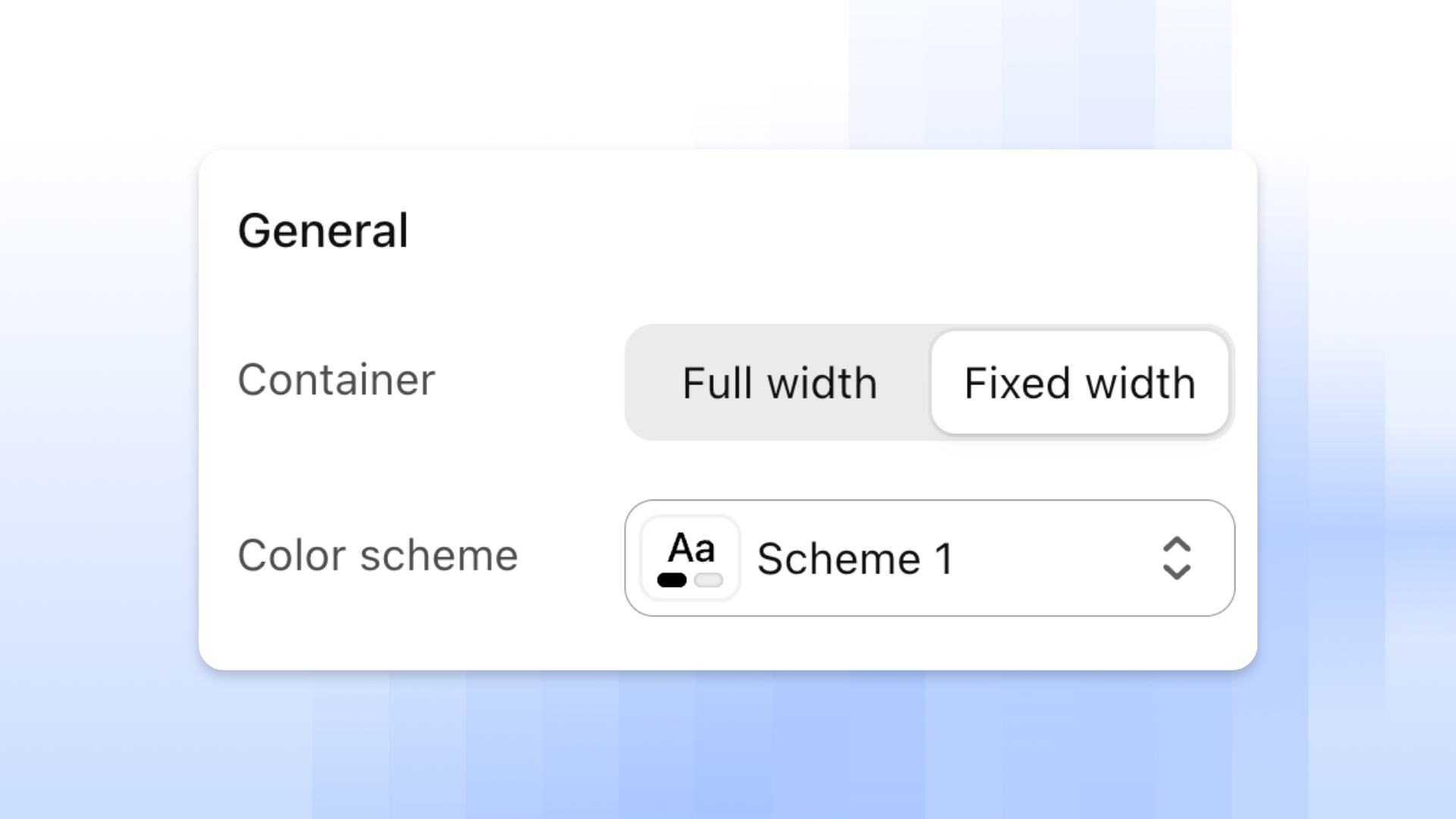
## General
The width and colors of the section.
| Setting | Description | Options |
| ---------------- | ---------------------------------------------- | -------------------------------------------------------------------------------- |
| **Container** | The width of the section's content. | **Full width** or **Fixed width**. |
| **Color scheme** | The background and text colors of the section. | Select one of your [color schemes](https://docs.foxecom.com/hyper-theme/theme-settings/colors). |
## Section header
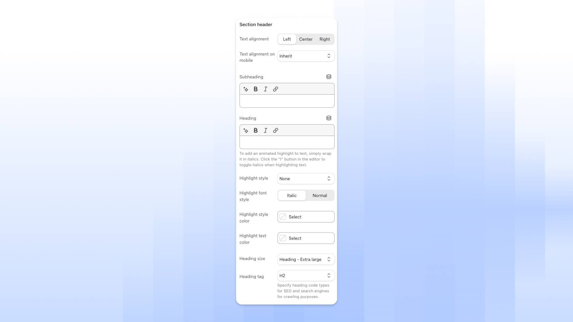
The heading shown above the section's content.
| Setting | Description | Options |
| ---------------------------- | ------------------------------------------------------------------------ | ----------------------------------------------------------------------------------------------------------------------------------------------------------------------- |
| **Text alignment** | Where the section header sits on desktop. | **Left**, **Center**, or **Right**. |
| **Text alignment on mobile** | Where the section header sits on mobile. | **Inherit** to use the desktop alignment, or **Left**, **Center**, or **Right**. |
| **Subheading** | A short line of text above the heading. | Enter text. You can make it bold or italic, or add a link.
*Leave blank to hide it.* |
| **Heading** | The main heading of the section. | Enter text. You can make it bold or italic, or add a link.
*Leave blank to hide it.* |
| **Heading size** | The size of the heading. | **Heading - Extra small**, **Heading - Small**, **Heading - Medium**, **Heading - Large**, **Heading - Extra large**, **Mega title - Base**, or **Mega title - Large**. |
| **Heading tag** | The heading level used in your store's code, for SEO and search engines. | **H1**, **H2**, **H3**, **H4**, **H5**, or **H6**. |
### Text and button
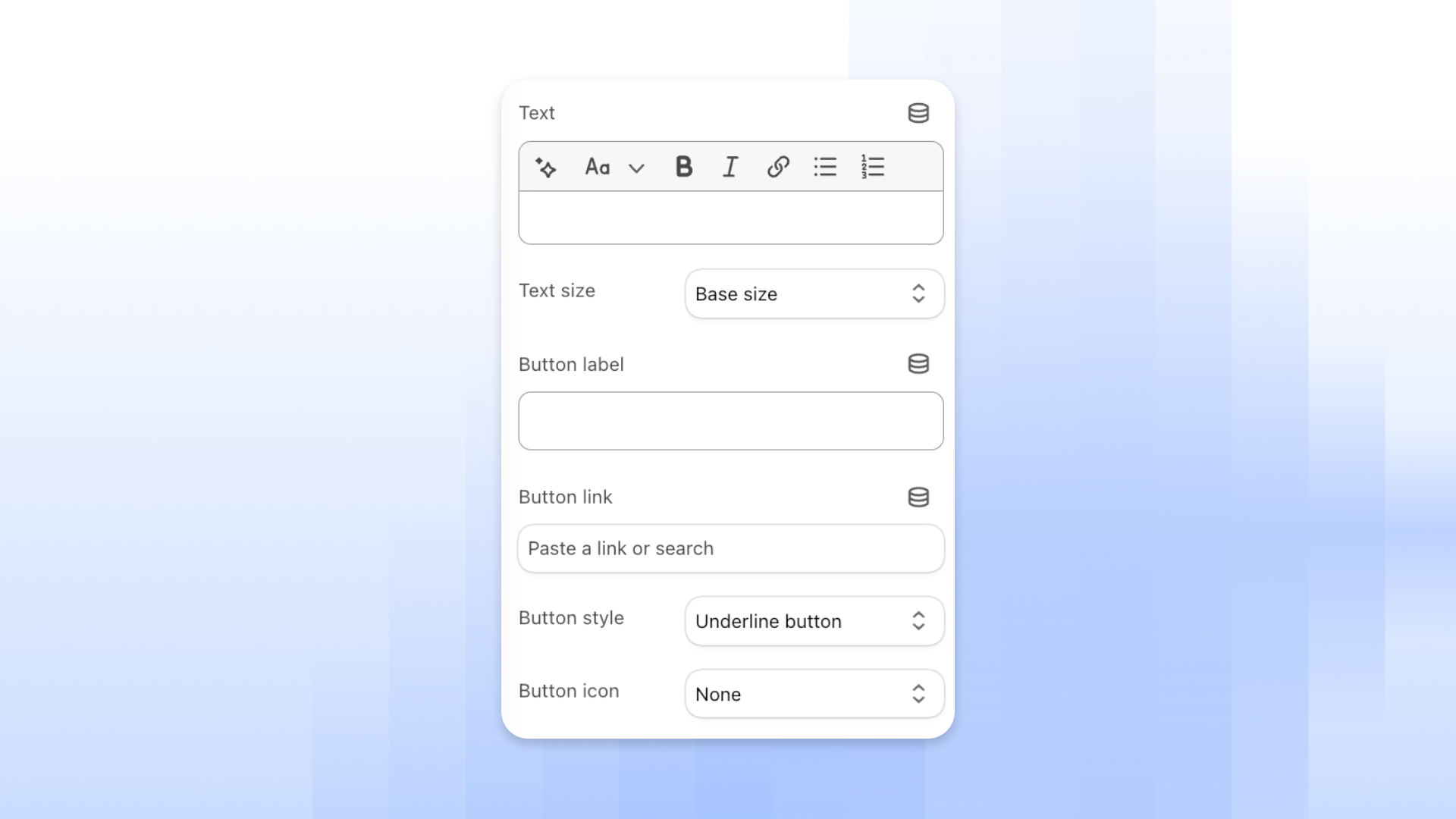
Some sections also have a description and a button in **Section header**.
| Setting | Description | Options |
| ---------------- | ---------------------------------------------------- | ---------------------------------------------------------------------------------------------------------------------------- |
| **Text** | The description below the heading. | Enter text. You can change its size, make it bold or italic, add a link, or add a list.
*Leave blank to hide it.* |
| **Text size** | The size of the description. | **Small**, **Base size**, **Large**, or **Inherit**. |
| **Button label** | The text on the button. | Enter text.
*Leave blank to hide the button.* |
| **Button link** | The page customers go to when they click the button. | Paste a link or search for a page. |
| **Button style** | How the button looks. | **Primary button**, **Secondary button**, **Underline button**, or **Plain button**. |
| **Button icon** | The icon shown on the button. | **None**, or an icon such as **Arrow right**, **Caret right**, or **Cart**. |
### Highlight text
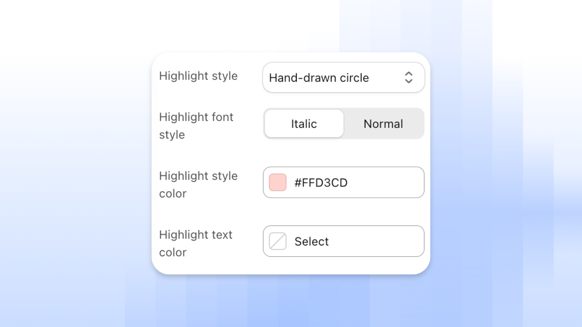
To highlight a word in **Heading**, make it italic: select the word, then click the **I** button in the text editor. Then choose how the highlight looks.
| Setting | Description | Options |
| ------------------------- | --------------------------------------- | ---------------------------------------------------------------------------- |
| **Highlight style** | The effect on the highlighted word. | **Hand-drawn circle**, **Thick underline**, **Wave underline**, or **None**. |
| **Highlight font style** | The font style of the highlighted word. | **Italic** or **Normal**. |
| **Highlight style color** | The color of the circle or underline. | Pick a color. |
| **Highlight text color** | The text color of the highlighted word. | Pick a color. Optional. |
See each style in [Add highlighted text to headings](https://docs.foxecom.com/hyper-theme/faqs/add-highlighted-text-to-your-headings).
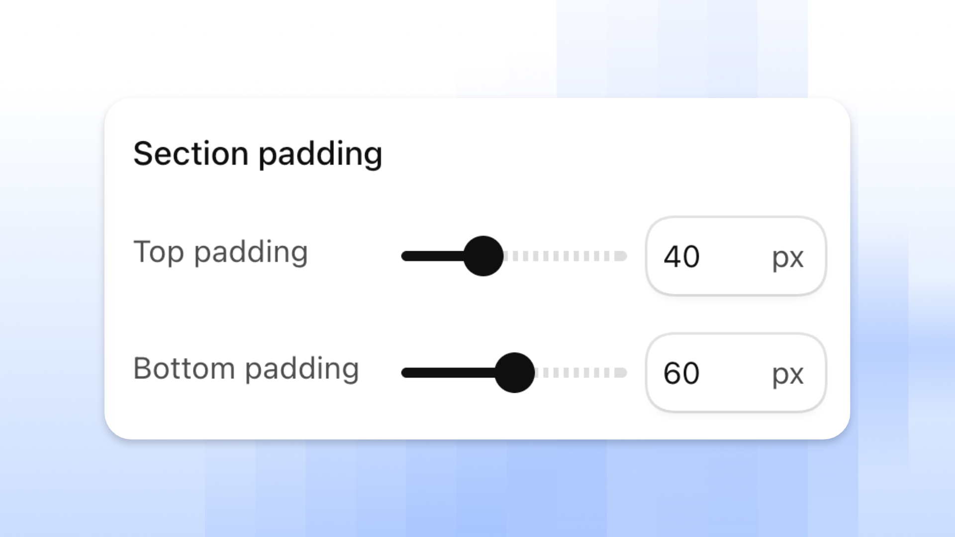
## Section padding
The space above and below the section's content.
| Setting | Description | Options |
| ------------------ | -------------------------------------- | ------------- |
| **Top padding** | The space above the section's content. | **0–100 px.** |
| **Bottom padding** | The space below the section's content. | **0–100 px.** |
## Section divider
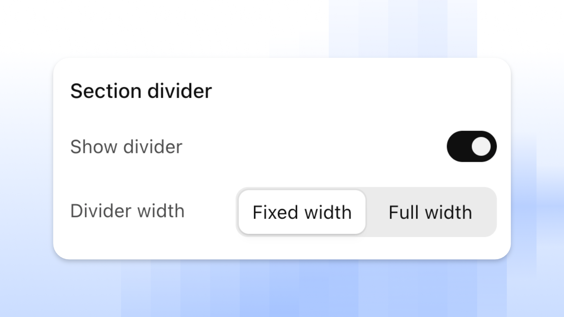
A line at the top of the section that separates it from the section above.
| Setting | Description | Options |
| ----------------- | ----------------------------- | ---------------------------------- |
| **Show divider** | Shows the divider line. | **On** or **Off**. |
| **Divider width** | How wide the divider line is. | **Fixed width** or **Full width**. |
## Tips and best practices
Highlight only 1 or 2 words in a heading, so the effect stands out.
## Related articles
Add highlighted text to headings
Colors
Typography