A blog acts as your brand’s direct voice to the outside world. It helps build, reaffirm and strengthen your brand name online while attracting more traffic to your website.
In this article, we will show you how to customize your Blog posts section.
## Customize your blog posts section header
First, you need to add a blog posts section to your page.
In your section header block, you can easily add. remove, or reorder child blocks (which are heading, subheading, and rich text).
## Customize your blog posts grid
### Content settings
Let's start with selecting a blog that you've created in Shopify admin > Blog posts.
Haven't added any blogs yet? Check out [this article](https://help.shopify.com/en/manual/online-store/blogs) on how to add a blog and create blog posts.
In the blog posts grid content settings, you can config your number of posts to show between 1 and 24 using the toggle.
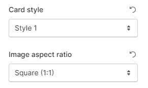
After that, change the card style and set the image aspect ratio to your liking.
### Desktop layout
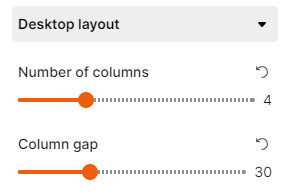
Set your number of columns (1-12 columns) and the gap between columns on the desktop view.
### Mobile layout
Similar to desktop layout, mobile layout lets you set your number of columns shown on mobile view (1 column/2 columns) and the column gap.
Check **Enable swipe on mobile** to display the blog posts grid in horizontal order with a slider.


.gif?alt=media&token=2a7f379e-c107-4be0-9bc2-98e6b0280ded)