# Password form
Add a password-protected entry field to your Shopify password page — so visitors can unlock access before your store launches.
## When to use this element
Use the Password form element when you're building a custom password page in Foxify and need to let visitors enter a password to access your store.
Best fits for:
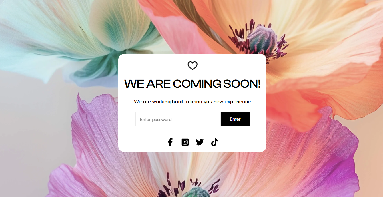
* A coming soon page before your store officially launches
* A members-only or VIP early-access page
* A wholesale or B2B storefront with restricted access
* Any page where you want to control who can enter using Shopify's password feature
#### How is this different from similar elements?
Password form
Note: The Password form element only works on [Password page type](page://559bda45-b679-451b-b151-55ce12df8ab8).
## Quick setup
**Before you start:** Make sure your Shopify store's password protection is enabled. [Learn how to add your online store password](https://help.shopify.com/manual/online-store/themes/password-page)
**Add the Password form element**
Click **Add elements** (or press **E**) → find **Password form** under Advanced elements → drag it onto your canvas.
**Configure the form**
In the Inspector panel → **General** tab, set the password placeholder text, button label, button icon, and button style.
**Style the form**
Switch to the **Design** tab to style the element container, form input, submit button, and submit button hover state separately.
**Preview and publish**
Switch to mobile preview to check how the form renders. Click **Save & Publish** when ready.
**Expected result:** Your password page now shows a styled input field and submit button. Visitors enter the password to unlock access to your store. The form connects directly to Shopify's password protection — no additional setup needed.
## Settings — General
| Setting | What it does | When to use |
| --- | --- | --- |
| Password placeholder | The hint text shown inside the password input field before the visitor types | Use something clear like "Enter password" — keep it short |
| Button label | The text on the submit button | Common options: "Enter", "Unlock", "Access store". Keep it 1-2 words. |
| Button icon | Optional icon displayed on the submit button | Use when you want an icon-only or icon+text button.
Leave empty for text only. |
| Button style | Apply a predefined button style from [Global styles](page://4797f281-d24a-40d1-a7d5-07754adc0136) | Click **Select style** to choose from your saved button presets — keeps the button consistent with the rest of your store. |
## Settings — Design
The Password form has 4 design layers you can style independently:
The outer wrapper — controls overall width, padding, background, and borders of the entire form block.
Available settings:
* **Form layout:** You can set the input field and button to display on the same line or stack them across two lines.
* **Input & Button height:** Allow adjustment of the height for the input field & button.
The password input field — controls background, border, text color, font, and padding of the input area.
Available settings:
* **Color:** Set the color for the text form.
* **Font**: Choose from hundreds of fonts. You can also [upload your own fonts to Foxify](page://c658461d-c020-4b23-b2a8-e9373e8d0aa8).
* **Weight:** Set the thickness (font weight) of the text.
* **Size**: Define the font size of the text.
* **Spacing:** Change the spacing between the lines and characters in the text box.
* **Align:** Allows for aligning the position of the text inside the input field.
* **Text case**: Click the icons to set the text's capitalization: **As typed** — , **Upper case** **AG**, **Title case** **Ag**, or **Lower case** **ag**.
The normal state of the submit button — background color, text color, font, size, and border.
Available settings:
* **Fill:** Set the text color and background color of the button.
* **Font**: Choose from hundreds of fonts. You can also [upload your own fonts to Foxify](page://c658461d-c020-4b23-b2a8-e9373e8d0aa8).
* **Weight:** Set the thickness (font weight) of the text.
* **Size**: Define the font size of the text.
* **Text case**: Click the icons to set the text's capitalization: **As typed** — , **Upper case** **AG**, **Title case** **Ag**, or **Lower case** **ag**.
* **Spacing:** Change the spacing between the lines and characters in the text box.
How the button looks when a visitor hovers over it. Set a different background or text color to signal interactivity.
Available settings:
**Fill:** Set the text color and background color of the button hover.
## FAQs
#### Can I use the Password form element on a regular Foxify page?
No — it only works on Password page type.
#### Where do I set the actual store password?
In Shopify Admin → Online Store → Preferences → Password protection. The Password form element in Foxify handles the visual form only — the password itself is managed in Shopify.
####
Can I have multiple Password form elements on the same page?
You can add more than one, but only one is needed — Shopify's password page only requires a single form to authenticate. Adding multiple forms doesn't add functionality.