
Faqs And TroubleshootingTroubleshooting
Blank space on the right side of mobile view
2 min read
✅ Common causes & fixes
Element width exceeds screen size
- Cause: One or more elements have a fixed or oversized width that pushes the content out of the screen.
- Fix:
- Select the element (e.g.
Stack,Image, orText). - In the Design tab, under Size, ensure:
Widthis set to100%or a responsive value (vw,%, orauto) — avoid using large fixed pixel.
- Use the Constraint feature to help Foxify adapt the layout across devices. Learn more: Constraints
- Double-check both Tablet and Mobile views by toggling view modes at the top.
- Select the element (e.g.
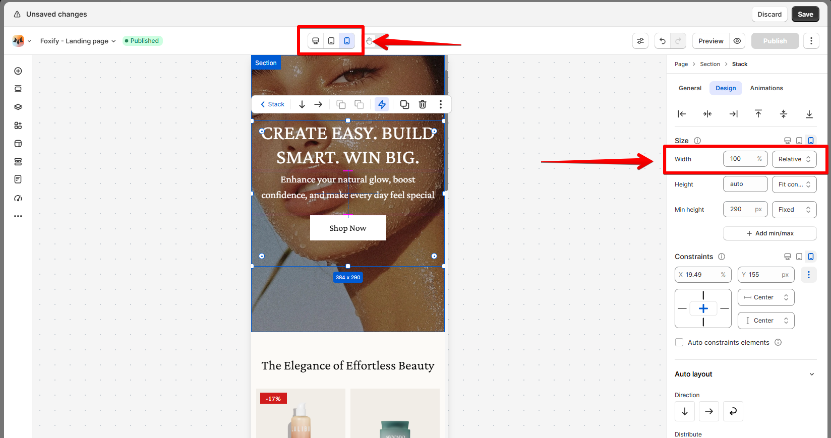
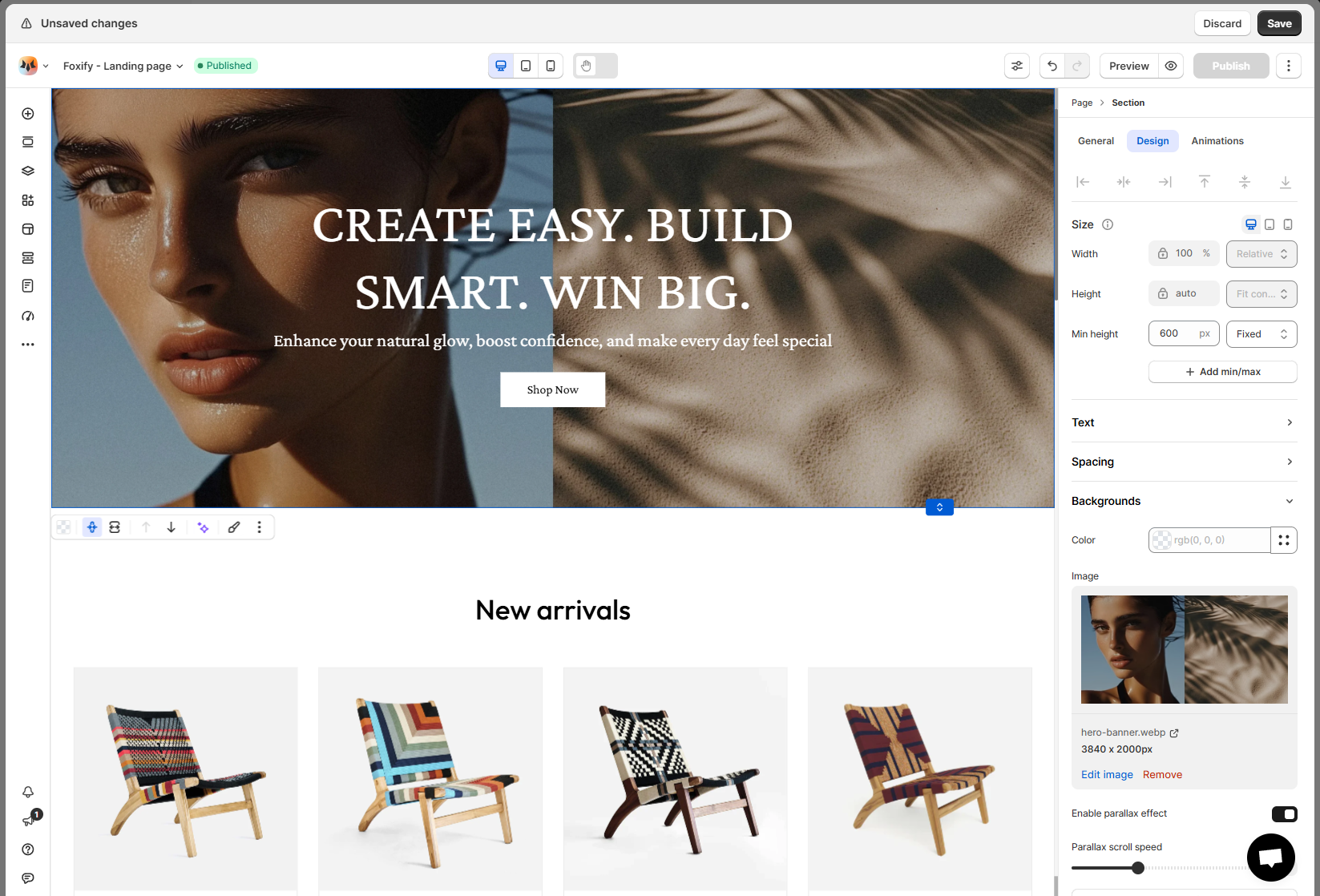
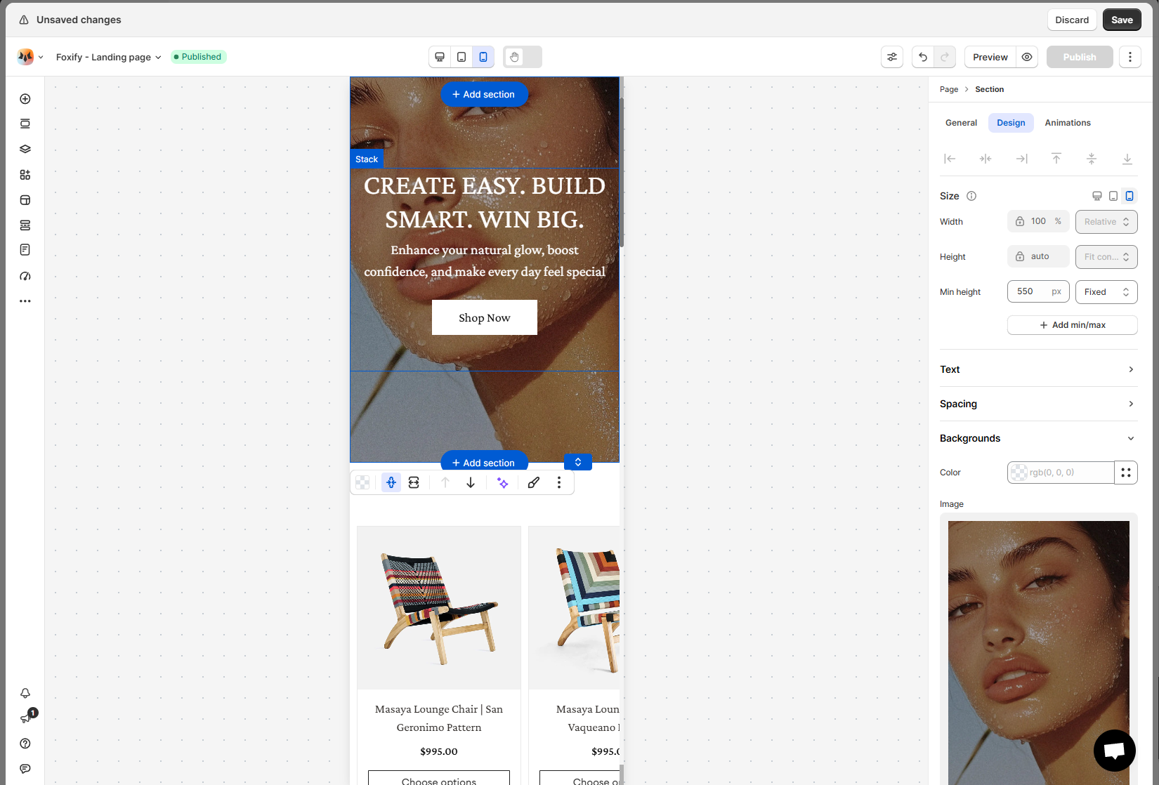
Image or button overflows
- Cause: Large images or buttons that aren't optimized for mobile can stretch the layout.
- Fix:
- Set different widths for Desktop and Mobile using the device toggle in the settings panel.
- or Upload separate mobile-optimized images if needed.
🎥 Need a visual guide?
🧪 Still seeing issues?
- Recheck the affected section’s constraints and sizes.
- Contact our support team — we’re here to help!
How to report an issue
Last updated